Colour · Key & temperature
Light ground
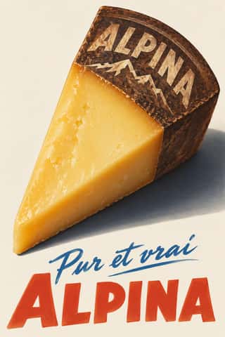
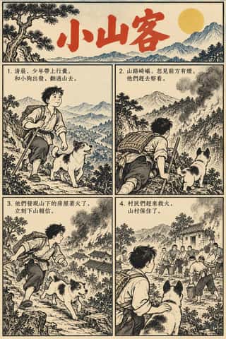
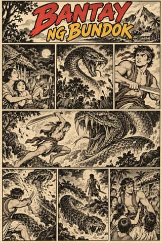
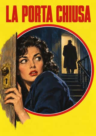
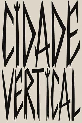
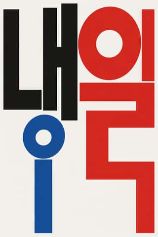
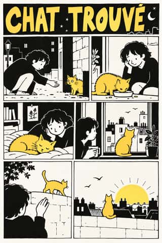
Paper-white or pale fields dominate.
A design choice in Stylogeny’s vocabulary, under colour: what is the colour strategy?
- styles make it
- 231
- as a defining choice
- 30
- as a usual one
- 166
- now and then
- 35
- avoid it
- 7
Styles defined by it 30
For these styles it is one of the choices that make the style.
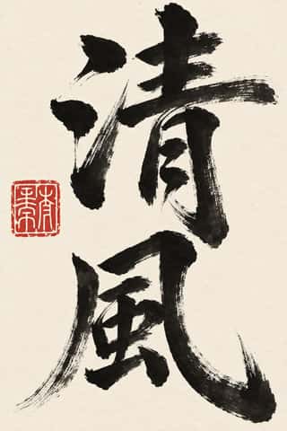
Chinese Calligraphy & Seal Carving (Shufa & Zhuanke)The written art of China and the root of East Asian lettering.
- Hebrew MicrographyA Jewish scribal art in which lines of minute Hebrew script, usually the Masoretic notes that guard the biblical text, are written so that the line itself draws: interlaced frames and star rosettes on full carpet pages, and animals, knights, fish and grotesques in the margins.
- Maghrebi Script (Maghribi Calligraphy of al-Andalus and North Africa)The family of Arabic scripts of al-Andalus and North Africa, descended from early Kufic bookhands.
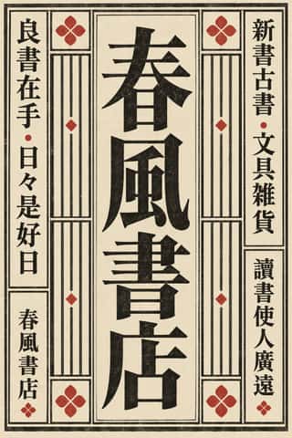
Song–Ming Woodblock Book Typography (Songti / Mincho)The page and letter of the East Asian book.
Mixteca-Puebla Codex PaintingThe painted screenfold books of Postclassic southern and central Mexico (not the Maya codices): long strips of gesso-coated deerskin, folded like a screen and painted on both sides.
Renaissance Book TypographyThe printed book as shaped by humanist Italy and France: roman and italic types modelled on humanist handwriting, a single justified text block set in harmonious proportions within generous margins, and woodcut initials, borders and printer's devices as the only ornament.
Emblem Book (Motto, Picture & Epigram)A European book genre in which, from Chrestien Wechel's Paris edition of 1534 on, every page or opening repeats one fixed unit: a short motto, an allegorical picture and an explanatory verse, which only together yield a moral, amorous or religious meaning.
- Ten Bamboo Studio Colour Woodblock (Douban & Gonghua)A kind of colour woodblock printing begun in late-Ming Nanjing, made so that a print looks like a brush painting.
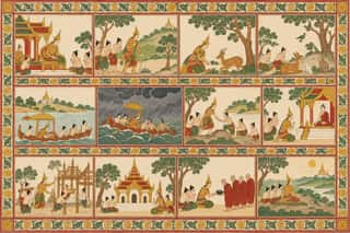
Burmese Parabaik Painting (Konbaung Folding Books)Painted Burmese folding books of the Konbaung court and its monasteries.
Bulaq (Amiriyya) Naskh Book PrintingThe page of the Arabic printed book as Egypt's state press at Bulaq shaped it from 1822: justified blocks of black Naskh type on pale paper, often boxed in a ruled frame, with an ornamental headpiece on the opening page, headings set larger or in a second script such as Nastaʿlīq, and almost no pictures.
- Kalighat Pat & Battala Bazaar PrintsThe bazaar art of nineteenth-century Calcutta: watercolours sold to pilgrims by patua painters at the Kalighat temple, and the cheap woodcuts and metal engravings that Battala presses printed for chapbooks and almanacs.
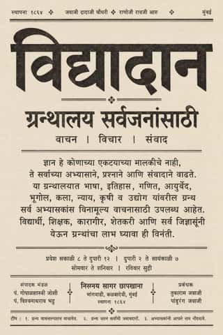
Nirnaya Sagar Devanagari Typography (Bombay Metal Type)Devanagari as Javaji Dadaji's Bombay type foundry (1864) and Nirnaya Sagar Press (1869) cut and printed it: upright metal type with a strong headline, cut with the punch-cutter Ranoji Aru, and enough conjunct and 'Akhand' sorts to set Sanskrit, Vedic accents and Marathi whole.
- German Book Art Movement (Buchkunstbewegung)The German reform of the book, from the magazine Pan (1895) to the private presses that ended around 1933.
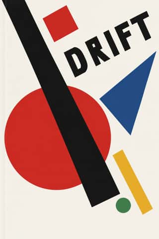
SuprematismKazimir Malevich's non-objective art, unveiled with the Black Square at the 0.10 exhibition in Petrograd in 1915, reduced painting to pure geometric planes floating in white, infinite space.
Leningrad Avant-Garde Picture BookThin, large picture books made in Petrograd/Leningrad from 1922 to the mid-1930s for Raduga and the Gosizdat children's department led by Samuil Marshak, with Vladimir Lebedev as art editor.
Scandinavian FunctionalismNordic functionalism (funkis) arrived in graphic form with Sigurd Lewerentz's posters and winged emblem for the 1930 Stockholm Exhibition.
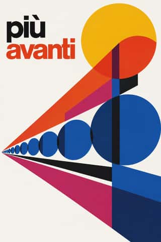
Milanese Industrial Modernism (Olivetti, Pirelli, Studio Boggeri)The Milan-centred school that married Bauhaus- and Swiss-trained discipline with Italian painterly wit for enlightened industrial patrons such as Olivetti, Pirelli and La Rinascente.
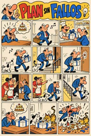
Escuela Bruguera (Spanish Humour Comics)The house style of Editorial Bruguera's humour cartoonists in Barcelona from 1947 to 1986, named the 'Escuela Bruguera' by Terenci Moix in 1968.
- Machine-Age Simplified Arabic TypeArabic redrawn for the machine rather than the reed pen.
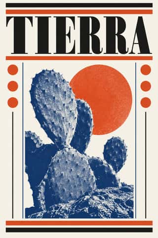
Vicente Rojo & Mexican Editorial ModernismThe design of Mexico City's literary and cultural press, shaped from the 1950s by the Barcelona-born exile Vicente Rojo: México en la Cultura, the Revista de la Universidad, Plural, La Jornada and the covers of Ediciones Era.
Kinngait (Cape Dorset) Inuit PrintmakingPrints from the Inuit co-operative studio at Kinngait (Cape Dorset), Nunavut, with a catalogued collection every year since 1959.
- Bossa Nova Sleeve Modernism (César Villela and Elenco)The cover language of bossa nova, made in Rio by the self-taught designer César Villela, first at Odeon and then on the first sixteen LPs of Aloysio de Oliveira's label Elenco (from 1963), often around Francisco Pereira's photographs.
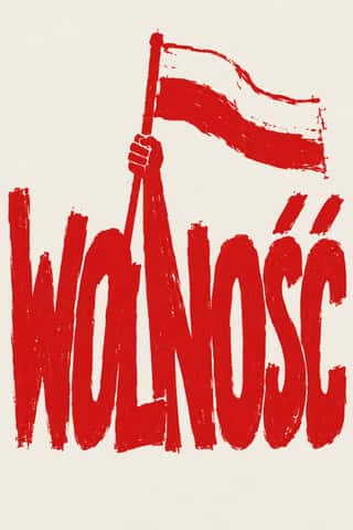
Solidarność & Polish Underground GraphicsThe graphic language of Poland's Solidarność movement, from the August 1980 shipyard strike to the semi-free election of 4 June 1989.
- Madinah Mushaf (King Fahd Complex Qur'an Page)One fixed page for the Qur'an across much of the Muslim world: Uthman Taha's fully vowelled Naskh in fifteen justified lines, written so that every page ends at the end of a verse (the late Ottoman âyet-berkenar layout), inside a floral frame, with sura titles in framed cartouches and verse numbers in small round medallions.
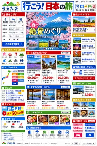
Japanese Dense Web DesignThe information-packed look of Japan's big portals, shops, airlines and ministries: three or more narrow columns of boxed modules, crowded with small Japanese text, blue links, tiny thumbnails, dated news lists and rotating ad banners, in bright colours on a white page.
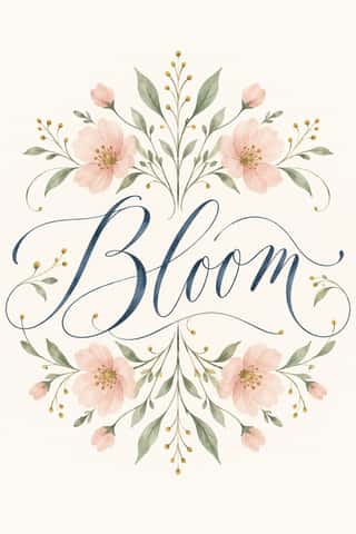
Modern Calligraphy and Brush LetteringThe loose pointed-pen and brush-pen script of wedding stationery and the 2010s craft boom.
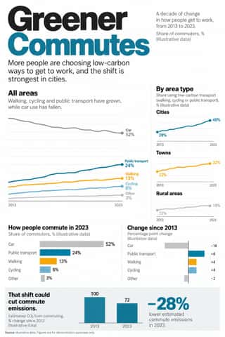
Newsroom Data Graphics & ScrollytellingThe house style of newspaper graphics desks since about 2009–2011 (the New York Times graphics desk, D3.js, the Guardian Datablog): conventional charts drawn from the data, on a white or pale paper ground with light grey gridlines and no axis titles, lines labelled directly in place of a legend where possible and short annotations saying what to look at.
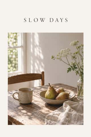
Slow-Living Editorial (the Kinfolk Look)The look of Kinfolk, the slow-living quarterly founded in Portland in 2011 and run from Copenhagen since 2015, and of the indie lifestyle titles and Instagram feeds that copied it.
GOV.UK Design (GDS Style)The text-led design of GOV.UK, the UK government's single website, built by the Government Digital Service from 2012 and codified in the GOV.UK Design System (2018).
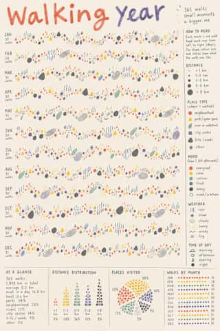
Data HumanismAn information-design approach that draws data rather than charting it, treating numbers as personal, approximate and human.
Styles that often use it 166
A characteristic choice: usual in these styles, though not essential.
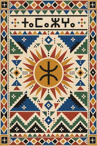
Amazigh Sign System & TifinaghThe visual language shared by Amazigh communities from the Rif, Atlas and Kabylie to the Aurès and the Tuareg Sahara.
- Ancient Egyptian Hieroglyphic & Register CompositionThe visual system of pharaonic Egypt, in which writing is made of pictures and pictures are ruled like writing.
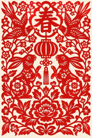
Chinese Paper-Cut (Jianzhi)China's folk art of cut paper, made mostly by rural women and passed from mother to daughter, and by town guilds and workshops.
- Ethiopian Ge'ez Manuscript & Haräg IlluminationThe manuscript art of the Ethiopian and Eritrean Orthodox Tewahedo Church, written in the Ge'ez syllabary on parchment from the Garima Gospels (radiocarbon-dated to roughly the 4th–7th centuries) to the present.
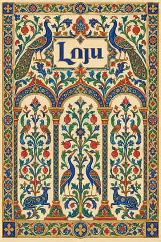
Armenian Manuscript IlluminationThe illuminated books of the Armenian Church, from the Gospel of Queen Mlke (c. 862) and the Etchmiadzin Gospels (989) to the last manuscripts around 1800.
Kamon (Japanese Family Crests)Japan's family crests: small one-colour emblems that reduce a plant, animal, tool or pattern to a flat silhouette, mirrored or repeated around a centre, often ringed and drawn with compass and brush.
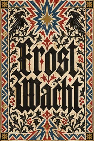
Gothic Blackletter & Fraktur TraditionThe broken scripts of the Latin West.
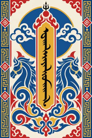
Mongol Bichig Calligraphy & Ugalz OrnamentMongolia's classical script and the auspicious ornament that frames it on state, Buddhist and household objects.
Vyaz (Ornamental Slavonic Lettering)Cyrillic letters bound into one even band of ornament.
- Ottoman Tughra & Dîvânî Chancery CalligraphyThe Ottoman sultan's calligraphic monogram and the chancery hand written beneath it.
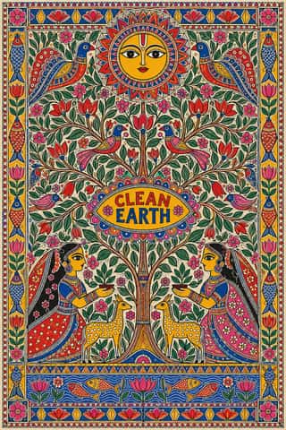
Mithila (Madhubani) PaintingWomen's ritual wall and floor painting from Mithila in north Bihar and Nepal's Terai, attested from at least the 14th century, seen by W.
- Persian Nastaʿlīq Calligraphy (Qiṭʿa, Chalipa and Siyāh-mashq)The 'hanging' script of Persian poetry and an art of the single sheet.
- Tibetan Woodblock Print Culture (Pecha & Prayer Flags)Tibetan Buddhist and Bön woodblock printing, from the first printed Kangyur (1410, cut in China) and the 15th-century presses of Gungthang to the great printing houses of Narthang, Derge and Lhasa.
Ma & Wabi-sabi AestheticsA Japanese aesthetic rooted in Zen and the wabi tea ceremony that prizes austerity, imperfection, impermanence and the charged interval (ma) between things.
- Zoomorphic & Figural Calligraphy (Islamic Calligrams)Pictorial writing in which the strokes of a devotional text form one figure: a lion of ʿAli built from the Nad-e ʿAli prayer, a galleon whose hull spells the names of the Seven Sleepers, a peacock, a Sufi cap.
- Đông Hồ & Hàng Trống Folk PrintsVietnam's two classic folk-print schools, bought for Tết. Đông Hồ families press each colour from its own carved block onto giấy điệp, dó paper brushed with ground scallop shell whose streaked, faintly sparkling surface serves as the white, and print the black line last.
Tarot de Marseille Woodcut CardsThe standard pattern of French tarot cards, descended from Milanese tarot and recut by card-makers in Paris, Lyon, Avignon, Dijon and Marseille from the 17th century.
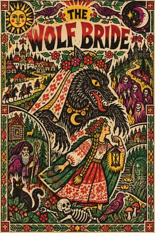
Lubok Popular PrintCheap single-sheet Russian popular prints sold at fairs and by pedlars from the later 17th century: woodcut, later engraved and lithographed pictures of saints, fables, heroes, battles and satire in which text and image share one sheet.
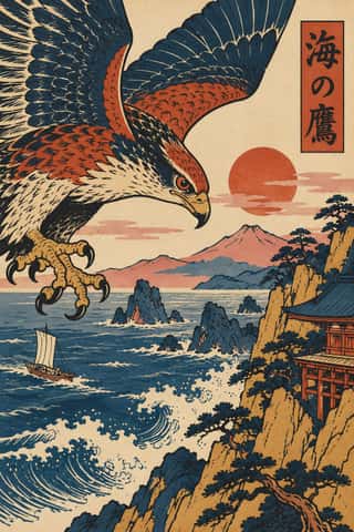
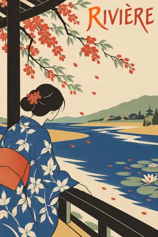
Ukiyo-e Woodblock PrintsMass-produced Edo-period woodblock prints of actors, courtesans, legends and landscapes, designed by an artist, cut and printed by specialist craftsmen and sold cheaply by commercial publishers.
- Northwest Coast Formline DesignThe two-dimensional design system of the northern Northwest Coast nations, painted, carved and woven onto boxes, house fronts, robes and hats, and printed as serigraphs since the 1960s.
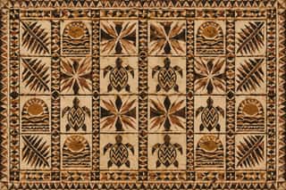
Pacific Barkcloth (Tapa) DesignBarkcloth beaten from paper-mulberry inner bark and decorated across Polynesia and Fiji for gift exchange at weddings, funerals and chiefly investitures.
- Thai Yantra (Yant) DiagramsThai protective diagrams in which Pali formulae, written in Khom, a sacred script derived from Khmer, are packed into squares, circles, triangles, spires and the outlines of Buddhas, monks and tigers, often framed by lines of script.
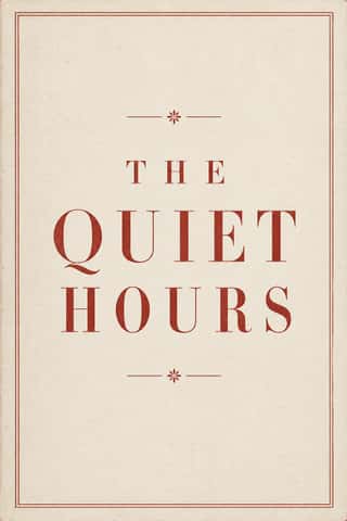
Neoclassical Book TypographyThe Enlightenment book stripped of Renaissance woodcut decoration.
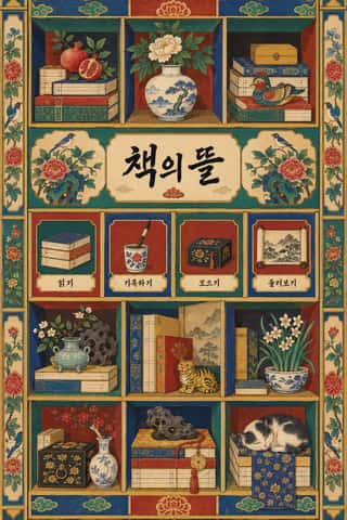
Chaekgeori & Minhwa Screen PaintingKorean painted folding screens of the late Joseon period.
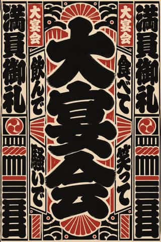
Edo-moji Commercial Lettering (Kanteiryū, Yose-moji, Sumō-ji)The fat, ink-heavy brush hands that Edo's professional sign and bill writers made for the city's entertainments: Kanteiryū for kabuki signboards and playbills from 1779, yose-moji for rakugo halls, sumō-ji for sumo ranking sheets, and squarish kago-moji for votive name slips.
Imagerie d'Épinal & European BilderbogenCheap single-sheet popular prints sold by pedlars across 19th-century Europe, led by the Pellerin imagerie at Épinal and the Neuruppin Bilderbogen.
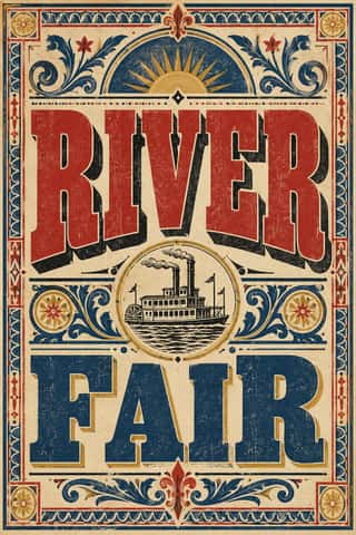
Victorian Letterpress & Wood TypeThe commercial jobbing print of the industrial century: posters, playbills, auction notices and ephemera built from a flood of new display types (fat faces, Egyptians, grotesques, Tuscans and condensed wood type).
- Urdu Katib LithographyFor about a century and a half Urdu chose lithography over movable type, because metal type could not reproduce the sloping, stacked ligatures of Nastaʿlīq.
- Persian Popular Narrative (Lithographs & Coffeehouse Painting)Iran's popular picture-stories in two media.
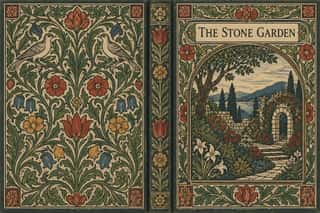
Arts & Crafts MovementA British-led reform movement that answered industrial shoddiness with honest handcraft, medieval models and the ideal of joy in labour.
JaponismeThe Western absorption of Japanese woodblock prints, textiles and crafts after Japan reopened to trade in the 1850s.
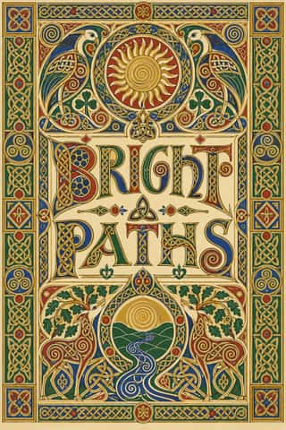
Celtic Revival Illumination & LetteringOrnament and lettering of the Celtic Revival in Ireland, Scotland and the Isle of Man, modelled on Insular gospel books such as Kells and on carved stone crosses.
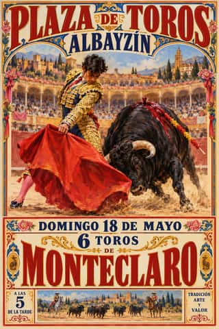
Spanish Bullfight Poster (Cartel Taurino)The Spanish bullfight poster in its illustrated form, from Marcelino de Unceta's lithographs (from 1879) to the Valencian house of Ortega, which supplied rings across Spain.
- Norwegian and Finnish National Romantic Graphics (Munthe & Karelianism)The flat, decorative branch of Norway's and Finland's national romanticism, which turned Viking carving, the sagas, the Kalevala and old peasant weaving into modern ornament.
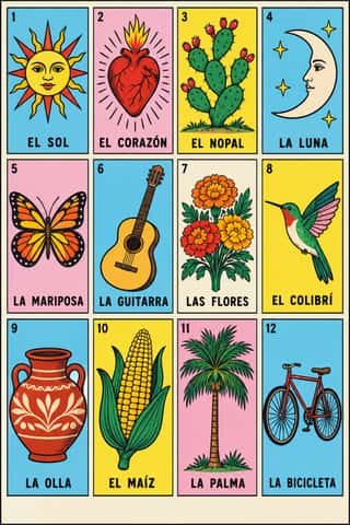
Lotería Card Imagery (Mexican Lotería)The picture deck of Mexico's lotería, a bingo-like game of chance.
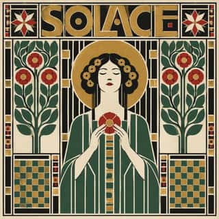
- Glasgow StyleGlasgow's distinctive answer to Art Nouveau, formed around Charles Rennie Mackintosh, Margaret and Frances Macdonald and Herbert MacNair at the Glasgow School of Art.
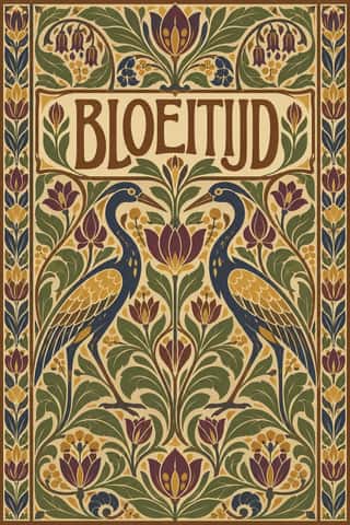
Nieuwe Kunst (Dutch Art Nouveau)The Dutch branch of Art Nouveau, seen mostly in book covers, vignettes and posters.
Simplicissimus Satirical Style (Munich)The house style of the Munich satirical weekly Simplicissimus, set by Th.
Vienna SecessionThe Viennese break with academic art led by Gustav Klimt, Koloman Moser, Josef Hoffmann and Alfred Roller, which pulled Art Nouveau toward the square, the grid and the flat plane.
Mir iskusstva Book ArtThe graphic idiom of the St Petersburg World of Art circle (journal 1898–1904, exhibitions until Paris 1927) and the book artists around it.
Uli & Nsibidi Line and Sign TraditionTwo linked graphic languages of southeastern Nigeria.
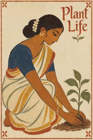
Santiniketan & Bengal School GraphicsThe nationalist, anti-academic art of Calcutta and Santiniketan, which turned from oil-paint naturalism and chromolithograph gloss to Indian and pan-Asian sources.
- London Transport DesignThe design programme Frank Pick built for London's Underground from 1908 and the London Passenger Transport Board (1933–40), continued by Harold Hutchison (1947–66).
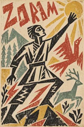
Russian Futurist BookThe cheap, small-run books of the Russian Cubo-Futurist poets and painters, from Kruchenykh and Khlebnikov to Goncharova, Larionov and Rozanova.
- Taishō Roman & Lyrical IllustrationThe lyrical illustration (jojōga) of late-Meiji to early-Shōwa Japan, led by Takehisa Yumeji: willowy, large-eyed women in kimono drawn with an Art Nouveau contour, set among camellias and kimono patterns and lettered by hand.
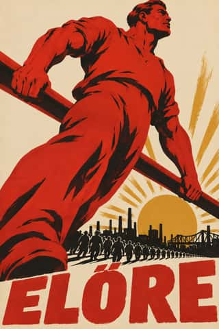
Hungarian Revolutionary PosterThe political posters of Hungary's revolutions.
- Vorticism & BLAST TypographyLondon's short-lived rival to Futurism, launched by Wyndham Lewis with BLAST (dated 20 June 1914; War Number, July 1915).
- DadaBorn in wartime Zurich at the Cabaret Voltaire in 1916 and spreading to Berlin, Hanover, Cologne and Paris, Dada used chance, absurdity and provocation against the culture that had produced the war.
De StijlA Dutch movement formed around Theo van Doesburg's journal De Stijl and Piet Mondrian's Neoplasticism, which sought universal harmony through the most elementary means: horizontal and vertical lines, rectangles, the three primaries and black, white and grey.
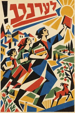
Kultur-Lige & Yiddish Avant-Garde Book DesignThe Yiddish modernist book of the Kultur-Lige, the secular Jewish culture league founded in Kyiv in 1918, and its circle: El Lissitzky, Issachar Ber Ryback, Iosif Chaikov, Boris Aronson and others, who sought a new Jewish art in the shtetl synagogues and tombstones they had recorded and in Cubo-Futurism and Suprematism.
- Russian ConstructivismConstructivism rejected art for art's sake in favour of the artist-engineer building useful things for the new Soviet society.
Wendingen & Amsterdam School TypographyThe graphic language of Wendingen (1918–1932), monthly of the Amsterdam architects' society Architectura et Amicitia, and its editor H.
Basel Object Poster (Swiss Sachplakat)The Swiss descendant of the German object poster, made in Zurich and above all Basel from 1919 to the early 1950s.
- BauhausThe German school founded by Walter Gropius in 1919 moved from Expressionist craft ideals to a programme of 'art and technology' after 1923, when Moholy-Nagy, Herbert Bayer and Joost Schmidt made its printing and advertising workshops a laboratory for functional communication.
ROSTA WindowsHand-stencilled satirical news posters made by the Russian Telegraph Agency during the Civil War and hung in empty shop windows, first in Moscow, then in Petrograd and provincial towns.
- Estridentismo (Stridentist) GraphicsMexico's first avant-garde (1921-27), launched when Manuel Maples Arce pasted his manifesto Actual No. 1 on Mexico City walls.
- Brazilian Modernismo Graphics (Klaxon and the Semana de 22)The print side of São Paulo's Modernismo (1922-29), set in jobbing print shops.
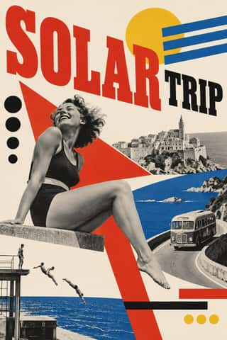
Czech Poetist Book Design (Devětsil)The book and magazine design of the Czech Devětsil circle, where Karel Teige and his colleagues turned constructivist tools (asymmetry, sans and slab capitals, heavy bars, photomontage) toward Poetism's lyrical celebration of travel, cinema, jazz and the circus.
Die Neue TypographieThe programme that turned avant-garde experiment into a functional typographic method, named by Moholy-Nagy in 1923 and codified in Jan Tschichold's 'elementare typographie' (1925) and Die neue Typographie (1928).
- MavoTokyo's anarchist avant-garde, founded in July 1923 by Murayama Tomoyoshi, back from a year in Berlin, with four former Futurists, and its magazine MAVO (seven issues, July 1924 to August 1925).
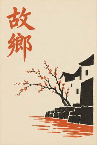
Republican Chinese Book Cover Design (Lu Xun & Tao Yuanqing)The covers of China's New Literature.
- Amazonian Boat Lettering (Abridores de Letras)The painted boat names of Pará's rivers in the Brazilian Amazon, made for about a century by self-taught riverside painters (abridores de letras).
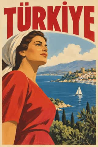
Early Turkish Republican Graphic DesignThe pictorial poster, label and ticket art of the young Turkish Republic, led by İhap Hulusi Görey after his Munich training in Ludwig Hohlwein's orbit, with Münif Fehim Özarman and, after 1943, Kenan Temizan.
Isotype Pictorial StatisticsA method of visual education developed by Otto Neurath, Marie Neurath (Reidemeister) and Gerd Arntz in Red Vienna from 1925, which turns statistics into rows of identical pictograms where a greater quantity is shown by more signs, never by bigger ones.
Lianhuanhua Picture-Story BooksPalm-sized Chinese picture books, about three by five inches, that tell a novel, opera, film or revolutionary story in hundreds of single framed drawings, one to a page, each with a short caption.
Filipino KomiksThe Philippines' newsstand comics magazines, from Kenkoy in Liwayway (1929) and Ace's Pilipino Komiks (1947) to the fall of the Roces titles in the late 1990s.
Giallo Mondadori Covers (I Libri Gialli)The cover system of Mondadori's crime series, Milan, from I Libri Gialli of 1929 to Il Giallo Mondadori today.
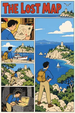
Ligne Claire (Franco-Belgian Clear Line)The comic drawing style of Hergé's Tintin and the Brussels school, named 'klare lijn' by Joost Swarte in 1977.
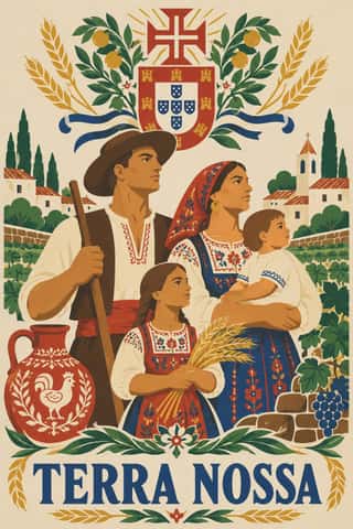
Estado Novo Folk Modernism (SPN)The official image of Salazar's Estado Novo, shaped by António Ferro's Secretariado de Propaganda Nacional (SPN, 1933; SNI from 1944).
- Nippon Kōbō & Tōhōsha Photo-Propaganda Magazines (NIPPON & FRONT)Luxury photo-propaganda magazines that imperial Japan sent abroad, 1934–45.
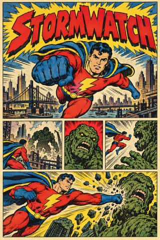
American Four-Colour Comic Book (Golden to Bronze Age)The American newsstand comic book from Famous Funnies (1934) and Action Comics #1 (1938) through the Golden, Silver and Bronze Ages, and past the Bronze Age's end in 1985 until computer colour replaced hand separations in the early 1990s.
Penguin Paperback Design (Three Bands to the Marber Grid)The cover system of Penguin Books, London, from 1935 until Germano Facetti left in 1972.
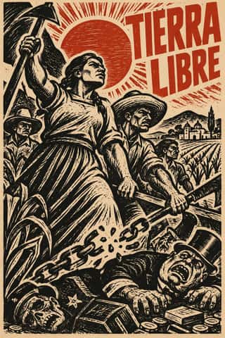
Taller de Gráfica PopularA Mexico City printmaking collective founded in 1937 around Leopoldo Méndez, Pablo O'Higgins and Luis Arenal to put art at the service of popular and anti-fascist struggles.
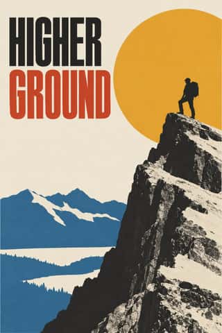
American Mid-Century ModernismThe American synthesis of European avant-garde form with wit, pragmatism and commercial clients, led by Paul Rand, Alvin Lustig, Lester Beall, Bradbury Thompson and Saul Bass.
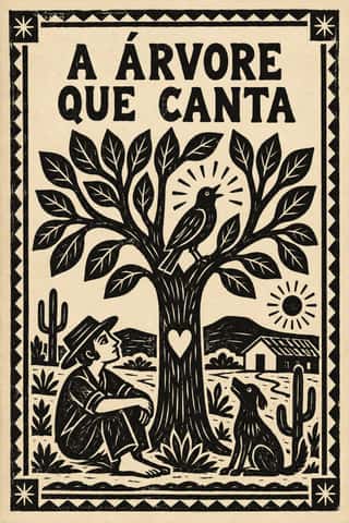
Literatura de Cordel WoodcutThe cover art of Brazil's literatura de cordel, pocket chapbooks of verse whose single picture is a small woodcut cut in soft umburana wood and printed in black above a plain letterpress title.
- Ndebele Geometric PaintingThe mural tradition of Southern Ndebele women, who paint homestead walls and gateways, and later canvases and objects, with bold, symmetrical geometric designs.
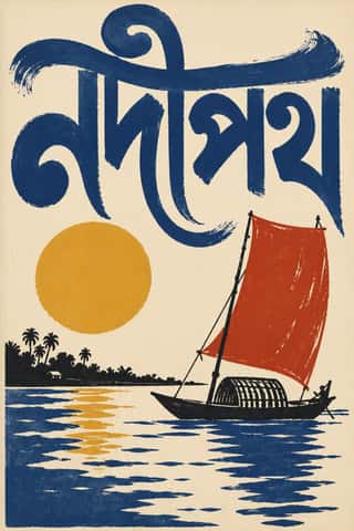
Bengali Modernist Book Cover (Prachchhad)A literary book-jacket culture that began at Calcutta's Signet Press in 1943, where Satyajit Ray and later Purnendu Pattrea made the hand-drawn Bengali title the main image of the cover.
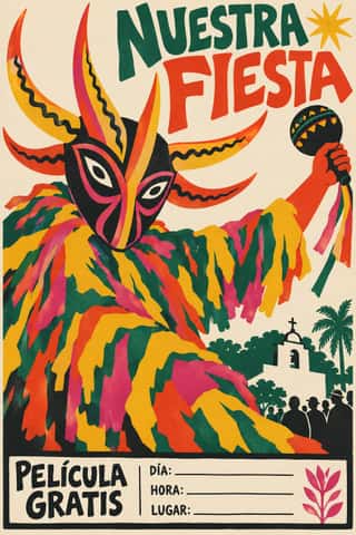
Puerto Rican Silkscreen Poster (DIVEDCO & ICP)The hand-pulled silkscreen poster of Puerto Rico, begun by Irene Delano's workshop in 1946–47 and grown in the government's Division of Community Education (DIVEDCO, 1949) and the Instituto de Cultura Puertorriqueña's print workshop under Lorenzo Homar (1957–73).
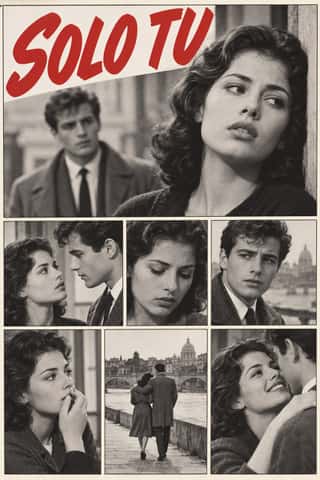
Fotoromanzo (Italian Photo-Romance)The photo-romance of the Italian women's weeklies: a melodrama told in staged photographs, first printed by Il mio sogno and Bolero Film in May 1947 and copied from France to Brazil.
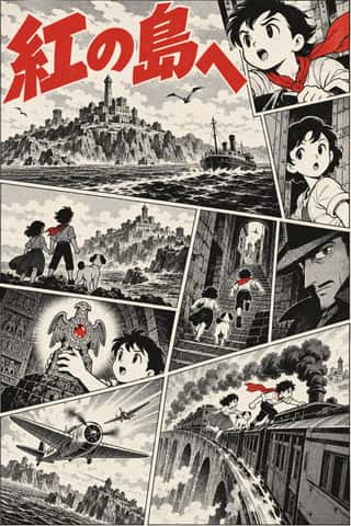
Story Manga (Postwar Japanese Comics)The black-and-white narrative comic of postwar Japan, from Tezuka Osamu's Shin Takarajima (1947) to the weekly boys' magazines of 1959 and 1968 and the paperbacks that collect them.
Argentine Adventure Historieta (Oesterheld–Breccia)The adult adventure comics of Buenos Aires newsstand magazines, from Misterix (1948) and Oesterheld's Hora Cero (1957) to Skorpio and Fierro; the humour line of Patoruzú, Rico Tipo and Mafalda is another tradition.
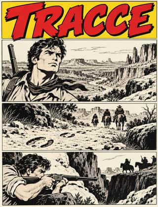
Bonelli Fumetto (Italian Popular Adventure Comics)The house format of Milan's Bonelli publishing house and its imitators (Tex, Zagor, Dylan Dog, Nathan Never): monthly newsstand paperbacks of 16 x 21 cm with about a hundred black-and-white pages, each a long episode of a serial hero.
French Post-War Visual-Gag Poster (Savignac, Villemot, Morvan)The humorous street poster of post-war Paris, which took off in 1949 when Raymond Savignac and Bernard Villemot showed their rejected projects together and Savignac's Monsavon cow, its udder filling a bar of soap, went up on the walls.
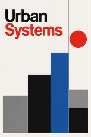
International Typographic StyleA post-war refinement of the New Typography in which the mathematical grid, objective photography and neo-grotesque sans-serifs were used to communicate with clarity and neutrality.
Japanese Postwar ModernismBuilding on the New Typography that Hiromu Hara and the Nippon Kobo circle had absorbed in the 1930s, Japan's postwar graphic designers fused the grid, sans-serif and objective photography of European modernism with indigenous traditions of family crests (kamon), asymmetry and charged emptiness (ma).
Brazilian Concrete DesignA São Paulo and Rio movement in which concrete art, concrete poetry and Brazil's first design offices shared one vocabulary: Max Bill's mathematically generated geometry, serial repetition and sans-serif type.
Finnish Bold Print (Marimekko Modernism)The printed-cotton modernism of Marimekko, founded in Helsinki in 1951 by Armi and Viljo Ratia out of Viljo's printing firm Printex.
HfG Ulm Systematic DesignThe Hochschule für Gestaltung Ulm (1953–1968) was founded as the successor to the Bauhaus.
West German Conceptual Film & Culture Poster (Hillmann and Rambow)The art-film and culture poster Hans Hillmann developed from 1953 for the West German distributors Neue Filmkunst and Atlas Film, which his Kassel student Gunter Rambow took with Gerhard Lienemeyer into staged photo posters for theatre, publishers and protest.
Zagreb School of Animated FilmThe modernist animation of Zagreb Film's Studio for Animated Film, grown from reduced-animation advertisements of 1954-1955 and named the 'Zagreb school' by Georges Sadoul and André Martin after Cannes 1958.
Corporate Identity ModernismModernist reduction applied to corporate communication.
Arab Children's Comic Magazines (Samir to Majid)Arabic children's comics weeklies, from Dar al-Hilal's Samir in Cairo (1956) to Abu Dhabi's Majid (1979), mixing translated Western strips with house characters by Egyptian, Lebanese, Armenian and European artists.
Blue Note Jazz Sleeve ModernismThe record-sleeve language of Blue Note Records, set by art director Reid Miles, who designed some 350 twelve-inch LP covers between about 1956 and 1967, often around Francis Wolff's session photographs.
Chinese National-Style Animation (Shanghai Animation Film Studio)The 'national style' of the Shanghai Animation Film Studio, which turned from Disney and Soviet models to Chinese media: Peking-opera masks and movement, paper-cut and folded-paper figures, mural and New Year print colour and, from 1960, ink-wash painting set in motion after Qi Baishi and Li Keran.
Situationist Détournement GraphicsGraphics of the Letterist and Situationist Internationals (1956–1972), built on détournement: taking existing words and pictures (comic strips, advertisements, news photographs, city maps, classic texts) and turning them against their source.
Thaw Modernism (Soviet and Czechoslovak)The light, stylised modernism that replaced Socialist Realist illusionism and Stalinist pomp in Soviet and Czechoslovak graphic and applied design, from the 1956 Secret Speech, the 1957 Moscow youth festival and Expo 58 to the crushing of the Prague Spring in 1968 (a political cut-off; the manner ran on into the 1970s).
- Dazibao (Big-Character Posters)Handwritten wall posters in large brush characters that turned the walls of Mao-era China into a public forum for criticism, denunciation and, at the Democracy Wall, dissent.
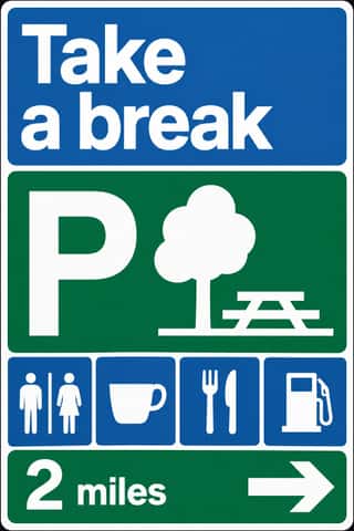
British Road Signage (Kinneir & Calvert)The national sign system Jock Kinneir and Margaret Calvert designed for Britain's motorways, first used on the Preston By-pass in 1958, and through the Worboys Committee for all roads from 1 January 1965.
Shōjo Manga (Japanese Girls' Comics)The look of Japan's girls' comics (strictly a readership, not a style), which Takahashi Macoto fixed in 1958 from the lyrical illustration (jojōga) of Nakahara Jun'ichi and the Year 24 Group remade in the 1970s.
Turkish Modernist Poster & Graphic DesignThe posters of Istanbul's first generation of professional graphic designers for theatres, films, festivals and exhibitions.
Di Tella Graphic Design (Instituto Torcuato Di Tella)The in-house graphics of Buenos Aires' Instituto Torcuato Di Tella, 1960–1970, led by Juan Carlos Distéfano with Juan Andralis, Rubén Fontana, Norberto Coppola and Carlos Soler.
Iranian Modernist Graphic DesignIranian graphic design came of age in the 1960s and 1970s.
Indian Institutional Modernism (NID)The design culture of independent India's public institutions, banks and broadcasters.
Fluxus Graphics (Maciunas)The house graphics George Maciunas made from 1962 until his death in 1978 for Fluxus, a network of artists who staged events and sold cheap multiples.
Phototype Expressive Typography (Lubalin & U&lc)The display typography of the phototype era, led in New York by Herb Lubalin, his lettering partners John Pistilli, Tom Carnase and Tony DiSpigna, and the International Typeface Corporation.
Rorke's Drift LinocutThe prints of the Lutheran art centre that Swedish teachers Peder and Ulla Gowenius started at Ceza Hospital in 1962 and moved to Rorke's Drift in 1963: under apartheid, which denied Black South Africans formal fine-art education, the chief training ground for many Black artists.
Baybayin Revival GraphicsThe revival of baybayin, the precolonial Tagalog abugida, as a mark of Filipino identity.
Total Design & Dutch FunctionalismThe Dutch strand of systematic modernism took shape when Wim Crouwel, Benno Wissing, Friso Kramer and Paul and Dick Schwarz founded Total Design in Amsterdam in 1963 as the country's first multidisciplinary studio.
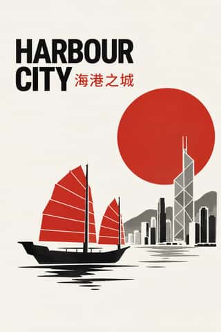
Hong Kong East–West Graphic ModernismThe studio design of Hong Kong from the 1960s, made for banks, developers, trade bodies, hotels and cultural events in a city that had to speak Chinese and English at once.
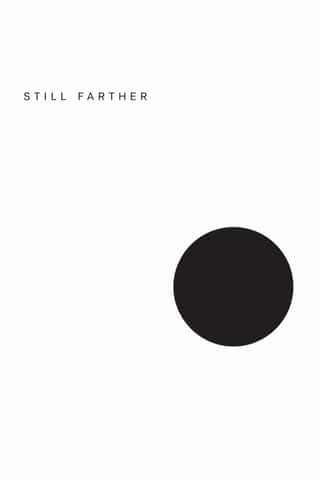
Minimalist Graphic DesignModernism reduced to its barest means, informed by 1960s Minimal art and Japanese emptiness: one image or line of type, vast white or neutral space, a monochrome or near-monochrome palette and meticulous typographic detail.
- Mexico 68 Olympic & Metro IdentityThe graphic programme of the 1968 Mexico City Olympics and the city's first Metro line.
Munich 1972 Olympic Design (Otl Aicher)The visual programme Otl Aicher's department made for the 1972 Munich Olympics, the 'cheerful Games' meant to show a democratic, modest West Germany.
Soviet Central Asian Ornamental ModernismThe monumental art of Soviet Central Asia after the 1966 Tashkent earthquake: a strand of Socialist Realism mixed with Islamic and national ornament.
Amar Chitra Katha ComicsThe Bombay comic-book series that from 1967 retold Hindu myth and epic, Buddhist and Jain tales, saints, folk legends, the jests of the court wits Birbal and Tenali Raman, and Indian history for children, in English and Indian languages, with well over 500 titles by the early 1990s.
- Black Panther Party GraphicsThe visual language of the Black Panther Party, created largely by its Minister of Culture, Emory Douglas, for the weekly newspaper The Black Panther.
- Atelier Populaire (May '68 Screenprint Poster)The posters of the Atelier populaire, set up when students, teachers and artists occupied the École des Beaux-Arts in Paris on 14 May 1968, until police cleared the school on 27 June.
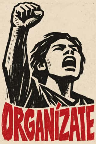
Gráfica del 68 (Mexican Student Movement Graphics)The graphics of the 1968 Mexican student movement, made in days by brigades in the print workshops of San Carlos and La Esmeralda and in improvised school workshops.
- Swiss Punk / New Wave TypographyA rebellion from inside the Swiss school: Wolfgang Weingart and his Basel students kept the grotesque and the grid but set them in motion with extreme letterspacing, stepped and angled lines, rules and bars, enlarged halftone screens and layered film montage.
Underground ComixSelf-published, adults-only comic books from the San Francisco counterculture, made outside the Comics Code on the newsstand comic's format.
ECM Sleeve Aesthetic (Munich)The cover language of the Munich label ECM, made since 1970 by Barbara Wojirsch, Dieter Rehm and later Sascha Kleis and Mayo Bucher with co-founder Manfred Eicher.
- Grapus (French Militant Graphic Collective)The posters and identities of Grapus, a Paris collective founded in 1970 by Communist Party members who had met in the 1968 poster workshops.
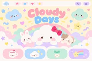
Kawaii DesignJapan's culture of cuteness, which grew from 1970s teenage rounded handwriting and shōjo fancy goods into a global design language through Sanrio, character merchandise and emoji.
Turkish Weekly Humour Magazines (Gırgır to Uykusuz)Istanbul's weekly cartoon magazines, from the Aral brothers' Gırgır (1972), which sold up to about half a million copies, through the chain of breakaways that followed it: Limon, LeMan, Penguen and Uykusuz.
Roman-like Thai Typography (modern loopless Thai)A Thai type genre that drops the head loops of most Thai letters, so the script reads as an even sans like Helvetica.
Lebanese Civil War Party PosterThe posters that some twenty parties and militias pasted on the walls of Beirut and other towns between 1975 and 1990, marking each quarter as one faction's territory.
South African Resistance PosterThe posters of the struggle against apartheid, from the exiled Medu Art Ensemble in Gaborone to the community workshops that served the United Democratic Front and the unions in the 1980s.
Cranbrook & Deconstructivist TypographyGraduate-school experimentation, centred on Katherine and Michael McCoy's Cranbrook design programme, that applied post-structuralist literary theory to the page.
Pixação (São Paulo Tag Reto)The name-writing of São Paulo's pixadores, which since the 1980s has covered walls and façades and, from the 1990s, the upper floors of tower blocks.
- Pardhan Gond Painting (Jangarh Kalam)Painting on paper and canvas by Pardhan Gond artists of Patangarh and Bhopal, begun when Bharat Bhavan, Bhopal, recruited Jangarh Singh Shyam in 1981; the style was later named Jangarh Kalam after him.
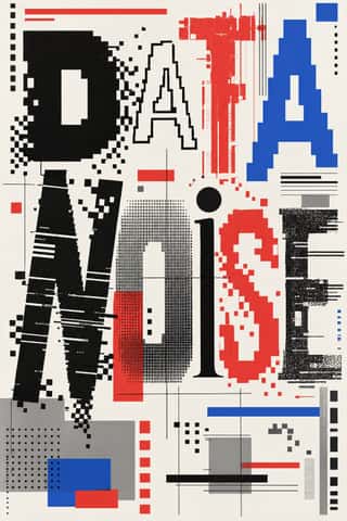
Emigre & Early Digital TypeRudy VanderLans and Zuzana Licko's magazine and type foundry, launched in 1984 alongside the first Macintosh, turned the computer's low-resolution constraints into a new typographic idiom.
Out-of-Square Hangul TypographyA Korean typographic movement that frees Hangul from the equal square in which metal and photo type had always set each syllable.
Techno-Futurist GraphicsElectronic-music and video-game graphics of the late 1980s and 1990s that turned corporate modernism into a sci-fi consumer fantasy.
ACT UP & Gran Fury AIDS Activist GraphicsThe graphics of New York's AIDS activist movement: the SILENCE=DEATH poster of 1987, a pink triangle above white capitals on black, and the posters, stickers, T-shirts, billboards and bus ads of Gran Fury (1988–1995), ACT UP's 'unofficial propaganda ministry'.
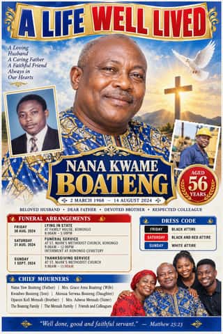
Ghanaian Funeral Poster & BannerThe printed death announcements of southern Ghana, also found elsewhere in West Africa: colour posters, mostly A2, pasted on walls, trees, poles and vehicles, and by the mid-2010s large PVC banners hung at the family house.
L'Association and French Alternative ComicsThe black-and-white auteur comics of L'Association, the Paris publisher founded by seven cartoonists in 1990, and the 1990s small-press scene it led.
- Bitterkomix (Afrikaans Underground Comics)The Afrikaans underground comics magazine founded in Stellenbosch in 1992 by Anton Kannemeyer (Joe Dog) and Conrad Botes (Konradski), with Mark Kannemeyer (Lorcan White).
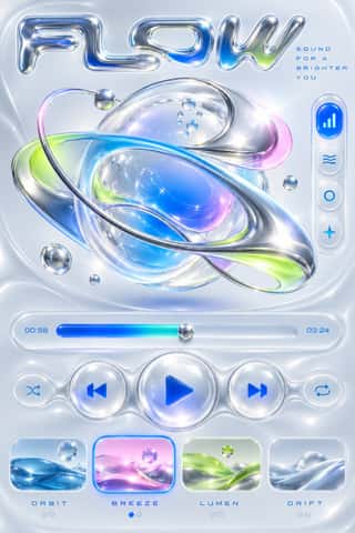
Y2K FuturismThe optimistic, chrome-plated vision of the future that surrounded the turn of the millennium, spread by consumer electronics, music videos, games, fashion and dot-com branding.
Korean Commercial Calligraphy (Kaelligeurapi)Brush-written Hangul made for commerce, not the scroll.
Yuru-chara (Japanese Local Mascot Design)Japan's local mascots: characters commissioned by prefectures, towns and tourism bodies to stand for a place, named yuru-kyara ('loose characters') by the illustrator Jun Miura around 2000.
Korean Webtoon GraphicsThe full-colour, vertical-scroll comic that Korean web portals made standard in the 2000s and smartphone apps took worldwide.
- Contemporary Chinese Book Design ('Most Beautiful Books of China')Chinese book design since 2003, when Shanghai founded the yearly 'Most Beautiful Books of China' award, whose winners go on to Leipzig.
- Internet Ugly & Meme VernacularA deliberately amateur image dialect of forums, imageboards and social feeds, named 'Internet Ugly' by Nick Douglas in 2014.
Contemporary Arabic & Dual-Script Type DesignA twenty-first-century type culture that redraws Arabic as a family matched to a Latin companion in weight, proportion and contrast, so the two scripts can share a page, screen or sign as equals.
- Frutiger AeroThe glossy, optimistic look of consumer technology from the mid-2000s to the early 2010s, retrospectively named in 2017 by the Consumer Aesthetics Research Institute after Windows Vista's Aero interface and Adrian Frutiger's humanist sans.
Neo-Swiss RevivalA contemporary revival of the International Typographic Style, fuelled by digital re-releases of neo-grotesques and by studios such as Experimental Jetset and Norm: modular grids, flush-left grotesque type, huge tightly set headlines and flat fields of black, white and one signal colour.
- Seoul Independent Graphic Design (Small-Studio Scene)Graphic design by Seoul's small, self-run studios, which from about 2005 chose to stay small.
- Oaxacan Protest Printmaking & Street Graphics (ASARO)The street graphics of Oaxaca City since the 2006 teachers' strike and APPO uprising, when ASARO, the stencil collective Lapiztola and later workshops such as Colectivo Subterráneos made the colonial centre's walls a newspaper.
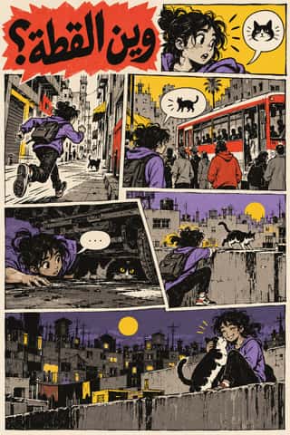
Arab Independent Comics (Samandal, TokTok, Lab619, Skefkef)Adult comics magazines edited by Arab artists' collectives since 2007, at times with a ministry grant or an NGO partner: Samandal in Beirut, TokTok in Cairo, Lab619 in Tunis and Skefkef in Casablanca.
Hipster Artisanal RevivalThe trade-mark look of the 2007–2018 craft boom, which dressed new coffee roasters, breweries and stationers as nineteenth- and early-twentieth-century firms.
Lucerne Poster Scene (Neubad & Südpol Posters)Lucerne's poster culture for small non-commercial venues (Südpol, Neubad, Treibhaus) and the Weltformat festival.
Natural Wine Label ArtThe labels of the natural (low-intervention) wine scene, which grew from Beaujolais into a worldwide network of small growers, bars and importers.
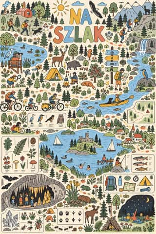
Polish Information Picture Book (Dwie Siostry)Mostly large-format information picture books made since 2008 by the Warsaw publisher Dwie Siostry with young illustrators led by Aleksandra and Daniel Mizieliński, graduates of the city's Academy of Fine Arts: atlases, cross-sections, labyrinths, activity books and wordless seek-and-find board books.
Risograph & Indie Print CultureA contemporary culture of zines, art books, posters and prints made on Japanese Risograph stencil duplicators, whose soy-based spot inks (fluorescent pink, yellow, blue, teal) are laid down one drum at a time.
Flat DesignAn interface and illustration language that stripped screens of simulated materials, replacing bevels, gloss and textures with solid fields of colour, clean sans-serif type and reduced pictograms.
Syrian Revolution Graphics (Kafranbel Banners & Poster Collectives)Protest graphics of the Syrian uprising from 2011, made to be photographed and shared online rather than to last on a wall.
DTC 'Blanding' / Millennial MinimalismThe friendly, frictionless minimalism of 2010s direct-to-consumer start-ups, built for the phone screen, the Instagram feed and the unboxing.
Brutalist Web DesignA reaction against templated, conversion-optimised web design that exposes the raw materials of the browser: default system fonts, blue underlined links, visible borders, unstyled forms and plain document flow.
Material DesignGoogle's design system, launched in 2014, which reintroduced controlled depth to flat design through the metaphor of 'material': sheets of digital paper and ink that sit at defined elevations, cast consistent shadows and move with meaningful motion.
Corporate MemphisThe flat vector illustration style that became the default visual voice of big tech in the late 2010s: faceless, ethnically non-specific figures with elongated limbs and tiny heads, drawn in bright flat colour among blobs, leaves and confetti.
Newtro (Korean New-Retro)A South Korean branding trend, named 'Going New-tro' in Seoul National University's Trend Korea 2019 (October 2018), in which heritage firms reissue their own postwar to 1990s labels, trademarks and mascots, polished for young buyers.
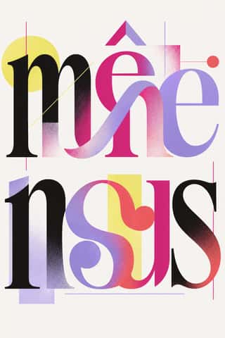
Post-Binary Typography (Bye Bye Binary and Inclusive French Type)A Franco-Belgian type practice that redesigns written French for gender inclusion inside the word.
NeumorphismA short-lived interface trend in which controls are extruded from, or pressed into, a background of the same colour and modelled only by paired soft shadows.
Claymorphism & Soft 3DA soft, toy-like 3D look from product design around 2020, given the name 'claymorphism' in a December 2021 article by Michał Malewicz.
Instagram Slideshow Activism (Social-Justice Infographics)The text-led explainer slideshows that filled Instagram after George Floyd's murder in May 2020.
- Neo-BrutalismA friendly, commercial descendant of web brutalism that keeps its blunt boxes but adds candy colour: thick black outlines, hard unblurred offset shadows, flat saturated fills and chunky sans-serif type on conventional, usable layouts.
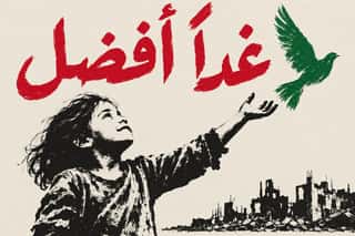
- Palestinian Watermelon and Keffiyeh GraphicsGraphics of Palestinian identity and of solidarity with Palestinians, made by Palestinian artists, the diaspora and supporters worldwide and shared mainly online, above all since the Gaza war began in October 2023.
Styles that use it now and then 35
An occasional choice in these styles.
- Nianhua & Chinese Folk Printc. 1100–present
- Square Kufic (Bannāʾī)c. 1100–present
- Persian Miniature (Ilkhanid, Timurid and Safavid Book Painting)c. 1300–1700
- Javanese Wayang Kulit (Tatah Sungging)1500–present
- Kōwhaiwhai & Toi Māori Design1500–present
- Rinpa & Saga-bon1600–present
- Cuban Tobacco Lithography (Habilitaciones & Marquillas)1845–present
- Fante Asafo Flags (Frankaa)1850–present
- Kanga (Swahili Message Cloth)1886–present
- Arnhem Land Bark Painting & Rarrk1912–present
- AIZ Political Photomontage (Heartfield)1930–1938
- Chinese Modern Woodcut Movement1931–1949
- Hebrew Poster Lettering & Early Israeli State Design1934–1974
- Tiki Pop (Polynesian Pop)1934–present
- WPA Silkscreen Posters1935–1943
- West African Barbershop & Hair Salon Signs1950–present
- Drum Magazine & Sophiatown Photojournalism1951–1965
- Zagreb Modernist Graphics (EXAT 51 to Teatar &TD)1951–1975
- Cairo–Beirut Arab Modernist Book & Periodical Design1952–1990
- Pop Achorado (Peruvian Agrarian Reform Posters)1969–1975
- Ethiopian Revolutionary Poster (Derg Era)1974–1991
- Nigerian Pentecostal Crusade Poster & Billboard1990–present
- Torres Strait Islander Linocut1991–present
- Superflat1993–present
- Indian Pop-Kitsch Design (Desi Kitsch)1997–present
- Tamil Nadu Flex Banners2000–present
- Hauntology & Ghost Box Design2004–present
- Generative & Dynamic Identities2007–present
- Egyptian Revolutionary Street Art (Mohamed Mahmoud Murals)2011–2014
- Low Poly Illustration2012–present
- Solarpunk2014–present
- Latin American Feminist Protest Graphics (Ni Una Menos and the Green Wave)2015–present
- Chilean Estallido Social Graphics (Revuelta Popular of 2019–20)2019–2022
- Ukrainian Wartime Graphics (Saint Javelin, War Stamps and Be Brave Like Ukraine)2022–present
- Woman, Life, Freedom Protest Graphics (Iran and the Diaspora)2022–present
It often goes with
Choices that the styles making it make more often than the atlas as a whole.
- Generous white spacein 98 of 231
- Line illustrationin 134 of 231
- Monochromein 129 of 231
- Paper & letterpress bitein 96 of 231
- Limited spot coloursin 158 of 231
- Typography onlyin 97 of 231
Styles that avoid it
Styles that deliberately leave it out.
- Picó Sound-System Painting (Colombian Caribbean)1967–present
- Demoscene Graphics (Cracktros, Demos & Text-Mode Art)1985–present
- Black Metal Graphics1990–present
- Fantasy User Interface (FUI) & Sci-Fi HUD1999–present
- Synthwave / Outrun2006–present
- Book Blob (Abstract Colour-Blob Literary Fiction Cover)2019–2023
- Dark Tech Minimalism2019–present