Avant-garde · 1923–1940 · Central Europe, Western Europe
Die Neue Typographie
Also known as The New Typography, Elementare Typographie, Ring neue Werbegestalter
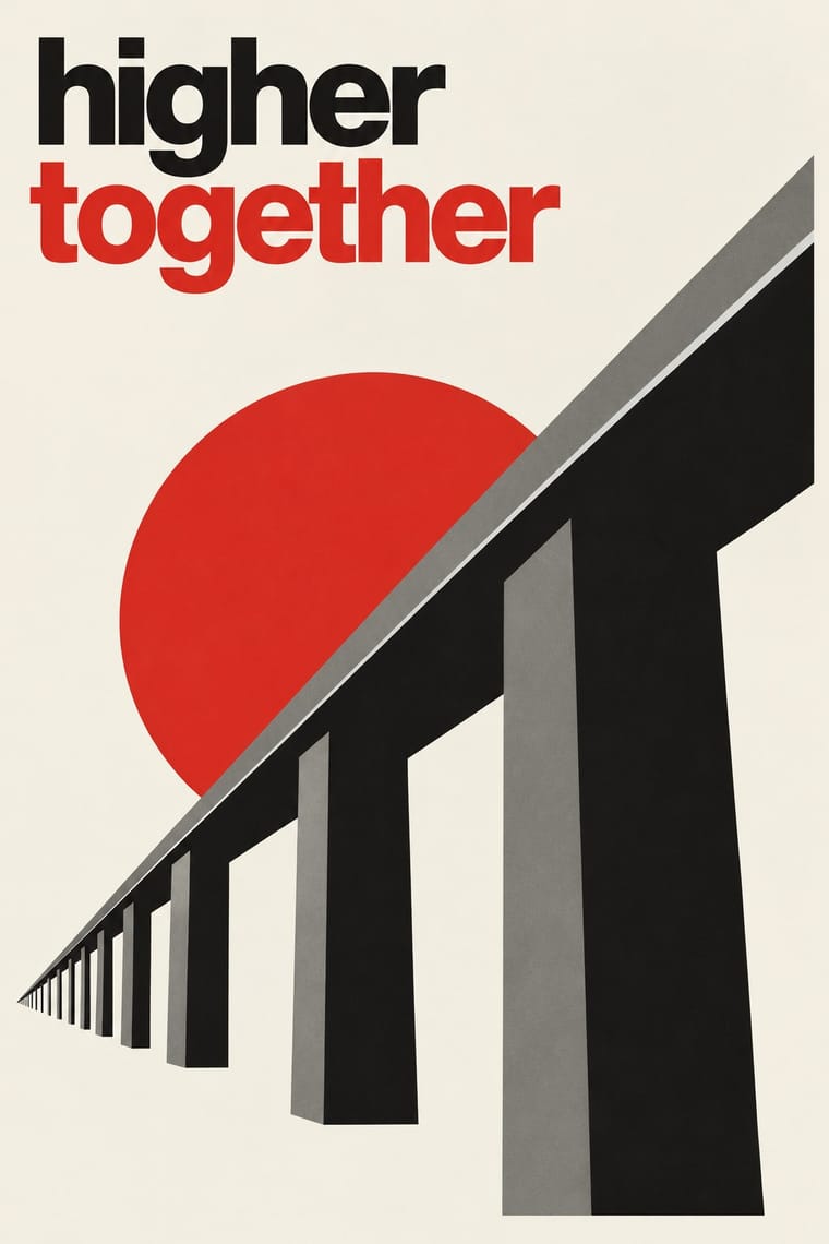
The programme that turned avant-garde experiment into a functional typographic method, named by Moholy-Nagy in 1923 and codified in Jan Tschichold's 'elementare typographie' (1925) and Die neue Typographie (1928). It demanded asymmetric layouts, sans-serif type, standard paper formats, photography and active white space, all justified by clarity of communication, and spread through the Ring neue Werbegestalter and designers from Delft to Prague.
Make something in this styleGet advice in this styleMix it with another style
01
How it works
- Organise the page asymmetrically around the logic of the content, never around a central axis.
- Set text in sans-serif, flush left and ragged right, building hierarchy from size, weight and position.
- Treat white space as an active compositional element, not leftover background.
- Use photography rather than drawing, and integrate it with type as 'typophoto'.
- Restrict colour to black plus one accent, usually red, laid flat.
- Standardise: use DIN paper formats and systematic letterheads, forms and advertisements.
Germany (Weimar, Leipzig, Munich, Hanover), with centres in the Netherlands, Czechoslovakia and Poland
02
Its design choices
From Stylogeny’s vocabulary of design choices: defining choices make the style, characteristic ones are usual, occasional ones turn up now and then.
- Layout & composition
- Space & hierarchy
- Typography
- Colour
- Form & shape
- Surface & texture
- Medium & production
- Tone & intent
- Avoids
- Central symmetry, Classical text block, Blackletter, Ornamented display, Script, Abundant decoration, Borders & frames
Palette
#f3efe4#141414#d32a1f#7d7a73#e2dccb
Typefaces
Futura
Paul Renner, 1927
Akzidenz-Grotesk
Erbar-Grotesk
Jakob Erbar
Kabel
Rudolf Koch, 1927
Known for
Jan Tschichold
elementare typographie, 1925; Die neue Typographie, 1928; Phoebus-Palast film posters
El Lissitzky
Topography of Typography, 1923
Piet Zwart
NKF cable catalogue, 1928
Paul Schuitema
Ring neue Werbegestalter
founded 1927 by Kurt Schwitters, with Max Burchartz, Walter Dexel, César Domela and others
Karel Teige & Ladislav Sutnar
Czechoslovakia
03
Make something in this style
Say what you need, and Stylogeny’s image studio draws it from Die Neue Typographie’s design choices and checks it against them. It takes about a minute, and you get a link to share.
04
Where it comes from, and what it’s close to
Before it
The style it grew out of, and the styles it borrowed from.


After it
The styles that grew out of it.


Alike in its design choices
Styles that make many of the same choices, related or not, besides those above.


05
Real works
Artefacts in museums, libraries and archives that show the style, linked at their source.
- Ausstellung Margarete Naumann – Spitzen, Posamenten, Perlen, Bast, Stickereien, Papier usw. – Römermuseum HildesheimKurt Schwitters · 1930 · Plakatsammlung der Schule für Gestaltung Basel, CH-000957-X:40352 (gift of Jan Tschichold, 1935; scan contributed by the collection to Wikimedia Commons)
- dammerstock: Ausstellung Karlsruhe, Dammerstock-Siedlung, Die GebrauchswohnungKurt Schwitters · 1929 · Plakatsammlung der Schule für Gestaltung Basel, CH-000957-X:11567 (scan contributed by the collection to Wikimedia Commons)
- USSR. Russische Ausstellung, Kunstgewerbemuseum ZürichEl Lissitzky · 1929 · Plakatsammlung der Schule für Gestaltung Basel, CH-000957-X:8308 (scan contributed by the collection to Wikimedia Commons)
- Neues Bauen: Lichtbildervortrag Walter GropiusJan Tschichold · ca. mid 1920s · Victoria and Albert Museum, London (CIRC.415-1974)

06
Sources
- Jan Tschichold, Die neue Typographie (1928; trans. Ruari McLean as The New Typography, 1995)
- Christopher Burke, Active Literature: Jan Tschichold and New Typography (Hyphen Press, 2007)
- Paul Stirton, Jan Tschichold and the New Typography: Graphic Design Between the World Wars (Bard Graduate Center, 2019)
How Stylogeny researches and checks a style: where the facts come from.