Colour · Strategy
Primary triad
Red, yellow and blue with black and white.
A design choice in Stylogeny’s vocabulary, under colour: what is the colour strategy?
- styles make it
- 25
- as a defining choice
- 4
- as a usual one
- 12
- now and then
- 9
- avoid it
- 3
Styles defined by it 4
For these styles it is one of the choices that make the style.
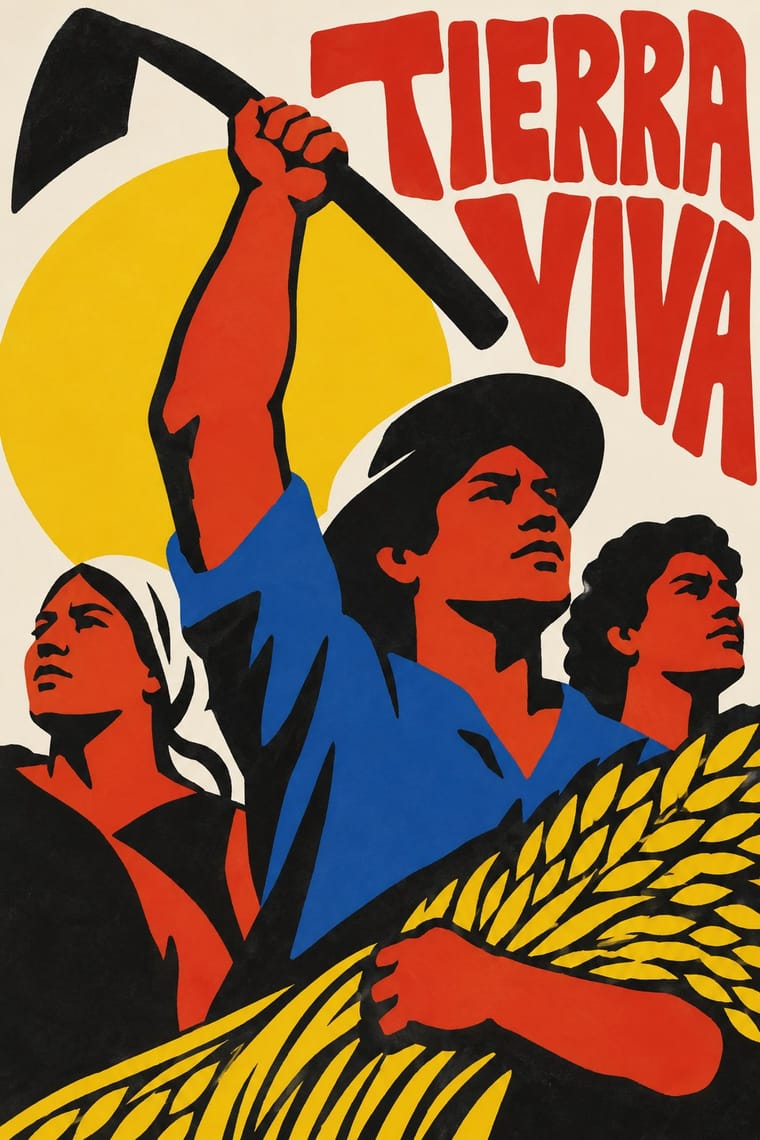
- Sápmi Graphic Identity (Duodji & Gákti Colour Code)Duodji is Sámi handicraft: hard work in wood, horn and bone, soft work in skin and cloth; drums painted with alder-bark figures survive from the 17th and 18th centuries.
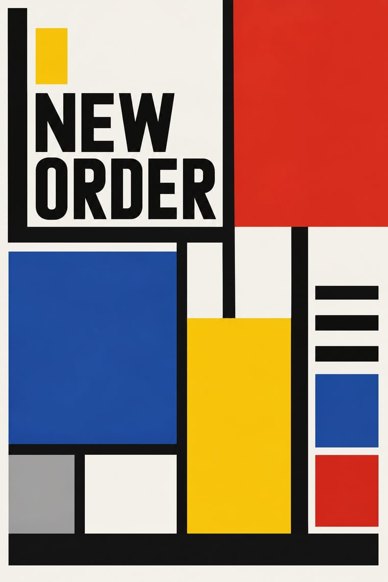
De StijlA Dutch movement formed around Theo van Doesburg's journal De Stijl and Piet Mondrian's Neoplasticism, which sought universal harmony through the most elementary means: horizontal and vertical lines, rectangles, the three primaries and black, white and grey.
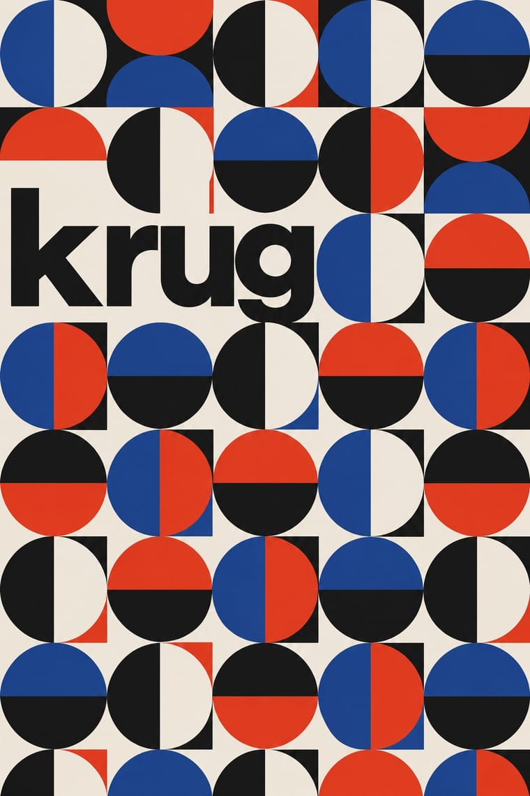
- BauhausThe German school founded by Walter Gropius in 1919 moved from Expressionist craft ideals to a programme of 'art and technology' after 1923, when Moholy-Nagy, Herbert Bayer and Joost Schmidt made its printing and advertising workshops a laboratory for functional communication.
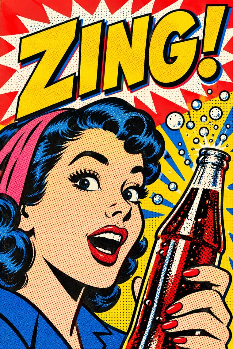
Pop Art GraphicsPop turned the commercial imagery of post-war consumer culture (comics, packaging, celebrity photographs and advertising) into both its subject and its method.
Styles that often use it 12
A characteristic choice: usual in these styles, though not essential.
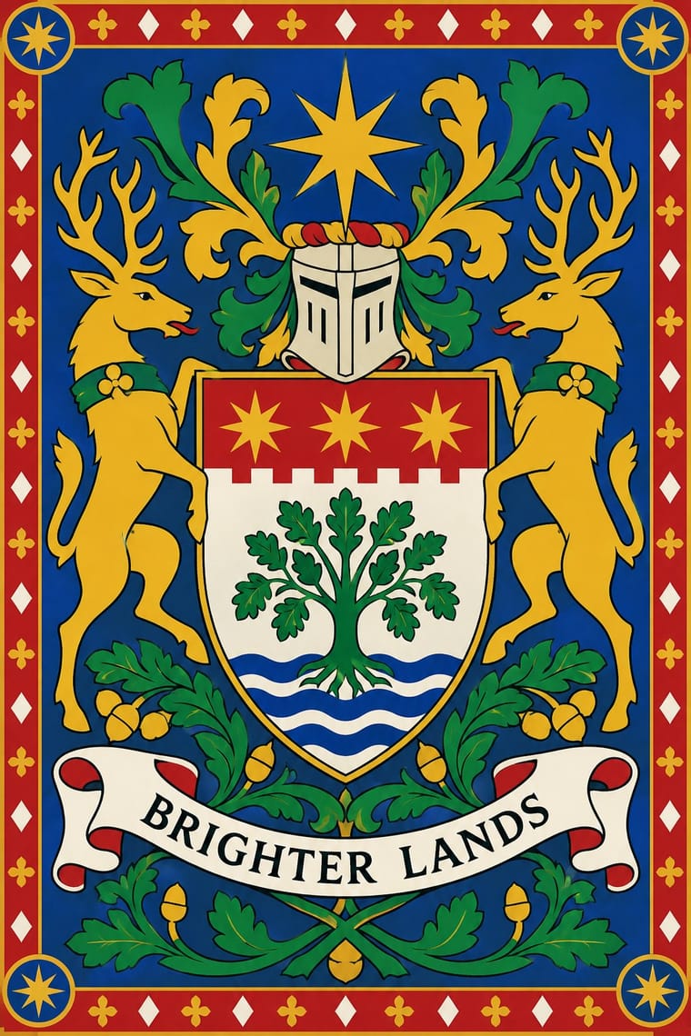
European HeraldryThe hereditary identifying devices of medieval Europe's knights and seals, codified into a rule-bound grammar still used by states, cities, churches, universities and families.
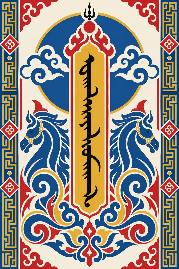
Mongol Bichig Calligraphy & Ugalz OrnamentMongolia's classical script and the auspicious ornament that frames it on state, Buddhist and household objects.
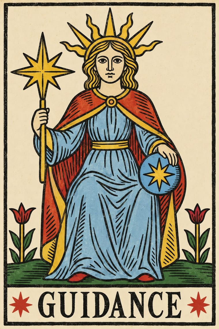
Tarot de Marseille Woodcut CardsThe standard pattern of French tarot cards, descended from Milanese tarot and recut by card-makers in Paris, Lyon, Avignon, Dijon and Marseille from the 17th century.
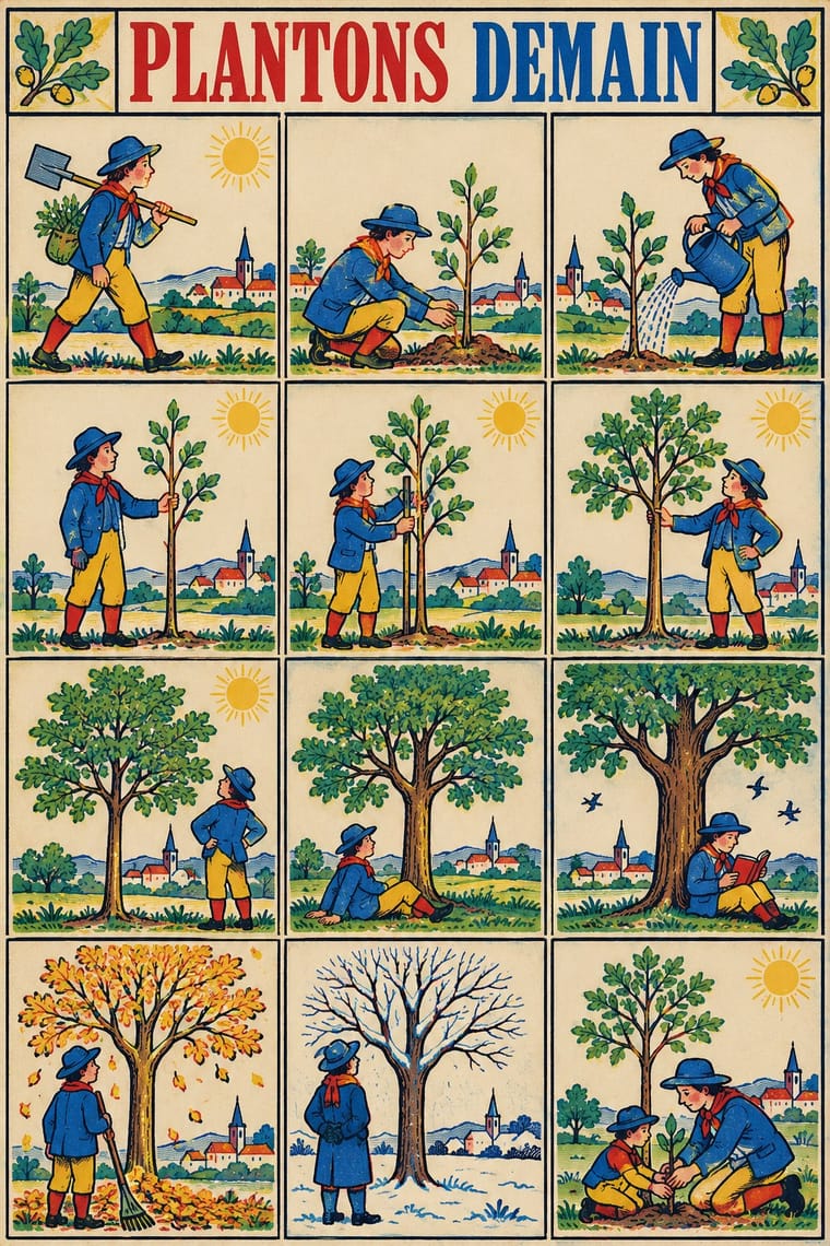
Imagerie d'Épinal & European BilderbogenCheap single-sheet popular prints sold by pedlars across 19th-century Europe, led by the Pellerin imagerie at Épinal and the Neuruppin Bilderbogen.
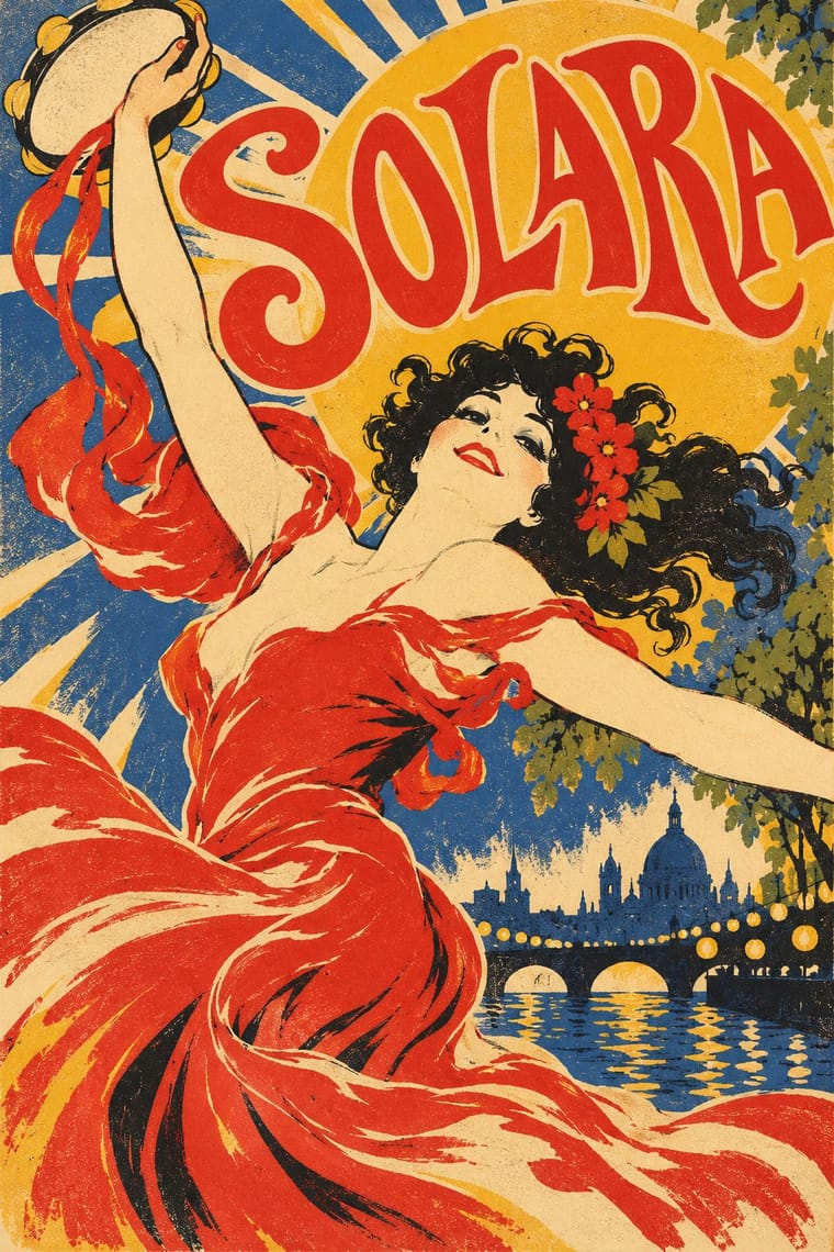
Belle Époque Lithographic PosterThe large colour lithographic street poster that turned Paris into an open-air gallery, from Jules Chéret's first posters of 1866 to Leonetto Cappiello before the First World War.
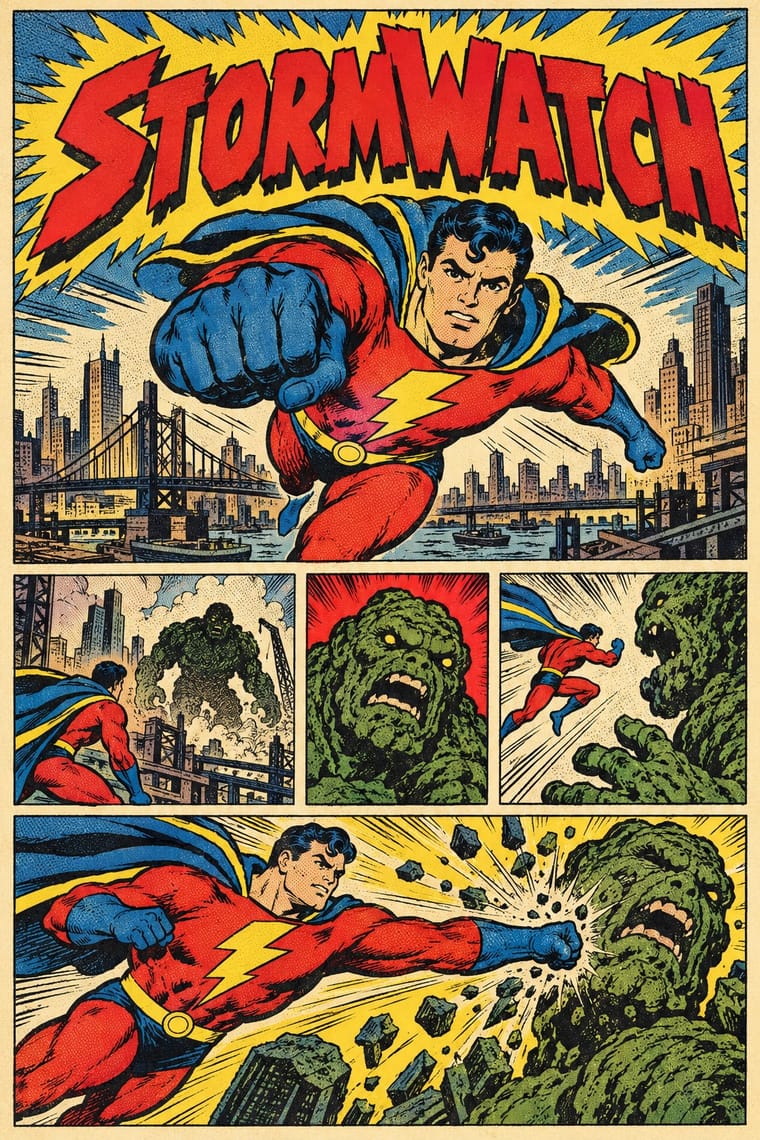
American Four-Colour Comic Book (Golden to Bronze Age)The American newsstand comic book from Famous Funnies (1934) and Action Comics #1 (1938) through the Golden, Silver and Bronze Ages, and past the Bronze Age's end in 1985 until computer colour replaced hand separations in the early 1990s.
- Ndebele Geometric PaintingThe mural tradition of Southern Ndebele women, who paint homestead walls and gateways, and later canvases and objects, with bold, symmetrical geometric designs.
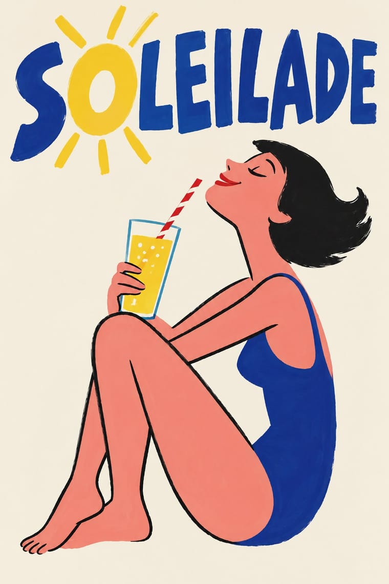
French Post-War Visual-Gag Poster (Savignac, Villemot, Morvan)The humorous street poster of post-war Paris, which took off in 1949 when Raymond Savignac and Bernard Villemot showed their rejected projects together and Savignac's Monsavon cow, its udder filling a bar of soap, went up on the walls.
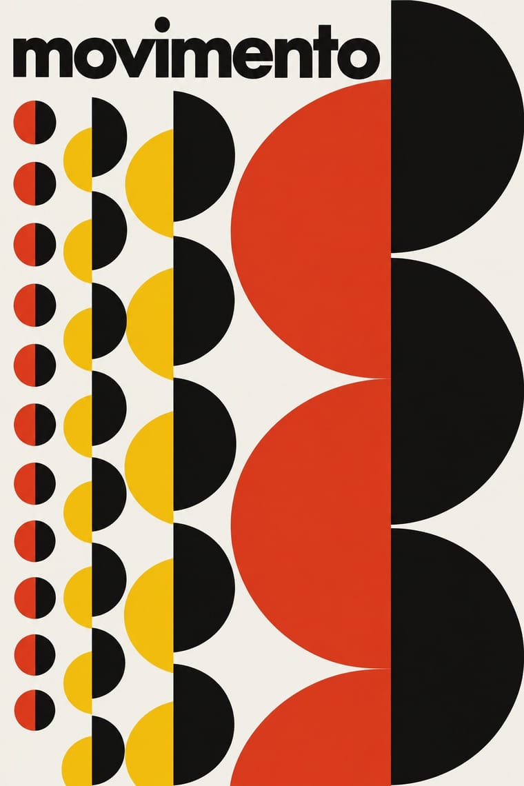
Brazilian Concrete DesignA São Paulo and Rio movement in which concrete art, concrete poetry and Brazil's first design offices shared one vocabulary: Max Bill's mathematically generated geometry, serial repetition and sans-serif type.
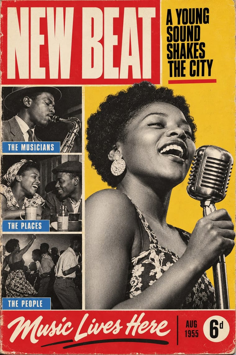
Drum Magazine & Sophiatown PhotojournalismThe picture magazine of Black urban Africa in the 1950s.
Zagreb Modernist Graphics (EXAT 51 to Teatar &TD)Zagreb graphic design grown from the EXAT 51 manifesto (1951), which tied abstract art to visual communication.
Chilean Unidad Popular & Nueva Canción GraphicsThe graphics of the Nueva Canción Chilena and Allende's Unidad Popular, 1967–1973.
Styles that use it now and then 9
An occasional choice in these styles.
- Leningrad Avant-Garde Picture Book1922–1936
- American Mid-Century Modernism1940–1970
- UPA & Cartoon Modern1944–1960
- International Typographic Style1950–1975
- Arab Children's Comic Magazines (Samir to Majid)1956–present
- Grapus (French Militant Graphic Collective)1970–1990
- Dutch Expressive Postmodernism (Studio Dumbar & Hard Werken)1977–1994
- Out-of-Square Hangul Typography1985–present
- Newtro (Korean New-Retro)2017–present
It often goes with
Choices that the styles making it make more often than the atlas as a whole.
- Geometric primitivesin 16 of 25
- Diagonal axisin 12 of 25
- Flat fieldsin 25 of 25
- Dynamic asymmetryin 13 of 25
- Rectilinearin 13 of 25
- Architecture & signagein 15 of 25
Styles that avoid it
Styles that deliberately leave it out.