Postmodern · 1985–present · East Asia
Out-of-Square Hangul Typography
Also known as Tal-nemo (out-of-square) Hangul, Talnemokkol typefaces (탈네모꼴), De-squared Hangul, Ahn Sang-soo style
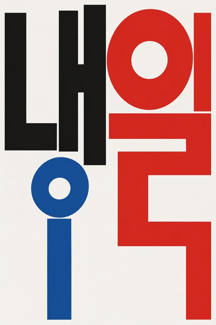
A Korean typographic movement that frees Hangul from the equal square in which metal and photo type had always set each syllable. Beginning with Ahn Sang-soo's 1985 typeface, jamo keep fixed sizes so syllables vary in height and lines hang from a shared top edge; letters are built from circle, dot and straight stroke, and in posters and the magazine Bogoseo/Bogoseo they are enlarged until they become the picture.
Make something in this styleGet advice in this styleMix it with another style
01
How it works
- Draw each consonant and vowel at one fixed size and let syllables grow downward, so lines hang from a common top edge and finish raggedly at the bottom.
- Construct letters from the script's own geometric primitives (circle, dot, horizontal and vertical stroke) as monoline modules rather than brush-derived strokes.
- Enlarge a single jamo or syllable until it becomes the image, and let its circles and strokes double as figures.
- Work in black and one or two flat spot colours on white, so the letter structure carries the expression.
- Experiment with the structure of Hangul itself, a featural syllabic script, instead of importing distortions from Latin typography.
Seoul, South Korea: Ahn Sang-soo's 1985 typeface, Ahn Graphics and the magazine Bogoseo/Bogoseo, prefigured by the non-square output of mid-century Hangul typewriters
02
Its design choices
From Stylogeny’s vocabulary of design choices: defining choices make the style, characteristic ones are usual, occasional ones turn up now and then.
- Layout & composition
- Space & hierarchy
- Typography
- Colour
- Surface & texture
- Ornament
- Medium & production
- Tone & intent
- Avoids
- Monospace, Script, Ornamented display, Abundant decoration, Floral & vegetal, Skeuomorphic material, Painterly illustration
Palette
#f5f3ee#111111#d7261e#1f4fa0#f2c12e
Typefaces
Ahn Sang-soo typeface
안상수체, 1985
Isang-che, Mir-che and Mano-che
Ahn Sang-soo
Hankyoreh Gyeol-che
한겨레결체, 2005
Hangul typewriter letterforms
Gong Byeong-u's sebeolsik machines
Known for
Ahn Sang-soo, Ahn Sang-soo typeface
1985; digital version 1991
Ahn Sang-soo, Isang-che, Mir-che and Mano-che typefaces
Ahn Sang-soo, Madang typeface for Madang magazine
art director from 1983
Bogoseo/Bogoseo (Report/Report), alternative art and culture magazine, from 1988
Hankyoreh Gyeol-che, out-of-square text face by Tae System for the Hankyoreh newspaper
2005
Ahn Sang-soo
Imagining Hangul, Rodin Gallery, Seoul (2002)
Paju Typography Institute (PaTI), founded by Ahn Sang-soo
2013
03
Make something in this style
Say what you need, and Stylogeny’s image studio draws it from Out-of-Square Hangul Typography’s design choices and checks it against them. It takes about a minute, and you get a link to share.
04
Where it comes from, and what it’s close to
Before it
The style it grew out of, and the styles it borrowed from.
After it
The styles that grew out of it.
No later style in the atlas grew out of it yet.
Alike in its design choices
Styles that make many of the same choices, related or not, besides those above.
05
Real works
Artefacts in museums, libraries and archives that show the style, linked at their source.
- bogoseo\bogoseo (보고서\보고서), vol. 6, coverAhn Sang-soo · 1991 · M+, Hong Kong, M+ Library Special Collection (CL.2020.1.3)
- 557th Commemoration of Hangeul Day (poster)Ahn Sang-soo · 2003 · Victoria and Albert Museum, London (FE.66-2019)
- bogoseo\bogoseo (보고서\보고서), vol. 1, coverAhn Sang-soo · 1988 · M+, Hong Kong, M+ Library Special Collection (CL.2020.1.1)
- letters.for.life (Ahn Sang-soo exhibition poster, Xue Xue gallery, Taipei)Ahn Sang-soo · 2018 (exhibition 15 March – 20 June 2018) · Ahn Sang-soo, ssahn.com (designer's own site), 'works' category, post of 11 April 2018
- We Live in Seocho (from the 'We Live in Seoul' poster series)Shin Gwang (INTERNETMADE) · 2017 (printed 2022) · Victoria and Albert Museum, London (FE.357-2022)
06
Sources
- https://en.wikipedia.org/wiki/Ahn_Sang-soo_(designer)
- https://ko.wikipedia.org/wiki/한겨레결체
- https://languagelog.ldc.upenn.edu/nll/?p=61173 (comment by Jongseong Park on tal-nemo typefaces)
- https://www.koreajoongangdaily.com/lifestyle/typeface-artist-truly-a-font-of-creativity/11131007
How Stylogeny researches and checks a style: where the facts come from.