Postmodern · 2007–present · Central Europe
Lucerne Poster Scene (Neubad & Südpol Posters)
Also known as Poster Town Lucerne, Plakatszene Luzern, Lucerne poster culture
Lucerne's poster culture for small non-commercial venues (Südpol, Neubad, Treibhaus) and the Weltformat festival. Each event gets a one-off poster, most often with the title as the picture: letters built, twisted or warped into one optical motif. Neubad's posters are black and white only; Felix Pfäffli's Südpol series (2010–2015) added Risograph colour. The scene rests on local designers' exchange, fostered by Brechbühl through Weltformat (co-founded 2009) and the Show & Tell meetings (2012); in 2015, 26 of the 100 best posters from Germany, Austria and Switzerland came from the Lucerne area.
Make something in this styleGet advice in this styleMix it with another style

01
How it works
- Make a new poster for every event and treat each one as a one-off experiment, held together only by a venue's light rule: the recurring SÜDPOL wordmark in Brechbühl's slaughterhouse-sign typeface, placed wherever the composition allows, on the Südpol posters; black and white for every Neubad poster.
- Most often, make the title the picture: construct, bend, slice or build the letters of the band or event name until they fill the sheet as one motif, and keep date, venue and line-up in small grotesque text at the edges.
- Play on perception: draw letters and fields that seem to twist, vibrate or stand out of the flat sheet, with op-art line fields, moiré, warped checkerboards, figure-ground reversals, cubes, paper folds and cast shadows.
- Let a limit do the design work: black and white only at the Neubad (for The Notwist Brechbühl even ruled out greys), on F4 sheets most often printed digitally, sometimes in offset or screenprint; a small Risograph sheet in a few inks at Südpol; a handful of spot or metallic inks, screenprinted or lithographed, on the F4 sheet for festival and exhibition posters.
- Draw openly with the computer: gradients, blurs, blend-tool line sequences, rendered crystals and digitally simulated wear are welcome, as long as one idea carries the sheet.
Lucerne and neighbouring Kriens, Switzerland: posters for small non-commercial cultural venues and for the Weltformat festival, held in Lucerne every year since 2009 and co-founded by Erich Brechbühl, who had trained with the poster designer Niklaus Troxler in Willisau, in the canton of Lucerne, until 2002 and opened his studio Mixer in Lucerne in 2003. Troxler's jazz posters for Willisau, which often made the letters themselves the picture (painted with a brush, or drawn as lines that spell the band's name), are the scene's local root; its wider lineage is the Swiss break from within the grid that New Wave typography began in Basel, though Lucerne bends the title into one optical motif instead of layering type and screens. Brechbühl drew the corporate design of the Südpol cultural centre in 2008; Felix Pfäffli made all of Südpol's posters from mid-2010 to mid-2015 on Brechbühl's loose guidelines. The Neubad, a cultural interim use of the old municipal indoor swimming pool since 2013, gives each event a black-and-white poster by one of a changing roster of designers, Brechbühl among them, in a series he curates. Brechbühl also started the Show & Tell exchange meetings for graphic designers in 2012. Optical, type-as-image cultural posters are made across the German-speaking competition culture of the 100 Best Posters (Berlin's Fons Hickmann also designs for the Neubad); Lucerne is its densest centre, set apart by local institutions: the venue rules (Neubad's black and white, Südpol's wordmark), the festival and the meetings. The Poster Town archive documents the scene from 2007 on.
02
Its design choices
From Stylogeny’s vocabulary of design choices: defining choices make the style, characteristic ones are usual, occasional ones turn up now and then.
- Layout & composition
- Space & hierarchy
- Typography
- Colour
- Form & shape
- Surface & texture
- Ornament
- Imagery
- Medium & production
- Tone & intent
- Avoids
- Abundant decoration, Floral & vegetal, Classical text block, Layered information, Eclectic mixing, Painterly illustration, Nostalgic & retro, Authoritative & institutional
Palette
#0a0a0a#ffffff#3a9833#f0e111#ff415b#744dc9
Typefaces
Letters constructed or distorted for each poster
Brechbühl's handwritten blend-tool letters for The Notwist (2019), the square-tiled cube letters of Neubad Start (2013), Pfäffli's bent, sliced and paper-folded titles for Südpol; elsewhere set type is warped rather than drawn, as in the condensed sans bent round a disc for Future Islands (2014) or the serif of When Saints Go Machine
The Südpol typeface drawn by Erich Brechbühl in 2008 from the letterforms of the signage of the old slaughterhouse, used for the SÜDPOL wordmark that recurs, in varying positions, on the Südpol posters
Small neo-grotesque text blocks for date, venue and line-up at the edges of the sheet, often in letterspaced capitals
as seen on the Südpol and Neubad posters
Known for
Erich Brechbühl (b. 1977, studio Mixer, Lucerne, from 2003; AGI member from 2007), 'Neubad Start', 2013
poster for the opening of the cultural interim use of the old municipal indoor pool, the words 'Neubad Start 1.–7. Sept.' drawn as letters of white and grey squares on the faces of a cube in perspective, on black, with a rendered chrome pool ladder hooked over the tiled cube; F4, offset-printed by Plakatif AG, Stans (100 best posters 13; image viewed on his site)
Erich Brechbühl, 'The Notwist', concert at Neubad, 2019
the band name in handwritten letters built from blend-tool line sequences into twisted black-and-white ribbons in the style of Op Art, on a ground of black and white stripes, with a shadow added by hand, letterspaced small capitals at top and bottom and, by his own rule, no shades of grey; F4, digitally printed by Multi Reflex AG; an animated version followed (100 best posters 19; Grand Prize, Ecuador Poster Bienal 2020)
Erich Brechbühl, 'SOS Neubad', 2020, a digitally printed fund-raising poster during the Covid crisis
an all-over maze of wavy black and white lines, with the words 'Neubad', 'über Wasser halten', 'jetzt spenden' (keep afloat, donate now) in small letterspaced capitals inside white pills (100 best posters 20; Master's Eye Award, Trnava Poster Triennial 2022); and '10 Years Neubad', 2023, a black-and-white checkerboard turned inside out in a central disc, with the title cropped at the top edge (100 best posters 23)
Felix Pfäffli (b. 1986, studio Feixen from 2009, Studio Feixen from 2015)
over 100 posters for Südpol, 2010–2015, printed by Risograph at 42 × 30 cm, the SÜDPOL wordmark recurring but placed anew each time: at the head beside the date for Bonobo (18.12.10), a red sphere on a red-to-blue gradient; beside the title for Konono No. 1 (4.4.12), round red drawn letters on yellow under a flat green field; turned upright for Future Islands (22.5.14), huge black condensed letters bending round a blurred white disc; rotated into a green corner triangle for Nils Frahm (7.6.14), green letter shapes that seem cut and folded out of the white sheet. Not every sheet makes the title the picture: others in the series show faces, a skull, a comic-strip pastiche or a portrait photograph (The Pains of Being Pure at Heart) (images viewed on Studio Feixen's site)
Felix Pfäffli, 'Weltformat 13', poster for the 2013 Weltformat festival, lithograph, 128 × 89.5 cm
his earlier posters stacked as if pasted on a wall, digitally torn to show the layers beneath, with metallic silver ink for the steel poster wall (Cooper Hewitt, Smithsonian Design Museum, 2014-30-2)
Fons Hickmann (Berlin), Neubad posters for the Solotage festival, for the Leipzig band The Cloche and 'Kurz & Mittwoch' (screenprinted F4), 2019, among the many Neubad posters by designers from outside Lucerne (AGI)
'Plakatszene Luzern', 2025, by Erich Brechbühl, Isabelle Mauchle and Felix Pfäffli
F4 screenprint in five spot colours (printed by Lézard Graphique) of curling paper ribbons forming letters, shaded with visible halftone dot screens, for the exhibition 'Poster Scene Lucerne' at the Plakatsammlung of the Schule für Gestaltung Basel (Münchenstein; the poster prints 17 October–1 November 2025, Slanted gives 16 October as the start), which showed posters by 21 designers and studios, among them Annik Troxler, Paula Troxler, Megi Zumstein, Sam Steiner, Johnson/Kingston and Vera Mattmann
Poster Town
Contemporary Poster Design from Lucerne (Spector Books, 2017), edited by eight Lucerne designers, and its online archive of about 800 posters by 160 designers from 2007 to 2017; The Neubad Plakat: A Contemporary Design Phenomenon (Slanted, 2023)
03
Make something in this style
Say what you need, and Stylogeny’s image studio draws it from Lucerne Poster Scene (Neubad & Südpol Posters)’s design choices and checks it against them. It takes about a minute, and you get a link to share.
04
Where it comes from, and what it’s close to
Before it
The style it grew out of, and the styles it borrowed from.


After it
The styles that grew out of it.
No later style in the atlas grew out of it yet.
Alike in its design choices
Styles that make many of the same choices, related or not, besides those above.
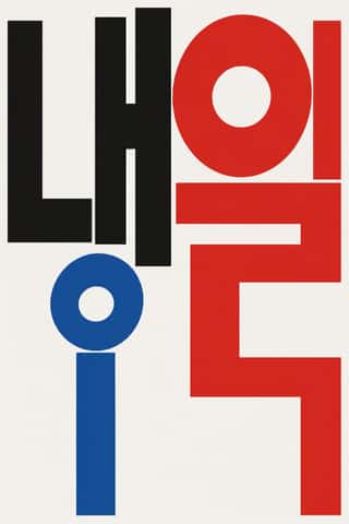
- Seoul Independent Graphic Design (Small-Studio Scene)73% alike


05
Sources
- Erich Brechbühl, project pages, https://erichbrechbuhl.ch/neubad-start, /the-notwist, /sos-neubad, /10-years-neubad, /suedpol and /plakatszene-luzern (Neubad Start 2013 'for the opening of the cultural interim use of the old municipal indoor swimming pool of the city of Lucerne'; The Notwist 2019: 'all Neubad posters are consistently kept in black and white', no shades of grey, 'in the style of Op-Art', Illustrator blend tool, handwritten letters, lined background, shadow added by hand, animated version, awards; SOS Neubad 2020 and 10 Years Neubad 2023 with awards; Südpol corporate design 2008, typeface from the old slaughterhouse signage, Risograph newspaper, posters by various designers at first, then Pfäffli from mid-2010 to mid-2015 'based on my loose design guidelines'; Plakatszene Luzern 2025 with Mauchle and Pfäffli, five spot colours, Weltformat 'held annually since 2009'; images viewed: the chrome pool ladder on Neubad Start, letterspaced small capitals on The Notwist and SOS Neubad, halftone dots and '17. Okt. bis 1. Nov. 2025' on Plakatszene Luzern)
- https://de.wikipedia.org/wiki/Erich_Brechb%C3%BChl (born 1977 in Sursee; apprenticeship as a typographer 1994–1998; trained with Niklaus Troxler in Willisau until 2002; studio Mixer in Lucerne 2003; AGI 2007; co-editor of The Neubad Plakat, 2023)
- Galerie 123, Erich Brechbühl biography, https://www.galerie123.com/en/artists/18665/erich-brechbuhl-original-vintage-poster (co-founder of the Weltformat poster festival in Lucerne in 2009)
- Graphic Days 2024, Erich Brechbühl, https://www.graphicdays.it/2024/en/guest/erich-brechbuhl/ (apprentice graphic designer under Niklaus Troxler; studio Mixer in Lucerne 2003; co-founder of the Weltformat Graphic Design Festival 2009; 'started the regular exchange meeting for graphic designers called Show & Tell in 2012'; AGI since 2007)
- Madeleine Morley, 'Since the 1960s, Niklaus Troxler Has Been Improvising with Letterforms Just Like a Jazz Musician', AIGA Eye on Design, 4 July 2018, https://eyeondesign.aiga.org/since-the-1960s-niklaus-troxler-has-been-improvising-with-letterforms-just-like-a-jazz-musician/ (Willisau jazz posters: an entirely typographic Thelonious Monk tribute, 1986; letters each made with a brush for James Blood Ulmer, 1991; lines drawn as guitar strings that spell the group's name for Der Rote Bereich, 2009); https://en.wikipedia.org/wiki/Willisau (a municipality in the Lucerne canton)
- Studio Feixen, https://www.studiofeixen.ch/about/ (Pfäffli born 1986 and raised in Lucerne; studio 'Feixen' 2009, Studio Feixen from 2015; over 100 posters for Südpol 2010–2015; youngest AGI member 2013; TDC Prize 2014); https://www.studiofeixen.ch/sudpol/ (posters 2010–2015, 42 x 30 cm, Risograph; 'only marginal design restrictions'; Südpol in Kriens near Lucerne; images viewed: the SÜDPOL wordmark recurs in varying positions, and the series includes faces, a skull, a comic-strip pastiche and portrait photographs); https://www.studiofeixen.ch/15-years-sudpol/
- Caitlin Condell, 'All Torn Up', Cooper Hewitt, 15 October 2014, https://www.cooperhewitt.org/2014/10/15/all-torn-up/ (Felix Pfäffli, Weltformat 13, 2013, lithograph, 128 × 89.5 cm, 2014-30-2, gift of the designer; layered earlier posters digitally torn, metallic silver ink, trompe l'oeil)
- AGI, Fons Hickmann, Neubad, https://a-g-i.org/design/neubad (the Neubad, an old indoor pool in Lucerne used for concerts and art events; 'each event is advertised with black and white posters by different designers'; series curated by Erich Brechbühl; Hickmann 'selected the »Solotage Festival« and the Leipzig band The Cloche', 2019)
- Neubad Luzern, https://www.neubad.org (cultural venue in the former municipal indoor pool, Bireggstrasse 36, run by the Verein Netzwerk Neubad; users since 2013)
- Slanted, The Neubad Plakat, https://www.slanted.de/?p=710428 and https://www.slanted.de/?p=708056 (Slanted Publishers 2023; editors Brechbühl, Hickmann, Hinrichs, Steiner and Lindhorst-Emme; 'minimalist black and white', 'progressive illustration and experimental typography', posters that 'playfully transcend the boundaries of our perceptual habits')
- Slanted, Poster Scene Lucerne, https://www.slanted.de/?p=798468 (exhibition of the Plakatsammlung SfG Basel, Münchenstein, 16 October–1 November 2025, curated by Rhea Rieben; posters for the non-commercial venues Treibhaus, Südpol and Neubad and the Weltformat festival; 21 designers listed; a culture of creative exchange and cooperation largely developed by Brechbühl)
- 100 beste Plakate, https://100-beste-plakate.de/plakate/plakatszene-luzern/ (Plakatszene Luzern, 2025, F4, Siebdruck, Lézard Graphique); https://100-beste-plakate.de/plakate/neubad-start/ (Brechbühl, 2013, F4, Offsetdruck, Plakatif AG, Stans); https://100-beste-plakate.de/plakate/the-notwist/ (Brechbühl, 2019, F4, Digitaldruck, Multi Reflex AG); https://100-beste-plakate.de/plakate/sos-neubad/ (Brechbühl, 2020, F4, Digitaldruck, Multi Reflex AG); https://100-beste-plakate.de/plakate/neubad-slam-2/ (Balmer Hählen, Neubad Slam, 2024, F4, Digitaldruck, Multi Reflex AG); https://100-beste-plakate.de/plakate/kurz-mittwoch/ (Fons Hickmann m23, Kurz & Mittwoch, 2019, F4, Siebdruck, Multi Reflex AG, client Neubad)
- Spector Books, Poster Town, https://spectorbooks.com/book/poster-town (2017, eight editors; in 2015, 26 of the 100 best posters from Germany, Austria and Switzerland came from Lucerne and its surroundings, by the publisher's account) and https://www.postertown.ch (archive of about 800 posters by 160 designers, 2007–2017; touring exhibition 2013–2017)
- bluewin / Keystone-SDA, 'Lucerne poster festival is in the starting blocks', 1 October 2024, https://www.bluewin.ch/en/news/switzerland/lucerne-poster-festival-is-in-the-starting-blocks-2388999.html (16th Weltformat Graphic Design Festival; held every year since 2009)
- https://en.wikipedia.org/wiki/Fons_Hickmann (founded the studio Fons Hickmann m23 in Berlin in 2001)
How Stylogeny researches and checks a style: where the facts come from.