Rational modernism · 1953–1990 · Latin America & Caribbean
Vicente Rojo & Mexican Editorial Modernism
Also known as Mexican editorial modernism, Ediciones Era cover design, Imprenta Madero design, Mexican cultural-supplement design (México en la Cultura, La Cultura en México)
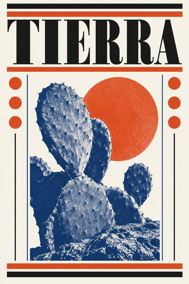
The design of Mexico City's literary and cultural press, shaped from the 1950s by the Barcelona-born exile Vicente Rojo: México en la Cultura, the Revista de la Universidad, Plural, La Jornada and the covers of Ediciones Era. Taught by Miguel Prieto to add nothing beyond what must be read, it sets an image on white inside a fine rule, orders text with the printer's stock (rules, bullets, stars, pointing hands), prints grainy high-contrast photographs in two inks, and keeps design below the text.
Make something in this styleGet advice in this styleMix it with another style
Use it with care
Rojo's covers, his drawn alphabets and the T of his Negaciones paintings are one artist's work: borrow the method (a white ground, a fine rule, the printer's stock, a two-ink treated photograph), not a particular Era cover or his signs, and never present a new design as an Era book. Some covers draw on pre-Hispanic codices (Los indios de México) and Mexican popular imagery (Cien años de soledad); do not lift codex figures as decoration.
01
How it works
- Keep the design below the text: let the cover suggest and insinuate what the book holds, very subtly, and add nothing the reader does not need.
- Order the page with the printer's own stock: rules of two weights, one- and two-line frames, bullets, asterisks, black and white stars and pointing hands that mark levels, quotations and titles.
- Treat photographs at the press: high-contrast film, coarse or blown-up grain and varied screens, printed as duotones in two opposed or complementary inks.
- Set a single image, vignette or sign on a white ground, edged by a fine rule, so it stands for the whole book.
- Give every series a fixed scheme (format, a flat coloured band round the image, a place for author and title, a slash between them on the spine) and change the image, letters or colour book by book.
- Treat letters as signs: build a cover from large wood types, a painter's geometric mark or a drawn alphabet rather than from illustration.
Mexico City: the INBA publications office of the Spanish-born typographer and painter Miguel Prieto, where the Barcelona-born Vicente Rojo (1932-2021, in Mexico from 1949) trained from 1950; Imprenta Madero, the press run by Tomás Espresate, where Rojo picked the typefaces, ran the photographic and pre-press work and trained a generation of designers; and Ediciones Era, which Rojo founded in 1960 with José Azorín and the Espresates to use the press's idle time
02
Its design choices
From Stylogeny’s vocabulary of design choices: defining choices make the style, characteristic ones are usual, occasional ones turn up now and then.
- Layout & composition
- Space & hierarchy
- Typography
- Colour
- Form & shape
- Surface & texture
- Ornament
- Imagery
- Medium & production
- Tone & intent
- Avoids
- Horror vacui, Experimental & distorted, Broken grid, Abundant decoration, Gloss & highlights, Fluorescent & neon, Skeuomorphic material, Eclectic mixing
Palette
#f5f2ea#151515#e04a1f#1f4f9c#d9a820
Typefaces
Bodoni
Rojo had Imprenta Madero buy the Bodoni, Egyptian and Futura families
Egyptian slab serifs
Egipcia, from the Imprenta Madero cases
Futura
Baskerville
probably the single family of Monsiváis's Días de guardar, 1970, according to Marina Garone
Univers
Juan García Ponce, Felguérez, UNAM, 1976
Rojo's drawn alphabet and masthead for Plural
1971
Large wood types
collage cover of Introducción a la poesía, FCE, 1962
Known for
Vicente Rojo (1932-2021), co-founder of Ediciones Era (1960); José Emilio Pacheco said in 1994 that every Era cover was his work, and Rojo estimated in 2018 about 700 Era covers and some 200 for other publishers
Miguel Prieto, Rojo's teacher at the INBA Oficina de Ediciones from January 1950, whom Rojo called the initiator, with the magazine Romance, of modern graphic design in Mexico
México en la Cultura, the supplement of the daily Novedades edited by Fernando Benítez
Rojo redesigned it in 1956 and was its art director, and largely its editor, until 1961
La Cultura en México, supplement of the magazine Siempre!
1962-1974
Artes de México (1953-1963), which Rojo co-founded and art-directed
Revista de la Universidad de México, designed by Rojo from 1965
(1966 according to Daniel Garza Usabiaga in the MUAC catalogue) until 1979, when his Madero assistant Bernardo Recamier took over: the cover heading changed every year, with a U sometimes in a solid colour and sometimes built from small circles; issue 3 of 1971 carried engravings by Leopoldo Méndez
Plural (1971), designed by Rojo with Kazuya Sakai, with an alphabet and masthead drawn by Rojo
The model layout (maqueta) of the daily La Jornada
1984-1987
03
Make something in this style
Say what you need, and Stylogeny’s image studio draws it from Vicente Rojo & Mexican Editorial Modernism’s design choices and checks it against them. It takes about a minute, and you get a link to share.
04
Where it comes from, and what it’s close to
Before it
The style it grew out of, and the styles it borrowed from.

After it
The styles that grew out of it.
No later style in the atlas grew out of it yet.
Alike in its design choices
Styles that make many of the same choices, related or not, besides those above.

05
Sources
- Cuauhtémoc Medina and Amanda de la Garza, 'Escrito / Pintado: Vicente Rojo como agente múltiple', Marina Garone Gravier, 'Rojo: un camino del diseño a la edición', and Daniel Garza Usabiaga, 'T Negaciones: pintura, diseño gráfico y la cultura visual corporativa de la posguerra', in Vicente Rojo. Escrito/Pintado (MUAC, UNAM and El Colegio Nacional, 2015), bilingual exhibition catalogue (Rojo's apprenticeship with Prieto, 1950-1952, and the tastes Prieto instilled, 'a symmetrical, axial order' mostly in black and white, with Baskerville and Bodoni among his types, which partly inclined Rojo to Bodoni and Egyptian at Madero; the French and US advertising manuals Rojo could find were 'not to his liking', and the Zurich magazine Du, Ricard Giralt Miracle and, for Artes de México, the Swiss-Italian art publisher Skira were his points of reference; the 1956 México en la Cultura redesign; Artes de México 1953-1963; La Cultura en México 1962-1974; Plural with Kazuya Sakai and Rojo's alphabet; the La Jornada model 1984-1987; the Serie del Volador scheme of a coloured band round a high-contrast image and a spine in two bands; Madero's Bodoni, Egyptian and Futura, Kodalith high contrast, and the designers Rojo trained; Rojo's vocabulary of clipped vignettes, bullets, asterisks, rules, hands and one- and two-line frames, grain treated in different sizes and two-colour mixes of opposite and complementary colours, light colour sweeps from the 1980s; Los indios de México with ochre grounds inside, Alacena, Serie del Volador, Introducción a la poesía; El gallo de oro coloured in direct tones on white inside a thin bar; Medina and de la Garza: Rojo used his anti-images from Señales and Negaciones as a basis or model for book covers, posters and album covers; Garza Usabiaga: Rojo art director of the Revista de la Universidad from 1966, its cover heading changed every year with a U sometimes in a solid colour and sometimes a cluster of small circles, circles and squares framing images on magazine covers, and the Plural logotype of lines in two clearly delimited colours): https://muac.unam.mx/assets/docs/p-071-f_muac-033-rojo-int-dobles-100dpi.pdf
- Marina Garone Gravier, 'Cultura visual y materialidad del ensayo: los dispositivos tipográficos de Vicente Rojo en Días de guardar (1970)' (CIALC, UNAM) (the printer's paraphernalia as recurring devices; high-contrast and screened photographs, two-colour at first and later with colour sweeps; the black-and-yellow duotone first cover of Días de guardar; one family, probably Baskerville, with two-weight rules, bullets, hands, asterisks and stars; mostly symmetric pages): https://rilzea.cialc.unam.mx/jspui/bitstream/CIALC-UNAM/CL120/1/ENSAYO_DIA_II_6.pdf
- Vicente Rojo, Los sueños compartidos, inaugural lecture at El Colegio Nacional, 16 November 1994, with José Emilio Pacheco's salutation (El Colegio Nacional, 1995; reprint 2016) (Prieto as initiator of modern Mexican graphic design and his 'democracia visual'; work 'con gran economía de medios'; Imprenta Madero and the designers formed there, among them Germán Montalvo and Rafael López Castro; Pacheco: 'La totalidad de las portadas es obra suya'; the fingerprint cover of Nueve pintores mexicanos): https://colnal.mx/wp-content/uploads/2019/11/Discurso-Vicente-Rojo.pdf
- 'El diseño gráfico como un acto de seducción. Entrevista con Vicente Rojo', Revista de la Universidad de México, July 2002 (Rojo designed the magazine 1965-1979, Bernardo Recamier then took over; Prieto's lesson to 'nunca poner nada de más'; good design 'sugiere, insinúa, propone' without weighing on the text): https://mia.revistadelauniversidad.mx/downloads/b1ed1bbf-8f62-4235-9259-6bb5df574346/rum-JUL.2002-art%c3%adculos-el-diseno-grafico-como-un-acto-de-seduccion-entrevista-con-vicente-rojo.pdf
- El Colegio Nacional, member page 'Vicente Rojo' (Imprenta Madero, Joaquín Mortiz, FCE; co-founder of Artes de México and Ediciones Era; designs for Plural, Diálogos, Vuelta, La Gaceta, La Jornada and Unomásuno): https://colnal.mx/integrantes/vicente-rojo/
- Alma Mater (Universidad de Antioquia), editorial 'Cien años de soledad, cincuenta años de compañía' (Rojo's cover arrived too late for the first edition, which carried Iris Pagano's galleon; it appeared from the second edition, June 1967, as a mosaic of small framed figures with the E of 'soledad' reversed): https://revistas.udea.edu.co/index.php/almamater/article/download/328137/20785091/128256
- Jorge Castañeda, 'Las increíbles historias de la portada de Cien años de soledad', Diario Río Negro, 12 March 2012 (white ground, a blue grid, motifs in black and red-orange; Rojo: 'escogí lo popular, los elementos que están en la imaginería popular'): https://www.rionegro.com.ar/?p=499995
- Wikipedia, 'Vicente Rojo Almazán' (Spanish) (in Mexico from 1949; Artes de México, México en la Cultura, La Cultura en México, Plural, La Jornada, Era; his 2018 estimate of about 700 Era covers and 200 more): https://es.wikipedia.org/wiki/Vicente_Rojo_Almaz%C3%A1n
- Wikipedia, 'Ediciones Era' (Spanish) (founded 1960 by Rojo, José Azorín and Neus, Jordi and Quico Espresate; the name from Espresate, Rojo, Azorín): https://es.wikipedia.org/wiki/Ediciones_Era
How Stylogeny researches and checks a style: where the facts come from.