Rational modernism · 1973–present · Southeast Asia
Roman-like Thai Typography (modern loopless Thai)
Also known as Loopless Thai, Roman-like Thai typefaces (แบบตัวพิมพ์ไทยเสมือนโรมัน), Thai Modern (Linotype's name for the loopless styles of Neue Frutiger Thai)
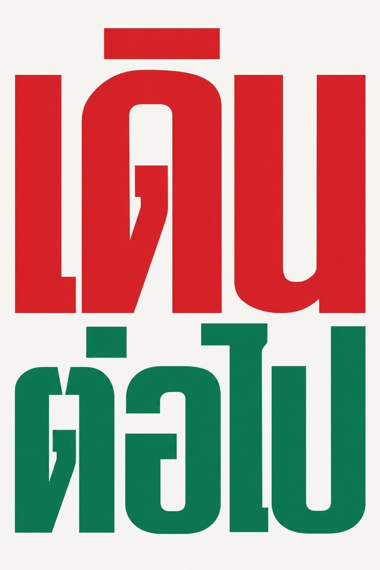
A Thai type genre that drops the head loops of most Thai letters, so the script reads as an even sans like Helvetica. Older loopless forms exist, but this line began with Manop Srisomporn's Manoptica, drawn from 1973 for dry transfer; Manop faces spread through advertising and road signs, and Cadson Demak's corporate fonts (AIS's among them) carried it into branding and screens. Since 1999 it has also been set as body text in magazines, screens and operating systems, which remains controversial; families now ship looped and loopless Thai side by side, mostly recommending loopless for display.
Make something in this styleGet advice in this styleMix it with another style
Use it with care
Loopless Thai is contested inside Thailand. Researchers such as Rachapoom Punsongserm find it harder to read in small, bold or justified body text and less legible across viewing distances than a Thai universal-design face, with letters that can be taken for Latin (พ.ร.บ. can read as W.S.U.), so keep it mostly to display sizes and set body, legal and small interface text in a looped face. Critics also see it as eroding the looped forms that mark Thai identity, and Cadson Demak, which popularised it, has since turned back towards looped faces. Have every Thai word checked by a fluent reader, since image models invent or garble Thai letters, and never pass shaped Latin letters off as Thai.
01
How it works
- Drop the head loops: end Thai strokes in plain terminals of even weight (flat, squared or rounded), so the letters take on the colour of a Latin sans, most often a neo-grotesque like Helvetica, but also humanist or geometric models.
- Keep apart the letters that become confusable without loops (ก ถ ภ, บ ป, ข ช, ฎ ฏ) through width, notches, tails and the placement of vowels and tone marks, or keep a reduced 'obscure' head, a small slab or nib, where the face must also work as text.
- Use the loopless form above all for display: set headlines, packaging, advertising, signs, logotypes and interface headings large, heavy and tight; where running text or small interface text must also be loopless, use an obscure-loop or crossover face, and otherwise set it in a looped companion.
- Match the Thai to its Latin partner in weight, proportion and terminal shape, so both scripts read as one modern sans family in a brand, a sign or an interface.
- Leave out ornament, flourishes and traditional Thai motifs; let the stripped letterform, over flat colour or photography, carry a modern, commercial voice.
Bangkok, Thailand: the dry-transfer lettering of Manop Srisomporn, a commercial letterer who from 1973 drew Manoptica, a Thai face without head loops, in response to the Helvetica then printed on imported goods. Dry transfer, which DHA Siamwalla brought to Thailand with the transfer-sheet maker Mecanorma, carried his Manop faces into advertising, offset print and government signage; Cadson Demak (founded 2002) took the loopless look into corporate fonts and screen type. Loopless Thai as such is older: unlooped letters were normal in the Sukhothai period, fast handwriting lets head loops fall open, and designs that truncate or omit the loop were used in sign-making and decorative text from the nineteenth century. This entry covers only the monoline, Latin-sans-modelled line that began with Manoptica, not those older hand forms
02
Its design choices
From Stylogeny’s vocabulary of design choices: defining choices make the style, characteristic ones are usual, occasional ones turn up now and then.
- Layout & composition
- Space & hierarchy
- Typography
- Colour
- Surface & texture
- Ornament
- Imagery
- Medium & production
- Tone & intent
- Avoids
- Abundant decoration, Floral & vegetal, Folk & sacred symbols, Brush & pen calligraphy, Script, Ornamented display, Painterly brushwork, Spiritual & sacred
Palette
#f6f5f1#141414#d6242a#0a7a4f#f5b800
Typefaces
Manoptica and the Manop line by Manop Srisomporn (Manop 2, Manop 5, LC Manop), revived by Cadson Demak as the variable Manop (Parin Rungpattarathakun), which keeps LC Manop's condensed proportions and concealed loops
PSL Display
Sukhumvit and Sukhumvit Tadmai
Sukhumvit Set; Anuthin Wongsunkakon and Stawix Ruecha, Cadson Demak
DB Ozone
Kanit, Prompt and Mitr
Cadson Demak, open source
Loopless styles of dual families
Neue Frutiger Thai, Noto Sans Thai, IBM Plex Sans Thai, Proxima Nova Thai
Helvetica, the Latin model for Manoptica
Known for
Manop Srisomporn, Manoptica (developed 1973–1987), a loopless Thai face based on Helvetica, later issued digitally as DB Manoptica in condensed, medium, bold, extended and italic styles
Manop Srisomporn Archive, M+, Hong Kong (CA46, donated 2018)
design sketches for dry-transfer letters (1968–1973) and 1970s dry-transfer sets for Manop, PF Manop, Manoptica Bold Condensed 2 and Helvetica Thai 46
Manop 5, used by Thai government agencies as an unofficial but widespread standard road-sign typeface
LC Manop and PSL Display, 'obscure loop' faces whose reduced heads made them the first loopless faces used for body text
Cadson Demak (co-founded 2002 by Anuthin Wongsunkakon), custom loopless Thai fonts for the mobile operator AIS, described as the first custom Thai digital font for a major telecom brand
Sukhumvit (Anuthin Wongsunkakon, 2009), extended as Sukhumvit Tadmai (2013) and known in operating systems as Sukhumvit Set, a loopless family for both display and text
Apple iOS 7 (2013), whose loopless Thai system font was reversed in a later update after users complained
Kanit (2015) and Prompt (2016), Cadson Demak's open-source loopless Thai and sans Latin families on Google Fonts
03
Make something in this style
Say what you need, and Stylogeny’s image studio draws it from Roman-like Thai Typography (modern loopless Thai)’s design choices and checks it against them. It takes about a minute, and you get a link to share.
04
Where it comes from, and what it’s close to
Before it
The style it grew out of, and the styles it borrowed from.


After it
The styles that grew out of it.
No later style in the atlas grew out of it yet.
Alike in its design choices
Styles that make many of the same choices, related or not, besides those above.


05
Sources
- Wikipedia, 'Thai typography' (https://en.wikipedia.org/wiki/Thai_typography)
- Wikipedia, 'Manoptica' (https://en.wikipedia.org/wiki/Manoptica)
- M+, Hong Kong, 'Manop Srisomporn Archive' (CA46) (https://www.mplus.org.hk/en/collection/archives/manop-srisomporn-archive-ca46/)
- M+, Hong Kong, 'Dry transfer lettering sets mainly for Manop typefaces' (CA46/2) (https://www.mplus.org.hk/en/collection/archives/dry-transfer-lettering-sets-mainly-for-manop-typefaces-ca46-2/)
- Rachapoom Punsongserm, 'Viewpoint of Using a Roman-like Typeface: Disappearance of Singularity and Legibility', Journal of Studies in the Field of Humanities (Kasetsart University) 19(1), 2012 (https://so04.tci-thaijo.org/index.php/abc/article/view/54148)
- Rachapoom Punsongserm, 'Comparing Legibility of Thai Universal Design Typeface and Roman-Like Thai Typefaces Using Multi-Viewing Distance Threshold', ATypI Brisbane 2024 (https://atypi.org/?p=27910)
- Granshan, 'Very well selected: Cadson Demak and the modern Thai typeface' (https://granshan.com/insights/very-well-selected-cadson-demak-and-the-modern-thai-typeface)
- Wikipedia, 'Anuthin Wongsunkakon' (https://en.wikipedia.org/wiki/Anuthin_Wongsunkakon)
- Slanted, 'Typeface of the Month: Sukhumvit Tadmai' (2020) (https://www.slanted.de/?p=626941)
- Adobe Fonts, 'Manop Variable' (Cadson Demak) (https://fonts.adobe.com/fonts/manop-variable)
- MyFonts, 'Linotype Neue Frutiger Thai' (https://myfonts.com/pages/linotype-neue-frutiger-thai)
- Google Fonts descriptions of Kanit, Prompt, Noto Sans Thai and Noto Sans Thai Looped (https://github.com/google/fonts/tree/main/ofl)
- Mark Simonson Studio, 'Proxima Nova Thai: the story' (https://www.marksimonson.com/proxima-super-nova/thai/story/)
- Ben Mitchell, 'On loops and Latinisation', The Fontpad, 2014 (https://www.fontpad.co.uk/?p=666)
- Rachapoom Punsongserm, 'Assessing legibility of Thai universal design typeface and Roman-like Thai typefaces across different viewing distances', Grafica 14(27), 2026 (https://revistes.uab.cat/grafica/article/view/v14-n27-punsongserm)
- Type and Media, KABK, class of 2024, Mint Tantisuwanna, 'Pristine' (on Thai Naris as broad-nib 'Thai blackletter') (https://2024.typemedia.org/mint/pristine.html)
How Stylogeny researches and checks a style: where the facts come from.