Digital native · 2012–2022 · North America, Global / networked
DTC 'Blanding' / Millennial Minimalism
Also known as Blanding, Millennial aesthetic, DTC aesthetic, Millennial pink branding, Blands
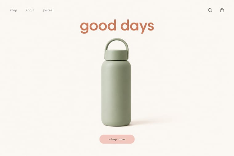
The friendly, frictionless minimalism of 2010s direct-to-consumer start-ups, built for the phone screen, the Instagram feed and the unboxing. Lowercase geometric or neo-grotesque wordmarks, one muted signature colour such as millennial pink, sage or terracotta, seamless-backdrop product photography and chatty copy made mattresses, razors and suitcases look interchangeable, a sameness critics called 'blanding' before brands swung to colourful maximalism around 2021–2022.
Make something in this styleGet advice in this styleMix it with another style
01
How it works
- Set the wordmark in a lowercase or sentence-case geometric or neo-grotesque sans, lightly tracked and without a symbol.
- Own one muted signature colour (millennial pink, sage, terracotta or butter yellow) and apply it in large flat blocks across packaging, site and ads.
- Shoot products as isolated objects on seamless backdrops that match the brand colour, or as tidy flat-lays.
- Let short, witty, conversational copy carry the personality instead of ornament or illustration.
- Design for the phone and the unboxing: big type, generous white space and a small surprise printed inside the box.
New York direct-to-consumer start-ups and their branding agencies (Warby Parker, Casper, Glossier, Away), spread through Instagram and e-commerce
02
Its design choices
From Stylogeny’s vocabulary of design choices: defining choices make the style, characteristic ones are usual, occasional ones turn up now and then.
- Layout & composition
- Space & hierarchy
- Typography
- Colour
- Form & shape
- Surface & texture
- Ornament
- Tone & intent
- Avoids
- Abundant decoration, Horror vacui, Ornamented display, Experimental & distorted, Fluorescent & neon, Complementary clash, Photocopy & distress, Authoritative & institutional
Palette
#faf7f2#f4cfc8#d27c5d#a9b8a1#f2e3a8#2b2b2b
Typefaces
Circular
Laurenz Brunner, Lineto, 2013
Graphik
Christian Schwartz, Commercial Type, 2009
Apercu
Colophon Foundry, 2010
Custom lowercase geometric wordmarks
Known for
Warby Parker
founded 2010
Casper mattress identity by Red Antler
2014
Glossier (launched 2014), pale-pink packaging and sans-serif wordmark
Away luggage
founded 2015
Cora (2016), white-and-sans packaging abandoned in its colourful 2022 rebrand
Burberry logo by Peter Saville with Riccardo Tisci (2018), the luxury cousin of the sans-serif convergence
03
Make something in this style
Say what you need, and Stylogeny’s image studio draws it from DTC 'Blanding' / Millennial Minimalism’s design choices and checks it against them. It takes about a minute, and you get a link to share.
04
Where it comes from, and what it’s close to
Before it
The style it grew out of, and the styles it borrowed from.


After it
The styles that grew out of it.

Alike in its design choices
Styles that make many of the same choices, related or not, besides those above.


05
Real works
Artefacts in museums, libraries and archives that show the style, linked at their source.
- Glossier homepage ("Gentle, yet very serious.")Glossier · July 2017 (archived 20 July 2017) · Internet Archive Wayback Machine
- Casper homepage ("Better sleep for brighter days")Casper Sleep (identity by Red Antler) · October 2014 (archived 12 October 2014) · Internet Archive Wayback Machine
- Away homepage ("Thoughtful standards for modern travel")Away · April 2018 (archived 5 April 2018) · Internet Archive Wayback Machine
- Cora homepage ("A better month awaits")Cora · August 2018 (archived 2 August 2018) · Internet Archive Wayback Machine
06
Sources
- Glossy, 'The fall of blanding: DTC labels rebrand to keep up with the era of maximalism' (2022)
- Bloomberg Opinion, 'Welcome to your bland new world of consumer capitalism' (2020)
How Stylogeny researches and checks a style: where the facts come from.