Postmodern · 2007–2018 · North America, Global / networked
Hipster Artisanal Revival
Also known as Hipster logo style, Hipster branding, Brooklyn artisanal, Neo-vintage badge style, Craft branding, B/W Hipster (late phase)
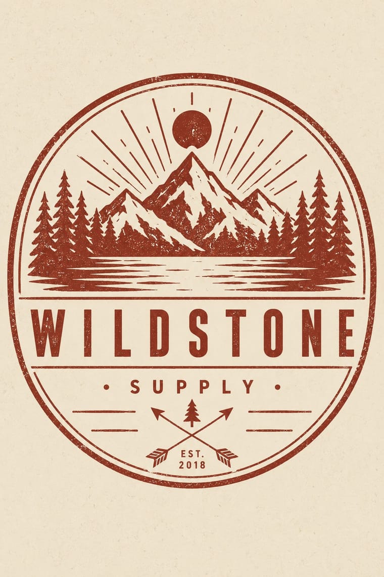
The trade-mark look of the 2007–2018 craft boom, which dressed new coffee roasters, breweries and stationers as nineteenth- and early-twentieth-century firms. A centred one-ink badge holds a line-drawn icon, crossed arrows or an X with words in its quadrants, a triangle and an 'Est.' date for a firm a year old, in tracked sans capitals and a flowing script on kraft, cream or chalkboard. Stock 'Hipster Badges' made it a template; by 2012–13 trend reports and parodies called it overdone, and by 2018 it had matured into colourless, detailed monoline badges that left the arrows and scripts behind.
Make something in this styleGet advice in this styleMix it with another style
Use it with care
The hipster fashion and branding of the same years also borrowed pseudo-Native 'tribal' dress: Adrienne Keene's Native Appropriations (2010) answered the fashion for 'hipster headdresses' by noting that eagle feathers 'have to be earned', and in 2012 the Navajo Nation sued Urban Outfitters over goods sold under the 'Navajo' name. Keep to arrows, triangles and trade-mark devices; do not add feathered headdresses, war bonnets or 'tribal' and 'Navajo' patterns as a heritage shorthand.
01
How it works
- Lock the name into a centred badge, roundel, hexagon or ribbon, with words running round the rim.
- Fill the badge with a few stock signs: crossed arrows or an X with a word in each quadrant, a triangle, a line-drawn product icon, and 'Est.' with the founding year, however recent.
- Set the name in widely tracked sans or slab capitals and pair it with one flowing retro script.
- Print in one dark ink, or one ink and a muted spot colour, on kraft, cream or chalkboard black, and let paper grain or a worn stamp edge age it.
- Borrow the authority of an old trade mark for a new small-batch business, knowing that the quotation shows.
Small coffee, beer, food and stationery brands in Brooklyn and Portland, Oregon; spread worldwide through design blogs, pay-what-you-want fonts and stock elements sold online as 'Hipster Badges'
02
Its design choices
From Stylogeny’s vocabulary of design choices: defining choices make the style, characteristic ones are usual, occasional ones turn up now and then.
- Layout & composition
- Space & hierarchy
- Typography
- Colour
- Form & shape
- Ornament
- Imagery
- Medium & production
- Tone & intent
- Avoids
- Dynamic asymmetry, Lowercase only, Experimental & distorted, Full polychrome, Fluorescent & neon, Pastel, Gradients, Gloss & highlights, Chrome & 3D render, Abundant decoration, 3D render
Palette
#f1e8d6#c4a27a#1e1c1a#2f3532#8e2f25
Typefaces
Wisdom Script (James T. Edmondson, Lost Type, 2011), originally drawn for the 'Woods of Wisdom' poster series
Brothers (John Downer, Emigre, 1999), after a turn-of-the-century chromolithographed Cole Brothers circus letterhead
Futura (Paul Renner, Bauer, 1927), as on the Field Notes cover
Widely letterspaced sans-serif capitals for the lettermark and 'Est.' line
Chalkboard hand-lettering
Dana Tanamachi and followers
Known for
Field Notes memo books (Draplin Design Co. of Portland, Oregon, with Coudal Partners of Chicago, 2007)
a take on farmers' agricultural memo books, Futura on a kraft cover
Dana Tanamachi, chalk lettering for the Ace Hotel New York and Rugby Ralph Lauren window displays 'reminiscent of 1940s-era signage'; Print reported in 2012 that the Wall Street Journal had 'crowned [her] the queen of hipster graphic design'
Jon Contino, New York lettering artist
hand lettering mixing 'nostalgia and vaguely modern touches' with 'New York whaling-era ephemera' (Grain Edit, 2010), whose 'vintage Americana feel' spawned collaborations with indie clothing companies (Adelphi University, 2016); monograph Brand by Hand (Abrams, 2018)
Tim Delger, 'The Hipster Logo Design Guide' (hipsterlogo.com, 2013), a satirical how-to set in Wisdom Script, Brothers and Futura
LogoLounge 2012 trend report (Bill Gardner)
crossed arrows or lines with words in the four quadrants, 'so overdone that designers themselves have begun to parody it'
LogoLounge 2018 trend 'B/W Hipster'
the same style matured into colourless, detailed monoline badges, 'advancing beyond the crossed arrows, flowing casual scripts, and other clichés'
03
Make something in this style
Say what you need, and Stylogeny’s image studio draws it from Hipster Artisanal Revival’s design choices and checks it against them. It takes about a minute, and you get a link to share.
04
Where it comes from, and what it’s close to
Before it
The style it grew out of, and the styles it borrowed from.


After it
The styles that grew out of it.
No later style in the atlas grew out of it yet.
Alike in its design choices
Styles that make many of the same choices, related or not, besides those above.


05
Sources
- Kajian Gaya Hipster dalam Logo, Wimba: Jurnal Komunikasi Visual 5(2), Institut Teknologi Bandung, 2013 (no authors listed; abstract: structural analysis of 12 hipster logos finds 'circular shape, X symbol or X composition of icons, monogram colors, and sans serif type lettermarks' are the basic ingredients, added with 'triangle, "estimated" or similar texts, and several images which represent activities or things in 1800s'; calls it a trending logo style in 2012): https://journal-itb.org/wimba/volumes/2013/5/issues/2/kajian-gaya-hipster-dalam-logo.html
- Bill Gardner, 2012 Logo Trends, LogoLounge (25 April 2012): https://www.logolounge.com/articles/2012-logo-trends
- LogoLounge 2018 trend report, 'B/W Hipster' (GDUSA): the category began 'as stock elements became available online actually marketed as Hipster Badges' and has since matured past 'the crossed arrows, flowing casual scripts, and other clichés'; the marks are 'void of color' but 'rich in detail': https://gdusa.com/logolounge-2018/b-w-hipster
- Fonts in Use, The Hipster Logo Design Guide (Tim Delger, 2013): https://fontsinuse.com/uses/4469/the-hipster-logo-design-guide
- Wikipedia: Field Notes (founded 2007 by Draplin Design Co. of Portland, Oregon, and Coudal Partners of Chicago; modelled on agricultural memo books): https://en.wikipedia.org/wiki/Field_Notes
- Lost Type, About (pay-what-you-want foundry since 2011, co-founded by Riley Cran and Tyler Galpin): https://www.losttype.com/about
- Lost Type, Wisdom Script (James T. Edmondson): https://www.losttype.com/font/?name=wisdom_script
- FINE, on James Edmondson's Wisdom Script (2011 release; 'linked to a growing trend toward artisan aesthetic', it inspired knock-offs and 'blogs dedicated to using it, banning it, or doing fake rebrands with it'): https://www.wearefine.com/news/fines-series-drum-james-edmondsons-wisdom-script-font/
- Emigre, Brothers (John Downer, 1999): https://www.emigre.com/Fonts/Brothers
- Print, 'Chalk Talk' (12 March 2012), on Dana Tanamachi's chalk lettering for the Ace Hotel and Rugby Ralph Lauren, and the Wall Street Journal calling her 'the queen of hipster graphic design': https://www.printmag.com/daily-heller/chalk-talk-1
- Liz Meyer, 'Jon Contino', Grain Edit (29 October 2010): https://grainedit.com/2010/10/29/jon-contino/
- Dan Rossi, 'Jon Contino '05: Portrait of the Artist as a Brand', Adelphi University (13 December 2016): https://www.adelphi.edu/news/jon-contino-05-portrait-of-the-artist-as-a-brand/
- Abrams, Jon Contino, Brand by Hand: Blisters, Calluses, and Clients: A Life in Design (23 October 2018): https://www.abramsbooks.com/product/brand-by-hand_9781683353171/
- Adrienne Keene, 'But Why Can't I Wear a Hipster Headdress?', Native Appropriations (27 April 2010): https://nativeappropriations.com/2010/04/but-why-cant-i-wear-a-hipster-headdress.html
- Turtle Talk, 'Navajo Nation Sues Urban Outfitters for Trademark Violations' (complaint filed 28 February 2012, D.N.M.): https://turtletalk.blog/2012/02/29/navajo-nation-sues-urban-outfitters-for-trademark-violations
- KSL, 'Tribe can seek potentially millions from Urban Outfitters' (1 April 2016), on the 2012 suit over the 'Navajo' name on clothing, jewelry and other merchandise: https://www.ksl.com/article/news/business/tribe-can-seek-potentially-millions-from-urban-outfitters/39137493
- Wikipedia: Hipster (contemporary subculture): https://en.wikipedia.org/wiki/Hipster_(contemporary_subculture)
How Stylogeny researches and checks a style: where the facts come from.