Counterculture · 2008–present · Global / networked
Risograph & Indie Print Culture
Also known as Riso, Riso printing, Riso zine culture
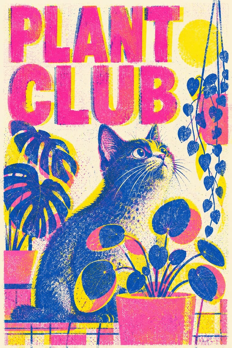
A contemporary culture of zines, art books, posters and prints made on Japanese Risograph stencil duplicators, whose soy-based spot inks (fluorescent pink, yellow, blue, teal) are laid down one drum at a time. Designers embrace the machine's limits: translucent overprints, slight misregistration, grainy coverage and coarse halftones give flat illustration and type a warm, handmade vibrancy at low cost.
Make something in this styleGet advice in this styleMix it with another style
01
How it works
- Separate the artwork into two to four spot colours, one drum per ink, and design for the new hues their overprints create.
- Lean on the fluorescent and bright inks (fluorescent pink, yellow, medium blue, teal) over off-white or coloured uncoated stock.
- Accept, even exaggerate, misregistration, uneven ink coverage and grain as part of the image.
- Build images from flat shapes, coarse halftones and grainy gradients rather than fine detail or full-colour photography.
- Publish small, in short-run zines, posters and art books printed in shared studios and traded at art-book fairs.
Independent print studios, zine publishers and art-book fairs in Europe, North America and East Asia, using Riso Kagaku (Tokyo) stencil duplicators
02
Its design choices
From Stylogeny’s vocabulary of design choices: defining choices make the style, characteristic ones are usual, occasional ones turn up now and then.
- Layout & composition
- Space & hierarchy
- Typography
- Colour
- Form & shape
- Surface & texture
- Ornament
- Imagery
- Medium & production
- Tone & intent
- Avoids
- Gloss & highlights, Chrome & 3D render, Skeuomorphic material, Iridescent & holographic, 3D render, Straight photography, Luxurious & glamorous, Authoritative & institutional
Palette
#ff48b0#ffe800#3255a4#00838a#f15060#f4f1ea
Typefaces
Neo-grotesques set large
e.g. Akzidenz-Grotesk, Helvetica
Monospace and typewriter faces
Hand-drawn display lettering
Known for
Knust
Nijmegen; stencil-duplicator press since 1984
Hato Press
London; founded 2009 by Jackson Lam and Ken Kirton
Risotto Studio and Riso Club
Glasgow; founded 2012 by Gabriella Marcella
Printed Matter's NY Art Book Fair
John Z. Komurki & Luca Bendandi, Risomania
The New Spirit of Printing (Niggli, 2017)
03
Make something in this style
Say what you need, and Stylogeny’s image studio draws it from Risograph & Indie Print Culture’s design choices and checks it against them. It takes about a minute, and you get a link to share.
04
Where it comes from, and what it’s close to
Before it
The style it grew out of, and the styles it borrowed from.


After it
The styles that grew out of it.
No later style in the atlas grew out of it yet.
Alike in its design choices
Styles that make many of the same choices, related or not, besides those above.


05
Real works
Artefacts in museums, libraries and archives that show the style, linked at their source.
- ResistersAqui Thami · ca. 2018 · Victoria and Albert Museum, London (E.669-2019)
- Rosie the Riveter (The Persian Rosie)Ghazal Foroutan · 2022 · Victoria and Albert Museum, London (CD.29-2023)
- Risograph print on the output tray of a Riso duplicatorUnidentified designer; photographed by Quinn Daedal (Flickr: quinn.anya) · 2024 (photographed 26 January 2024) · Wikimedia Commons (from Flickr)
- Two-colour risograph print (A3) of six chair studiesMario Felipe (designer and photographer); printed by A3press · 2014 (photographed 24 November 2014) · Wikimedia Commons (from Flickr)


06
Sources
- John Z. Komurki & Luca Bendandi, Risomania: The New Spirit of Printing (Niggli, 2017)
- AIGA Eye on Design, ‘Tracking the rise of Risograph printing with Glasgow's Risotto Studio’
How Stylogeny researches and checks a style: where the facts come from.