Traditions & vernacular · c. 1180–present · Central Europe, Western Europe, Northern Europe, Southern Europe, North America, Global / networked
Gothic Blackletter & Fraktur Tradition
Also known as Blackletter, Gothic script, Textura, Rotunda, Schwabacher, Fraktur, Gebrochene Schriften (broken scripts), Old English
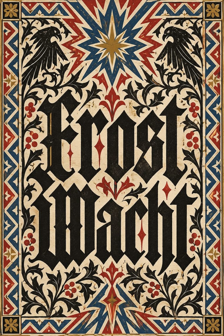
The broken scripts of the Latin West. Textualis, a book hand from the late 12th century (Rotunda its rounder Italian form), went into type with Gutenberg's 42-line Bible (Mainz, c. 1454–55); Schwabacher followed from 1472, and Fraktur was cut for Maximilian I's Prayer Book (1513). Curves break into angles; tight justified pages read as a dark, even weave with red rubrics. Fraktur set German text until the Nazi ban of 1941. Elsewhere it had long become a display letter, and today signals age, gravity or menace on mastheads, beer labels, metal logos and cholo lettering.
Make something in this styleGet advice in this styleMix it with another style
Use it with care
Blackletter carries political weight in German-speaking countries: the Nazi regime pushed Fraktur as the German script in its first years before banning it in January 1941 as supposed 'Schwabacher Jewish letters', and neo-Nazis still use broken scripts. In the United States, too, certain blackletter faces are associated with hate groups, on tattoos and clothing. Check how a blackletter wordmark will read, especially for anything German, national or political. Cholo placas are territorial inscriptions of Los Angeles Latino street writing with their own codes: do not copy a real neighbourhood's placa or roll call, and commission or credit Chicano letterers (such as Chaz Bojórquez) rather than borrowing their menace as decoration.
01
How it works
- Build every letter from a broad pen held at a steep angle and break its curves into straight, angled strokes, so that rows of upright stems with narrow counters and pointed arches weave the page into a dark, even texture.
- Set the text as a justified block, often in two columns, with tight word and line spacing, and let the black of the letters outweigh the white of the page.
- In the manuscript and early printed page, mark headings, initials and divisions in red and with large coloured or flourished initials, not by changing the size or weight of the text letter.
- Follow the grammar of broken type: use the long s and keep the ligatures ch, ck, tz and ſt; emphasise a word by letterspacing it (Sperrsatz) or setting it in Schwabacher rather than in italic or bold; set Latin and French words in roman (Antiqua); never set the capitals as a word in all caps.
- Pair the broken lowercase with Fraktur's swelling, curling capitals, and in display work let a single blackletter nameplate or wordmark carry age, gravity or menace on its own.
Book hands (Textualis) of western European scriptoria from the late 12th century; carried into type by Johannes Gutenberg at Mainz (c. 1454–55); Fraktur first cut at Augsburg and Nuremberg for Emperor Maximilian I (1513–17), and used for German text until the Nazi ban of 1941
02
Its design choices
From Stylogeny’s vocabulary of design choices: defining choices make the style, characteristic ones are usual, occasional ones turn up now and then.
- Layout & composition
- Space & hierarchy
- Typography
- Colour
- Surface & texture
- Ornament
- Medium & production
- Tone & intent
- Avoids
- All caps, Flush left, ragged right, Grotesque & neo-grotesque, Geometric sans, Dynamic asymmetry, Rounded & pill, Pastel, Fluorescent & neon, Gradients, Gloss & highlights
Palette
#efe6cf#1b1714#b0302a#2c4a8c#b8913a
Typefaces
Gutenberg's 42-line Bible textura
Mainz, c. 1454–55
Schwabacher
earliest surviving use Augsburg, 1472
Theuerdank Fraktur
designed by Vinzenz Rockner, cut for Johann Schönsperger, 1517
Breitkopf Fraktur (J. G. I. Breitkopf, Leipzig, 18th century), developed from the Theuerdank type
Walbaum-Fraktur
1800
Wilhelm-Klingspor-Schrift
Rudolf Koch, Klingspor, 1920–26
Cloister Black
American Type Founders, 1904; usually credited to Joseph W. Phinney, sometimes to Morris Fuller Benton; adapted from Priory Text, an 1870s version of William Caslon's blackletter Caslon Text of 1734
Known for
Gutenberg 42-line Bible (Johannes Gutenberg, Mainz, c. 1454–55)
textura type of about 290 sorts, with red headings and initials added by hand
Mainz Psalter (Johann Fust and Peter Schöffer, Mainz, 1457), printed in black and red; the first book with a printed date and a printer's mark
Nuremberg Chronicle (Anton Koberger, Nuremberg, 1493), set in Schwabacher
Prayer Book of Maximilian I
(Johann Schönsperger, Augsburg, 1513), printed on parchment in the first Fraktur type, with marginal drawings (1514–15) by Albrecht Dürer, Lucas Cranach the Elder, Hans Baldung Grien, Albrecht Altdorfer, Hans Burgkmair and Jörg Breu the Elder; now divided between the Bayerische Staatsbibliothek, Munich, and the Bibliothèque municipale, Besançon
Theuerdank (Johann Schönsperger, Nuremberg, 1517)
Fraktur designed by Vinzenz Rockner after the imperial chancery hand, with 118 woodcuts after Hans Schäufelein, Hans Burgkmair and Leonhard Beck
Rudolf Koch's blackletters for the Klingspor foundry, Offenbach
Deutsche Schrift (1908–21), Wilhelm-Klingspor-Schrift (1920–26) and Neufraktur (1933–34)
Blackletter newspaper nameplates
The New York Times, Los Angeles Times and Sydney Morning Herald; the Frankfurter Allgemeine Zeitung has kept a Fraktur title since its first issue in 1949, and the Neue Zürcher Zeitung kept its Fraktur title after moving its text from Fraktur to roman in 1946
Motörhead's band identity, with blackletter lettering by Phil Smee
03
Make something in this style
Say what you need, and Stylogeny’s image studio draws it from Gothic Blackletter & Fraktur Tradition’s design choices and checks it against them. It takes about a minute, and you get a link to share.
04
Where it comes from, and what it’s close to
Before it
The style it grew out of, and the styles it borrowed from.
Nothing earlier is recorded: in the atlas it is a starting point.

After it
The styles that grew out of it.
No later style in the atlas grew out of it yet.
Alike in its design choices
Styles that make many of the same choices, related or not, besides those above.


05
Sources
- Peter Bain & Paul Shaw (eds.), Blackletter: Type and National Identity (Princeton Architectural Press, 1998)
- Albert Kapr, Fraktur: Form und Geschichte der gebrochenen Schriften (Verlag Hermann Schmidt, 1993)
- Silvia Hartmann, Fraktur oder Antiqua: der Schriftstreit von 1881 bis 1941 (Peter Lang, 1998)
- Neue Deutsche Biographie, 'Schönsperger, Johann': https://www.deutsche-biographie.de/sfz79020.html
- Harry Ransom Center, The University of Texas at Austin, The Gutenberg Bible: https://www.hrc.utexas.edu/gutenberg-bible/
- Kris Sowersby, 'Heavy metal typography', Klim Type Foundry (2017; first published in Smith Journal 20, 2016): https://klim.co.nz/blog/heavy-metal-typography/
- François Chastanet, Howard Gribble & Chaz Bojórquez (foreword), Cholo Writing: Latino Gang Graffiti in Los Angeles (Dokument Press, 2024 edition)
- ILAB Breslauer Prize entry, 'Das neue Gebetbuch Kaiser Maximilians I. in seiner Entstehung' (the six artists of the marginal drawings): https://ilabprize.org/breslauer-entries/das-neue-gebetbuch-kaiser-maximilians-i-in-seiner-entstehung
- WFTX, 'Can a font be racist? Certain blackletter typefaces associated with hate groups' (Scripps): https://www.kivitv.com/news/national/can-a-font-be-racist-certain-blackletter-typefaces-associated-with-hate-groups
- MyFonts, Sectra Chrome (Alit Design), a blackletter sold for 'Y2K chrome aesthetics and acid graphics': https://www.myfonts.com/collections/sectra-chrome-font-alit-design
- https://en.wikipedia.org/wiki/Blackletter
- https://en.wikipedia.org/wiki/Fraktur
- https://en.wikipedia.org/wiki/Schwabacher
- https://en.wikipedia.org/wiki/Antiqua%E2%80%93Fraktur_dispute
- https://en.wikipedia.org/wiki/Gutenberg_Bible
- https://en.wikipedia.org/wiki/Mainz_Psalter
- https://en.wikipedia.org/wiki/Rudolf_Koch
- https://en.wikipedia.org/wiki/Cloister_Black
- https://en.wikipedia.org/wiki/Rotunda_(script)
- https://en.wikipedia.org/wiki/List_of_typefaces_designed_by_Morris_Fuller_Benton
- https://en.wikipedia.org/wiki/The_New_York_Times
- https://en.wikipedia.org/wiki/Charles_Boj%C3%B3rquez
- https://de.wikipedia.org/wiki/Normalschrifterlass
- https://de.wikipedia.org/wiki/Theuerdank
- https://de.wikipedia.org/wiki/Fraktur_(Schrift)
- https://de.wikipedia.org/wiki/Sperrsatz
- https://de.wikipedia.org/wiki/Frankfurter_Allgemeine_Zeitung
- https://de.wikipedia.org/wiki/Neue_Z%C3%BCrcher_Zeitung
How Stylogeny researches and checks a style: where the facts come from.