Rational modernism · 2004–present · Middle East & North Africa, Western Europe, Global / networked
Contemporary Arabic & Dual-Script Type Design
Also known as Arabic type modernism, Bilingual Arabic–Latin typography, Dual-script type design, Typographic Matchmaking
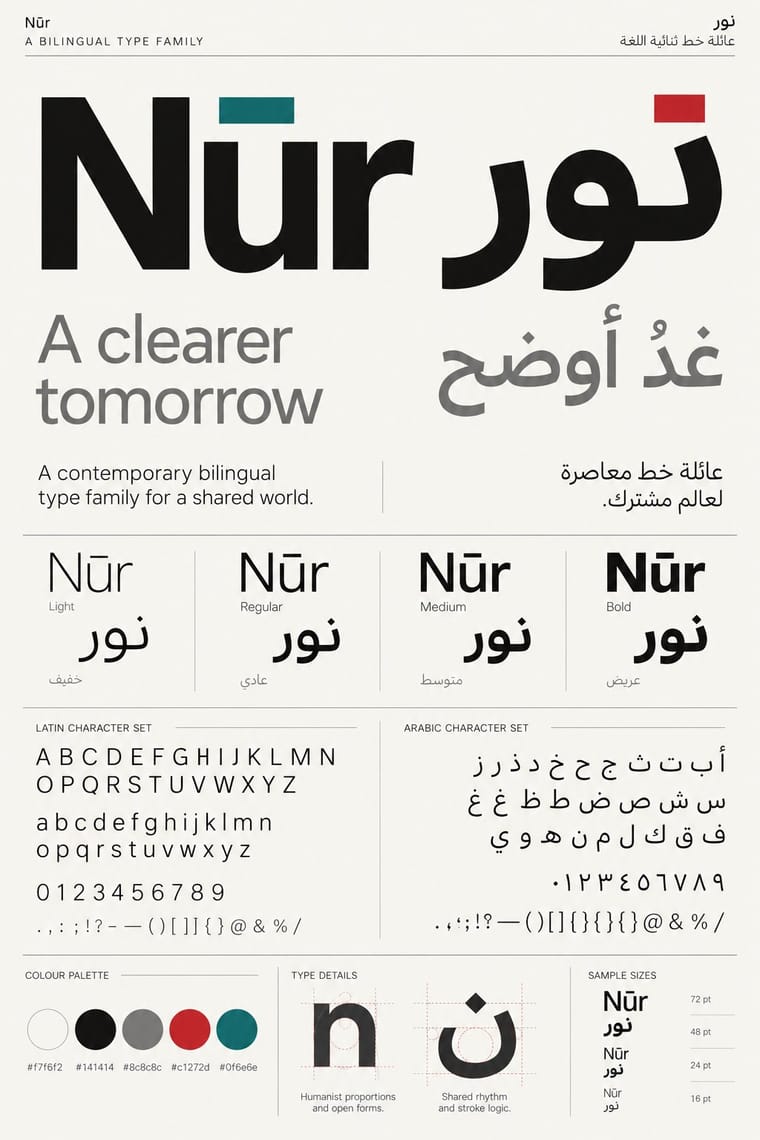
A twenty-first-century type culture that redraws Arabic as a family matched to a Latin companion in weight, proportion and contrast, so the two scripts can share a page, screen or sign as equals. The Khatt Foundation's Typographic Matchmaking (2007) did much to launch it, and foundries such as 29LT and TPTQ Arabic carried it forward. It favours low-contrast Kufi- and Naskh-derived forms, a firm horizontal baseline and mirrored grids for identities, wayfinding and interfaces.
Make something in this styleGet advice in this styleMix it with another style
Use it with care
Arabic must be set with correct contextual shaping and right-to-left direction; disconnected or reversed letters are a common and offensive error. Have every Arabic word checked by a fluent reader, avoid setting Qur'anic verses or the names of God and the Prophet as decorative texture, and commission or credit Arabic type designers rather than deriving Arabic glyphs from a Latin font.
01
How it works
- Design the Arabic and the Latin as one family, matching weight, proportion, stroke contrast and colour on the page so neither script looks like an afterthought.
- Build the Arabic on low-contrast Kufi or simplified Naskh structures with a firm horizontal baseline, and reduce vertical stacking and ligatures for screens and signs.
- Give both scripts equal hierarchy by mirroring the grid for right-to-left and left-to-right text rather than subordinating one to the other.
- Develop the Arabic with native-script designers and calligraphers instead of deriving it mechanically from the Latin.
- Keep the system ornament-free and rational so the letters themselves carry a contemporary Arab identity.
The Khatt Foundation (Amsterdam, 2004), Dutch and Reading type-design programmes, and foundries and studios in Beirut, the Gulf and Europe
02
Its design choices
From Stylogeny’s vocabulary of design choices: defining choices make the style, characteristic ones are usual, occasional ones turn up now and then.
- Layout & composition
- Space & hierarchy
- Typography
- Colour
- Surface & texture
- Ornament
- Medium & production
- Tone & intent
- Avoids
- Abundant decoration, Ornamented display, Tight setting, Painterly brushwork, Horror vacui, Painterly illustration
Palette
#f7f6f2#141414#8c8c8c#c1272d#0f6e6e
Typefaces
Frutiger Arabic and Helvetica Arabic
Nadine Chahine
29LT UA Neo B and UA Neo N
after Nasri Khattar's Unified Arabic
Qandus
Khatt Foundation; Latin, Arabic and Neo-Tifinagh
Low-contrast Kufi- and Naskh-derived Arabic text sans
Known for
Khatt Foundation, founded by Huda Smitshuijzen AbiFarès
Amsterdam, 2004
Typographic Matchmaking (2007)
Gerard Unger & Nadine Chahine, Martin Majoor & Pascal Zoghbi, Lucas de Groot & Mounir Al Shaarani, Peter Bilak & Tarek Atrissi, Fred Smeijers & Lara Assouad Khoury
TPTQ Arabic foundry
Peter Bilak & Kristyan Sarkis
29LT (Pascal Zoghbi), UA Neo B and UA Neo N, revivals of Nasri Khattar's Unified Arabic
patent filed 1947, granted 1950
Nadine Chahine, Arabic versions of Frutiger, Helvetica and Zapfino for Linotype; Koufiya, an early simultaneously designed Arabic–Latin face
03
Make something in this style
Say what you need, and Stylogeny’s image studio draws it from Contemporary Arabic & Dual-Script Type Design’s design choices and checks it against them. It takes about a minute, and you get a link to share.
04
Where it comes from, and what it’s close to
Before it
The style it grew out of, and the styles it borrowed from.


After it
The styles that grew out of it.
No later style in the atlas grew out of it yet.
Alike in its design choices
Styles that make many of the same choices, related or not, besides those above.


05
Real works
Artefacts in museums, libraries and archives that show the style, linked at their source.
- Frutiger Arabic, type specimenNadine Chahine for Linotype (typeface); specimen image by Paqribas · Typeface 2007; specimen image 2011 · Wikimedia Commons
- Khatt Foundation, Center for Arabic Typography: logoKhatt Foundation (image credited on khtt.net to Huda Smitshuijzen AbiFarès) · By 6 August 2010 (date of the logo image on khtt.net) · khtt.net, Khatt Foundation (Wayback Machine capture, 9 December 2019)
- Fedra Arabic, early proof with correctionsPeter Biľak, with Tarek Atrissi (Typographic Matchmaking) · 2005 · TPTQ Arabic, 'Fedra Arabic, 10 years later' (Wayback Machine capture, 31 December 2015)
- 29LT UA Neo B and N, type specimenPascal Zoghbi (29LT), after Nasri Khattar's Unified Arabic · Typeface published 2013; specimen pages online by November 2019 · 29LT foundry website (Wayback Machine capture, 29 June 2026)
- Typographic Matchmaking in the City: Propositions for a Pluralist Public Space (book cover)Khatt Foundation; edited by Huda Smitshuijzen AbiFarès (Khatt Books) · 2010 · khtt.net, Khatt Foundation (Wayback Machine capture, 3 January 2012)

06
Sources
- Wikipedia, 'Khatt Foundation' (https://en.wikipedia.org/wiki/Khatt_Foundation)
- Typotheque, 'New book: Typographic Matchmaking' (2007) (https://www.typotheque.com/blog/new-book-typographic-matchmaking)
- Works That Work 6, 'Unified Arabic' (https://worksthatwork.com/6/unified-arabic)
- 29LT, 'Nasri Khattar' (https://www.29lt.com/designer/nasri-khattar/)
How Stylogeny researches and checks a style: where the facts come from.