Rational modernism · 1950–1975 · Central Europe
International Typographic Style
Also known as Swiss Style, Swiss Modernism
A post-war refinement of the New Typography in which the mathematical grid, objective photography and neo-grotesque sans-serifs were used to communicate with clarity and neutrality. Taught at the Basel and Zurich schools, it became the default language of international corporate and institutional communication.
Make something in this styleGet advice in this styleMix it with another style

01
How it works
- Build every layout on a mathematically derived modular grid.
- Set text flush left, ragged right, in a neutral sans-serif.
- Prefer objective photography over illustration.
- Create hierarchy through scale, weight and position rather than ornament.
- Use white space as an active compositional element.
Zurich & Basel, Switzerland
02
Its design choices
From Stylogeny’s vocabulary of design choices: defining choices make the style, characteristic ones are usual, occasional ones turn up now and then.
- Layout & composition
- Space & hierarchy
- Typography
- Colour
- Form & shape
- Surface & texture
- Imagery
- Medium & production
- Tone & intent
- Avoids
- Abundant decoration, Floral & vegetal, Ornamented display, Script, Eclectic mixing, Central symmetry, Horror vacui, Skeuomorphic material
Palette
#f2f0e9#111111#e1251b#7a7a7a#1f4e9c
Typefaces
Akzidenz-Grotesk
Helvetica
Univers
Neue Haas Grotesk
Known for
Josef Müller-Brockmann
Zurich Tonhalle posters
Armin Hofmann
Basel School of Design
Emil Ruder
Typographie, 1967
Max Bill
Neue Grafik journal
1958–1965
Max Miedinger & Eduard Hoffmann
Helvetica, 1957
03
Make something in this style
Say what you need, and Stylogeny’s image studio draws it from International Typographic Style’s design choices and checks it against them. It takes about a minute, and you get a link to share.
04
Where it comes from, and what it’s close to
Before it
The style it grew out of, and the styles it borrowed from.


After it
The styles that grew out of it.
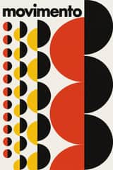

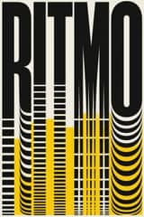
- Led toGreek Tourism Modernism (EOT)
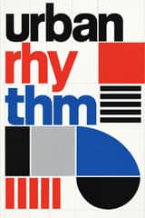
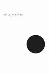
- Led toSwiss Punk / New Wave Typography
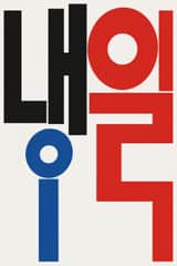


Alike in its design choices
Styles that make many of the same choices, related or not, besides those above.


05
Real works
Artefacts in museums, libraries and archives that show the style, linked at their source.
- Gestaltungsprobleme des Grafikers / The Graphic Artist and his Design Problems / Les problèmes d'un artiste graphique (cover, first edition)Josef Müller-Brockmann · 1961 · Museum für Gestaltung Zürich, Graphics Collection (L MUEL 1)
- der Film (exhibition poster, Kunstgewerbemuseum Zürich)Josef Müller-Brockmann · 1960 · The Museum of Modern Art, New York (57.1960)
- Max Gubler, Irène Zurkinden – Kunsthalle Basel, 24 Okt.–22 Nov.Armin Hofmann · 1959 · Museum für Gestaltung Zürich, Poster Collection (02-0769)
- Form & Farbe – Gewerbemuseum Winterthur, Ausstellung des Schweizerischen Werkbunds SWBArmin Hofmann · 1951 · Museum für Gestaltung Zürich, Poster Collection (02-0669)
- Tempel und Teehaus in Japan – Ausstellung im Gewerbemuseum BaselArmin Hofmann · ca. 1955 · Victoria and Albert Museum, London (E.4-2006)
- TM Typographische Monatsblätter, no. 4, April 1953 (cover)Emil Ruder · April 1953 · Museum für Gestaltung Zürich (eMuseum)
06
Sources
- Philip B. Meggs & Alston W. Purvis, Meggs' History of Graphic Design
- Josef Müller-Brockmann, Grid Systems in Graphic Design (1981)
How Stylogeny researches and checks a style: where the facts come from.