Rational modernism · 2011–present · North America, Northern Europe, Global / networked
Slow-Living Editorial (the Kinfolk Look)
Also known as Kinfolk aesthetic, Slow-living magazine style
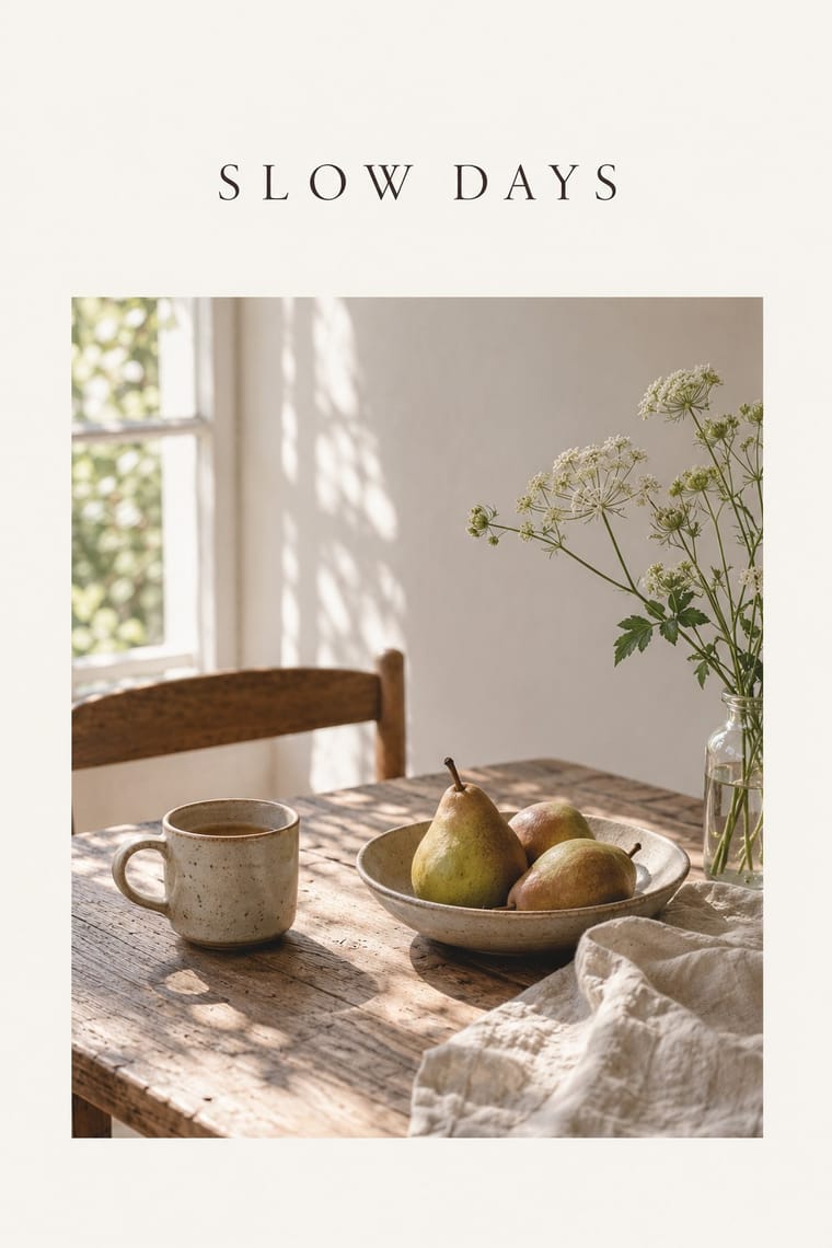
The look of Kinfolk, the slow-living quarterly founded in Portland in 2011 and run from Copenhagen since 2015, and of the indie lifestyle titles and Instagram feeds that copied it. Soft, naturally lit photographs of laid tables, wood-and-linen interiors and their unhurried owners sit in wide white margins on matte paper; a classical serif and slender capitals carry little text; colour stays in whites, oatmeal, wood and pastel. By 2014 'Kinfolk' was used as an adjective for a kind of photography.
Make something in this styleGet advice in this styleMix it with another style
Use it with care
Kinfolk and Cereal are living titles with their own mastheads and photographers: take the method (natural light, wide margins, a quiet serif), shoot or license your own pictures, and never letter the KINFOLK masthead or present a layout as an issue. Critics noted that its early pages pictured mostly young, white and beautiful people; cast, locate and style photographs widely so the calm does not become a single social type. By 2016 the magazine itself was casting more widely (FIT Library blog), so take the later issues, not the early imitators, as the model.
01
How it works
- Let one soft photograph carry each page: a laid table seen from above, a still life, a quiet room or its owner at ease, shot in daylight in a lived-in setting rather than on a studio sweep.
- Hold pictures and short texts in wide white margins, and leave the facing page nearly empty.
- Set text in a classical serif such as Garamond, with headings centred or in slender capitals, and keep the type small and quiet.
- Keep colour to paper white, oatmeal, wood, linen and one pastel ground; leave saturated and synthetic hues out.
- Print on matte, uncoated stock and let film-like grain show, so the page feels soft and handled rather than glossy.
- Build each issue around a theme and pace it slowly: recipes, home tours, portraits and essays in a calm sequence.
Portland, Oregon, where Nathan Williams, Katie Searle-Williams and Doug and Paige Bischoff founded the quarterly Kinfolk in July 2011 (first issues published by Weldon Owen, San Francisco); run from Copenhagen since 2015
02
Its design choices
From Stylogeny’s vocabulary of design choices: defining choices make the style, characteristic ones are usual, occasional ones turn up now and then.
- Layout & composition
- Space & hierarchy
- Typography
- Colour
- Form & shape
- Surface & texture
- Medium & production
- Tone & intent
- Avoids
- Horror vacui, Visual tension, Abundant decoration, Emblems & badges, Ornamented display, Experimental & distorted, Fluorescent & neon, Gloss & highlights, Flat vector illustration, 3D render, Ironic & self-aware, Full polychrome, Type as image
Palette
#f7f4ee#e8dfd3#dfcabf#b8bfae#9a7b5f#2d2a27
Typefaces
Garamond, Kinfolk's brand typeface, kept for body text through Charlotte Heal's 2015 redesign
It's Nice That, 2015
The slender capitals of the KINFOLK masthead, 'the same slender text as on the cover of each of the magazine's issues' (Portland Monthly, 2014), reworked by Abi Huynh in 2015
Avenir as the sans-serif companion, with Fortescue Pro and Tw Cen MT for heads and Swift for decks, in Heal's issue 14 redesign
A custom serif family (text, deck and display cuts with italics) and a secondary sans-serif drawn by Schick Toikka for the 2021 tenth-anniversary redesign
Known for
Kinfolk issues 1–13 (Portland, from July 2011), designed by Amanda Jane Jones
centred headers and photographs held in large white borders, with few full-bleed images
Kinfolk issue 14 (2015), redesigned by creative director Charlotte Heal, with a logotype reworked by Abi Huynh and more full-bleed photo essays
Kinfolk issue 22 (November 2016), the 'work' issue, redesigned by design director Alex Hunting on a larger format and a 12-column grid
Kinfolk issue 40, 'Future' (2021), the tenth-anniversary redesign by Alex Hunting Studio with typefaces by Schick Toikka, which dropped the white bars from the cover (shortlisted, D&AD Awards 2022, Magazine & Newspaper Design / Independent Magazines)
Matte covers on pastel grounds, such as issue 16, 'The Essentials Issue', and issue 19, 'The Adrenaline Issue'
Dezeen, 2016
The Kinfolk Table
Recipes for Small Gatherings (Artisan Books, 2013) and The Kinfolk Home: Interiors for Slow Living (Artisan Books, 2015)
Cereal (Bath, from December 2012; Rosa Park and Rich Stapleton), quarterly, then twice-yearly from 2015, known for its 'calm and pared-back aesthetic'
Instagram's 'very curated images of table settings' and 'over-styled, washed-out' photos of succulents and coffee (Dezeen, 2016), which Fab co-founder Jason Goldberg called 'the Kinfolk look' and Williams 'a beast on its own', though 'there's not a single photo of a latte' on the Kinfolk Instagram
03
Make something in this style
Say what you need, and Stylogeny’s image studio draws it from Slow-Living Editorial (the Kinfolk Look)’s design choices and checks it against them. It takes about a minute, and you get a link to share.
04
Where it comes from, and what it’s close to
Before it
The style it grew out of, and the styles it borrowed from.


After it
The styles that grew out of it.
No later style in the atlas grew out of it yet.
Alike in its design choices
Styles that make many of the same choices, related or not, besides those above.
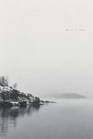
- Contemporary Chinese Book Design ('Most Beautiful Books of China')60% alike



- Post-Punk Record Sleeve (Stiff, Factory, 4AD)47% alike


05
Sources
- Wikipedia, Kinfolk (magazine) (founded July 2011 in Portland by Nathan Williams, Katie Searle-Williams, Doug and Paige Bischoff; quarterly with seasonal themes; Chinese, Japanese and Korean editions; books with Artisan: The Kinfolk Table 2013, The Kinfolk Home 2015, The Kinfolk Entrepreneur 2017; Tim Murphy, New York Times: 'the Martha Stewart Living of the Portland Set'): https://en.wikipedia.org/wiki/Kinfolk_(magazine)
- Dan Howarth, 'Kinfolk's influence on Instagram is "kind of scary" says magazine's co-founder', Dezeen, 2 March 2016 (first issue July 2011; first published by Weldon Owen, independent after the seventh issue; headquarters moved to Copenhagen the previous year; circulation 80,000; around 176 pages on 80# Accent Opaque stock; 'a minimal matte cover with a pastel-coloured background'; 'to really keep it quite minimal, not just the layouts but also the colour scheme'; Dezeen's own 'earthy, analogue-style photography of rustic interiors and objects', introducing Fab co-founder Jason Goldberg's 'a little bit like Brooklyn, a little bit Shoreditch, hipster yet accessible' and 'Everyone wants to have the Kinfolk look'; Howarth's question on 'the very curated images of table settings' on Instagram and Dezeen's 'over-styled, washed-out Instagram photo of a succulent or a cup of coffee'; 'We'll never shoot or feature a home without including a portrait of the home owner'; Ouur clients Zara, Toast, West Elm, Diesel and LG Electronics; 'just a beast on its own'; 'If you go through the Kinfolk Instagram there's not a single photo of a latte'): https://www.dezeen.com/2016/03/02/kinfolk-magazine-interview-founder-editor-in-chief-nathan-williams-instagram/
- Benjamin Tepler, 'Kinfolk Magazine Takes Over the World', Portland Monthly, 2 April 2014 ('visual vernacular of natural light and reclaimed wood'; 'soft focus and overhead shots of tables'; 80-pound matte paper; 'the same slender text as on the cover of each of the magazine's issues'; ''Kinfolk' is an adjective to describe their type of photography now'; 'a growing group of imitators'): https://www.pdxmonthly.com/news-and-city-life/2014/04/kinfolk-magazines-family-business-april-2014
- James Cartwright, 'We discuss Kinfolk's redesign with creative director Charlotte Heal', It's Nice That, 15 January 2015 (issue 14; original design by Amanda Jane Jones with centred headers and all photographs in large white borders; Garamond kept as brand typeface, Avenir, Fortescue Pro, Tw Cen MT and Swift added; logo reworked by Abi Huynh; more full-bleed images): https://www.itsnicethat.com/articles/kinfolk-redesign-charlotte-heal
- Jenny Brewer, 'Kinfolk unveils redesign for latest issue, and a star-studded "editorial board"', It's Nice That, 21 November 2016 (issue 22; design director Alex Hunting; larger format, 12-column grid, serif typefaces; editorial board including Leonard Koren and Jonas Bjerre-Poulsen; Copenhagen gallery by Norm Architects): https://itsnicethat.com/news/kinfolk-redesign-issue-22-211116
- Jeremy Leslie, interview with Alex Hunting, magCulture, 5 December 2016 (evolving rather than replacing the design; frame the photography 'and not let your design ego get in the way of it'; other titles copying Kinfolk's design): https://magculture.com/blogs/journal/alex-hunting-design-director-kinfolk
- Ruby Boddington, 'To celebrate ten years in print, Kinfolk undergoes total redesign with custom typefaces from Schick Toikka', It's Nice That, 23 June 2021 (text, deck and display serif cuts with italics and a secondary sans; 'dropping the iconic white bars from the cover'; new grid and paper stock): https://itsnicethat.com/news/kinfolk-tenth-anniversary-redesign-schick-toikka-publication-graphic-design-230621
- D&AD Awards archive, Kinfolk Issue 40, 2022, shortlisted, Magazine & Newspaper Design / Independent Magazines (Alex Hunting Studio as lead; complete redesign and custom typefaces for ten years in print): https://www.dandad.org/work/d-ad-awards-archive/kinfolk-issue-40
- George & Willy, interview with Amanda Jane Jones (founding designer; 'design it from scratch'; 'Issue 13 was my last'): https://www.georgeandwilly.com/blogs/blog/amanda-jane-jones-kinfolk-magazine
- Marjorie Skinner, 'Prairie Porn and Product: Kinfolk's Ouur', Portland Mercury, 30 April 2014 (quoting the New York Times on 'elegant white pages showing little more than beautiful, dreamy young (mostly white) people'): https://www.portlandmercury.com/Media/2014/04/30/12342079/prairie-porn-and-product-kinfolks-ouur
- Beth, 'Fashionable Minimalism', Volumes and Issues, FIT Library blog, 28 October 2016 (Kinfolk's 'white-edge, spare typeface, watercolor-embellished concept', the support for image.painterly 0.3; 'Each issue is built around a theme'; 'stylized, minimalist hipster magazine'; 'diverse models and interviewees throughout'; Cereal founded 2012 by Rosa Park and Rich Stapleton): https://blog.fitnyc.edu/volumesandissues/2016/10/28/fashionable-minimalism/
- Wikipedia, Cereal (magazine) (first issue 3 December 2012; Bath; Rosa Park and Rich Stapleton; launched as a quarterly and biannual from Volume 9 (2015); 'signature calm and pared-back aesthetic'): https://en.wikipedia.org/wiki/Cereal_(magazine)
How Stylogeny researches and checks a style: where the facts come from.