Traditions & vernacular · c. 1460–1600 · Southern Europe, Western Europe, Central Europe
Renaissance Book Typography
Also known as Humanist typography, Aldine style, Renaissance printing
The printed book as shaped by humanist Italy and France: roman and italic types modelled on humanist handwriting, a single justified text block set in harmonious proportions within generous margins, and woodcut initials, borders and printer's devices as the only ornament. Its page became the default model of the Western book for the next five centuries.
Make something in this styleGet advice in this styleMix it with another style
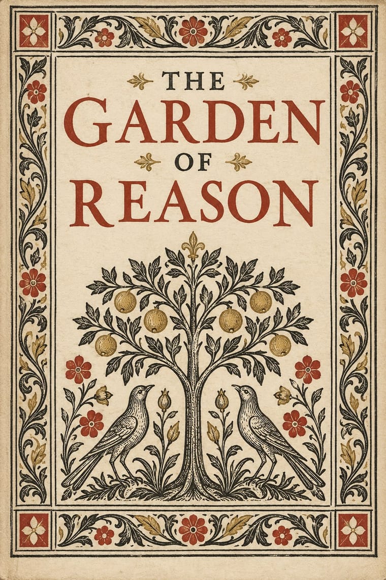
01
How it works
- Set a single justified block of humanist roman in harmonious page proportions, with inner and top margins narrower than fore-edge and foot.
- Open texts with a large woodcut or engraved initial and set titles in centred capitals, tapering the lines into an inverted triangle.
- Use italic as a separate voice for prefaces, verse or whole pocket editions, not for scattered emphasis.
- Print black on cream rag paper and add red only as a rubric second colour.
- Frame title pages in architectural or arabesque woodcut borders and sign the book with a printer's device.
Subiaco, Rome and Venice; later Paris, Lyon, Basel and Antwerp
02
Its design choices
From Stylogeny’s vocabulary of design choices: defining choices make the style, characteristic ones are usual, occasional ones turn up now and then.
- Layout & composition
- Space & hierarchy
- Typography
- Form & shape
- Surface & texture
- Ornament
- Medium & production
- Tone & intent
- Avoids
- Dynamic asymmetry, Flush left, ragged right, Eclectic mixing, Ornamented display, Grotesque & neo-grotesque, Full polychrome, Horror vacui
Palette
#f3ead8#1b1915#b23a2b#8a6e4b#b8973f
Typefaces
Jenson's roman
revived as Centaur and Adobe Jenson
Griffo's roman
revived as Bembo
Griffo's Aldine italic
Garamont's romans
Garamond revivals
Granjon's italics and Civilité
Known for
Nicolas Jenson, Eusebius, De praeparatione evangelica
Venice, 1470
Aldus Manutius & Francesco Griffo, Hypnerotomachia Poliphili (1499) and italic octavos
1501
Erhard Ratdolt, Regiomontanus' Kalendarium with decorated title page
Venice, 1476
Geofroy Tory, Champ fleury
1529
Claude Garamont and Robert Estienne
Paris
Johann Froben with Hans Holbein the Younger's title borders
Basel
Christophe Plantin, Polyglot Bible
Antwerp, 1568–73
03
Make something in this style
Say what you need, and Stylogeny’s image studio draws it from Renaissance Book Typography’s design choices and checks it against them. It takes about a minute, and you get a link to share.
04
Where it comes from, and what it’s close to
Before it
The style it grew out of, and the styles it borrowed from.


After it
The styles that grew out of it.


Alike in its design choices
Styles that make many of the same choices, related or not, besides those above.


05
Real works
Artefacts in museums, libraries and archives that show the style, linked at their source.
- Hypnerotomachia PoliphiliFrancesco Colonna (author); Aldus Manutius (printer); woodcuts attributed to Benedetto Bordone · December 1499 · The Metropolitan Museum of Art
- Sphaera mundi, with Peuerbach's Theoricae novae planetarumErhard Ratdolt (printer); texts by Johannes de Sacrobosco, Georg von Peuerbach and Regiomontanus · 1485 · The Metropolitan Museum of Art
- Eusebius, De evangelica praeparatione, fol. 1rNicolas Jenson (printer) · 1470 · Bridwell Library, Southern Methodist University (via Wikimedia Commons)
- Champ fleury, book III, fol. 32v (the letters Æ and AE)Geofroy Tory (author, designer and publisher), with Gilles de Gourmont · 1529 · Bibliothèque nationale de France, Gallica (via Wikimedia Commons)
- Title page of Erasmus, Christiani matrimonii institutio, in Holbein's Cleopatra borderHans Holbein the Younger (border design), Hans Lützelburger (block cutter), Johann Froben (printer) · 1526 (border first used 1523) · British Museum, 1864,1114.753


06
Sources
- Daniel Berkeley Updike, Printing Types: Their History, Forms, and Use (1922)
- Harry Carter, A View of Early Typography up to about 1600 (1969)
- Robert Bringhurst, The Elements of Typographic Style
How Stylogeny researches and checks a style: where the facts come from.