Rational modernism · 2005–present · Global / networked, Central Europe, Western Europe
Neo-Swiss Revival
Also known as Neo-Swiss, Swiss revival, Neo-modernism
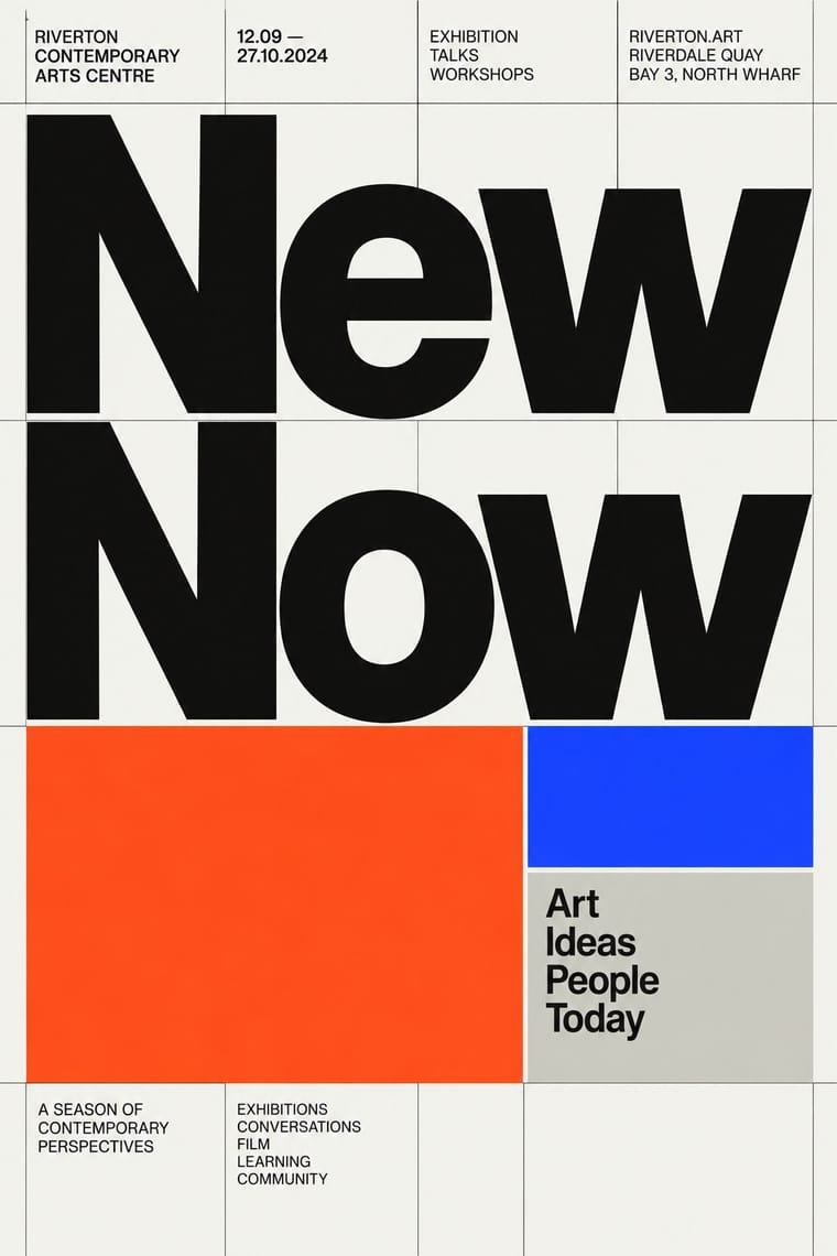
A contemporary revival of the International Typographic Style, fuelled by digital re-releases of neo-grotesques and by studios such as Experimental Jetset and Norm: modular grids, flush-left grotesque type, huge tightly set headlines and flat fields of black, white and one signal colour. It treats Swiss modernism as a living toolkit for posters, identities and the responsive web, sometimes with a knowing, citational wink.
Make something in this styleGet advice in this styleMix it with another style
01
How it works
- Build every layout on a strict modular grid and let the structure show through hairline rules, index-like tables and aligned captions.
- Set everything in one contemporary neo-grotesque, flush left, using weight and dramatic size jumps instead of extra typefaces.
- Let huge, tightly tracked display type act as the image against small, precise text.
- Hold colour to black, off-white and one saturated signal accent such as international orange, ultramarine or fluorescent.
- Carry the system onto screens with responsive grids, kinetic type and variable-font motion.
Zurich, Amsterdam and London studios and independent type foundries
02
Its design choices
From Stylogeny’s vocabulary of design choices: defining choices make the style, characteristic ones are usual, occasional ones turn up now and then.
- Layout & composition
- Space & hierarchy
- Typography
- Colour
- Form & shape
- Surface & texture
- Imagery
- Medium & production
- Avoids
- Abundant decoration, Floral & vegetal, Ornamented display, Script, Skeuomorphic material, Gloss & highlights, Horror vacui, Flat vector illustration
Palette
#f5f5f0#111111#ff4a1c#1d3bff#c8c8c3
Typefaces
Akkurat
Lineto
Neue Haas Grotesk
Christian Schwartz revival
Suisse Int'l
Swiss Typefaces
GT America
Grilli Type
Helvetica Now
Known for
Experimental Jetset
Amsterdam
Norm
Dimitri Bruni & Manuel Krebs, Zurich
Lineto type foundry
Cornel Windlin & Stephan Müller
Gary Hustwit, Helvetica
documentary, 2007
Mike Joyce, Swissted poster series
Unit Editions
Tony Brook & Adrian Shaughnessy, London
03
Make something in this style
Say what you need, and Stylogeny’s image studio draws it from Neo-Swiss Revival’s design choices and checks it against them. It takes about a minute, and you get a link to share.
04
Where it comes from, and what it’s close to
Before it
The style it grew out of, and the styles it borrowed from.


Alike in its design choices
Styles that make many of the same choices, related or not, besides those above.


05
Real works
Artefacts in museums, libraries and archives that show the style, linked at their source.
- Changing Ideals – Re-Thinking The HouseExperimental Jetset (Marieke Stolk, Danny van den Dungen, Erwin Brinkers) · 2008 · Museum für Gestaltung Zürich, Poster Collection (91-0752)
- ABCDEFGHIJKLMNOPQRSTUVWXYZ – HelveticaExperimental Jetset (Marieke Stolk, Danny van den Dungen, Erwin Brinkers) · 2006 · Museum für Gestaltung Zürich, Poster Collection (91-0761)
- ReplicaNorm (Dimitri Bruni, Manuel Krebs, Ludovic Varone) · 2009 · Museum für Gestaltung Zürich, Graphics Collection (L NORM 2)
- Back in black – Akkurat schwarzLaurenz Brunner · 2006 · Museum für Gestaltung Zürich, Poster Collection (58-2061)
- swissted (swissted.com homepage)Mike Joyce (Stereotype Design) · archived 31 January 2012 · Internet Archive Wayback Machine
06
Sources
- Richard Hollis, Swiss Graphic Design: The Origins and Growth of an International Style 1920–1965 (2006)
- Gary Hustwit (dir.), Helvetica (2007)
How Stylogeny researches and checks a style: where the facts come from.