Colour · Strategy
Analogous harmony
Neighbouring hues for a unified, calm field.
A design choice in Stylogeny’s vocabulary, under colour: what is the colour strategy?
- styles make it
- 36
- as a defining choice
- 1
- as a usual one
- 24
- now and then
- 11
- avoid it
- 3
Styles defined by it 1
For these styles it is one of the choices that make the style.
Styles that often use it 24
A characteristic choice: usual in these styles, though not essential.
Ma & Wabi-sabi AestheticsA Japanese aesthetic rooted in Zen and the wabi tea ceremony that prizes austerity, imperfection, impermanence and the charged interval (ma) between things.
Batik Pattern TraditionThe Javanese wax-resist textile tradition in which hot wax is drawn with a canting or stamped with a copper cap, then dyed in successive baths to build layered all-over patterns.
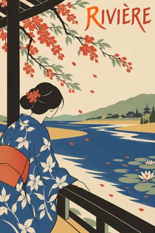
JaponismeThe Western absorption of Japanese woodblock prints, textiles and crafts after Japan reopened to trade in the 1850s.
Art NouveauAn international 'new art' that sought a modern style free of historical revival, drawing its forms from plant growth and the female figure.
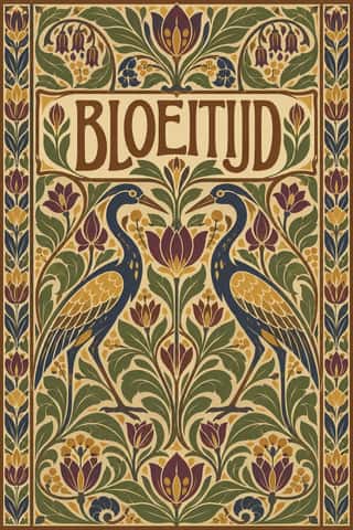
Nieuwe Kunst (Dutch Art Nouveau)The Dutch branch of Art Nouveau, seen mostly in book covers, vignettes and posters.
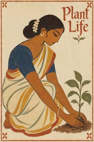
Santiniketan & Bengal School GraphicsThe nationalist, anti-academic art of Calcutta and Santiniketan, which turned from oil-paint naturalism and chromolithograph gloss to Indian and pan-Asian sources.
Cubist Pictorial SpaceThe pictorial revolution of Picasso and Braque that shattered single-point perspective into overlapping, faceted planes seen from several viewpoints at once.
Scandinavian FunctionalismNordic functionalism (funkis) arrived in graphic form with Sigurd Lewerentz's posters and winged emblem for the 1930 Stockholm Exhibition.
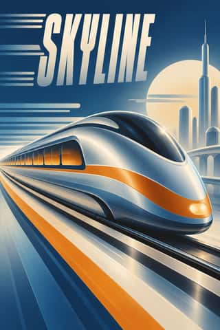
Streamline ModerneThe late, chiefly American phase of Art Deco, in which aerodynamic science became a visual language for a Depression-era culture hungry for progress.
- Hurufiyya Calligraphic ModernismA pan-Arab and Iranian modern-art movement, begun by Madiha Omar in the late 1940s, that freed the letters of the Arabic script from text and used them as abstract visual units.
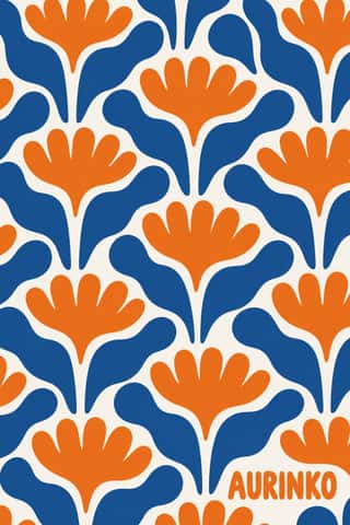
Finnish Bold Print (Marimekko Modernism)The printed-cotton modernism of Marimekko, founded in Helsinki in 1951 by Armi and Viljo Ratia out of Viljo's printing firm Printex.
Zagreb School of Animated FilmThe modernist animation of Zagreb Film's Studio for Animated Film, grown from reduced-animation advertisements of 1954-1955 and named the 'Zagreb school' by Georges Sadoul and André Martin after Cannes 1958.
Hipgnosis Photographic Concept SleeveThe sleeves the London studio Hipgnosis made for Pink Floyd, Led Zeppelin, Genesis, Peter Gabriel, 10cc and others from 1968 to 1983.
ECM Sleeve Aesthetic (Munich)The cover language of the Munich label ECM, made since 1970 by Barbara Wojirsch, Dieter Rehm and later Sascha Kleis and Mayo Bucher with co-founder Manfred Eicher.
City Pop IllustrationThe painted look of Japanese city pop record sleeves and magazine covers, fixed by Hiroshi Nagai's sleeve for Eiichi Ohtaki's A Long Vacation (1981) and Eizin Suzuki's for Tatsuro Yamashita's For You (1982).
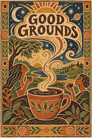
Global Village CoffeehouseThe faux-naive, earth-toned illustration style that late-1980s American designers set against Memphis, and that chain cafés, bookstores, packaging and clip art spread through the 1990s.
- Frutiger AeroThe glossy, optimistic look of consumer technology from the mid-2000s to the early 2010s, retrospectively named in 2017 by the Consumer Aesthetics Research Institute after Windows Vista's Aero interface and Adrian Frutiger's humanist sans.
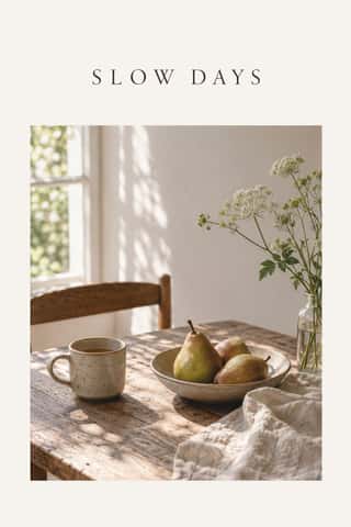
Slow-Living Editorial (the Kinfolk Look)The look of Kinfolk, the slow-living quarterly founded in Portland in 2011 and run from Copenhagen since 2015, and of the indie lifestyle titles and Instagram feeds that copied it.
VaporwaveAn internet-born microgenre and visual aesthetic that remixes the debris of late-20th-century consumer culture (Windows 95 dialogs, classical busts, palm trees, mall interiors, Japanese text, early 3D renders) in pastel pinks and cyans.
DTC 'Blanding' / Millennial MinimalismThe friendly, frictionless minimalism of 2010s direct-to-consumer start-ups, built for the phone screen, the Instagram feed and the unboxing.
Low Poly IllustrationA digital illustration and game look in which subjects are built from a visible mesh of a few flat-shaded polygons, so that animals, faces, vehicles and landscapes read as hard-edged facets with no outline or texture.
SolarpunkHopeful eco-futurist imagery born online.
- Lo-fi Anime AestheticThe look of YouTube's 24/7 lo-fi hip hop streams.
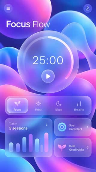
GlassmorphismAn interface style of translucent, frosted panels floating over vivid, blurred backgrounds, so that depth and hierarchy come from layered transparency.
Styles that use it now and then 11
An occasional choice in these styles.
- Ten Bamboo Studio Colour Woodblock (Douban & Gonghua)1626–present
- Diné (Navajo) Weaving Design1700–present
- Harlem Renaissance Graphic Art1925–1940
- Puerto Rican Silkscreen Poster (DIVEDCO & ICP)1946–1989
- Black Metal Graphics1990–present
- Y2K Futurism1997–2005
- Skeuomorphic UI2000–2013
- Contemporary Chinese Book Design ('Most Beautiful Books of China')2003–present
- Synthwave / Outrun2006–present
- Material Design2014–present
- Claymorphism & Soft 3D2020–present
It often goes with
Choices that the styles making it make more often than the atlas as a whole.
- Calm & contemplativein 21 of 36
- Earth & mineralin 22 of 36
- Gradientsin 20 of 36
- Biomorphic curvesin 20 of 36
- Web & CSSin 15 of 36
- Pastelin 14 of 36
Styles that avoid it
Styles that deliberately leave it out.