Digital native · 1999–present · East Asia
Japanese Dense Web Design
Also known as Information-dense Japanese web design, The 'cluttered' Japanese website
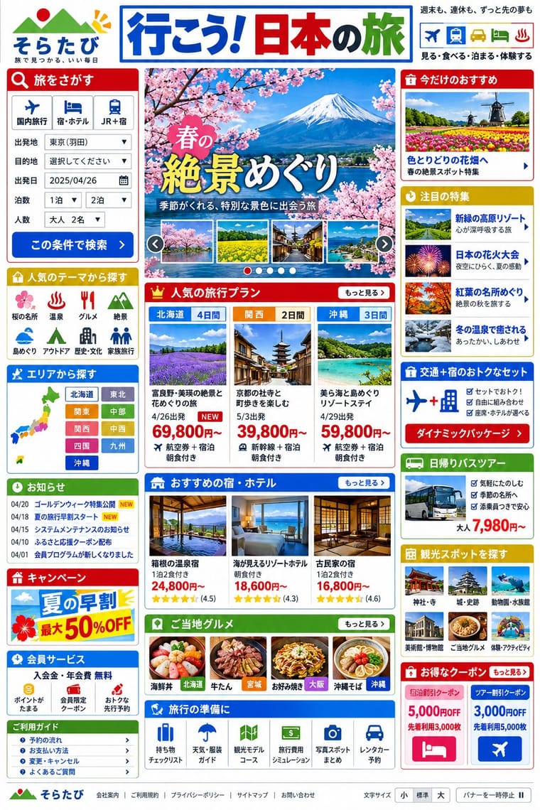
The information-packed look of Japan's big portals, shops, airlines and ministries: three or more narrow columns of boxed modules, crowded with small Japanese text, blue links, tiny thumbnails, dated news lists and rotating ad banners, in bright colours on a white page. Grown from the link directories of the late-1990s portals, often tied to the text-heavy phone web of i-mode, and kept by Yahoo! JAPAN, Rakuten and Kakaku.com into the 2020s, it puts completeness before calm and builds hierarchy with colour and boxes instead of type size.
Make something in this styleGet advice in this styleMix it with another style
Use it with care
Treat this as one Japanese web convention among several, not as a national essence or simply as bad design: commentators argue the density serves readers who want complete information before deciding (McGowan, 2018; Fujitsu Benelux, 2025), and many Japanese brands (MUJI, UNIQLO, POLA) choose minimal sites. Similar density appears on Korean portals such as Naver, which Fujitsu Benelux sets beside Yahoo! JAPAN, and Cruz found other regions that write in CJK characters close to Japan, so do not present it as uniquely Japanese. Dense pages still need accessibility work: offer a text-size control and a pause button for rotating banners, as mhlw.go.jp does, and give headlines lettered as images real text or alt text.
01
How it works
- Put everything on the first screen: lay the page out in three or more narrow columns of boxed modules, each under a coloured heading bar or tab, and fill every box with text links, prices, dates and thumbnails rather than leaving room to breathe.
- Let colour, boxes and rules carry the hierarchy, not type size: set most Japanese text at 12 to 14 pixels in the system gothic, line up dated news items with category and NEW labels, and keep links blue.
- Emphasise with signs and pictures of words instead of capitals and italics, which Japanese lacks: lenticular brackets around tags and labels (【40%OFF】, 【PR】), ※ notes, arrows and stars, and banner headlines lettered as images, set across or down the banner.
- Treat promotion as content: run a rotating banner strip near the top, fill the side margins with campaign banners and set labelled PR items beside editorial links.
- Give readers the detail before they ask: specifications, conditions, price lists and long category menus all on one page, so that completeness reads as trustworthiness.
The home pages of Japan's big portals, retailers, airlines and ministries, built up from the late 1990s and still kept in the 2020s. They grew out of the link directories of the 1990s web: Yahoo! JAPAN (live since 1 April 1996) was a single list of blue text links in 1996, and between 1998 and 2000 tables turned its home page, and that of Rakuten Ichiba (launched 1 May 1997), into columns of boxed modules (Internet Archive copies). The start date marks that change and NTT Docomo's i-mode (22 February 1999), and is approximate. Western designers took the look as a puzzle (Jeffrey Zeldman, 2010; Randomwire, 2013), and commentators offer several explanations. One is the phone web that came first, on which text had been the norm and large pictures mattered less (Sabrina Cruz, 2022) and smaller firms 'had to opt for single designs' for computer and phone (Hongkiat); that fits the link lists and small images better than the box grid, which i-mode's C-HTML, without tables, font styling or style sheets, could not draw. Others point to the few Japanese web fonts and the lack of capitals and italics, buyers who want every detail before they decide (Douglass McGowan, 2018; COOSY, a Tokyo web firm, 2023), websites treated as advertising space, and print habits such as chirashi, the flyers delivered with the morning paper (McGowan). These explanations are debated: the font argument does not hold for other regions that write in CJK characters (Chris Coyier, 2023), which Cruz found 'close' to Japan though more open to dark designs; Cruz found no pattern among Japan's neighbours for the argument from a risk-averse culture; and Fujitsu Benelux sets Yahoo! JAPAN beside South Korea's Naver. The same density shows in ponchi-e, the one-page summary diagrams that officials have made in PowerPoint since the late 1990s. Sites such as UNIQLO, MUJI and POLA's corporate site (2017) show the minimal alternative
02
Its design choices
From Stylogeny’s vocabulary of design choices: defining choices make the style, characteristic ones are usual, occasional ones turn up now and then.
- Layout & composition
- Space & hierarchy
- Typography
- Colour
- Form & shape
- Surface & texture
- Ornament
- Medium & production
- Tone & intent
- Avoids
- Generous white space, Single focal point, Isolated object, Full bleed, Dark ground, Ornament-free, Calm & contemplative
Palette
#ffffff#333333#0650cb#bf0000#d3b134#54822b
Typefaces
MS PGothic (MS Pゴシック), distributed with Windows from Windows 95, the Windows fallback in the font stacks of mhlw.go.jp, kakaku.com and Rakuten Travel
Meiryo (C&G Inc., Eiichi Kōno and Takeharu Suzuki, with Latin letters by Matthew Carter after Verdana), the default Japanese system font from Windows Vista, first in kakaku.com's stack
Hiragino Kaku Gothic (Jiyukobo; the Hiragino family from 1993), the Apple system gothic, first in the stacks of mhlw.go.jp ('ヒラギノ角ゴ Pro W3') and Rakuten Travel (ProN)
Arial, Verdana and Osaka as Latin and older Mac fallbacks in the same stacks
Banner headlines and decorated 'graphic text' lettered as images, used because few Japanese web fonts exist (Randomwire, 2013), and set horizontally or vertically (McGowan, 2018)
Lenticular brackets 【】, ※ and arrows as typographic emphasis in place of capitals and italics
Known for
The Ministry of Health, Labour and Welfare
(mhlw.go.jp), which Zeldman (2010) called 'typical of the style'; its home page, fetched on 18 October 2026, holds about 390 links and 62 images: tabbed lists of dated news items each flagged NEW, a rotating banner strip with a pause button, dozens of policy keywords and a three-step text-size switch
Japan Airlines (jal.co.jp), the Statistics Bureau (stat.go.jp) and the music store mora.jp, Zeldman's other examples of 'strangely cluttered' Japanese sites (2010)
Rakuten Ichiba (launched 1 May 1997), Randomwire's 'Exhibit A'
(2013); its Japanese site 'shoehorns a lot more information onto the page' than its English one (McGowan, 2018). By October 2000 its home page set 【契約ショップ数】 and 【商品数】 counts above three table columns of offers under red (#bf0000), green and pink heading bars (Internet Archive); rendered on 18 October 2026, it held about 850 links and 1,500 images, with hundreds of product names tagged in lenticular brackets such as 【40%OFF】 and 【2026年新作】
Rakuten Travel, whose site for Japanese customers is denser than the version adapted for global customers (Fujitsu Benelux, 2025); its home page (fetched 18 October 2026) labels promotions 【PR】 and sets search conditions in lenticular brackets
Kakaku.com, the price-comparison site cited by Hongkiat, and by COOSY
(2023) as its example of enclosing each category in a box; its home page (fetched 18 October 2026) opens under a 468 × 60 banner slot with a grid of 39 category boxes naming about 230 subcategories in 12 to 14 px type, and reserves 140 × 830 advertising slots in both side margins
Yahoo! JAPAN (yahoo.co.jp, live since 1 April 1996), named with goo and Rakuten as typical high-density sites
(Gigazine, 2022) and set beside South Korea's Naver by Fujitsu Benelux (2025). Internet Archive copies trace the build-up: in November 1996 a left-aligned bulleted list of 14 directory categories under a centred logo and search box, already with an ad banner and a [new] flag (about 100 links and 4 images); in December 1998 two columns of categories beside a grey column of news topics and notices, with NEW! flags; in January 2005 about 240 links and 70 images in boxes under coloured tabs
Goo, Yomiuri, NicoNico, OKWave and @cosme (Randomwire, 2013), and Livedoor, Hatena and Sankei
Hongkiat
The Japanese sites of Honda (honda.co.jp) and Starbucks, which show more text up front than their .com sites
McGowan, 2018
03
Make something in this style
Say what you need, and Stylogeny’s image studio draws it from Japanese Dense Web Design’s design choices and checks it against them. It takes about a minute, and you get a link to share.
04
Where it comes from, and what it’s close to
After it
The styles that grew out of it.
No later style in the atlas grew out of it yet.
Alike in its design choices
Styles that make many of the same choices, related or not, besides those above.
05
Sources
- Jeffrey Zeldman, 'The puzzle of Japanese web design', 25 July 2010, https://zeldman.com/2010/07/25/the-puzzle-of-japanese-web-design/ (Japanese sites that 'prize clutter over clarity' in a 'land of world-leading minimalism in the traditional arts and design'; mhlw.go.jp 'typical of the style'; jal.co.jp, stat.go.jp and mora.jp as further examples)
- Randomwire, 'Why Japanese Web Design Is So… Different', 10 November 2013, https://randomwire.com/why-japanese-web-design-is-so-different/ (Rakuten Ichiba as 'Exhibit A'; Goo, Rakuten, Yomiuri, NicoNico, OKWave and @cosme; 'dense tightly packed text', 'tiny low-quality images', 'more columns than you can count', 'bright clashing colours and flashing banners'; no italics or capitals, so designers add decoration or 'graphic text'; few web fonts for Japanese; the mobile legacy; the web as an advertising platform; UNIQLO, MUJI, CookPad and Kinokuniya as exceptions)
- Rean, 'Unconventional Japanese Website Design and Why It Works', Hongkiat, updated 6 April 2023, https://www.hongkiat.com/blog/japanese-web-design/ (Japan as 'the forerunner of minimalism' against its cluttered sites; Rakuten, Kakaku, Goo, Livedoor, Hatena and Sankei; pages 'chock-full with text' like newspapers; 'tons of (blue-colored!) hyperlinks'; 'lots and lots of advertisements'; very small images; Flash banners and slideshows; side margins 'filled with animated advertisements'; the J-SH04 camera phone of November 2000 and i-mode; 'smaller companies had to opt for single designs that were easy to view on both the computer and mobile phones'; text set in images)
- Douglass McGowan, 'The truth about Japanese web design', MultiLingual, August/September 2018, https://multilingual.com/issues/aug-sep-2018/the-truth-about-japanese-web-design/ (a Tokyo-based consultant with a Japanese mother; 'loud banners, dense text, multiple columns, lots of tiny images'; kana and kanji 'can be laid out horizontally or vertically (such as in banners)'; Rakuten's Japanese site against its English one; Honda and Starbucks Japan; chirashi flyers delivered with the morning paper; 'Japanese people tend to require more information before reaching a purchasing decision'; POLA's minimal corporate site of 2017)
- Sabrina Cruz, 'the peculiar case of japanese web design', sabrinas.space (an Answers in Progress project, screenshots of November 2022), https://sabrinas.space/ (bright colours, small images and much text; Japan 'relatively unique in its concentration of lighter coloured and/or denser web design'; few fonts for Japanese and no capitals for hierarchy, but other CJK regions are 'close' and 'more open to darker designs'; a risk-averse culture, though comparing Japan with its regional neighbours 'no patterns arise'; a phone culture that developed separately, in which 'text was more acceptable since it had been the norm since the early days')
- Gigazine, 'Why are Japanese websites with lots of text and flashy colors so "different"?', 29 November 2022, https://gigazine.net/gsc_news/en/20221129-peculiar-case-of-japanese-web-design (Cruz's analysis of 2,671 screenshots by density and brightness; most Japanese sites 'high-density' and avoiding 'blank, dark designs'; goo, Rakuten and Yahoo! JAPAN as examples; decoration and graphic text in place of italics and capitals)
- Chris Coyier, 'Japanese Web Design', 31 January 2023, https://chriscoyier.net/2023/01/31/japanese-web-design/ (summary of Cruz's three explanations: fonts and capitalisation, 'although doesn't hold up to other areas that use CJK characters'; risk-averse culture; a text-heavy mobile web that came sooner)
- Rebecca Rébillé, 'When clutter got purpose: Understanding the role of cultural context in UX/UI', Fujitsu Benelux, 3 March 2025, https://global.fujitsu/en-benelux/local/blog/2025/when-clutter-got-purpose-understanding-the-role-of-cultural-context-in-ux-ui (read via the Internet Archive copy of 18 June 2026: ponchi-e as densely packed one-page PowerPoint slides since the 1990s, an approach that 'also appears in Japanese UX/UI', with the Ministry of the Environment's 'Regional Circular and Ecological Sphere' (2018); 'more information often means more trust'; Rakuten Travel's Japanese and global versions; high-context communication 'common in many other Asian countries', with Yahoo! JAPAN beside South Korea's Naver; Muji as a minimal Japanese site)
- Japanese Wikipedia, 'ポンチ絵', https://ja.wikipedia.org/wiki/ポンチ絵 (section on government agencies: summary diagrams made with PowerPoint from the late 1990s, with tones, gradients and full colour; text boxes and arrows so intricate the diagram becomes hard to read; making ponchi-e 'a basic and essential skill' (基礎的かつ必須の技能) for central-government officials, a sentence without a citation)
- Wikipedia, 'i-mode', https://en.wikipedia.org/wiki/I-mode (launched in Japan by NTT Docomo on 22 February 1999; C-HTML omitted tables, image maps, multiple fonts, font styling, backgrounds, frames and style sheets)
- Wikipedia, 'Yahoo! Japan', https://en.wikipedia.org/wiki/Yahoo!_Japan (went live on 1 April 1996; the most-visited website in Japan in October 2018) and 'Rakuten', https://en.wikipedia.org/wiki/Rakuten (Rakuten Ichiba officially launched on 1 May 1997)
- Wikipedia, 'Emoji', https://en.wikipedia.org/wiki/Emoji (SoftBank's 1997 set, launched by its J-Phone arm on the SkyWalker DP-211SW; Shigetaka Kurita's set of 1999 for NTT DoCoMo's i-mode)
- Wikipedia, 'Meiryo', https://en.wikipedia.org/wiki/Meiryo (Japanese characters by C&G Inc. and Eiichi Kōno with Takeharu Suzuki, Latin by Matthew Carter, based on Verdana; replaced MS Gothic as the default Japanese system font from Windows Vista); 'MS Gothic', https://en.wikipedia.org/wiki/MS_Gothic (MS PGothic distributed with Windows 95 and later); 'Hiragino', https://en.wikipedia.org/wiki/Hiragino (designed by Jiyukobo, released 1993, built into macOS and iOS)
- Internet Archive copies of the Yahoo! JAPAN and Rakuten Ichiba home pages: https://web.archive.org/web/19961120065342/http://www.yahoo.co.jp/ (a single centred list of directory categories, about 100 links and 4 images), https://web.archive.org/web/19981201194523/http://www.yahoo.co.jp/ (two columns of categories beside a grey column of トピックス news headlines and お知らせ notices; NEW! flags), https://web.archive.org/web/20050101090716/http://www.yahoo.co.jp/ (about 240 links and 70 images in boxes under coloured tabs), https://web.archive.org/web/20001007084314/http://www.rakuten.co.jp/ (【契約ショップ数】4,450店 | 【商品数】506,000点; three table columns under #bf0000, #339900 and #ff0080 heading bars)
- Home pages and style sheets fetched on 18 October 2026: https://www.mhlw.go.jp/index.html and /common/css/app.css (about 390 links and 62 images; NEW-flagged news tabs; a rotating banner strip with a pause control; text-size switch; font stack ヒラギノ角ゴ Pro W3, Hiragino Kaku Gothic Pro, メイリオ, Meiryo, MS Pゴシック, MS PGothic; colours #0650cb and #c00); https://kakaku.com/, https://css1.kakaku.k-img.com/css/common.css and https://css1.kakaku.k-img.com/css/home/home.css (39 category boxes with about 230 subcategory names; ad slots top_468x60, top_300x250 and top_140x830l / top_140x830r in the side margins; 12 to 14 px type; stack Meiryo, Hiragino Sans, Hiragino Kaku Gothic Pro, MS PGothic, Osaka, Arial, Verdana; #0867bf in common.css and home.css, #d3b134 in home.css); https://travel.rakuten.co.jp/ and its style-pc.css (【PR】 labels and bracketed search conditions; Hiragino Kaku Gothic ProN and MS-PGothic; colours #bf0000, #1d54a7 and #54822b); https://www.rakuten.co.jp/, rendered in a browser (about 850 links and 1,500 images; hundreds of 【】 product tags such as 【40%OFF】 and 【2026年新作】, 12 ※ and 36 ★)
- 佐藤有那 and 加藤久佳 (COOSY Blog), '日本と海外(欧米)のWebデザイン事情!ローカライズのために押さえておきたいユーザーの性質', COOSY Inc. (株式会社クーシー, a Tokyo web-production company founded in 1999), 14 August 2023, https://coosy.co.jp/blog/website-overseas-difference/ (a Japanese web firm's account: Japanese consumers tend to want many details before buying (日本の消費者は商品を購入する際、詳細を多く求める傾向があります); Japanese sites sort information into categories by colour, and the more categories, the more colours (カテゴリーが多ければ多いほど、色も増えていきます); boxing information to divide content, as on Kakaku.com, is one of the distinctively Japanese designs (日本独特なデザインの一つ); lower-quality images for faster loading; Rakuten, Starbucks, Yahoo! and Zurich compared with their British and American versions)
How Stylogeny researches and checks a style: where the facts come from.