Rational modernism · 1951–1975 · Latin America & Caribbean
Brazilian Concrete Design
Also known as Concretismo, Brazilian concrete and neo-concrete design, Design concreto
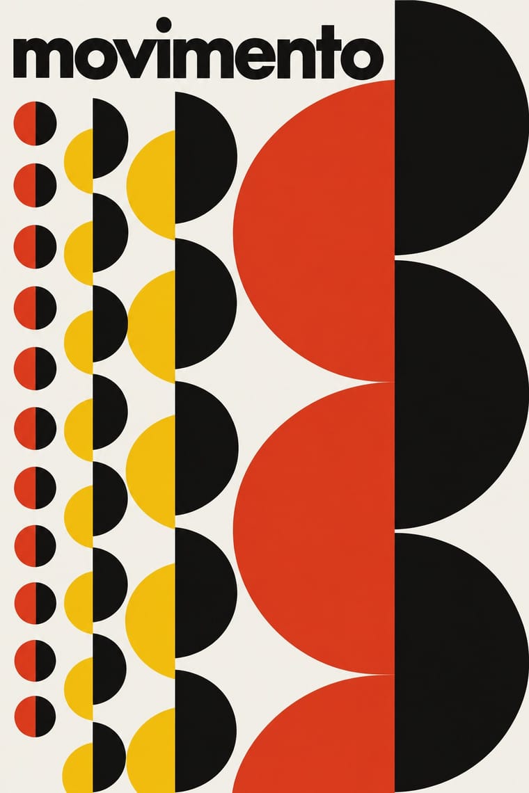
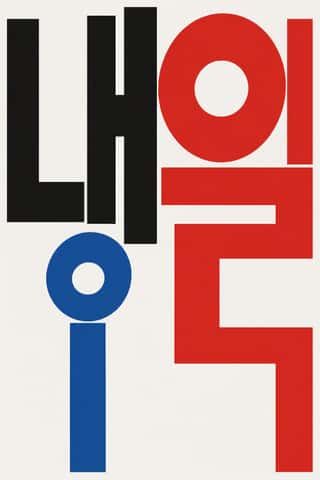
A São Paulo and Rio movement in which concrete art, concrete poetry and Brazil's first design offices shared one vocabulary: Max Bill's mathematically generated geometry, serial repetition and sans-serif type. Sparked by Bill's 1951 retrospective at MASP and the first São Paulo Bienal, it passed through Ulm via Alexandre Wollner into Forminform (1957) and ESDI (1963), producing rigorous trademarks, posters and a celebrated newspaper redesign.
Make something in this styleGet advice in this styleMix it with another style
01
How it works
- Generate the image from a rule (repetition, rotation or progression of one module) rather than from depiction.
- Treat the page as a field of tension between a few flat geometric elements and the white ground.
- Set words spatially, as concrete poetry does, so that position, spacing and size carry meaning.
- Restrict colour to one or two saturated inks with black on white.
- Construct trademarks as geometric signs that can be drawn with ruler and compass.
São Paulo and Rio de Janeiro, Brazil
02
Its design choices
From Stylogeny’s vocabulary of design choices: defining choices make the style, characteristic ones are usual, occasional ones turn up now and then.
- Layout & composition
- Space & hierarchy
- Typography
- Colour
- Form & shape
- Surface & texture
- Ornament
- Medium & production
- Tone & intent
- Avoids
- Floral & vegetal, Abundant decoration, Naturalistic depiction, Painterly illustration, Script, Ornamented display, Painterly brushwork
Palette
#f4f2ec#121212#e2361f#f3c316#1f4e9e
Typefaces
Futura
concrete poetry
Akzidenz-Grotesk
Helvetica
Univers
Known for
Antônio Maluf
poster for the 1st Bienal de São Paulo, 1951
Alexandre Wollner
4th Bienal de São Paulo poster, 1957; co-founder of Forminform, 1957, and ESDI, 1963
Geraldo de Barros
Grupo Ruptura; Forminform
Amílcar de Castro
Jornal do Brasil redesign, late 1950s
Lygia Pape
Piraquê biscuit packaging
Aloísio Magalhães
IV Centenário do Rio de Janeiro symbol, 1965; cruzeiro banknotes from 1970
Noigandres group
Augusto & Haroldo de Campos, Décio Pignatari (concrete poetry)
03
Make something in this style
Say what you need, and Stylogeny’s image studio draws it from Brazilian Concrete Design’s design choices and checks it against them. It takes about a minute, and you get a link to share.
04
Where it comes from, and what it’s close to
Before it
The style it grew out of, and the styles it borrowed from.


After it
The styles that grew out of it.
No later style in the atlas grew out of it yet.
Alike in its design choices
Styles that make many of the same choices, related or not, besides those above.




05
Real works
Artefacts in museums, libraries and archives that show the style, linked at their source.
- Poster for the First Bienal de São PauloAntônio Maluf · 1951 · The Museum of Modern Art, New York (576.1951)
- IV Bienal – Museu de Arte Moderna São Paulo – Brasil – Parque Ibirapuera – Sob o patrocínio da Prefeitura Municipal de São PauloAlexandre Wollner · 1957 · Museum für Gestaltung Zürich, Poster Collection (08-0078)
- The Third Biennal at the Museum of Modern Art, São PauloAlexandre Wollner · 1955 · The Museum of Modern Art, New York (184.1955)
- VII bienal de São PauloAlmir Mavignier · 1963 · Museum für Gestaltung Zürich, Poster Collection (19-0406)
06
Sources
- MoMA, Antonio Maluf, Poster for the First Bienal de São Paulo, 1951 (https://www.moma.org/collection/works/7587)
- Alexandre Wollner, Design visual 50 anos (2003)
- Revista Pesquisa FAPESP on Alexandre Wollner (https://revistapesquisa.fapesp.br/es/un-puente-al-mundo/)
How Stylogeny researches and checks a style: where the facts come from.