Rational modernism · 1964–present · East Asia
Hong Kong East–West Graphic Modernism
Also known as Hong Kong studio design, East/West design, Cross-cultural design (Henry Steiner)
The studio design of Hong Kong from the 1960s, made for banks, developers, trade bodies, hotels and cultural events in a city that had to speak Chinese and English at once. Henry Steiner, a Yale student of Paul Rand, and a local generation taught by Wucius Wong, led by Kan Tai-keung, set compact symbols, sans-serif type and white space against quoted Chinese signs: ancient coins, characters, mythical creatures and, from the 1980s, ink washes and brush strokes, often staged as an East–West visual pun.
Make something in this styleGet advice in this styleMix it with another style
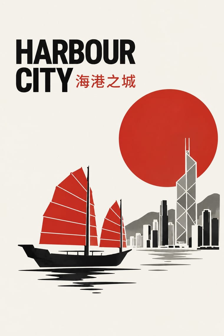
Use it with care
Hong Kong uses traditional Chinese characters, so do not substitute simplified forms, and have every Chinese word in a lockup checked by a literate reader, since image models often invent or garble characters. The style used real Chinese signs and characters for their meaning, such as the coin and 中 of the Bank of China emblem; do not fall back on brush-effect 'chop-suey' Latin fonts or random characters as exotic texture.
01
How it works
- Give Chinese and English a designed place in one lockup: either match the stroke weight of a Latin sans and the Chinese characters, or contrast them deliberately in size and angle, as Progress Hong Kong (1975) skews a bold Latin at about thirty degrees beside smaller horizontal Chinese.
- Quote one Chinese sign, such as an ancient coin, a character, a seal or a mythical creature, and reduce it to a modernist symbol instead of scattering it as ornament.
- Build the idea on contrast: set an Eastern and a Western image side by side, or let one turn into the other, so the meaning lands as a visual pun.
- Stage ink and brush inside a modernist field: one wash, one stroke or a red dot against wide white space and a strict sans-serif.
- Keep to a few flat spot inks on a pale, grey or black ground. In the ink-inflected posters this narrows to ink black, paper white and one red dot; Steiner's posters admit bright accents, as in the punk's red, pink and blue in East/West Design Dialogues (1988).
Hong Kong: Henry Steiner, posted there by The Asia Magazine in 1961, founded Graphic Communication in 1964; a local generation trained in Wucius Wong's design courses, led by Kan Tai-keung (at Graphic Atelier from 1968, co-founder of his own studio in 1976), served the city's banks, developers, trade bodies, hotels and cultural events
02
Its design choices
From Stylogeny’s vocabulary of design choices: defining choices make the style, characteristic ones are usual, occasional ones turn up now and then.
- Layout & composition
- Space & hierarchy
- Typography
- Colour
- Form & shape
- Surface & texture
- Ornament
- Imagery
- Medium & production
- Tone & intent
- Avoids
- Horror vacui, Abundant decoration, Ornamented display, Fluorescent & neon, Gloss & highlights, Photocopy & distress, Rebellious & subversive
Palette
#f3efe6#151515#c62a20#8c8b86#b08d4a
Typefaces
Sans-serifs for the Latin
Helvetica in Kan Tai-keung's poster for The Arch (1970); a bold sans skewed at thirty degrees in Steiner's 'Progress Hong Kong' (1975)
Chinese set horizontally and smaller than the Latin, as the title 香港之進展 beside the skewed English of 'Progress Hong Kong'
1975
Single Chinese characters drawn into a symbol
中 formed by the square hole and vertical strokes of Kan's Bank of China coin, and the character for longevity combined with a floor plan in Steiner's Hongkong Land H
Chinese brush calligraphy and ink-brushed strokes, which Kan Tai-keung, trained in ink painting under Lui Shou-kwan, brought into his posters from the 1980s
Known for
Henry Steiner, 'Progress Hong Kong' poster for the Hong Kong Trade Development Council
1975; M+ 2017.5
Henry Steiner, 'Henry Steiner: East/West Design Dialogues' poster
1988; M+ 2020.95
Henry Steiner, HSBC hexagon symbol, abstracted from the St Andrew's cross on the bank's original house flag
1983; a logo mock-up of c. 1984 was shown at M+ in 2024
Henry Steiner, Hong Kong banknotes for Standard Chartered Bank with mythical Chinese creatures
M+ archive CA31/27
Henry Steiner, Hongkong Land 'H' mark combining a Chinese character for longevity with a floor plan
Kan Tai-keung, poster for Cecile Tang's film The Arch (1970), black and white with Helvetica beside the Chinese title
Kan Tai-keung for Graphic Atelier Ltd, poster-pamphlet
1972; M+ 2017.11
Kan Tai-keung, Bank of China emblem in the form of an ancient coin
commissioned 1980, in use from the mid-1980s
03
Make something in this style
Say what you need, and Stylogeny’s image studio draws it from Hong Kong East–West Graphic Modernism’s design choices and checks it against them. It takes about a minute, and you get a link to share.
04
Where it comes from, and what it’s close to
Before it
The style it grew out of, and the styles it borrowed from.


After it
The styles that grew out of it.
No later style in the atlas grew out of it yet.
Alike in its design choices
Styles that make many of the same choices, related or not, besides those above.


05
Sources
- M+, Henry Steiner: The Art of Graphic Communication (exhibition, 15 June–10 November 2024): https://www.mplus.org.hk/en/exhibitions/henry-steiner-graphic-communicator
- M+, Henry Steiner Project Archives (CA31): https://mplus.org.hk/en/collection/archives/henry-steiner-project-archives-ca31
- M+, Poster, 'Progress Hong Kong' (1975): https://www.mplus.org.hk/en/collection/objects/poster-progress-hong-kong-20175/
- M+, Poster, Henry Steiner: East/West Design Dialogues (1988): https://www.mplus.org.hk/en/collection/objects/poster-henry-steiner-east-west-design-dialogues-202095/
- M+, Poster-pamphlet, Graphic Atelier Ltd. (1972): https://www.mplus.org.hk/en/collection/objects/poster-pamphlet-graphic-atelier-ltd-201711/
- M+, Hong Kong: Here and Beyond (exhibition): https://www.mplus.org.hk/en/exhibitions/hong-kong-here-and-beyond/
- M+ Magazine, 'Unboxing Henry Steiner's Design Archive': https://www.mplus.org.hk/en/magazine/unbox-m-henry-steiners-design-archive/
- M+, Hand fan, the Mandarin Hotel, Hong Kong (Alan Chan, 1971; 2020.327): https://www.mplus.org.hk/en/collection/objects/hand-fan-the-mandarin-hotel-hong-kong-2020327/
- Hong Kong Government press release on 'From Life to Mind: Kan Tai-keung's Design and Art', Hong Kong Heritage Museum (4 June 2002): https://www.info.gov.hk/gia/general/200206/04/0604145.htm
- AGI, Tai-Keung Kan: https://a-g-i.org/user/taikeungkan
- Wikipedia, Henry Steiner: https://en.wikipedia.org/wiki/Henry_Steiner
- Wikipedia, Wucius Wong: https://en.wikipedia.org/wiki/Wucius_Wong
- Wikipedia (Chinese), 靳埭強 (Kan Tai-keung): https://zh.wikipedia.org/wiki/靳埭強
- People's Graphic Design Archive, 1980s rebranding of HSBC (Henry Steiner, 1983): https://peoplesgdarchive.org/item/18424/1980s-rebranding-of-hsbc-the-hongkong-and-shanghai-banking-corporation
- BP&O, 'HSBC by Henry Steiner, 1983' (Richard Baird, 3 May 2024): https://bpando.org/?p=119363
- Wikipedia, Traditional Chinese characters (official script of Hong Kong, Macau and Taiwan): https://en.wikipedia.org/wiki/Traditional_Chinese_characters
How Stylogeny researches and checks a style: where the facts come from.