Rational modernism · 1960–1970 · Latin America & Caribbean
Di Tella Graphic Design (Instituto Torcuato Di Tella)
Also known as Departamento de Diseño Gráfico del Instituto Torcuato Di Tella, La gráfica del Di Tella, Di Tella posters
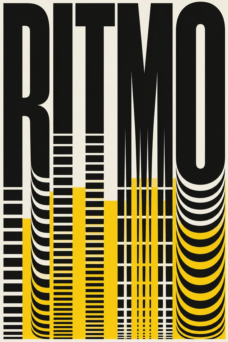
The in-house graphics of Buenos Aires' Instituto Torcuato Di Tella, 1960–1970, led by Juan Carlos Distéfano with Juan Andralis, Rubén Fontana, Norberto Coppola and Carlos Soler. Swiss order is turned on the avant-garde art it announced: title words blown up into the picture, optical stripes, one or two flat inks (letterpress programmes, offset street posters), square catalogues and double-square programmes. Its rule was that limited means make the style. Fontana later carried its typography into the University of Buenos Aires design course and the magazine tipoGráfica.
Make something in this styleGet advice in this styleMix it with another style
01
How it works
- Make the title word the picture: enlarge, condense, stack or cut the letters until the event's name is the image.
- Print in one or two flat inks and count the white of the paper as a colour; treat a third ink as a luxury.
- Answer the work you announce: borrow its method, such as optical stripes for kinetic art or repeated modules for a composer's rhythm.
- Keep the facts in a small flush-left grotesque block, set against the enlarged title or figure.
- Fix the formats: a square for catalogues and reports, a double square for programmes, shows and indoor posters, so every piece reads as the Institute's.
- Design for the press at hand: find effects in screens, reused plates and positive-negative engravings rather than in extra colours.
Buenos Aires, Argentina: Juan Carlos Distéfano's graphics for the Instituto Torcuato Di Tella from its first public show in 1960, formalised in 1963 as a Graphic Design Department serving the visual-arts (CAV), music (CLAEM) and audiovisual-theatre (CEA) centres at Florida 936; it closed with the art centres in 1970
02
Its design choices
From Stylogeny’s vocabulary of design choices: defining choices make the style, characteristic ones are usual, occasional ones turn up now and then.
- Layout & composition
- Space & hierarchy
- Typography
- Type as image defining
- Grotesque & neo-grotesque defining
- Condensed display characteristic
- Tight setting characteristic
- Experimental & distorted characteristic
- Hand-lettering characteristic
- Flush left, ragged right characteristic
- Lowercase only occasional
- All caps occasional
- Rotated & vertical setting occasional
- Colour
- Form & shape
- Surface & texture
- Imagery
- Medium & production
- Tone & intent
- Avoids
- Script, Abundant decoration, Floral & vegetal, Full polychrome, Jewel & metallic, Gloss & highlights, Painterly illustration, Naturalistic depiction, Luxurious & glamorous
Palette
#f3f0e8#111111#f5c400#95bca7#b89668
Typefaces
Helvetica
with other neo-grotesques for titles and fact blocks; identified on the 1962 sculpture-prize poster by the UNCuyo reader
Hand-drawn condensed grotesque capitals
the reversed title of the Le Parc poster, 1967; Rubén Fontana was called in for letter drawing
Linotype text faces
composition by Linosur, in small flush-left blocks
Known for
Juan Carlos Distéfano, Premio Internacional de Escultura Instituto Torcuato Di Tella poster (1962)
a diagonal letter E built from black and cream bands on an olive ground, its text in Helvetica
Juan Carlos Distéfano, Homenaje a Luigi Dallapiccola concert programme for the CLAEM
1964
Juan Carlos Distéfano, Premio Di Tella 64 poster (1964)
black, yellow and white, its striped motif taken from a ridged plastic engraving plate for the Vario-Klischograph; Fontana recalls a street corner on Lavalle papered with it; printed by Platt ('Impresión: Platt' on the sheet)
Lutero poster for the CEA (1965, Juan Carlos Distéfano; Experimenta credits him with Rubén Fontana, and the Institute lists a Lutero programme by Distéfano): one black ink, the title word used as the image
El Desatino poster for Griselda Gambaro's play (1965, Distéfano, Fontana and Andralis per Experimenta; the Institute lists an El Desatino programme by Distéfano): two flat inks
Programme for the play Artaud 66 (1966)
Juan Andralis per the Institute; Ares credits Distéfano and Andralis
Juan Carlos Distéfano and Rubén Fontana (MoMA adds Carlos Soler), Le Parc exhibition poster (1967)
one ink, giant custom-drawn condensed capitals reversed out of black, printed offset by Platt
Juan Carlos Distéfano and Rubén Fontana, Más allá de la geometría catalogue (1967) and the Beyond Geometry poster for the exhibition's New York showing at the Center for Inter-American Relations (1968)
03
Make something in this style
Say what you need, and Stylogeny’s image studio draws it from Di Tella Graphic Design (Instituto Torcuato Di Tella)’s design choices and checks it against them. It takes about a minute, and you get a link to share.
04
Where it comes from, and what it’s close to
Before it
The style it grew out of, and the styles it borrowed from.


After it
The styles that grew out of it.
No later style in the atlas grew out of it yet.
Alike in its design choices
Styles that make many of the same choices, related or not, besides those above.


05
Sources
- Guido Di Tella, Enrique Oteiza, Juan Carlos Distéfano, Rubén Fontana and Juan Andralis, 'La gráfica del Di Tella (1960/1970)', tipoGráfica no. 3 (December 1987), pp. 7–18 (testimonies: one-ink Lutero and Le Parc, two flat inks for Premio Di Tella 1964 and El Desatino, more than two inks 'un lujo'; letterpress printing for books, catalogues and programmes because their runs rarely passed 1,000 copies; kraft, newsprint and manila catalogue stocks; plates by Miguel Pilato on the Vario-Klischograph, printing by Imprenta Anzilotti, Linotype by Linosur; square and double-square formats; Andralis's account of the Premio Di Tella 64 motif, recreated in the Olivetti poster and the last poster, Polesello; Distéfano's 'los medios limitados hacen el estilo'; Fontana's Beatles piece of 1967; MoMA among the collections and Graphis 122/1965 among the publications): https://www.revistatipografica.com/wp-content/uploads/2018/12/tpg_3.pdf
- Instituto Torcuato Di Tella, 'Departamento de Diseño Gráfico y Departamento de Fotografía' (created 1963; Swiss design and New York advertising as sources; 'el primer espacio argentino en el que se desarrolla el diseño gráfico de manera profesional'; posters made for the street; members Rubén Fontana, Juan Andralis, Norberto Coppola, Carlos Soler and Juan Carlos Indart; captions credit Artaud 66 (programme, 1966) to Andralis and the Premio Di Tella 64 poster and the Lutero and El Desatino programmes (1965) to Distéfano; Fontana and Soler in charge from 1969; closed 1970): https://itdt.edu/0departamento-de-diseno-grafico-y-departamento-de-fotografia/
- Felipe Taborda, 'Maestros del Diseño en América Latina: Juan Carlos Distéfano (Argentina)', Experimenta (11 Oct 2022) (interview: Swiss rigour and the Polish school's variety of styles; works and co-authors 1964–1969; handwork, small budgets, the Anzilotti print shop and the motto 'Los medios limitados forman el estilo e invitan a la creación'): https://www.experimenta.es/noticias/grafica-y-comunicacion/maestros-del-diseno-en-america-latina-juan-carlos-distefano-argentina/
- Fernando García, 'Rubén Fontana: en el Di Tella la independencia creativa fue total y eso no sucedió más', La Nación (22 Oct 2017) (flat, basic inks because budgets were small; Lutero in black ink on white paper; El Desatino in two inks; Fontana says he joined in 1967 after collaborating from 1964, so his 1965 co-credits rest on Experimenta; Fontana denies that Pop art or the advertising of the day shaped the style, hence no pop-art influence here, although Ares (below) sees Pop elements): https://www.lanacion.com.ar/opinion/ruben-fontana-en-el-di-tella-la-independencia-creativa-fue-total-y-eso-no-sucedio-mas-nid2073743/
- Fabio Ares, 'Juan Andralis: vanguardia y tipografía (París – Buenos Aires, 1928–1994)', Arte e Investigación 18 (Universidad Nacional de La Plata, November 2020), doi:10.24215/24691488e056 (Andralis at the department for about three years from his return in 1965; Fontana called in for his letter drawing; Figure 3 credits the Premio Di Tella 1965 poster and the Artaud 66 programme to 'Juan Carlos Distéfano y Juan Andralis'; sees Swiss graphics fused with Pop elements): https://papelcosido.fba.unlp.edu.ar/ojs/index.php/aei/article/download/1203/1439/2490
- Gastón Lugano, 'La imprenta en Buenos Aires a través de la revista TipoGráfica' (Universidad Nacional de La Plata, SEDICI) (Fontana trained at the Di Tella department and from 1987 held the typography and editorial design courses at the University of Buenos Aires; tipoGráfica 1987–2007; the 1987 Di Tella testimonies and the Anzilotti press): https://sedici.unlp.edu.ar/bitstream/handle/10915/198800/Documento_completo.pdf?sequence=1
- Facultad de Artes y Diseño, Universidad Nacional de Cuyo, course reader 'Instituto Di Tella' (captions: the 1961 Premio poster on a three-column typographic grid; the 1962 sculpture-prize poster's geometric E in Helvetica; Op influence in CLAEM programmes by Distéfano, Fontana and Norberto Coppola; the 1969 Olivetti poster where the text becomes the image): https://virtual.fad.uncu.edu.ar/pluginfile.php/72326/mod_book/chapter/1621/Instituto%20Di%20Tella.pdf
- Wikipedia, 'Juan Carlos Distéfano' (Spanish): https://es.wikipedia.org/wiki/Juan_Carlos_Dist%C3%A9fano
- Wikipedia, 'Torcuato di Tella Institute' (founded 1958; Florida Street building from 1963; Distéfano's cover for the 1967 Le Parc exhibition): https://en.wikipedia.org/wiki/Torcuato_di_Tella_Institute
- People's Graphic Design Archive, 'Rubén Fontana work 1960s + 1987' (dates the Le Parc poster 1966, against 1967 in Experimenta and Wikipedia): https://peoplesgdarchive.org/item/5457/ruben-fontana-work-1960s-1987
- Museum of Modern Art, New York, collection records 1129.1969 (Olivetti: Diseño y Productos, 1969), 1130.1969 (Le Park, 1967; credited to Distéfano, Fontana and Soler) and 1131.1969 (Premio di Tella; the sheet reads September 1964 and 'Diseño: Juan Carlos Distéfano', although MoMA dates it 1967 and credits Distéfano, Fontana and Soler): offset lithographs about 72 x 109 cm printed by S. A. Platt; 780.2015 (Premio internacional de escultura, 1962, lithograph, 105.4 x 69.9 cm). The images show the palette's grounds: the 1962 poster's olive-khaki ground, the Olivetti poster's ochre and pale green with black, and the Premio 64 poster's black, yellow and paper white: https://www.moma.org/collection/works/8606, https://www.moma.org/collection/works/8608, https://www.moma.org/collection/works/8610, https://www.moma.org/collection/works/192822
- Rubén Fontana and Zalma Jalluf (spelled 'Jaluff' in La Nación), Historia gráfica del Di Tella (Buenos Aires: Capital Intelectual) (book, not consulted; described in the La Nación interview)
How Stylogeny researches and checks a style: where the facts come from.