Rational modernism · 1956–1967 · North America
Blue Note Jazz Sleeve Modernism
Also known as Reid Miles style, Blue Note cover style, Blue Note look
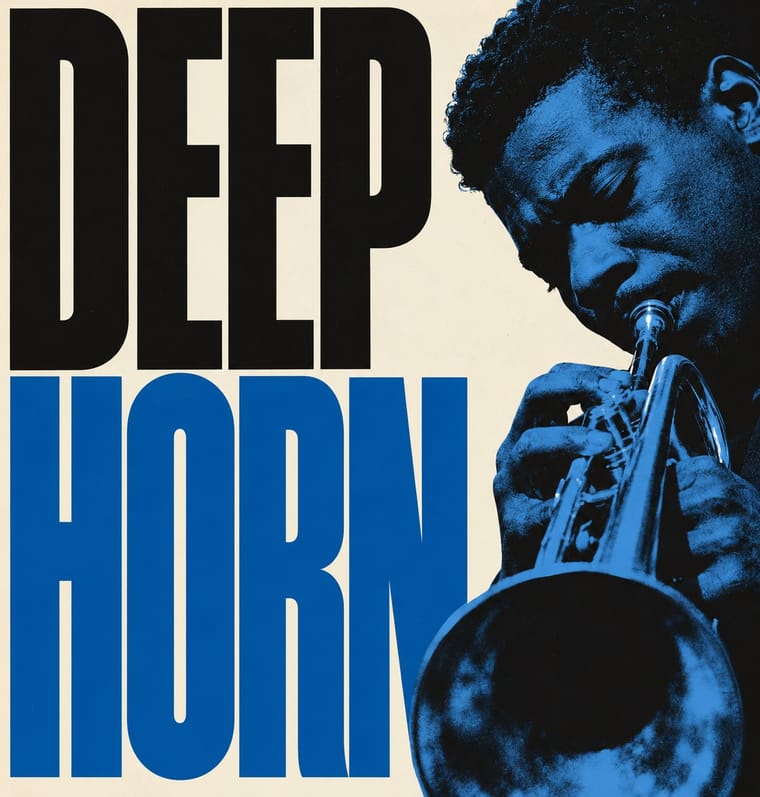
The record-sleeve language of Blue Note Records, set by art director Reid Miles, who designed some 350 twelve-inch LP covers between about 1956 and 1967, often around Francis Wolff's session photographs. With what Miles called 'one or two colors to work with', he tinted and cropped black-and-white photographs, ran flat bands of colour, and set titles huge in grotesques, slabs and fat faces that are stacked, squeezed, repeated or cut off by the edge. It made mid-century American modernism a serial system of photograph and type for one square format.
Make something in this styleGet advice in this styleMix it with another style
Use it with care
The covers, Wolff's photographs, the Blue Note name and its oval logo are still owned and reissued by the label. Borrow the system (one tint, a hard crop, one giant word), never a particular sleeve, the label's logo or its catalogue-number line, and never present a new design as a Blue Note release. The photographs record named Black musicians at work: photograph or license your own named subject, or crop to an instrument, hands or an object, rather than inventing a generic Black jazz musician as period decor for 'cool'. Do not copy the generic 'tribal' pictograms of Afro-Cuban (1957) as shorthand for music of the African diaspora.
01
How it works
- Work with one or two colours: print the black-and-white session photograph in a single tint, or set black and white against one flat colour band. From about 1965 a full-colour photograph sometimes takes the place of the tint (Horace Silver, Song for My Father), still against flat type.
- Crop the documentary photograph hard (a hand at the chin, a trumpet bell, legs in mid-stride) and either bleed it off the square or shrink it to a small block in an empty field.
- Make the title the picture: set it enormous in a heavy grotesque, Clarendon or Ultra Bodoni, and let it be stacked, squeezed until letters touch, repeated, warped or cut off by the sleeve's edge.
- Balance one dominant mass asymmetrically against small sans-serif lists of the sidemen and a small label mark and catalogue number of your own, never the Blue Note name or its logo.
- When there is no photograph, build the whole cover from letters and punctuation, using repetition and rhythm to stand for the music.
New York: Blue Note Records, run by Alfred Lion and Francis Wolff, where Reid Miles, after working for John Hermansader and Esquire, designed most of the twelve-inch LP covers from about 1956 until Lion retired in 1967
02
Its design choices
From Stylogeny’s vocabulary of design choices: defining choices make the style, characteristic ones are usual, occasional ones turn up now and then.
- Layout & composition
- Space & hierarchy
- Typography
- Type as image defining
- Grotesque & neo-grotesque defining
- Condensed display characteristic
- Slab serif characteristic
- Lowercase only characteristic
- Tight setting characteristic
- Didone characteristic
- All caps characteristic
- Rotated & vertical setting occasional
- Experimental & distorted occasional
- Flush left, ragged right occasional
- Humanist & Garalde serif occasional
- Colour
- Form & shape
- Surface & texture
- Imagery
- Medium & production
- Tone & intent
- Avoids
- Gradients, Pastel, Abundant decoration, Floral & vegetal, Ornamented display, Painterly illustration, Central symmetry
Palette
#0d0d0d#0b50a1#56a5e4#e4532a#d19a39#f3efe2
Typefaces
Trade Gothic and Trade Gothic Extended
Dexter Gordon, Go; Herbie Hancock, Takin' Off; Kenny Burrell, Midnight Blue
Ultra Bodoni
Jackie McLean, It's Time!; Horace Parlan, Happy Frame of Mind; Hank Mobley, Dippin'
Clarendon
John Coltrane, Blue Train; Lee Morgan, Lee-Way
Franklin Gothic and News Gothic
Cannonball Adderley, Somethin' Else; Lee Morgan, The Sidewinder
Heavy condensed Inserat-type grotesques
Kenny Burrell, Midnight Blue; Jackie McLean, Let Freedom Ring
Caslon No. 471 and 540
Jackie McLean, Let Freedom Ring; Art Taylor, A.T.'s Delight
Known for
Reid Miles, art director of Blue Note Records
c. 1956-1967
Francis Wolff, Lion's partner in running the label, whose session photographs, usually taken at rehearsals, appear on many covers
Kenny Dorham, Afro-Cuban
12-inch BLP 1535, May 1957, with new cover art: Dorham's photograph above black pictograms on red; Cooper Hewitt's 2026 label dates it 1955, the year of the sessions and the 10-inch issue
John Coltrane, Blue Train
recorded 1957; Miles design, Wolff photograph in deep blue on black, title in Clarendon
Sonny Clark, Cool Struttin'
BLP 1588, 1958; Wolff's photograph of Ruth Lion cropped to her legs in mid-stride
Jackie McLean, Let Freedom Ring
1963; condensed grotesque set so tight the letters touch, filling the sleeve
Kenny Burrell, Midnight Blue
1963; 'midnight' in magenta and a huge condensed lowercase 'blue' in blue on black, beside a small inset photograph
Eric Dolphy, Out to Lunch!
BLP 4163, 1964; a photograph of a 'Will Be Back' shop sign with a seven-handed clock
03
Make something in this style
Say what you need, and Stylogeny’s image studio draws it from Blue Note Jazz Sleeve Modernism’s design choices and checks it against them. It takes about a minute, and you get a link to share.
04
Where it comes from, and what it’s close to
Before it
The style it grew out of, and the styles it borrowed from.


Alike in its design choices
Styles that make many of the same choices, related or not, besides those above.


05
Sources
- https://en.wikipedia.org/wiki/Reid_Miles
- https://en.wikipedia.org/wiki/Blue_Note_Records (solid colour bands 'influenced by the Bauhaus school of design'; 'restricted color palette (often black and white with a single color)'; Warhol drawings on 'a few mid-1950s album covers')
- https://en.wikipedia.org/wiki/Francis_Wolff
- https://en.wikipedia.org/wiki/Blue_Train_(album)
- https://en.wikipedia.org/wiki/Cool_Struttin%27
- https://en.wikipedia.org/wiki/Out_to_Lunch!
- https://en.wikipedia.org/wiki/Afro-Cuban_(album) (10-inch BLP 5065, October 1955, sessions January and March 1955; 12-inch BLP 1535, May 1957, with new cover art)
- https://en.wikipedia.org/wiki/Song_for_My_Father_(album) (Blue Note BST 84185, January 1965; the cover photograph shows Silver's father, John Tavares Silver)
- Museum of Modern Art, Architecture and Design: Reid Miles, Blue Note Records album covers, 822.2014-828.2014 (e.g. https://www.moma.org/collection/works/185424, Hub-Tones, 1962, with Francis Wolff); MoMA collection dataset, https://github.com/MuseumofModernArt/collection
- Cooper Hewitt, Smithsonian Design Museum, 'Album Covers' wall label (2026): 'Reid Miles for Blue Note Records, whose bold graphic style defined 1950s and '60s jazz album art', https://www.cooperhewitt.org/wp-content/uploads/2026/02/Album-Covers_Label-Graphic_PDF.pdf
- Fonts In Use, Reid Miles (typeface identifications for 27 Blue Note covers, including Caslon No. 471 & 540 on Let Freedom Ring and A.T.'s Delight), https://fontsinuse.com/designers/1906/reid-miles
- Graham Marsh & Glyn Callingham, The Cover Art of Blue Note Records (cited by Wikipedia for Miles's 'one or two colors' quote)
- Steven Heller & Greg D'Onofrio, The Moderns: Midcentury American Graphic Design (Abrams, 2017)
How Stylogeny researches and checks a style: where the facts come from.