Traditions & vernacular · 1500–present · East Asia
Ma & Wabi-sabi Aesthetics
Also known as Wabi-sabi, Ma (the interval), Shibui
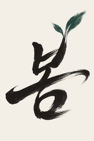
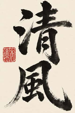
A Japanese aesthetic rooted in Zen and the wabi tea ceremony that prizes austerity, imperfection, impermanence and the charged interval (ma) between things. In graphic design it appears as vast empty grounds, a single off-centre element, muted natural colours, visible material texture and the unrepeatable brush mark, from ink painting to Muji's 'emptiness'.
Make something in this styleGet advice in this styleMix it with another style

01
How it works
- Leave most of the surface empty and let the interval between elements carry the meaning.
- Place a single element off-centre and resist balancing it symmetrically.
- Choose muted natural colours (ash, clay, moss, undyed paper) and let material texture show.
- Accept irregularity: a broken brush edge, an uneven glaze or a deckled paper over machined perfection.
- Remove everything that is not essential, then stop before the result turns clinical.
Kyoto and Sakai, Japan (tea culture of Murata Jukō, Takeno Jōō and Sen no Rikyū)
02
Its design choices
From Stylogeny’s vocabulary of design choices: defining choices make the style, characteristic ones are usual, occasional ones turn up now and then.
- Layout & composition
- Space & hierarchy
- Typography
- Colour
- Form & shape
- Surface & texture
- Imagery
- Medium & production
- Tone & intent
- Avoids
- Abundant decoration, Horror vacui, Central symmetry, Fluorescent & neon, Full polychrome, Gloss & highlights, Chrome & 3D render, Ornamented display
Palette
#e9e4d8#8a7f6e#4f5a3f#2b2a28#b9a88a#7d4e3a
Typefaces
Bokuseki
Zen ink calligraphy
Sōsho cursive kana and kanji
Mincho text faces
e.g. Ryumin
Known for
Sen no Rikyū
Taian tea room, c. 1582
Chōjirō
Raku tea bowls
Hasegawa Tōhaku, Pine Trees screens
late 16th c., Tokyo National Museum
Jun'ichirō Tanizaki, In Praise of Shadows
1933
Ikko Tanaka and Kenya Hara
Muji art direction, 1980–
Leonard Koren, Wabi-Sabi for Artists, Designers, Poets & Philosophers
1994
03
Make something in this style
Say what you need, and Stylogeny’s image studio draws it from Ma & Wabi-sabi Aesthetics’s design choices and checks it against them. It takes about a minute, and you get a link to share.
04
Where it comes from, and what it’s close to
Before it
The style it grew out of, and the styles it borrowed from.
Nothing earlier is recorded: in the atlas it is a starting point.

After it
The styles that grew out of it.
No later style in the atlas grew out of it yet.
Alike in its design choices
Styles that make many of the same choices, related or not, besides those above.
- Contemporary Chinese Book Design ('Most Beautiful Books of China')73% alike
- Ten Bamboo Studio Colour Woodblock (Douban & Gonghua)67% alike


05
Real works
Artefacts in museums, libraries and archives that show the style, linked at their source.
- Pine Trees (Shōrin-zu byōbu), right-hand screenHasegawa Tōhaku · Azuchi-Momoyama period, late 16th century · Tokyo National Museum (National Treasure); image via Wikimedia Commons
- Splashed-Ink LandscapeBokushō Shūshō · early 16th century · The Metropolitan Museum of Art
- MelonsYamada Dōan · late 16th century · The Metropolitan Museum of Art
- Hokku poem 'With a Powder Brush', from The Narrow Road to the Deep NorthMatsuo Bashō · ca. 1689 · The Metropolitan Museum of Art

06
Sources
- Leonard Koren, Wabi-Sabi for Artists, Designers, Poets & Philosophers (1994)
- Jun'ichirō Tanizaki, In Praise of Shadows (1933)
- Kenya Hara, Designing Design (Lars Müller, 2007)
How Stylogeny researches and checks a style: where the facts come from.