Counterculture · 1962–1978 · North America, Central Europe, Western Europe
Fluxus Graphics (Maciunas)
Also known as Fluxus design, Fluxus Editions graphics, Fluxus look
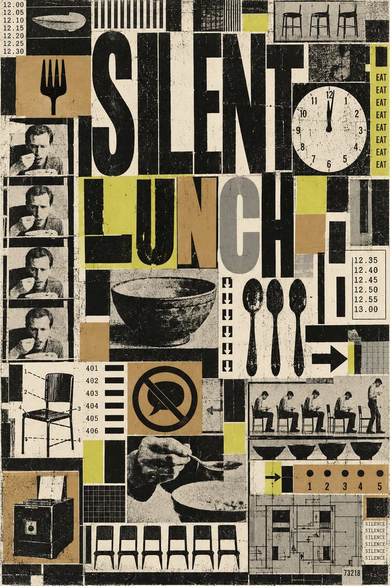
The house graphics George Maciunas made from 1962 until his death in 1978 for Fluxus, a network of artists who staged events and sold cheap multiples. Running text came straight off an IBM Executive typewriter in one condensed sans, enlarged by photostat. Headlines, credits and puzzle monograms were pressed from dry-transfer letters in mismatched faces and packed into tight rectilinear blocks running to the edge of the sheet, printed almost always in black alone on kraft or coloured stock beside old engravings borrowed from a public picture library.
Make something in this styleGet advice in this styleMix it with another style
01
How it works
- Type all running text on one typewriter face, a condensed sans, and get every larger size by photostatic enlargement instead of buying more type.
- Press headlines, credits and monograms from dry-transfer sheets, switching to whatever alphabet is left when one runs out, and overlap, invert and interlock the letters until each name becomes a puzzle filling its square; in a title, let stray capitals spell a second word (as cc Valise e TRanglE hides V TRE).
- Fill the sheet right up to its borders with justified, rectilinear blocks, cut margins and blank paper as waste, and get variety only by reversing type white on black, turning it in different directions or setting it in patterns.
- Print in black ink, almost without exception, and let cheap kraft, manila or coloured stock supply the colour, even if the colour sequence changes from copy to copy.
- Take pictures from a public picture file, such as old engravings and medical or technical diagrams, and let a deadpan pairing with the title turn them into a joke.
- Design the edition as an object to handle and post: an offset label on a box, envelopes bolted into a book, a deck of event cards, all priced low and sold by mail order.
Wiesbaden, West Germany, where George Maciunas, then a designer for the US Air Force, organised the Fluxus Internationale Festspiele Neuester Musik at the Städtisches Museum (1–23 September 1962), after laying out La Monte Young's An Anthology (designed 1961, published 1963); from 1964 run from Maciunas's New York base, with a European Mail-Order Warehouse/Fluxshop kept by Willem de Ridder in Amsterdam, until Maciunas's death in 1978
02
Its design choices
From Stylogeny’s vocabulary of design choices: defining choices make the style, characteristic ones are usual, occasional ones turn up now and then.
- Layout & composition
- Space & hierarchy
- Typography
- Colour
- Surface & texture
- Imagery
- Tone & intent
- Avoids
- Generous white space, Full polychrome, Gradients, Painterly brushwork, Gloss & highlights, Floral & vegetal, Abundant decoration, Luxurious & glamorous
Palette
#141414#f2efe7#b3905f#cbd04f#9a978d
Typefaces
IBM Executive condensed sans typewriter
nearly all running text for about eight years, published straight from the machine and enlarged by photostat; the machine's owners, La Monte Young and Marian Zazeela, say Maciunas had some letters custom-replaced with broader ones; after 1968 a newer IBM with changeable faces added bold and italic, still sans serif
Dry-transfer lettering in mixed faces
sheets Letraset invented in the late 1950s and brought to the United States about 1961; hundreds of faces mixed letter by letter for headlines, artist credits and puzzle monograms
Rubber-stamped titles
as on the cover and envelopes of Fluxus 1
Drafting-pen hand lettering
in Maciunas's early work, last used on a Fluxus letterhead of 1962, and the precise lettering of his early, unique handwritten diagrams and charts; his published charts were typed on his IBMs
Known for
Fluxus 1, edited and assembled by George Maciunas (announced 1962, released 1964–65 and assembled until 1977)
offset pages and manila envelopes bound by metal bolts, with rubber-stamped titles, in a wooden box (MoMA, Gilbert and Lila Silverman Fluxus Collection)
George Brecht and George Maciunas, cc V TRE
(Fluxus newspaper no. 1), 1964, offset lithograph, 23 1/16 × 36 in. open (Walker Art Center, 1989.155), named after Brecht's one-off V TRE for the Yam Festival of 1963; later issues hide those capitals in mixed-case titles, as in cc Valise e TRanglE (no. 3, 1964), cc fiVe ThReE (no. 4, June 1964) and fluxus Vacuum TRapEzoid (no. 5, March 1965, its cover a found top-hatted dandy repeated), all designed and produced by Maciunas
George Brecht, Water Yam, 1963 (announced 1962)
a cardboard box with an offset label holding offset event-score cards, designed, assembled and produced by Maciunas (MoMA)
Flux Year Box 2, c. 1968 (announced 1965)
a partitioned wooden box whose hinged lid is screenprinted with a matrix of mismatched fonts, assembled by Maciunas (MoMA)
Fluxkit, 1965 (announced 1964)
a vinyl-covered attaché case of Fluxus Editions, assembled by Maciunas (MoMA)
No Smoking
George Brecht's idea (c. 1963) set by Maciunas in interlocking letters that alternate white on black and black on white, as a card in Fluxpack 3 (c. 1971) and as a sign, poster and offset wallpaper (Fluxus Foundation; MoMA)
Fluxus Manifesto, 1963, offset, edited, designed and produced by Maciunas
MoMA
Box labels for Fluxus Editions, a hundred or more in all
an engraving of an electric chair for Flux Furniture, and a medical diagram of treatment points on a figure for Ben Vautier's Flux Suicide Kit (Barbara Moore)
03
Make something in this style
Say what you need, and Stylogeny’s image studio draws it from Fluxus Graphics (Maciunas)’s design choices and checks it against them. It takes about a minute, and you get a link to share.
04
Where it comes from, and what it’s close to
Before it
The style it grew out of, and the styles it borrowed from.

After it
The styles that grew out of it.
No later style in the atlas grew out of it yet.
Alike in its design choices
Styles that make many of the same choices, related or not, besides those above.


05
Sources
- Barbara Moore, 'George Maciunas: A Finger in Fluxus', Artforum, https://www.artforum.com/features/george-maciunas-a-finger-in-fluxus-208230/, reprinted by the Fluxus Foundation as 'Art Forum: A Finger In Fluxus', https://fluxusfoundation.com/?p=421 (text published straight and unaltered from an IBM Executive typewriter with a condensed sans for nearly eight years, though its owners La Monte Young and Marian Zazeela say Maciunas had certain letters replaced with broader ones (note 3); bold and italic added on a new IBM in 1968; photostatic enlargement; reverse printing white or colour on black; type in patterns or facing different directions; dry-transfer lettering from hundreds of faces, a process Letraset invented in the late 1950s for headlines, credits and monograms; monograms of overlapping letterforms, character inversions and wildly varying sizes; economical use of page space right up to its borders giving a tight rectilinearity; 'specific color as an integral part of the design was used so rarely that it is worth mentioning' (black the only ink in An Anthology; exceptions the 1967 anti-Vietnam War flag poster with stripes of red text, its similar 1966 predecessor and a later red, white and blue Cuban flag); colour from cheap kraft and coloured papers, alternate colours of one stock for a single piece, and a red, chartreuse or grayish green run over nine months that included the first published art-historical chart; Maciunas colourblind; Maciunas 'responsible for the "Fluxus look"'; the first of three published versions of his history of the avant-garde, May 1966, composed on his IBMs, while his early unique handwritten diagrams used precise drafting-pen lettering; hand lettering abandoned after a Fluxus letterhead of 1962; pictures mainly from the New York Public Library Picture Collection, such as the repeated top-hatted dandy on fluxus Vacuum TRapEzoid (Fluxus Newspaper no. 5, March 1965); a hundred or more box labels, Flux Furniture and Ben Vautier's Flux Suicide Kit; Fluxus 1 with bolted manila envelopes, IBM copy and rubber-stamped titles in a wood box; Fluxus 1 and A Guitar Manual on a square page module of about 7½ in.; the 1965 Eric Andersen mailer; the 1967 anti-Vietnam War poster)
- The Museum of Modern Art, Thing/Thought: Fluxus Editions, 1962–1978 (21 September 2011 – 16 January 2012), exhibition website, https://www.moma.org/interactives/exhibitions/2011/fluxus_editions/ (introduction: affordable multiples conceived by Maciunas, who often designed and assembled them himself, unifying their appearance; Duchamp's readymades and Constructivism's integration of art and life as touchstones; Fluxus 1, 1964, book with offset, metal bolts and stamped ink in a wood box; Fluxkit, 1965, vinyl-covered attaché case; Flux Year Box 2, partitioned wooden box printed with a matrix of mismatched fonts on its hinged cover), and its press checklist, https://www.moma.org/interactives/exhibitions/2011/fluxus_editions/wp-content/uploads/2011/10/fluxus-editions-press-checklist.pdf (Water Yam, 1963, cardboard box with offset label and offset cards designed, assembled and produced by Maciunas; No Smoking, c. 1973, offset wallpaper; Fluxus Manifesto, 1963; poster for Fluxus Internationale Festspiele Neuester Musik, Städtisches Museum, Wiesbaden, 1–23 September 1962; Fluxus cc Valise e TRanglE, Fluxus newspaper no. 3, 1964, and Fluxus cc fiVe ThReE, Fluxus newspaper no. 4, June 1964, both designed and produced by Maciunas; European Mail-Order Warehouse/Fluxshop pricelists by Willem de Ridder, c. 1964)
- Walker Art Center, George Brecht and George Maciunas, cc V TRE (Fluxus newspaper # 1), 1964, offset lithograph on paper, 23 1/16 × 36 in. open, 1989.155, https://walkerart.org/collections/artworks/cc-v-tre-fluxus-newspaper-1
- Walker Art Center, George Maciunas, Fluxus (Its Historical Development and Relationship to Avant-Garde Movements), 1966, offset lithograph on paper, 17 × 5 5/8 in., 1989.277, https://walkerart.org/collections/artworks/fluxus-its-historical-development-and-relationship-to-avant-garde-movements; the same chart at the Whitney Museum of American Art, c. 1965, photo-offset lithograph, 94.205.15, https://whitney.org/collection/works/38279 (described as a branching chart of avant-garde movements), and at Harvard Art Museums, c. 1966, offset photolithograph on green paper, https://harvardartmuseums.org/collections/object/218123
- San Serriffe, 'The Fluxus Newspaper' (Primary Information reprint collecting all eleven newspapers, January 1964 – March 1979, published 2024), https://san-serriffe.com/?p=22112 (issues first titled cc V TRE after George Brecht's one-off V TRE for the Yam Festival, 1963; after the first two releases the editors played with other titles containing V TRE, such as cc Valise e ThReE, Vacuum TRapEzoid and Vaseline sTREet; every issue except the last two designed by Maciunas)
- Fluxus Foundation, 'Notes on No Smoking', https://fluxusfoundation.com/?p=207 (George Brecht's idea of the early 1960s; Maciunas's card of about 1971 in Fluxpack 3, in his characteristic interlocking lettering alternating white on black and black on white; also as sign, poster and wallpaper)
- Thomas Kellein, 'Art from Letters and Paper', georgemaciunas.com, https://georgemaciunas.com/essays-2/art-from-letters-and-paper-by-thomas-kellein-on-george-maciunas/ (his IBM Executive, taken to Wiesbaden in November 1961 for a job with the US Army and Air Force Exchange Service; An Anthology retyped on it; the ideal paper was surplus stock and wastage; advertised services included packaging, labels, box design and books)
- Stadtlexikon Wiesbaden, 'Maciunas, George', https://www.wiesbaden.de/en/stadtlexikon/stadtlexikon-a-z/maciunas-george (designer for the US Air Force in Wiesbaden-Erbenheim; organised the first Fluxus festival in the auditorium of the Wiesbaden Museum in 1962; the layout of An Anthology of 1961 influential for later Fluxus publications; 8 November 1931 – 9 May 1978)
- Tate, Art term 'Fluxus', https://www.tate.org.uk/art/art-terms/f/fluxus (network founded by Maciunas, characterised as a shared attitude rather than a movement; first event at the AG Gallery, New York, 1961, followed by festivals in Europe in 1962)
- Wikipedia, 'Fluxus 1', https://en.wikipedia.org/wiki/Fluxus_1 (envelopes bound by metal bolts in a wooden case sprayed with the title; copies assembled over 13 years, about a hundred more in Amsterdam by Willem de Ridder; a folded sheet of Maciunas's typographic representations of each artist's name), and 'George Maciunas', https://en.wikipedia.org/wiki/George_Maciunas (studied graphic design and architecture at Cooper Union; 11 irregular issues of the newspaper cc V TRE, 1964–79, edited with George Brecht)
How Stylogeny researches and checks a style: where the facts come from.