Traditions & vernacular · 1837–present · South Asia
Urdu Katib Lithography
Also known as Katib (khushnawees) newspapers, Lithographed Nastaʿlīq print, Handwritten Urdu press
For about a century and a half Urdu chose lithography over movable type, because metal type could not reproduce the sloping, stacked ligatures of Nastaʿlīq. Teams of katibs wrote whole newspapers, books and advertisements by hand on transfer paper, nesting each cascading word into dense, hand-ruled columns under enlarged calligraphic headlines. Noori Nastaliq (1981), digitised from Ahmed Mirza Jamil's hand, carried the katib's letterforms into computer composition.
Use it with care
Urdu pages often carry Qur'anic phrases, the names of God and the Prophet and religious verse; never use Nastaʿlīq as meaningless texture or set invented text that imitates it, and have every word read by a fluent Urdu reader. Katibs were rarely credited; name the calligrapher where known, and commission a working khushnawees rather than tracing archival pages.
01
How it works
- Write every line by hand in Nastaʿlīq, letting each word cascade diagonally down to the baseline rather than forcing the script onto movable type.
- Nest words into compact lines judged by eye, filling the column without stretching the spaces.
- Rule columns, boxes and advertisement frames by hand, and build hierarchy through enlarged, heavier calligraphic headlines.
- Keep the page black on cheap paper and print it by lithography from the katib's transfer sheet.
- When digitising, keep the katib's ligatures, as Noori Nastaliq did, instead of simplifying the script to fit a Naskh-style type model.
Lithographic presses of Delhi, Lucknow (Newal Kishore Press, 1858) and Lahore; later the Urdu dailies of Pakistan and India, from Karachi and Lahore to Delhi and Chennai
02
Its design choices
From Stylogeny’s vocabulary of design choices: defining choices make the style, characteristic ones are usual, occasional ones turn up now and then.
- Layout & composition
- Space & hierarchy
- Typography
- Surface & texture
- Ornament
- Medium & production
- Tone & intent
- Avoids
- Full polychrome, Gradients, Generous white space, Grotesque & neo-grotesque, Monospace, Gloss & highlights, Photomontage
Palette
#eee6d2#141312#5f5a52#c9bfa6#a32a2a
Typefaces
Lahori Nastaʿlīq
katib hand
Dehlavi Nastaʿlīq
Noori Nastaliq
Ahmed Mirza Jamil with Monotype, 1981
Naskh for Arabic quotations
Known for
Newal Kishore Press, Lucknow (founded 1858) and its weekly Avadh Akhbar
1859
Tajuddin Zareen Raqam (1906–1955), calligraphic front pages for Zamindar, Inquilab and Nawa-i-Waqt; Muraqqa Zareen
1936
Madinah, Bijnor (1912–early 1970s), a lithographed Urdu newspaper
The Musalman, Chennai (founded 1927), still written by hand by katibs in the 2010s
Ahmed Mirza Jamil with Monotype, Noori Nastaliq
1981
InPage (Concept Software), which brought Noori Nastaliq to Windows PCs from 1995
03
Where it comes from, and what it’s close to
Before it
The style it grew out of, and the styles it borrowed from.

After it
The styles that grew out of it.
No later style in the atlas grew out of it yet.
Alike in its design choices
Styles that make many of the same choices, related or not, besides those above.
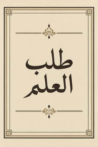
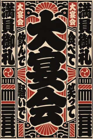
- Maghrebi Script (Maghribi Calligraphy of al-Andalus and North Africa)69% alike
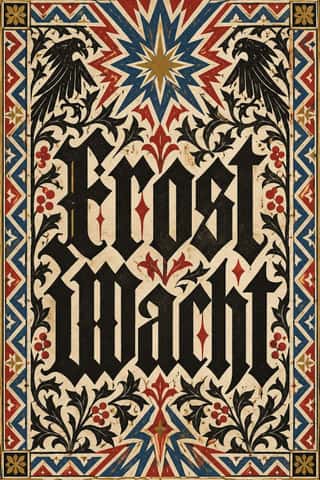
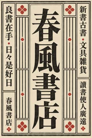
- Hebrew Micrography61% alike


04
Real works
Artefacts in museums, libraries and archives that show the style, linked at their source.
- Hurmuz nāmah (Dāstān-i Amīr Ḥamzah, Daftar-i avval, vol. 2), page 11Tasadduq Husain (author); Munshi Newal Kishore Press, Lucknow (lithographer and publisher) · March 1900 (first printing) · Columbia University Libraries, digitised via the Internet Archive (ldpd_11262705_000)
- Oudh Ukhbar (Avadh Akhbar), front page, 1 January 1875Newal Kishore Press, Lucknow · 1 January 1875 · British Library (image watermarked), via Wikimedia Commons
- Paisa Akhbar, vol. 14, front page, 3 February 1900Paisa Akhbar (Munshi Mahbub Alam), Lahore · 3 February 1900 · Internet Archive (paisa-akhbar-vol-14-1900, uploaded 2021 by an anonymous account; holding library not stated)
- Kirti Lehar (weekly), front page, 28 August 1938Kirti Lehar, Meerut (katib unrecorded) · Sunday 28 August 1938 (date line on the page; Commons gives '1936 or 1926') · Desh Bhagat Yadgar Hall archives, Jalandhar (image published by The Wire), via Wikimedia Commons
- Daily Jang, Karachi, first issue, front pageDaily Jang (katib unrecorded) · 14 October 1947 (per Commons; photographed framed copy, possibly a later facsimile) · Wikimedia Commons (photograph of a framed copy; holding institution not stated)


05
Sources
- Wikipedia, 'Noori Nastaliq' and 'Ahmed Mirza Jamil' (https://en.wikipedia.org/wiki/Noori_Nastaliq, https://en.wikipedia.org/wiki/Ahmed_Mirza_Jamil)
- The Friday Times, 'Remembering Tajuddin Zareen Raqam, a forgotten master calligrapher of Lahore' (2022)
- Global Voices, 'India: The Last Handwritten Newspaper in the World' (2012)
- Ulrike Stark, An Empire of Books: The Naval Kishore Press and the Diffusion of the Printed Word in Colonial India (Permanent Black, 2007)
How Stylogeny researches and checks a style: where the facts come from.