Rational modernism · 1950–1990 · East Asia
Japanese Postwar Modernism
Also known as Japanese Modern Graphic Design, Nihon modern design
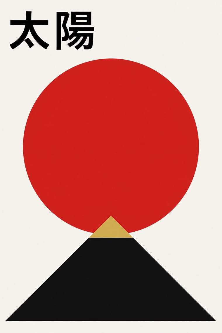
Building on the New Typography that Hiromu Hara and the Nippon Kobo circle had absorbed in the 1930s, Japan's postwar graphic designers fused the grid, sans-serif and objective photography of European modernism with indigenous traditions of family crests (kamon), asymmetry and charged emptiness (ma). From the Graphic '55 exhibition and the Nippon Design Center to Yusaku Kamekura's Tokyo 1964 Olympic posters, it produced bold emblematic symbols, luminous flat colour fields and photography of startling precision.
Make something in this styleGet advice in this styleMix it with another style
01
How it works
- Build the poster around one emblematic geometric symbol (a disc, a crest, a stylised figure) set against a large empty field.
- Treat emptiness (ma) as an active part of the composition, not as leftover margin.
- Combine flat fields of saturated colour, especially red, black and gold, with precise photography or geometry.
- Set Latin and Japanese text with the same modular discipline, letting vertical and horizontal lines coexist.
- Reduce traditional motifs (crests, textile patterns, theatre masks) to geometric primitives rather than quoting them literally.
Tokyo and Osaka, Japan
02
Its design choices
From Stylogeny’s vocabulary of design choices: defining choices make the style, characteristic ones are usual, occasional ones turn up now and then.
- Layout & composition
- Space & hierarchy
- Typography
- Colour
- Form & shape
- Surface & texture
- Imagery
- Medium & production
- Tone & intent
- Avoids
- Horror vacui, Abundant decoration, Collage & layering, Photocopy & distress, Eclectic mixing, Ornamented display, Rebellious & subversive
Palette
#f4f1ea#111111#d7261e#c8a24a#1d3c78
Typefaces
Gothic
kaku gothic Japanese sans
Mincho
Japanese serif
Helvetica
Futura
Univers
Known for
Yusaku Kamekura
Tokyo 1964 Olympic emblem and posters
Masaru Katsumie & Yoshiro Yamashita
Tokyo 1964 Olympic pictograms
Ikko Tanaka
Nihon Buyo poster, 1981
Kazumasa Nagai
Hiromu Hara
Graphic '55 exhibition
Takashimaya, Tokyo, 1955
Nippon Design Center
founded 1959
03
Make something in this style
Say what you need, and Stylogeny’s image studio draws it from Japanese Postwar Modernism’s design choices and checks it against them. It takes about a minute, and you get a link to share.
04
Where it comes from, and what it’s close to
Before it
The style it grew out of, and the styles it borrowed from.


After it
The styles that grew out of it.
No later style in the atlas grew out of it yet.
Alike in its design choices
Styles that make many of the same choices, related or not, besides those above.


05
Real works
Artefacts in museums, libraries and archives that show the style, linked at their source.
- Tokyo 1964Yusaku Kamekura · 1962 · The Museum of Modern Art, New York (1482.2000)
- On Children's DayShigeo Fukuda · 1955 · The Museum of Modern Art, New York (80.1990)
- Poster for the Japan Tourist AssociationHiroshi Ohchi · c. 1960–1965 · The Museum of Modern Art, New York (883.2015)
- Nihon BuyoIkko Tanaka · 1981 · The Museum of Modern Art, New York (649.1981)
06
Sources
- Richard S. Thornton, The Graphic Spirit of Japan (1991)
- Philip B. Meggs & Alston W. Purvis, Meggs' History of Graphic Design
- Nippon Design Center, History (https://ndc.co.jp/en/about/history)
How Stylogeny researches and checks a style: where the facts come from.