Medium & production · Print industry
Offset printing
Industrial four-colour and spot-colour offset.
A design choice in Stylogeny’s vocabulary, under medium & production: what technology shaped it?
- styles make it
- 165
- as a defining choice
- 41
- as a usual one
- 85
- now and then
- 39
- avoid it
- 2
Styles defined by it 41
For these styles it is one of the choices that make the style.
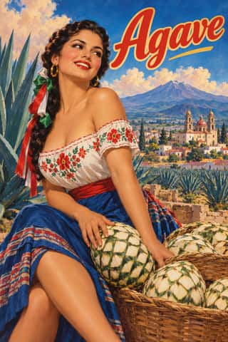
Mexican Calendar Chromo (Cromos calendáricos)Mexico's give-away advertising calendars, at their height from the 1930s to the late 1960s.
Milanese Industrial Modernism (Olivetti, Pirelli, Studio Boggeri)The Milan-centred school that married Bauhaus- and Swiss-trained discipline with Italian painterly wit for enlightened industrial patrons such as Olivetti, Pirelli and La Rinascente.
American Mid-Century ModernismThe American synthesis of European avant-garde form with wit, pragmatism and commercial clients, led by Paul Rand, Alvin Lustig, Lester Beall, Bradbury Thompson and Saul Bass.
International Typographic StyleA post-war refinement of the New Typography in which the mathematical grid, objective photography and neo-grotesque sans-serifs were used to communicate with clarity and neutrality.
Cairo–Beirut Arab Modernist Book & Periodical DesignThe illustrated book, magazine and children's-book culture that ran from Cairo's post-1952 publishing houses to the Arab nationalist and leftist presses of Beirut.
Vicente Rojo & Mexican Editorial ModernismThe design of Mexico City's literary and cultural press, shaped from the 1950s by the Barcelona-born exile Vicente Rojo: México en la Cultura, the Revista de la Universidad, Plural, La Jornada and the covers of Ediciones Era.
Arab Children's Comic Magazines (Samir to Majid)Arabic children's comics weeklies, from Dar al-Hilal's Samir in Cairo (1956) to Abu Dhabi's Majid (1979), mixing translated Western strips with house characters by Egyptian, Lebanese, Armenian and European artists.
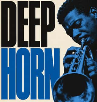
Blue Note Jazz Sleeve ModernismThe record-sleeve language of Blue Note Records, set by art director Reid Miles, who designed some 350 twelve-inch LP covers between about 1956 and 1967, often around Francis Wolff's session photographs.
- Bossa Nova Sleeve Modernism (César Villela and Elenco)The cover language of bossa nova, made in Rio by the self-taught designer César Villela, first at Odeon and then on the first sixteen LPs of Aloysio de Oliveira's label Elenco (from 1963), often around Francisco Pereira's photographs.
Fluxus Graphics (Maciunas)The house graphics George Maciunas made from 1962 until his death in 1978 for Fluxus, a network of artists who staged events and sold cheap multiples.
Phototype Expressive Typography (Lubalin & U&lc)The display typography of the phototype era, led in New York by Herb Lubalin, his lettering partners John Pistilli, Tom Carnase and Tony DiSpigna, and the International Typeface Corporation.
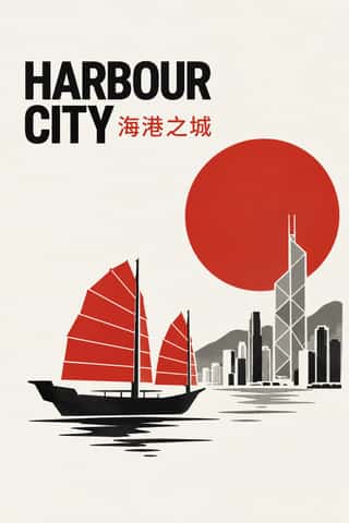
Hong Kong East–West Graphic ModernismThe studio design of Hong Kong from the 1960s, made for banks, developers, trade bodies, hotels and cultural events in a city that had to speak Chinese and English at once.
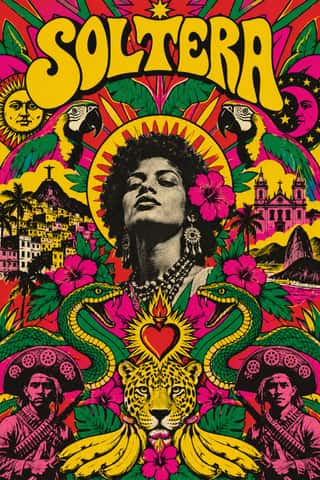
Tropicália Graphic DesignThe graphic language of Brazil's Tropicália, foreshadowed by Rogério Duarte's poster for Deus e o Diabo na Terra do Sol (1964), which already devours Ulm modernism, and set by his 1968 covers for Caetano Veloso and Gilberto Gil.
- Palestinian Resistance PosterThe poster culture of the Palestinian national movement after 1965, issued by the PLO and its factions from Beirut and other Arab capitals for refugee camps, homes and solidarity audiences abroad.
Munich 1972 Olympic Design (Otl Aicher)The visual programme Otl Aicher's department made for the 1972 Munich Olympics, the 'cheerful Games' meant to show a democratic, modest West Germany.
- Black Panther Party GraphicsThe visual language of the Black Panther Party, created largely by its Minister of Culture, Emory Douglas, for the weekly newspaper The Black Panther.
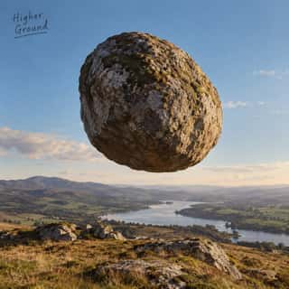
Hipgnosis Photographic Concept SleeveThe sleeves the London studio Hipgnosis made for Pink Floyd, Led Zeppelin, Genesis, Peter Gabriel, 10cc and others from 1968 to 1983.
Underground ComixSelf-published, adults-only comic books from the San Francisco counterculture, made outside the Comics Code on the newsstand comic's format.
ECM Sleeve Aesthetic (Munich)The cover language of the Munich label ECM, made since 1970 by Barbara Wojirsch, Dieter Rehm and later Sascha Kleis and Mayo Bucher with co-founder Manfred Eicher.
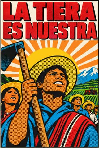
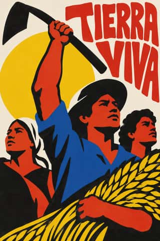
Pop Achorado (Peruvian Agrarian Reform Posters)Posters for the Peruvian military government's agrarian reform, made in Lima from 1969 by Jesús Ruiz Durand and colleagues at the state's reform publicity office.
- Grapus (French Militant Graphic Collective)The posters and identities of Grapus, a Paris collective founded in 1970 by Communist Party members who had met in the 1968 poster workshops.
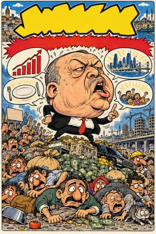
Turkish Weekly Humour Magazines (Gırgır to Uykusuz)Istanbul's weekly cartoon magazines, from the Aral brothers' Gırgır (1972), which sold up to about half a million copies, through the chain of breakaways that followed it: Limon, LeMan, Penguen and Uykusuz.
- Roots Reggae Sleeve Art & Rasta IconographyThe record sleeves of roots reggae, from Catch a Fire (1973) until dancehall took over in the 1980s.
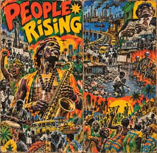
Afrobeat Sleeve ArtThe painted and collaged record covers of Nigerian Afrobeat, defined by Lemi Ghariokwu's sleeves for Fela Kuti from Alagbon Close (1974) onward.
- Ethiopian Revolutionary Poster (Derg Era)The poster and mural art of the Derg military government and its successor, Mengistu's People's Democratic Republic of Ethiopia (1974–1991), made mostly by teachers and students of the Addis Ababa School of Fine Arts.
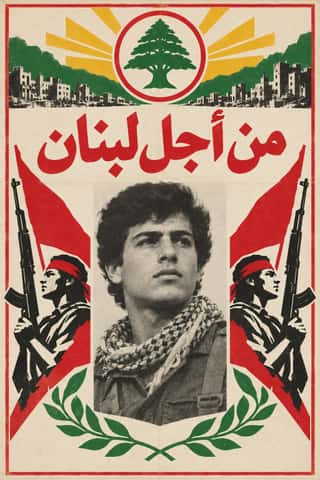
Lebanese Civil War Party PosterThe posters that some twenty parties and militias pasted on the walls of Beirut and other towns between 1975 and 1990, marking each quarter as one faction's territory.
Dutch Expressive Postmodernism (Studio Dumbar & Hard Werken)An anti-functionalist current in Dutch graphic design led by Studio Dumbar in The Hague (from 1977) and the Rotterdam collective Hard Werken (magazine from 1979, design office 1982–1994).
- Post-Punk Record Sleeve (Stiff, Factory, 4AD)The record sleeves that British art-school designers made after punk, for independent labels and some majors: Barney Bubbles at Stiff, Malcolm Garrett for Buzzcocks, Peter Saville at Factory and 23 Envelope at 4AD.
- Iranian Revolutionary & Sacred Defence PosterPosters, murals and stamps of the 1978–79 Iranian Revolution and the 1980–88 war with Iraq, which fused the red-white-black international revolutionary poster with Persian miniature and coffeehouse narrative painting.
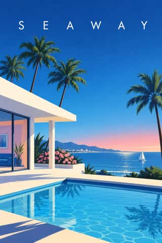
City Pop IllustrationThe painted look of Japanese city pop record sleeves and magazine covers, fixed by Hiroshi Nagai's sleeve for Eiichi Ohtaki's A Long Vacation (1981) and Eizin Suzuki's for Tatsuro Yamashita's For You (1982).
- Madinah Mushaf (King Fahd Complex Qur'an Page)One fixed page for the Qur'an across much of the Muslim world: Uthman Taha's fully vowelled Naskh in fifteen justified lines, written so that every page ends at the end of a verse (the late Ottoman âyet-berkenar layout), inside a floral frame, with sura titles in framed cartouches and verse numbers in small round medallions.
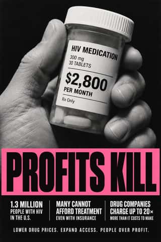
ACT UP & Gran Fury AIDS Activist GraphicsThe graphics of New York's AIDS activist movement: the SILENCE=DEATH poster of 1987, a pink triangle above white capitals on black, and the posters, stickers, T-shirts, billboards and bus ads of Gran Fury (1988–1995), ACT UP's 'unofficial propaganda ministry'.
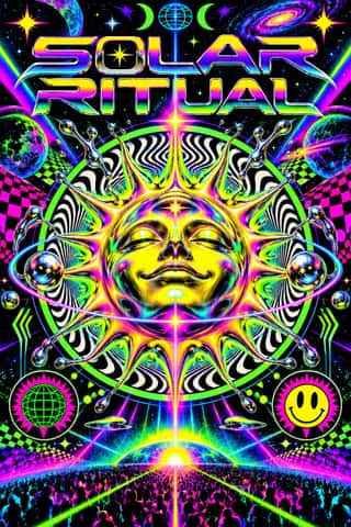
Rave & Acid House GraphicsThe pocket-sized promotional art of acid house, rave and early techno, handed out in record shops and car parks to advertise all-night parties.
- Nollywood Video Jacket & Film PosterThe cover and poster art of Nigeria's home-video boom, from Living in Bondage (1992) on.
- Contemporary Chinese Book Design ('Most Beautiful Books of China')Chinese book design since 2003, when Shanghai founded the yearly 'Most Beautiful Books of China' award, whose winners go on to Leipzig.
- Seoul Independent Graphic Design (Small-Studio Scene)Graphic design by Seoul's small, self-run studios, which from about 2005 chose to stay small.
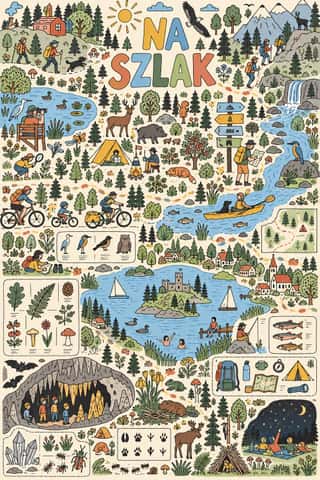
Polish Information Picture Book (Dwie Siostry)Mostly large-format information picture books made since 2008 by the Warsaw publisher Dwie Siostry with young illustrators led by Aleksandra and Daniel Mizieliński, graduates of the city's Academy of Fine Arts: atlases, cross-sections, labyrinths, activity books and wordless seek-and-find board books.
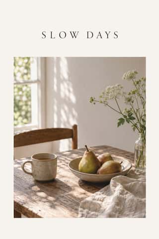
Slow-Living Editorial (the Kinfolk Look)The look of Kinfolk, the slow-living quarterly founded in Portland in 2011 and run from Copenhagen since 2015, and of the indie lifestyle titles and Instagram feeds that copied it.
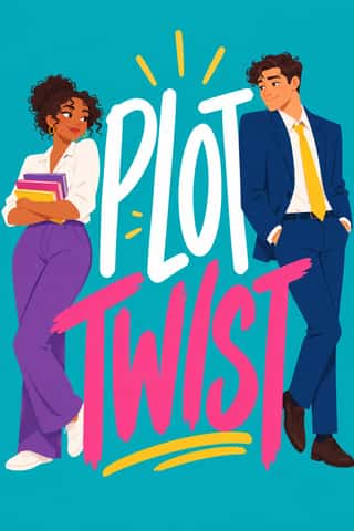
Illustrated Rom-Com Book Cover (Cartoon Couple Cover)The illustrated cover of the contemporary romantic comedy: a couple drawn as flat cartoon figures with simplified faces, from silhouettes and hidden faces to a few cartoon features, caught in one gesture that states the premise, on a single saturated ground of teal, pink, yellow or purple, under a hand-lettered title so large that the figures often lean on it.
Newtro (Korean New-Retro)A South Korean branding trend, named 'Going New-tro' in Seoul National University's Trend Korea 2019 (October 2018), in which heritage firms reissue their own postwar to 1990s labels, trademarks and mascots, polished for young buyers.
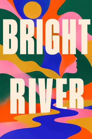
Book Blob (Abstract Colour-Blob Literary Fiction Cover)The default jacket of US literary fiction around 2019–2023: soft, overlapping blobs of saturated colour fill the cover edge to edge (cobalt, pink, orange-red, deep green, mustard).
Styles that often use it 85
A characteristic choice: usual in these styles, though not essential.
- Indian Calendar & Bazaar ArtMass-printed images of Hindu deities, epic scenes, saints, nationalist heroes and film stars, sold in bazaars and given away as business calendars, from the chromolithographs of the Calcutta Art Studio and Ravi Varma Press to Sivakasi offset.
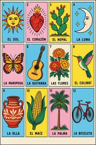
Lotería Card Imagery (Mexican Lotería)The picture deck of Mexico's lotería, a bingo-like game of chance.
Shanghai Modern & YuefenpaiThe commercial art of treaty-port Shanghai.
- Taishō Roman & Lyrical IllustrationThe lyrical illustration (jojōga) of late-Meiji to early-Shōwa Japan, led by Takehisa Yumeji: willowy, large-eyed women in kimono drawn with an Art Nouveau contour, set among camellias and kimono patterns and lettered by hand.
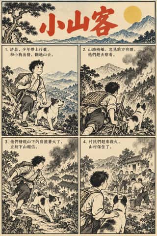
Lianhuanhua Picture-Story BooksPalm-sized Chinese picture books, about three by five inches, that tell a novel, opera, film or revolutionary story in hundreds of single framed drawings, one to a page, each with a short caption.
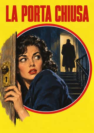
Giallo Mondadori Covers (I Libri Gialli)The cover system of Mondadori's crime series, Milan, from I Libri Gialli of 1929 to Il Giallo Mondadori today.
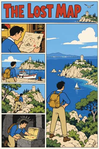
Ligne Claire (Franco-Belgian Clear Line)The comic drawing style of Hergé's Tintin and the Brussels school, named 'klare lijn' by Joost Swarte in 1977.
- AIZ Political Photomontage (Heartfield)The political photomontage John Heartfield made for the communist weekly AIZ from 1930 to 1938, in Berlin and, from 1933, in Prague exile.
Scandinavian FunctionalismNordic functionalism (funkis) arrived in graphic form with Sigurd Lewerentz's posters and winged emblem for the 1930 Stockholm Exhibition.
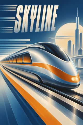
Streamline ModerneThe late, chiefly American phase of Art Deco, in which aerodynamic science became a visual language for a Depression-era culture hungry for progress.
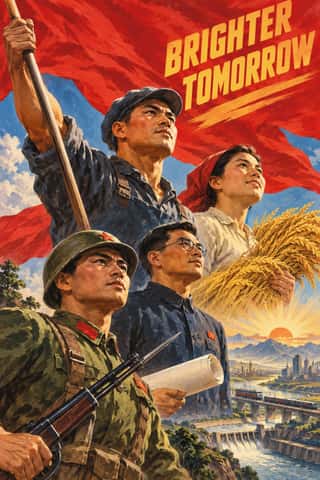
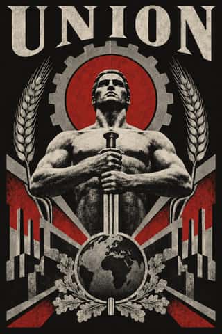
Socialist Realist Propaganda PosterThe official art doctrine of the Soviet Union from 1932, later exported across the socialist world, which replaced avant-garde experiment with legible, heroic realism 'national in form, socialist in content'.
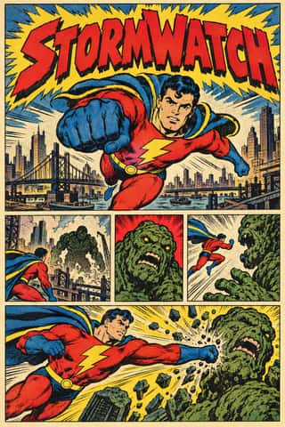
American Four-Colour Comic Book (Golden to Bronze Age)The American newsstand comic book from Famous Funnies (1934) and Action Comics #1 (1938) through the Golden, Silver and Bronze Ages, and past the Bronze Age's end in 1985 until computer colour replaced hand separations in the early 1990s.
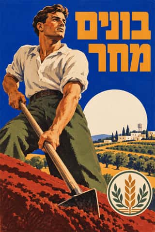
Hebrew Poster Lettering & Early Israeli State DesignThe commercial and state graphics of the Jewish community in Mandate Palestine and early Israel, made in Tel Aviv from 1934 by designers who had trained in Berlin and Vienna: Franz Krausz, Otte Wallish and the Shamir brothers.
Tiki Pop (Polynesian Pop)The mainland American fantasy of the South Seas, begun by Don the Beachcomber's Hollywood bar (about 1934) and Trader Vic's in Oakland and at its height in the Polynesian restaurants of the 1950s and 60s.
Penguin Paperback Design (Three Bands to the Marber Grid)The cover system of Penguin Books, London, from 1935 until Germano Facetti left in 1972.
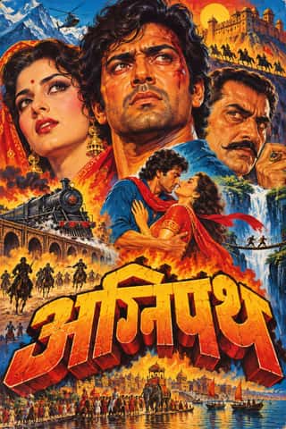
Hand-Painted Bollywood PosterThe painted publicity of Bombay's Hindi film industry, at its height from the 1940s to the 1980s.
Bengali Modernist Book Cover (Prachchhad)A literary book-jacket culture that began at Calcutta's Signet Press in 1943, where Satyajit Ray and later Purnendu Pattrea made the hand-drawn Bengali title the main image of the cover.
Fotoromanzo (Italian Photo-Romance)The photo-romance of the Italian women's weeklies: a melodrama told in staged photographs, first printed by Il mio sogno and Bolero Film in May 1947 and copied from France to Brazil.
- Machine-Age Simplified Arabic TypeArabic redrawn for the machine rather than the reed pen.
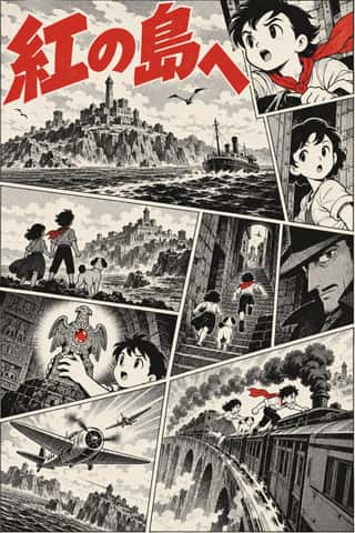
Story Manga (Postwar Japanese Comics)The black-and-white narrative comic of postwar Japan, from Tezuka Osamu's Shin Takarajima (1947) to the weekly boys' magazines of 1959 and 1968 and the paperbacks that collect them.
Bonelli Fumetto (Italian Popular Adventure Comics)The house format of Milan's Bonelli publishing house and its imitators (Tex, Zagor, Dylan Dog, Nathan Never): monthly newsstand paperbacks of 16 x 21 cm with about a hundred black-and-white pages, each a long episode of a serial hero.
Japanese Postwar ModernismBuilding on the New Typography that Hiromu Hara and the Nippon Kobo circle had absorbed in the 1930s, Japan's postwar graphic designers fused the grid, sans-serif and objective photography of European modernism with indigenous traditions of family crests (kamon), asymmetry and charged emptiness (ma).
Polish Poster SchoolA painterly, metaphorical poster culture that flourished in communist Poland, chiefly for film, theatre, opera and circus.
Brazilian Concrete DesignA São Paulo and Rio movement in which concrete art, concrete poetry and Brazil's first design offices shared one vocabulary: Max Bill's mathematically generated geometry, serial repetition and sans-serif type.
Drum Magazine & Sophiatown PhotojournalismThe picture magazine of Black urban Africa in the 1950s.
Zagreb Modernist Graphics (EXAT 51 to Teatar &TD)Zagreb graphic design grown from the EXAT 51 manifesto (1951), which tied abstract art to visual communication.
HfG Ulm Systematic DesignThe Hochschule für Gestaltung Ulm (1953–1968) was founded as the successor to the Bauhaus.
West German Conceptual Film & Culture Poster (Hillmann and Rambow)The art-film and culture poster Hans Hillmann developed from 1953 for the West German distributors Neue Filmkunst and Atlas Film, which his Kassel student Gunter Rambow took with Gerhard Lienemeyer into staged photo posters for theatre, publishers and protest.
Push Pin StyleThe eclectic illustrative style of New York's Push Pin Studios, founded by Seymour Chwast, Milton Glaser and Edward Sorel.
Corporate Identity ModernismModernist reduction applied to corporate communication.
Pop Art GraphicsPop turned the commercial imagery of post-war consumer culture (comics, packaging, celebrity photographs and advertising) into both its subject and its method.
Situationist Détournement GraphicsGraphics of the Letterist and Situationist Internationals (1956–1972), built on détournement: taking existing words and pictures (comic strips, advertisements, news photographs, city maps, classic texts) and turning them against their source.
Thaw Modernism (Soviet and Czechoslovak)The light, stylised modernism that replaced Socialist Realist illusionism and Stalinist pomp in Soviet and Czechoslovak graphic and applied design, from the 1956 Secret Speech, the 1957 Moscow youth festival and Expo 58 to the crushing of the Prague Spring in 1968 (a political cut-off; the manner ran on into the 1970s).
Shōjo Manga (Japanese Girls' Comics)The look of Japan's girls' comics (strictly a readership, not a style), which Takahashi Macoto fixed in 1958 from the lyrical illustration (jojōga) of Nakahara Jun'ichi and the Year 24 Group remade in the 1970s.
Turkish Modernist Poster & Graphic DesignThe posters of Istanbul's first generation of professional graphic designers for theatres, films, festivals and exhibitions.
Cuban Revolutionary Poster (OSPAAAL & ICAIC)The poster culture of revolutionary Cuba, produced for the film institute ICAIC and the solidarity organisation OSPAAAL.
Di Tella Graphic Design (Instituto Torcuato Di Tella)The in-house graphics of Buenos Aires' Instituto Torcuato Di Tella, 1960–1970, led by Juan Carlos Distéfano with Juan Andralis, Rubén Fontana, Norberto Coppola and Carlos Soler.
- Greek Tourism Modernism (EOT)The modernist image of Greece made for the National Tourism Organisation (EOT) by Michalis Katzourakis, its art adviser in 1960-1967, and by Frederick Carabott, who advised it until 1967; in 1962 the two also founded the K&K Athens Advertising Centre.
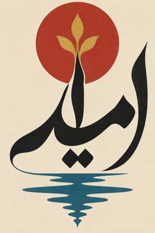
Iranian Modernist Graphic DesignIranian graphic design came of age in the 1960s and 1970s.
Op Art GraphicsA 1960s style that turned perceptual research into graphic effect: precisely drawn lines, checks, concentric rings and modular grids, usually black and white or complementaries of equal value, that seem to vibrate, swell or move.
Indian Institutional Modernism (NID)The design culture of independent India's public institutions, banks and broadcasters.
- Casablanca School Graphic ModernismA postcolonial modernism formed at the Casablanca fine-art school under Farid Belkahia, where Mohamed Melehi, Mohammed Chabâa and colleagues set Amazigh rugs and jewellery, painted ceilings and calligraphy beside a Bauhaus-style merging of art, craft and design.
Total Design & Dutch FunctionalismThe Dutch strand of systematic modernism took shape when Wim Crouwel, Benno Wissing, Friso Kramer and Paul and Dick Schwarz founded Total Design in Amsterdam in 1963 as the country's first multidisciplinary studio.
Angura Theatre PosterThe posters of Japan's underground (angura) theatre from the mid-1960s to the mid-1980s, made for troupes such as Kara Jūrō's Jōkyō Gekijō and Terayama Shūji's Tenjō Sajiki.
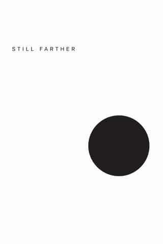
Minimalist Graphic DesignModernism reduced to its barest means, informed by 1960s Minimal art and Japanese emptiness: one image or line of type, vast white or neutral space, a monochrome or near-monochrome palette and meticulous typographic detail.
Psychedelic PosterThe concert-poster language of the 1960s counterculture, born in San Francisco's Fillmore and Avalon ballrooms and echoed in London's underground press.
- Mexico 68 Olympic & Metro IdentityThe graphic programme of the 1968 Mexico City Olympics and the city's first Metro line.
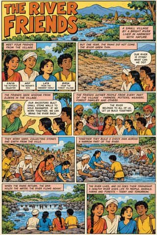
Amar Chitra Katha ComicsThe Bombay comic-book series that from 1967 retold Hindu myth and epic, Buddhist and Jain tales, saints, folk legends, the jests of the court wits Birbal and Tenali Raman, and Indian history for children, in English and Indian languages, with well over 500 titles by the early 1990s.
Chilean Unidad Popular & Nueva Canción GraphicsThe graphics of the Nueva Canción Chilena and Allende's Unidad Popular, 1967–1973.
- Swiss Punk / New Wave TypographyA rebellion from inside the Swiss school: Wolfgang Weingart and his Basel students kept the grotesque and the grid but set them in motion with extreme letterspacing, stepped and angled lines, rules and bars, enlarged halftone screens and layered film montage.
Afrofuturist DesignA visual language of Black futures that fuses African and diasporic iconography (pyramids and ankhs, Adinkra and Nsibidi glyphs, textile patterning) with spacecraft, cosmic fields and technology.
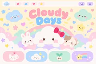
Kawaii DesignJapan's culture of cuteness, which grew from 1970s teenage rounded handwriting and shōjo fancy goods into a global design language through Sanrio, character merchandise and emoji.
Roman-like Thai Typography (modern loopless Thai)A Thai type genre that drops the head loops of most Thai letters, so the script reads as an even sans like Helvetica.
Métal hurlant Science-Fiction Comics (Mœbius, Druillet & Les Humanoïdes Associés)The adult science-fiction comics of Métal hurlant, the Paris magazine founded in 1974 by Mœbius, Philippe Druillet, Jean-Pierre Dionnet and Bernard Farkas.
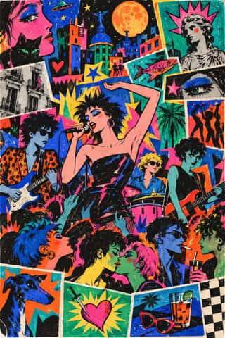
La Movida Madrileña GraphicsThe graphics of Madrid's Movida, the post-Franco scene of new-wave bands, fanzines and night life usually dated from the Canito concert of 9 February 1980 and later backed by the city council.
Cranbrook & Deconstructivist TypographyGraduate-school experimentation, centred on Katherine and Michael McCoy's Cranbrook design programme, that applied post-structuralist literary theory to the page.
NSK Retro-Avant-GardeThe retro-avant-garde of Neue Slowenische Kunst, founded in Ljubljana in 1984 by Laibach, IRWIN and the Scipion Nasice Sisters Theatre, with Novi kolektivizem as its design department.
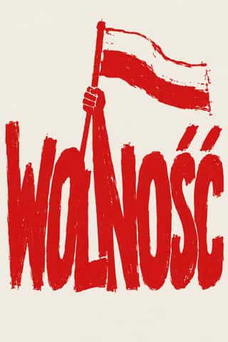
Solidarność & Polish Underground GraphicsThe graphic language of Poland's Solidarność movement, from the August 1980 shipyard strike to the semi-free election of 4 June 1989.
Memphis DesignThe Milan collective founded by Ettore Sottsass, whose furniture, laminates and objects (first shown in September 1981) became a graphic language of their own.
Emigre & Early Digital TypeRudy VanderLans and Zuzana Licko's magazine and type foundry, launched in 1984 alongside the first Macintosh, turned the computer's low-resolution constraints into a new typographic idiom.
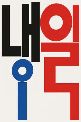
Out-of-Square Hangul TypographyA Korean typographic movement that frees Hangul from the equal square in which metal and photo type had always set each syllable.
Techno-Futurist GraphicsElectronic-music and video-game graphics of the late 1980s and 1990s that turned corporate modernism into a sci-fi consumer fantasy.
Global Village CoffeehouseThe faux-naive, earth-toned illustration style that late-1980s American designers set against Memphis, and that chain cafés, bookstores, packaging and clip art spread through the 1990s.
- Black Metal GraphicsThe visual language of black metal, fixed by Norway's second wave in the early 1990s, now worldwide, since the 2010s borrowed by mainstream acts (Szpajdel's Rihanna and Metallica logos, 2016).
Grunge TypographyThe 1990s magazine and music-industry style in which type was layered, eroded, overlapped and cropped until legibility became negotiable.
L'Association and French Alternative ComicsThe black-and-white auteur comics of L'Association, the Paris publisher founded by seven cartoonists in 1990, and the 1990s small-press scene it led.
- Bitterkomix (Afrikaans Underground Comics)The Afrikaans underground comics magazine founded in Stellenbosch in 1992 by Anton Kannemeyer (Joe Dog) and Conrad Botes (Konradski), with Mark Kannemeyer (Lorcan White).
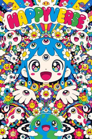
SuperflatThe flat, saturated, cartoon-crowded look that Takashi Murakami named in his exhibition and manifesto Superflat (Tokyo, 2000; US tour 2001).
- South African Vernacular Design (Ijusi)A post-apartheid design language launched in Durban in 1995 by Garth Walker's Orange Juice Design and its free, experimental magazine Ijusi (isiZulu for 'juice'), which asked 'What makes me South African, and what does that look like?'.
- Indian Pop-Kitsch Design (Desi Kitsch)Urban Indian gift and T-shirt design from the late 1990s into the 2010s that recasts the street and bazaar as ironic, affectionate icons: truck tails and 'Horn OK Please', auto-rickshaws, Ambassadors and Chetaks, cutting chai, old Bollywood stills and dialogues, Bhagat Singh in place of Che.
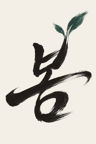
Korean Commercial Calligraphy (Kaelligeurapi)Brush-written Hangul made for commerce, not the scroll.
Yuru-chara (Japanese Local Mascot Design)Japan's local mascots: characters commissioned by prefectures, towns and tourism bodies to stand for a place, named yuru-kyara ('loose characters') by the illustrator Jun Miura around 2000.
Hauntology & Ghost Box DesignSleeves and print that rebuild a misremembered British past from the public graphics of roughly 1958–1978.
Neo-Swiss RevivalA contemporary revival of the International Typographic Style, fuelled by digital re-releases of neo-grotesques and by studios such as Experimental Jetset and Norm: modular grids, flush-left grotesque type, huge tightly set headlines and flat fields of black, white and one signal colour.
Arab Independent Comics (Samandal, TokTok, Lab619, Skefkef)Adult comics magazines edited by Arab artists' collectives since 2007, at times with a ministry grant or an NGO partner: Samandal in Beirut, TokTok in Cairo, Lab619 in Tunis and Skefkef in Casablanca.
Hipster Artisanal RevivalThe trade-mark look of the 2007–2018 craft boom, which dressed new coffee roasters, breweries and stationers as nineteenth- and early-twentieth-century firms.
Natural Wine Label ArtThe labels of the natural (low-intervention) wine scene, which grew from Beaujolais into a worldwide network of small growers, bars and importers.
DTC 'Blanding' / Millennial MinimalismThe friendly, frictionless minimalism of 2010s direct-to-consumer start-ups, built for the phone screen, the Instagram feed and the unboxing.
Plain Tobacco PackagingA packaging language written into law to strip tobacco of persuasion.
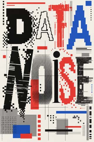
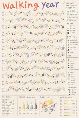
Data HumanismAn information-design approach that draws data rather than charting it, treating numbers as personal, approximate and human.
SolarpunkHopeful eco-futurist imagery born online.
- Front-of-Pack Warning Octagons (Latin American Food Warning Seals)A state warning system stacked on commercial food packs.
Guochao (China-Chic National Trend)A Chinese branding and fashion trend, usually dated from Li-Ning's 'China Li-Ning' show at New York Fashion Week in February 2018, that redraws heritage motifs as finishes for sneakers, apparel, cosmetics and museum merchandise.
Post-Binary Typography (Bye Bye Binary and Inclusive French Type)A Franco-Belgian type practice that redesigns written French for gender inclusion inside the word.
Ukrainian Wartime Graphics (Saint Javelin, War Stamps and Be Brave Like Ukraine)The graphics of Ukraine's defence since Russia's full-scale invasion in February 2022, made by the state, the national post, agencies, illustrators and volunteers at home and abroad.
Styles that use it now and then 39
An occasional choice in these styles.
- Song–Ming Woodblock Book Typography (Songti / Mincho)c. 960–present
- Square Kufic (Bannāʾī)c. 1100–present
- Zoomorphic & Figural Calligraphy (Islamic Calligrams)1500–present
- Tarot de Marseille Woodcut Cards1639–present
- Edo-moji Commercial Lettering (Kanteiryū, Yose-moji, Sumō-ji)1779–present
- Urdu Katib Lithography1837–present
- Cuban Tobacco Lithography (Habilitaciones & Marquillas)1845–present
- Nirnaya Sagar Devanagari Typography (Bombay Metal Type)1864–present
- Spanish Bullfight Poster (Cartel Taurino)1879–present
- London Transport Design1908–1966
- Art Deco1910–1939
- Basel Object Poster (Swiss Sachplakat)1919–1955
- Surrealist Graphics1924–1960
- Harlem Renaissance Graphic Art1925–1940
- Isotype Pictorial Statistics1925–1971
- Australian Travel Poster (ANTA Era)1929–1959
- Egyptian Painted Film Poster1932–1996
- UPA & Cartoon Modern1944–1960
- Googie & Atomic Age1945–1965
- Vietnamese Propaganda Poster (Tranh cổ động)1945–present
- Puerto Rican Silkscreen Poster (DIVEDCO & ICP)1946–1989
- French Post-War Visual-Gag Poster (Savignac, Villemot, Morvan)1948–1979
- Woodland School (Legend Painting)1962–present
- Baybayin Revival Graphics1963–present
- Chicano Screenprint Poster1965–present
- Atelier Populaire (May '68 Screenprint Poster)1968
- Gráfica del 68 (Mexican Student Movement Graphics)1968
- Graffiti & Hip-Hop Graphics1972–present
- Punk & DIY Zine1976–1986
- South African Resistance Poster1978–1994
- Jamaican Dancehall Signs & Sleeve Art1980–present
- Pardhan Gond Painting (Jangarh Kalam)1981–present
- Y2K Futurism1997–2005
- Korean Webtoon Graphics2002–present
- Contemporary Arabic & Dual-Script Type Design2004–present
- Modern Calligraphy and Brush Lettering2005–present
- Synthwave / Outrun2006–present
- Lucerne Poster Scene (Neubad & Südpol Posters)2007–present
- Newsroom Data Graphics & Scrollytelling2009–present
It often goes with
Choices that the styles making it make more often than the atlas as a whole.
- Treated photographyin 53 of 165
- Full bleedin 76 of 165
- Straight photographyin 60 of 165
- Photomontagein 50 of 165
- Layered informationin 72 of 165
- Isolated objectin 106 of 165
Styles that avoid it
Styles that deliberately leave it out.