Counterculture · 1990–2000 · North America, Western Europe
Grunge Typography
Also known as Grunge type, Ray Gun style, Dirty type
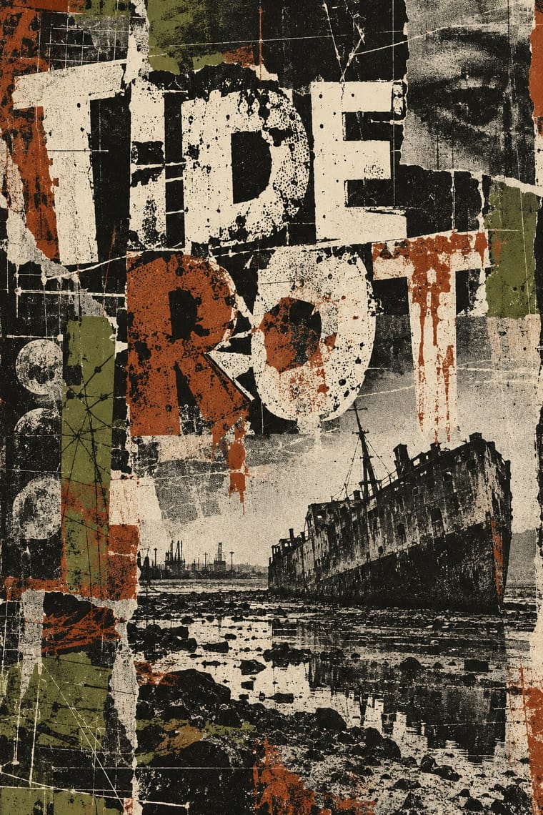
The 1990s magazine and music-industry style in which type was layered, eroded, overlapped and cropped until legibility became negotiable. Made on the Macintosh but deliberately dirty, it combined distressed digital fonts, scanned textures and blurred, cropped photography with layouts that broke the grid on every spread, treating the page as an expressive surface rather than a neutral container for text.
Make something in this styleGet advice in this styleMix it with another style
01
How it works
- Layer and overlap text blocks, letting lines collide, bleed off the page or sink into the image.
- Use distressed, eroded or mismatched fonts and mix several on a single spread.
- Scan in dirt: photocopy grain, scratches, smudges and torn paper as background texture.
- Crop, blur and darken photographs so they convey mood rather than information.
- Break the grid on every spread, changing column widths, leading and alignment from page to page.
- Put expression before legibility, but leave the reader one clear point of entry.
Southern California (Beach Culture, Ray Gun), Seattle and London
02
Its design choices
From Stylogeny’s vocabulary of design choices: defining choices make the style, characteristic ones are usual, occasional ones turn up now and then.
- Layout & composition
- Space & hierarchy
- Typography
- Colour
- Surface & texture
- Imagery
- Medium & production
- Tone & intent
- Avoids
- Modular grid, Central symmetry, Classical text block, Flat, Gloss & highlights, Pastel, Rational & objective, Authoritative & institutional
Palette
#1b1a17#e8e2d0#8b3a1a#6b6b3a#7d7a73#a8322d
Typefaces
Template Gothic
Barry Deck, 1990
FF Trixie
Erik van Blokland, 1991
FF Blur
Neville Brody, 1992
Dead History
P. Scott Makela, 1990
Known for
David Carson
Beach Culture; Ray Gun, 1992–95
Ray Gun magazine
1992–2000
Art Chantry
Sub Pop, The Rocket, Seattle
Barry Deck
Template Gothic, 1990
Neville Brody & Jon Wozencroft
FUSE, from 1991
Jonathan Barnbrook
03
Make something in this style
Say what you need, and Stylogeny’s image studio draws it from Grunge Typography’s design choices and checks it against them. It takes about a minute, and you get a link to share.
04
Where it comes from, and what it’s close to
Before it
The style it grew out of, and the styles it borrowed from.


After it
The styles that grew out of it.
No later style in the atlas grew out of it yet.
Alike in its design choices
Styles that make many of the same choices, related or not, besides those above.


05
Real works
Artefacts in museums, libraries and archives that show the style, linked at their source.
- Tora Tora Tora club night at the Art College, Belfast (David Holmes, David Anderson, Timmy and Glenn)Glenn Leyburn · 1990s (a Saturday 31 May falls only in 1997 within the decade) · Victoria and Albert Museum, London (S.506-2026)
06
Sources
- Lewis Blackwell & David Carson, The End of Print: The Graphic Design of David Carson (1995)
- Rick Poynor, No More Rules: Graphic Design and Postmodernism (2003)
- Philip B. Meggs & Alston W. Purvis, Meggs' History of Graphic Design
How Stylogeny researches and checks a style: where the facts come from.