Medium & production · Screen
Desktop publishing
Early Mac/PC layout, bitmap fonts and PostScript.
A design choice in Stylogeny’s vocabulary, under medium & production: what technology shaped it?
- styles make it
- 19
- as a defining choice
- 5
- as a usual one
- 9
- now and then
- 5
- avoid it
- 5
Styles defined by it 5
For these styles it is one of the choices that make the style.
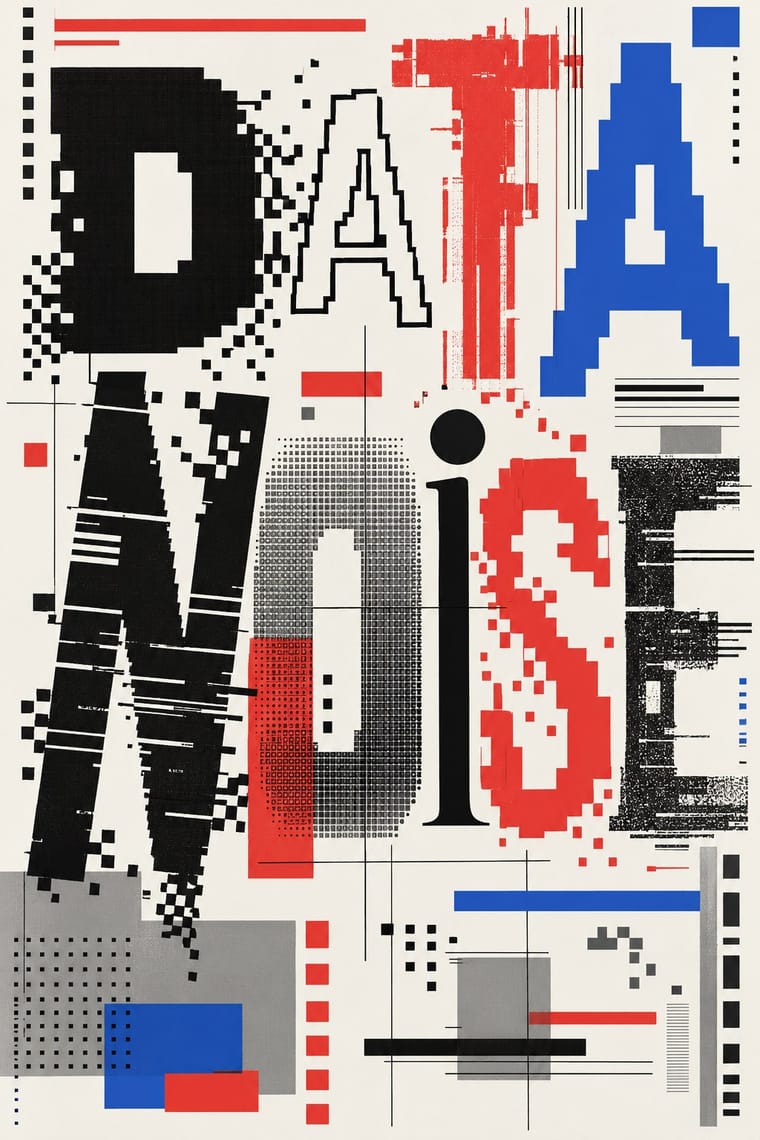
Emigre & Early Digital TypeRudy VanderLans and Zuzana Licko's magazine and type foundry, launched in 1984 alongside the first Macintosh, turned the computer's low-resolution constraints into a new typographic idiom.
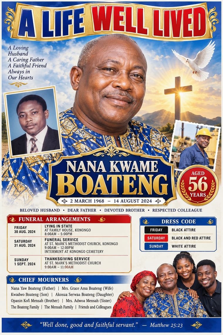
Ghanaian Funeral Poster & BannerThe printed death announcements of southern Ghana, also found elsewhere in West Africa: colour posters, mostly A2, pasted on walls, trees, poles and vehicles, and by the mid-2010s large PVC banners hung at the family house.
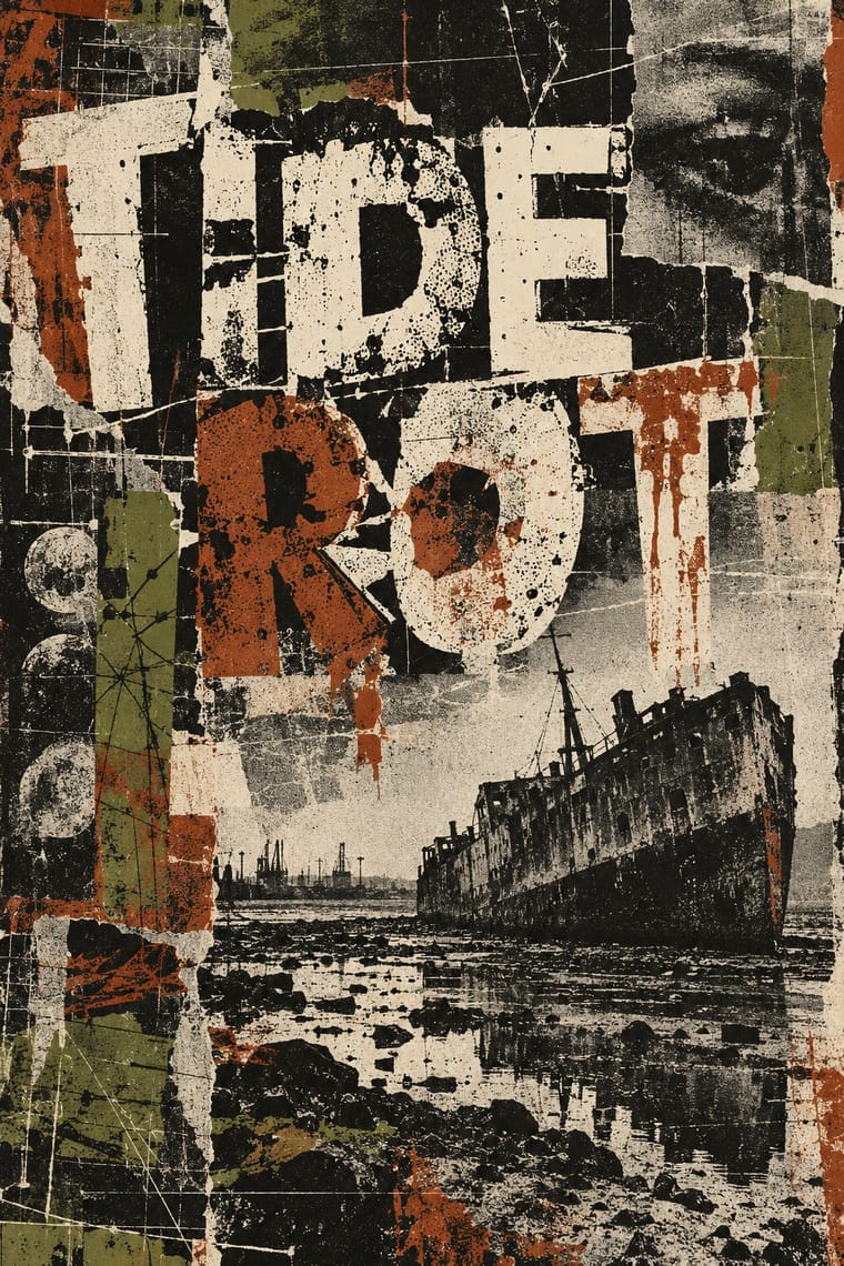
Grunge TypographyThe 1990s magazine and music-industry style in which type was layered, eroded, overlapped and cropped until legibility became negotiable.
- Nigerian Pentecostal Crusade Poster & BillboardThe roadside adverts of Nigeria's Pentecostal and independent churches: billboards, banners and posters on poles, walls and bridges announcing crusades, revivals, conventions and night vigils.
- Tamil Nadu Flex BannersThe digitally printed vinyl boards, locally called flex banners, that fan clubs, party cadres, businesses and families have put up along the roads of Tamil Nadu since about 2000, as flex displaced hand-painted cinema banners and cut-outs over the following decade.
Styles that often use it 9
A characteristic choice: usual in these styles, though not essential.
- Machine-Age Simplified Arabic TypeArabic redrawn for the machine rather than the reed pen.
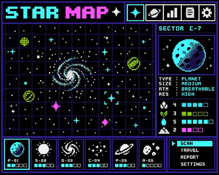
Bitmap & Pixel GraphicsGraphics and lettering built from the square pixels of low-resolution screens (arcade and console sprites, home-computer displays and the first graphical user interfaces), where every dot was placed by hand within tight limits of memory, resolution and palette.
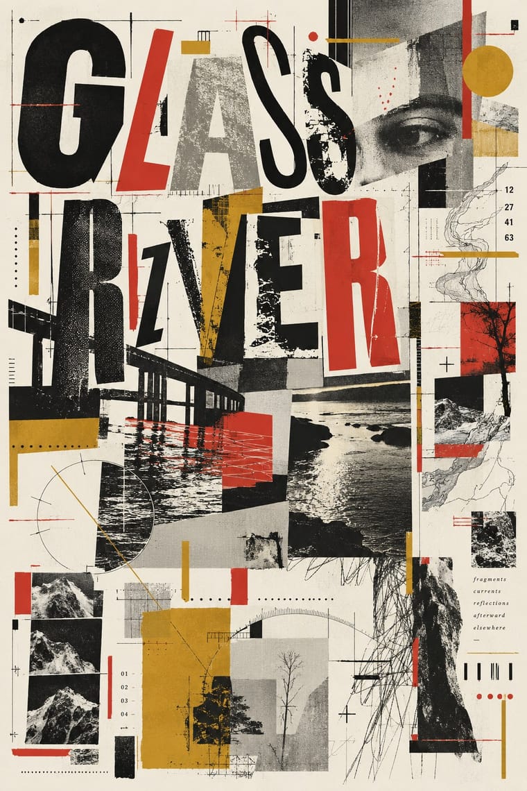
Cranbrook & Deconstructivist TypographyGraduate-school experimentation, centred on Katherine and Michael McCoy's Cranbrook design programme, that applied post-structuralist literary theory to the page.
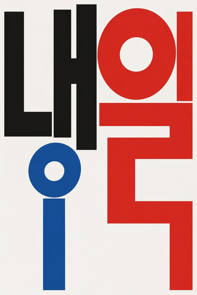
Out-of-Square Hangul TypographyA Korean typographic movement that frees Hangul from the equal square in which metal and photo type had always set each syllable.
Techno-Futurist GraphicsElectronic-music and video-game graphics of the late 1980s and 1990s that turned corporate modernism into a sci-fi consumer fantasy.
Global Village CoffeehouseThe faux-naive, earth-toned illustration style that late-1980s American designers set against Memphis, and that chain cafés, bookstores, packaging and clip art spread through the 1990s.
Rave & Acid House GraphicsThe pocket-sized promotional art of acid house, rave and early techno, handed out in record shops and car parks to advertise all-night parties.
- South African Vernacular Design (Ijusi)A post-apartheid design language launched in Durban in 1995 by Garth Walker's Orange Juice Design and its free, experimental magazine Ijusi (isiZulu for 'juice'), which asked 'What makes me South African, and what does that look like?'.
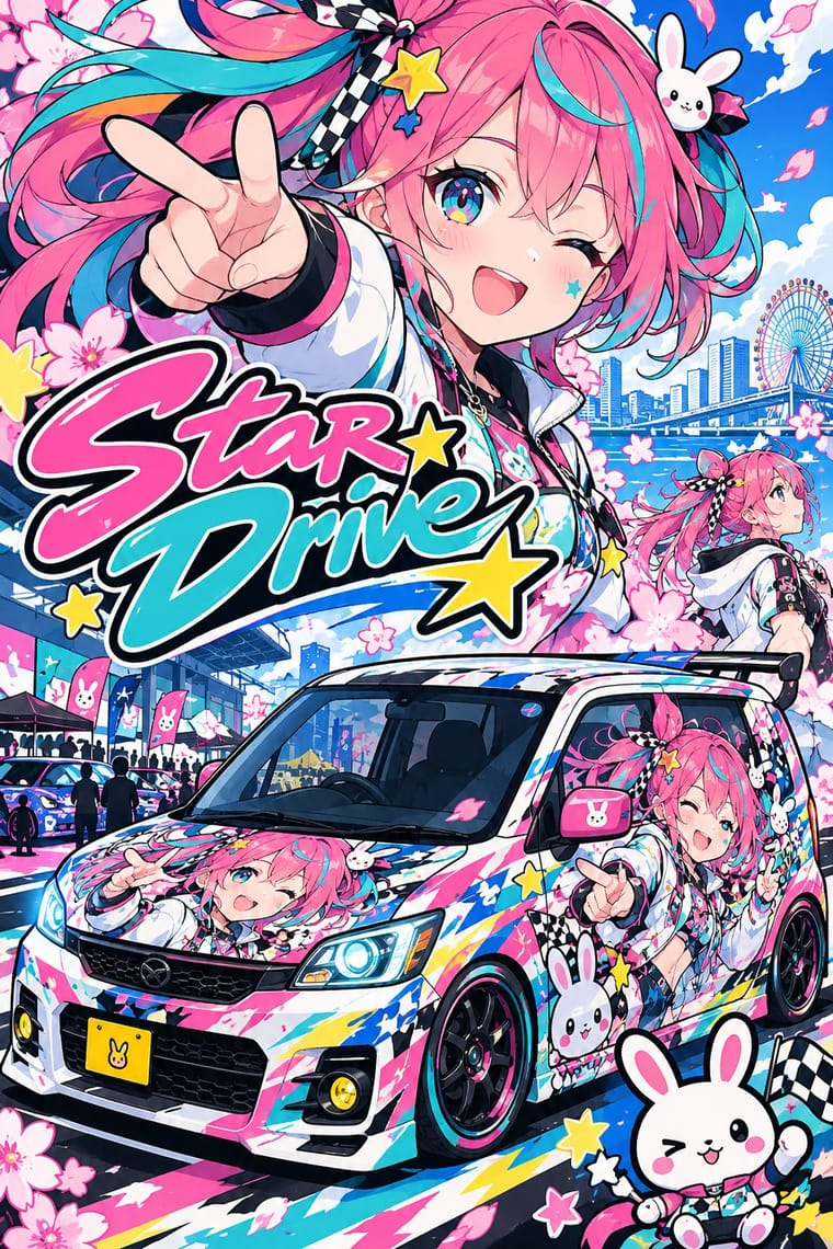
Itasha (Anime Character Car Graphics)Private cars, motorbikes and bicycles that Japanese fans of anime, manga and games cover with their favourite characters, named by the mid-2000s with the self-mocking word itasha, 'painful car'.
Styles that use it now and then 5
An occasional choice in these styles.
It often goes with
Choices that the styles making it make more often than the atlas as a whole.
- Layered informationin 16 of 19
- Found & vernacular imageryin 13 of 19
- Collage & layeringin 13 of 19
- Eclectic mixingin 12 of 19
- Extreme scale contrastin 15 of 19
- Offset printingin 14 of 19
Styles that avoid it
Styles that deliberately leave it out.