Pictorial & machine age · 1929–1959 · Oceania
Australian Travel Poster (ANTA Era)
Also known as ANTA posters, Australian National Travel Association posters, Golden era of Australian poster design, Australian travel posters 1930s–1950s
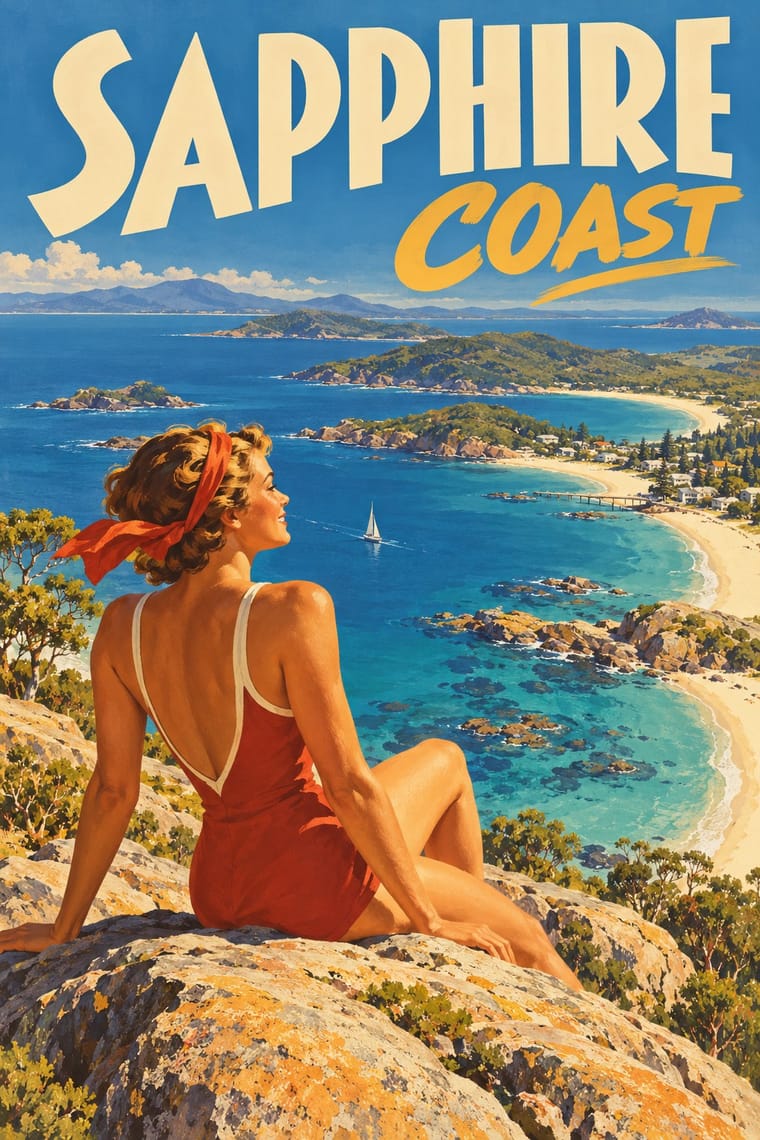
The pictorial posters that the Australian National Travel Association (ANTA, 1929), state tourist bureaux, railways and shipping lines commissioned to sell Australia abroad and at home. Percy Trompf, James Northfield, Gert Sellheim, Douglas Annand and Eileen Mayo painted surf, bathers, eucalypt forests, wildflowers and parrots in sunlit, simplified realism and flat lithographic colour, under AUSTRALIA in big drawn capitals. Modernists added airbrush, photomontage and slanted type; photography and fewer commissions ended it after the 1950s.
Make something in this styleGet advice in this styleMix it with another style
Use it with care
This was settler Australia's image of itself for tourists, settlers and investors. Its designers borrowed Aboriginal imagery for 'a distinctly Australian look': the National Library's curators note motifs drawn from x-ray art, rock paintings and material culture, as in Sellheim's boomerang poster of 1957, and Jillian Barnes shows how Trompf's 'Winter Tours to Central Australia' for Commonwealth Railways 'applied the Santa Fe railway aesthetic', the American railroad's romantic tourist image of Native Americans, to Central Australia, replacing 'Indians' of the pueblos with Arrernte ('Arunta') men, and put modern white travellers at the centre and the Arrernte men small, servile and at the rear, standing for the past. Do not reuse its boomerangs, corroboree figures, x-ray or rock-art motifs, or its picture of Aboriginal people, as period decoration: Aboriginal designs belong to particular peoples and clans, so work with First Nations artists under Creative Australia's Protocols for using First Nations Cultural and Intellectual Property in the Arts. Treat its colonial subjects, Cook's landing at Botany Bay and 'the tallest trees in the British Empire', as celebrations of British settlement on unceded Aboriginal land, not neutral heritage. Many posters are still in copyright, credited by the National Library to the Percy Trompf Artistic Trust, the Northfield family and the Sellheim and Annand families: license them or paint your own place and light.
01
How it works
- Give the whole sheet to one sunlit subject of the place (on the Australian sheets a surf beach, a eucalypt forest, a pastoral valley, a wildflower or a parrot), painted in simplified realism with large areas of flat colour and sunlit modelling.
- Put a figure in the scene as the viewer's stand-in, a diver, a bather, riders or a couple looking out over the view, so the landscape gains scale and the outdoors looks inviting rather than empty.
- Open the picture into deep space: a high viewpoint, aerial perspective and a tiny town or beach far behind a giant foreground figure.
- Sell the place by name: letter the country, state or resort in large drawn letters, mostly capitals, across the foot or the head of the sheet, often on a solid band (AUSTRALIA under Trompf's giant trees, COOLANGATTA over Northfield's diver), with a short invitation beside it ('North Queensland calls you', 'for Sun and Surf') and a small line of particulars below.
- Choose the symbols a foreign traveller would find strange or alluring (for Australia surf, sun, unique flora and fauna, the Harbour Bridge and colonial history), and sign the sheet with the issuing body's emblem (ANTA's kangaroo roundel).
- Print by colour lithography from several stones or plates, drawing the lettering as part of the design rather than setting it in type; some 1950s sheets were printed by offset or photolithography.
Melbourne and Sydney: colour-lithographed posters commissioned by the Australian National Travel Association (ANTA, founded 1 July 1929), state government tourist bureaux, the Commonwealth and state railways and shipping lines, drawn by commercial artists such as Percy Trompf and James Northfield and printed by lithographers such as Troedel & Cooper and Sands & McDougall
02
Its design choices
From Stylogeny’s vocabulary of design choices: defining choices make the style, characteristic ones are usual, occasional ones turn up now and then.
- Layout & composition
- Space & hierarchy
- Typography
- Colour
- Surface & texture
- Ornament
- Tone & intent
- Avoids
- Modular grid, Typography only, Lowercase only, Experimental & distorted, Non-representational, Abundant decoration, Photocopy & distress, Rebellious & subversive, Ironic & self-aware
Palette
#f3e6c2#e3b23c#4a8fb8#45633d#c8381e#1f1d2b
Typefaces
Hand-drawn Art Deco sans capitals
Bold soft-serif display in mixed case
Brush script for slogan words
The place name as the master word in large hand-drawn capitals across the foot of the sheet
yellow bold sans on Trompf's 'The Tallest Trees in the British Empire', tall condensed, widely spaced capitals on Northfield's 'Australian Parrots', red serif roman capitals on a dark band on Mayo's 'Sturt's Desert Pea' (1956–57); or across the head, as the heavy Art Deco display sans COOLANGATTA on a dark band on Northfield's 'Coolangatta'
Geometric and Art Deco sans capitals for place names and slogans, as on Goodchild's 'Mount Gambier: The Lake District of South Australia'
(1930s), Kelly's 'Tasmania: The Switzerland of the South' (1940s) and the thin, high-waisted 'AUSTRALIA'S 150th ANNIVERSARY CELEBRATIONS' on Tom Purvis's 1938 poster for ANTA
Bold soft-serif display in upper and lower case for a title that speaks to the traveller, as the yellow 'North Queensland calls you' on a dark band on Trompf's 1933 poster
Slab capitals with drop shadows against script connecting words, as 'THERE and BACK by' over 'TRANS-AUSTRALIAN RAILWAY' on a dark band on Andrews' Commonwealth Railways poster (1930s)
Brush script and italic for the slogan or connecting words against the capitals, as 'for Your' and 'Where it's warmer in Winter—and Cooler in Summer' on Northfield's 'Coolangatta'
Small spaced sans capitals for the practical line ('Particulars at all shipping offices and travel agencies') beside the ANTA kangaroo emblem
Widely spaced roman capitals for historical subjects, as AUSTRALIA on Trompf's 'The Landing of Captain Cook at Botany Bay 1770'
Known for
Percy Trompf, 'Australia: The Tallest Trees in the British Empire—Marysville, Victoria' (ANTA, 1930s; colour lithograph, National Library of Australia Z99): riders on horseback dwarfed by towering eucalypt trunks, above AUSTRALIA in yellow bold sans capitals
Percy Trompf, 'North Queensland Calls You to a Winter Holiday in the Tropics' (Queensland Government Tourist Bureau, 1933; NLA Z342)
a man in a pith helmet calls through his cupped hand among palms, under the line 'Take a Kodak with you', with the title on a dark band
Percy Trompf, 'Australia in the sun'
ANTA, 1930; lithograph printed in colour from multiple stones by Troedel & Cooper, Melbourne; National Gallery of Australia 94.1275
James Northfield, 'Coolangatta (South Queensland) for Your Winter Holidays' (Queensland Government Tourist Bureau, 1930s; NLA Z343)
a bather bent forward to dive above a tiny, crowded beach, with 'Where it's warmer in Winter—and Cooler in Summer' in brush script
James Northfield, 'Australian Parrots, Australia' (ANTA, 1930s; NLA Z85)
parrots and a cockatoo in the foreground, two small figures looking out over a river plain, and AUSTRALIA in tall, widely spaced capitals on black
James Northfield, 'Pastoral Australia' (Australian National Publicity Association, poster no. 102, 1950s; NLA S10459)
drovers on horseback and a flock spread across a wide valley under ranges
Gert Sellheim, 'Australia for Sun and Surf' (ANTA, 1931; colour lithograph printed by Troedel & Cooper; Powerhouse 2009/52/1), which the Powerhouse calls a modernist composition of photomontage and constructed lettering
Douglas Annand, '"Venetian Nights", Sydney Harbour. Australia's 150th Anniversary 1938' (ANTA, 1937; NLA Z109)
slanted lettering and a giant 150 over a night view of the harbour lights
03
Make something in this style
Say what you need, and Stylogeny’s image studio draws it from Australian Travel Poster (ANTA Era)’s design choices and checks it against them. It takes about a minute, and you get a link to share.
04
Where it comes from, and what it’s close to
Before it
The style it grew out of, and the styles it borrowed from.


After it
The styles that grew out of it.
No later style in the atlas grew out of it yet.
Alike in its design choices
Styles that make many of the same choices, related or not, besides those above.
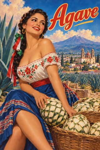

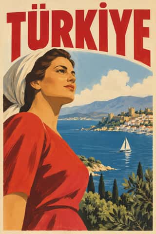
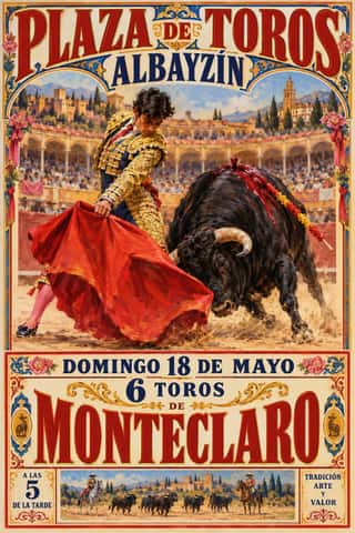

- Nippon Kōbō & Tōhōsha Photo-Propaganda Magazines (NIPPON & FRONT)69% alike


05
Sources
- National Library of Australia, 'Follow the Sun: Australian Travel Posters 1930s–1950s' (exhibition, 13 November 1999–13 February 2000; online exhibition with pages on ANTA, lithography, styles, symbols and artists, and catalogue captions with artist, date, publisher, medium and NLA number), http://www.nla.gov.au/exhibitions/sun/, archived at https://web.archive.org/web/2005/http://www.nla.gov.au/exhibitions/sun/anta.html; the artist page on Tom Purvis and the ANTA commission for London billboards: https://web.archive.org/web/2005/http://www.nla.gov.au/exhibitions/sun/artists/purvis.html; exhibition list: https://www.library.gov.au/whats-on/exhibitions/exhibitions-1992-1999
- Katie Spearritt and Peter Spearritt, 'Trompf, Percival Albert (Percy) (1902–1964)', Australian Dictionary of Biography, vol. 12 (1990): https://adb.anu.edu.au/biography/trompf-percival-albert-percy-8855
- Peter Spearritt, 'Northfield, Isaac James (1887–1973)', Australian Dictionary of Biography, vol. 15 (2000), on his hand lithographic work and travel posters for the Victorian Railways and ANTA: https://adb.anu.edu.au/biography/northfield-isaac-james-11259
- National Gallery of Victoria, education resource for its Art Deco exhibition, on Gert Sellheim's 'Australia surf club' (c.1936, Sands & McDougall, NGA), his 'distinctive Art Deco typeface', ANTA's artists and the debt to London Underground and LNER posters: https://ngv.vic.gov.au/wp-content/uploads/2014/02/OnlineDeco_POSTER.pdf
- Powerhouse Collection, Gert Sellheim, 'Australia For Sun and Surf' poster, 1931, printed by Troedel & Cooper: https://collection.powerhouse.com.au/object/391676 and https://collection.powerhouse.com.au/object/8679
- Australian Prints + Printmaking (National Gallery of Australia), Percy Trompf, 'Australia in the sun' (1930, NGA 94.1275): https://printsandprintmaking.gov.au/works/35739; 'Visit colourful Queensland' (1930s, NGA 80.333): https://printsandprintmaking.gov.au/works/37219; Eileen Mayo, 'Australia (Sturt's Desert Pea)' (1957, offset-lithograph from multiple plates, printed by McLaren, NGA 93.238): https://printsandprintmaking.gov.au/works/15332
- Jillian E. Barnes, 'Resisting the captured image: how Gwoja Tjungurrayi, "One Pound Jimmy", escaped the "Stone Age"', in Transgressions: Critical Australian Indigenous Histories (ANU Press, 2007), on Trompf's 'Winter Tours to Central Australia', its debt to the Santa Fe railroad's tourist imagery and ANTA's use of Aboriginal images: https://doi.org/10.22459/T.12.2007.05
- Wikipedia, 'Percy Trompf', for the description of his colour lithography as 'bold, simplified realism in an Art Deco style' (citing Spirit of Progress, 2018 and 2019) and a list of his posters: https://en.wikipedia.org/wiki/Percy_Trompf
- Wikipedia, 'Tom Purvis', for his work for the London and North Eastern Railway from 1923 to 1943: https://en.wikipedia.org/wiki/Tom_Purvis
How Stylogeny researches and checks a style: where the facts come from.