Medium & production · Hand & relief
Letterpress
Metal and wood type printed in relief.
A design choice in Stylogeny’s vocabulary, under medium & production: what technology shaped it?
- styles make it
- 61
- as a defining choice
- 18
- as a usual one
- 31
- now and then
- 12
- avoid it
- 1
Styles defined by it 18
For these styles it is one of the choices that make the style.
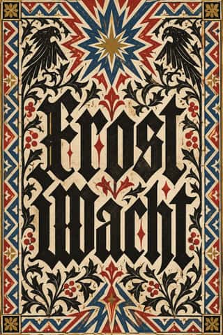
Gothic Blackletter & Fraktur TraditionThe broken scripts of the Latin West.
Renaissance Book TypographyThe printed book as shaped by humanist Italy and France: roman and italic types modelled on humanist handwriting, a single justified text block set in harmonious proportions within generous margins, and woodcut initials, borders and printer's devices as the only ornament.
Emblem Book (Motto, Picture & Epigram)A European book genre in which, from Chrestien Wechel's Paris edition of 1534 on, every page or opening repeats one fixed unit: a short motto, an allegorical picture and an explanatory verse, which only together yield a moral, amorous or religious meaning.
Neoclassical Book TypographyThe Enlightenment book stripped of Renaissance woodcut decoration.
Victorian Letterpress & Wood TypeThe commercial jobbing print of the industrial century: posters, playbills, auction notices and ephemera built from a flood of new display types (fat faces, Egyptians, grotesques, Tuscans and condensed wood type).
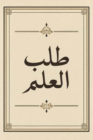
Bulaq (Amiriyya) Naskh Book PrintingThe page of the Arabic printed book as Egypt's state press at Bulaq shaped it from 1822: justified blocks of black Naskh type on pale paper, often boxed in a ruled frame, with an ornamental headpiece on the opening page, headings set larger or in a second script such as Nastaʿlīq, and almost no pictures.
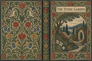
Arts & Crafts MovementA British-led reform movement that answered industrial shoddiness with honest handcraft, medieval models and the ideal of joy in labour.
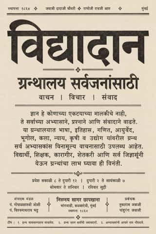
Nirnaya Sagar Devanagari Typography (Bombay Metal Type)Devanagari as Javaji Dadaji's Bombay type foundry (1864) and Nirnaya Sagar Press (1869) cut and printed it: upright metal type with a strong headline, cut with the punch-cutter Ranoji Aru, and enough conjunct and 'Akhand' sorts to set Sanskrit, Vedic accents and Marathi whole.
- Mexican Popular Graphics (Posada)Cheap broadsheets, chapbooks and gazettes sold on the streets of Porfirian Mexico City by the publisher Antonio Vanegas Arroyo and illustrated by Manuel Manilla and José Guadalupe Posada.
- German Book Art Movement (Buchkunstbewegung)The German reform of the book, from the magazine Pan (1895) to the private presses that ended around 1933.
- Vorticism & BLAST TypographyLondon's short-lived rival to Futurism, launched by Wyndham Lewis with BLAST (dated 20 June 1914; War Number, July 1915).
Wendingen & Amsterdam School TypographyThe graphic language of Wendingen (1918–1932), monthly of the Amsterdam architects' society Architectura et Amicitia, and its editor H.
- Brazilian Modernismo Graphics (Klaxon and the Semana de 22)The print side of São Paulo's Modernismo (1922-29), set in jobbing print shops.
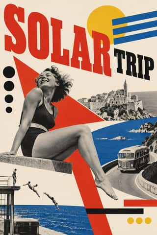
Czech Poetist Book Design (Devětsil)The book and magazine design of the Czech Devětsil circle, where Karel Teige and his colleagues turned constructivist tools (asymmetry, sans and slab capitals, heavy bars, photomontage) toward Poetism's lyrical celebration of travel, cinema, jazz and the circus.
- MavoTokyo's anarchist avant-garde, founded in July 1923 by Murayama Tomoyoshi, back from a year in Berlin, with four former Futurists, and its magazine MAVO (seven issues, July 1924 to August 1925).
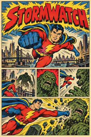
American Four-Colour Comic Book (Golden to Bronze Age)The American newsstand comic book from Famous Funnies (1934) and Action Comics #1 (1938) through the Golden, Silver and Bronze Ages, and past the Bronze Age's end in 1985 until computer colour replaced hand separations in the early 1990s.
- Machine-Age Simplified Arabic TypeArabic redrawn for the machine rather than the reed pen.
- Onitsha Market PamphletsCheap, stapled pamphlets of romance, advice, drama and political biography, written by students, clerks, journalists and traders and printed by jobbing letterpress shops around Onitsha Main Market in eastern Nigeria from the late 1940s.
Styles that often use it 31
A characteristic choice: usual in these styles, though not essential.
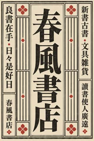
Song–Ming Woodblock Book Typography (Songti / Mincho)The page and letter of the East Asian book.
Vyaz (Ornamental Slavonic Lettering)Cyrillic letters bound into one even band of ornament.
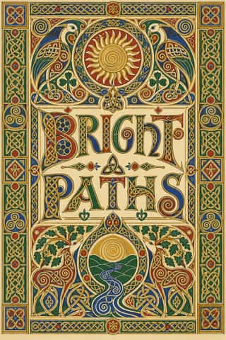
Celtic Revival Illumination & LetteringOrnament and lettering of the Celtic Revival in Ireland, Scotland and the Isle of Man, modelled on Insular gospel books such as Kells and on carved stone crosses.
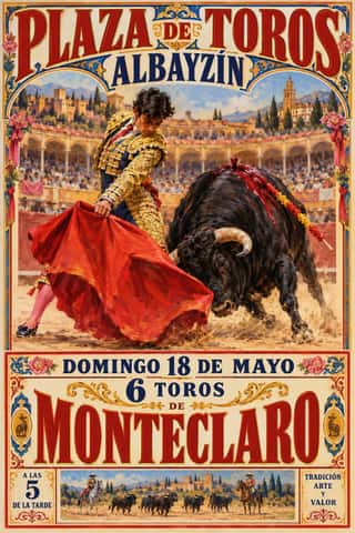
Spanish Bullfight Poster (Cartel Taurino)The Spanish bullfight poster in its illustrated form, from Marcelino de Unceta's lithographs (from 1879) to the Valencian house of Ortega, which supplied rings across Spain.
- Norwegian and Finnish National Romantic Graphics (Munthe & Karelianism)The flat, decorative branch of Norway's and Finland's national romanticism, which turned Viking carving, the sagas, the Kalevala and old peasant weaving into modern ornament.
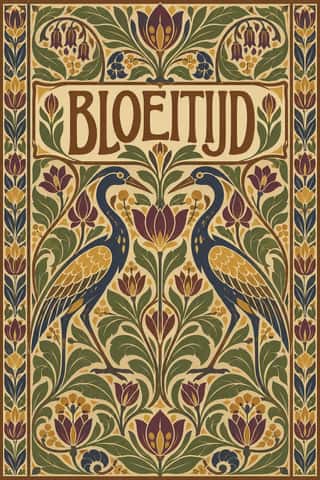
Nieuwe Kunst (Dutch Art Nouveau)The Dutch branch of Art Nouveau, seen mostly in book covers, vignettes and posters.
Simplicissimus Satirical Style (Munich)The house style of the Munich satirical weekly Simplicissimus, set by Th.
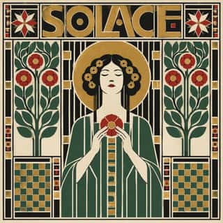
Vienna SecessionThe Viennese break with academic art led by Gustav Klimt, Koloman Moser, Josef Hoffmann and Alfred Roller, which pulled Art Nouveau toward the square, the grid and the flat plane.
Mir iskusstva Book ArtThe graphic idiom of the St Petersburg World of Art circle (journal 1898–1904, exhibitions until Paris 1927) and the book artists around it.
- London Transport DesignThe design programme Frank Pick built for London's Underground from 1908 and the London Passenger Transport Board (1933–40), continued by Harold Hutchison (1947–66).
- Italian FuturismLaunched by Marinetti's 1909 manifesto, Futurism glorified speed, machines, the city and war, and turned the printed page into an explosive, noisy field.
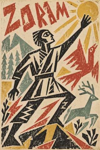
Russian Futurist BookThe cheap, small-run books of the Russian Cubo-Futurist poets and painters, from Kruchenykh and Khlebnikov to Goncharova, Larionov and Rozanova.
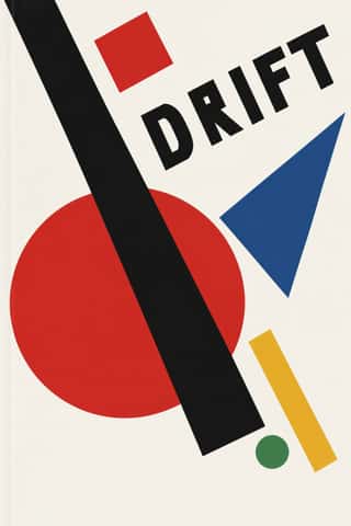
SuprematismKazimir Malevich's non-objective art, unveiled with the Black Square at the 0.10 exhibition in Petrograd in 1915, reduced painting to pure geometric planes floating in white, infinite space.
- DadaBorn in wartime Zurich at the Cabaret Voltaire in 1916 and spreading to Berlin, Hanover, Cologne and Paris, Dada used chance, absurdity and provocation against the culture that had produced the war.
De StijlA Dutch movement formed around Theo van Doesburg's journal De Stijl and Piet Mondrian's Neoplasticism, which sought universal harmony through the most elementary means: horizontal and vertical lines, rectangles, the three primaries and black, white and grey.
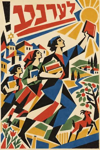
Kultur-Lige & Yiddish Avant-Garde Book DesignThe Yiddish modernist book of the Kultur-Lige, the secular Jewish culture league founded in Kyiv in 1918, and its circle: El Lissitzky, Issachar Ber Ryback, Iosif Chaikov, Boris Aronson and others, who sought a new Jewish art in the shtetl synagogues and tombstones they had recorded and in Cubo-Futurism and Suprematism.
- Russian ConstructivismConstructivism rejected art for art's sake in favour of the artist-engineer building useful things for the new Soviet society.
- BauhausThe German school founded by Walter Gropius in 1919 moved from Expressionist craft ideals to a programme of 'art and technology' after 1923, when Moholy-Nagy, Herbert Bayer and Joost Schmidt made its printing and advertising workshops a laboratory for functional communication.
- Estridentismo (Stridentist) GraphicsMexico's first avant-garde (1921-27), launched when Manuel Maples Arce pasted his manifesto Actual No. 1 on Mexico City walls.
Die Neue TypographieThe programme that turned avant-garde experiment into a functional typographic method, named by Moholy-Nagy in 1923 and codified in Jan Tschichold's 'elementare typographie' (1925) and Die neue Typographie (1928).
Republican Chinese Book Cover Design (Lu Xun & Tao Yuanqing)The covers of China's New Literature.
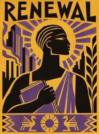
Harlem Renaissance Graphic ArtThe illustration, cover and jacket art of the New Negro movement, set by Aaron Douglas after he moved to Harlem in 1925 and studied with Winold Reiss.
Isotype Pictorial StatisticsA method of visual education developed by Otto Neurath, Marie Neurath (Reidemeister) and Gerd Arntz in Red Vienna from 1925, which turns statistics into rows of identical pictograms where a greater quantity is shown by more signs, never by bigger ones.
Penguin Paperback Design (Three Bands to the Marber Grid)The cover system of Penguin Books, London, from 1935 until Germano Facetti left in 1972.
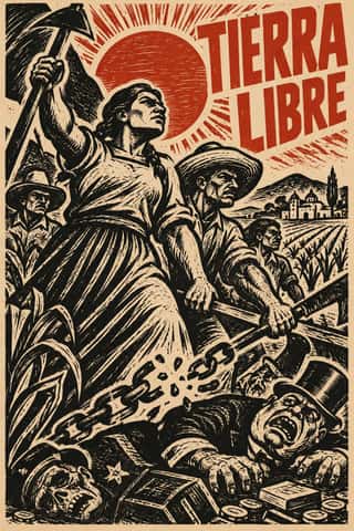
Taller de Gráfica PopularA Mexico City printmaking collective founded in 1937 around Leopoldo Méndez, Pablo O'Higgins and Luis Arenal to put art at the service of popular and anti-fascist struggles.
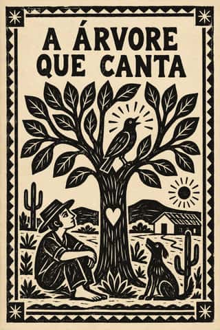
Literatura de Cordel WoodcutThe cover art of Brazil's literatura de cordel, pocket chapbooks of verse whose single picture is a small woodcut cut in soft umburana wood and printed in black above a plain letterpress title.
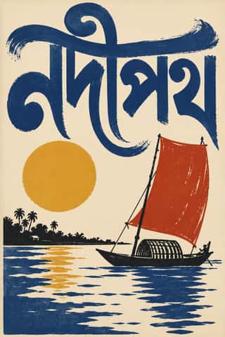
Bengali Modernist Book Cover (Prachchhad)A literary book-jacket culture that began at Calcutta's Signet Press in 1943, where Satyajit Ray and later Purnendu Pattrea made the hand-drawn Bengali title the main image of the cover.
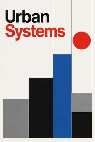
International Typographic StyleA post-war refinement of the New Typography in which the mathematical grid, objective photography and neo-grotesque sans-serifs were used to communicate with clarity and neutrality.
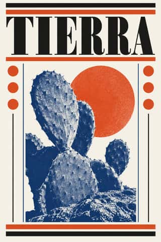
Vicente Rojo & Mexican Editorial ModernismThe design of Mexico City's literary and cultural press, shaped from the 1950s by the Barcelona-born exile Vicente Rojo: México en la Cultura, the Revista de la Universidad, Plural, La Jornada and the covers of Ediciones Era.
Di Tella Graphic Design (Instituto Torcuato Di Tella)The in-house graphics of Buenos Aires' Instituto Torcuato Di Tella, 1960–1970, led by Juan Carlos Distéfano with Juan Andralis, Rubén Fontana, Norberto Coppola and Carlos Soler.
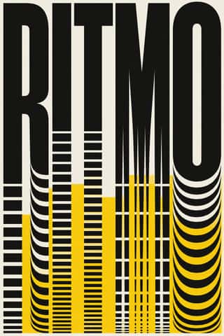
- Swiss Punk / New Wave TypographyA rebellion from inside the Swiss school: Wolfgang Weingart and his Basel students kept the grotesque and the grid but set them in motion with extreme letterspacing, stepped and angled lines, rules and bars, enlarged halftone screens and layered film montage.
Styles that use it now and then 12
An occasional choice in these styles.
- Rinpa & Saga-bon1600–present
- Imagerie d'Épinal & European Bilderbogen1796–1939
- Kalighat Pat & Battala Bazaar Prints1830–1930
- Art Nouveau1890–1910
- Expressionist Woodcut Graphics1905–1925
- Cubist Pictorial Space1907–1925
- Surrealist Graphics1924–1960
- Chinese Modern Woodcut Movement1931–1949
- Gráfica del 68 (Mexican Student Movement Graphics)1968
- Modern Calligraphy and Brush Lettering2005–present
- Hipster Artisanal Revival2007–2018
- Extinction Rebellion Graphics2018–present
It often goes with
Choices that the styles making it make more often than the atlas as a whole.
- Paper & letterpress bitein 45 of 61
- Monochromein 47 of 61
- Carved linein 28 of 61
- Rules & barsin 32 of 61
- Line illustrationin 45 of 61
- Typography onlyin 36 of 61
Styles that avoid it
Styles that deliberately leave it out.