Pictorial & machine age · 1979–present · East Asia, Global / networked
City Pop Illustration
Also known as City pop album art, City pop sleeve illustration, City pop art
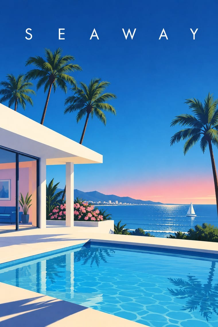
The painted look of Japanese city pop record sleeves and magazine covers, fixed by Hiroshi Nagai's sleeve for Eiichi Ohtaki's A Long Vacation (1981) and Eizin Suzuki's for Tatsuro Yamashita's For You (1982). Idealised, sunlit resort scenes of pools, palms, modernist villas, roadside shops and cars by the sea under a deep blue sky, built from hard-edged flat colour with Nagai's black shadows or Suzuki's clean outlines, and usually few or no people. Aspirational in Japan's boom years, it returned with the city pop revival from the 2010s and is now read as nostalgia.
Make something in this styleGet advice in this styleMix it with another style
Use it with care
The look rests on two working artists, Hiroshi Nagai and Eizin Suzuki, who still paint, sell originals and prints and take commissions. For their pictures, commission or license them. Otherwise invent your own place, light and palette in the shared idiom: never trace or recompose their compositions (A Long Vacation's pool, For You's radio shop, Pacific Breeze's villas), never ask an image model for their style by name, and never present a generated image as their work or as a period sleeve.
01
How it works
- Paint a place, not a crowd: a swimming pool, a modernist villa or motel, a roadside shop, palms and a car parked by the sea, recomposed from architecture magazines and travel catalogues into an idealised resort, with people absent or small and incidental. Figures are a strand of their own (Nagai's HUMAN NATURE volume), but the classic sleeve is a place.
- Give the sky a large share of the picture: a deep, clear blue, flat or graded lighter towards a low horizon, so the scene recedes in clean perspective under a calm field, left empty or scattered with a few coloured ribbons and triangles (Suzuki); keep a sunset pink for the occasional evening variation, never neon.
- Build forms from crisp, flat fields of colour with hard edges and almost no texture. Model the sunlight by contrast, casting shadows as solid black or deep-blue shapes (Nagai), or outline every form in a clean contour and render gradation in solid lines (Suzuki's ligne claire). Keep gradients for the sky and water.
- Anchor the palette in cool, clear blues: ultramarine sky, aquamarine water, white walls and palm greens, warmed by pastel pink, mint and egg-yolk yellow on the buildings (Nagai) or by the saturated red, yellow, orange and green of shop signs (Suzuki).
- Set the title in spaced capitals in the clear sky or on a white margin, never over the buildings: large, bold and condensed on the white margin above a painting framed in white, one word spaced out with interpuncts and one letter in red; or thin, small and widely tracked in the top corner of a full-bleed sky. Let any further words appear as English shop signs and fascias drawn into the scene.
- Play it straight: an inviting holiday without irony, collage, appropriated imagery, glitch, grain or visible print process.
Japan's record and magazine industry around 1980, in the sleeves and magazine covers of two illustrators (Hiroshi Nagai, born in Tokushima in 1947, a graphic designer from 1970, took his subject from a 40-day trip to the United States in 1973 and a trip to Guam in 1974, drew on pop art and David Hockney, was encouraged by the illustrator Teruhiko Yumura from 1975 and went freelance in 1978; his 1979 picture book A Long Vacation with Eiichi Ohtaki, published by CBS Sony Publishing, led to the sleeve of Ohtaki's 1981 album. Eizin Suzuki, born in Fukuoka in 1948, debuted as an illustrator in 1980 and drew the covers of FM Station from 1981 and the sleeve of Tatsuro Yamashita's For You in 1982 in clean ligne-claire contours). Revived worldwide from the 2010s through music blogs, reissues, YouTube, vaporwave and compilations
02
Its design choices
From Stylogeny’s vocabulary of design choices: defining choices make the style, characteristic ones are usual, occasional ones turn up now and then.
- Layout & composition
- Space & hierarchy
- Typography
- Colour
- Form & shape
- Surface & texture
- Imagery
- Medium & production
- Tone & intent
- Avoids
- Collage & layering, Found & vernacular imagery, Halftone & Ben-Day dots, Glitch, Grain & noise, Chrome & 3D render, Fluorescent & neon, Horror vacui, Ironic & self-aware
Palette
#0f3a8a#35a9dc#f7f5ef#f3a5b6#f2c230#2f6e45
Typefaces
Widely letter-spaced sans-serif capitals for title and artist, set small in the sky at the top left of the full-bleed picture, as in FOR YOU and TATSURO YAMASHITA on Suzuki's sleeve (1982)
Large bold condensed capitals, the second word spaced out with interpuncts, one letter picked out in red, as in A LONG V·A·C·A·T·I·O·N on Nagai's sleeve for Ohtaki (1981)
English shop-sign and storefront lettering drawn into the scene, such as the radio-shop fascias on For You
Known for
Hiroshi Nagai, sleeve for Eiichi Ohtaki, A Long Vacation (Niagara/CBS Sony, 21 March 1981)
a pool with a ladder, a parasol and palms under a deep blue sky, painted as a panel on a white sleeve beneath the large condensed title, its A in red and VACATION spaced with interpuncts; it won Nagai a CBS/Sony gold disc as a special album-jacket award
Hiroshi Nagai, sleeve for Eiichi Ohtaki, Niagara Song Book (1982), and his picture books A Long Vacation (CBS Sony Publishing, 1979) and Halation (CBS Sony Publishing, 1981)
Eizin Suzuki, sleeve for Tatsuro Yamashita, For You (Air/RVC, 21 January 1982)
a roadside radio shop with English signs, palms, a tall pole and a small standing figure, outlined throughout, under a flat blue sky scattered with coloured ribbons and triangles, the title in thin spaced capitals at top left; Yamashita had first thought of asking Nagai, who was committed to A Long Vacation
Eizin Suzuki, cover illustrations for the FM radio magazine FM Station (Diamond) from its launch in 1981 to 1988, and the jacket of a Huey Lewis & the News album released in Japan as ベイエリアの風 ('Bay Area Breeze', 1982)
Light in the Attic Records, Pacific Breeze
Japanese City Pop, AOR & Boogie 1976–1986 (3 May 2019), with a newly commissioned Nagai painting of a pink and a mint villa, a pool, loungers and tall palms against a deep blue sky
Hiroshi Nagai
Paintings for Music, The Japan Foundation Gallery, Sydney (25 September 2020 – 23 January 2021), his first international solo show: 20 original works in acrylic spanning his career, with record jackets made for music from Japan and around the world
Sony Music Labels, CITY POP STORIES -'70s & '80s- (1 November 2024), compiled by Hitoshi Kurimoto, its jacket an illustration Eizin Suzuki drew in 1984
03
Make something in this style
Say what you need, and Stylogeny’s image studio draws it from City Pop Illustration’s design choices and checks it against them. It takes about a minute, and you get a link to share.
04
Where it comes from, and what it’s close to


After it
The styles that grew out of it.
No later style in the atlas grew out of it yet.
Alike in its design choices
Styles that make many of the same choices, related or not, besides those above.


05
Sources
- Wikipedia: 'Hiroshi Nagai' (https://en.wikipedia.org/wiki/Hiroshi_Nagai: born 22 December 1947 in Tokushima; graphic designer from 1970; the United States and Guam 1973–75; influenced by pop art and David Hockney; tropical and clear landscape illustrations from the 1980s; covers for A Long Vacation and Niagara Song Book; influence on vaporwave; books A Long Vacation, 1979, and Halation, 1981)
- Wikipedia (Japanese): '永井博 (イラストレーター)' (https://ja.wikipedia.org/wiki/永井博_(イラストレーター): the 40-day US trip in summer 1973 and the 1974 Guam trip as the origin of his style; guidance from Teruhiko Yumura from 1975, independent in 1978; the CBS/Sony gold disc for the A LONG VACATION jacket; NIAGARA SONG BOOK, 1982)
- Wikipedia (Japanese): '鈴木英人' (https://ja.wikipedia.org/wiki/鈴木英人: born 6 July 1948 in Fukuoka; illustrator from about 1980; 'グラデーションを実線で表すリーニュクレール様式', a ligne-claire style that renders gradation in solid lines, compared with Hergé and Seizō Watase; cars and coastlines as frequent motifs, '作中では車や海岸といったモチーフが良く使われる'; FM STATION covers from 1981 to 1988; the Japanese edition of Huey Lewis & the News' 'ベイエリアの風', 1982; Tatsuro Yamashita's FOR YOU)
- Eizin Suzuki, official profile: https://eizin.co.jp/?page_id=87 (born 1948 in Hakata; illustrator debut 1980; EAST ALBUM, 30 lithographs shown at five galleries in Tokyo and Osaka in 1985, and more than 300 prints since; FM STATION covers; jackets for Tatsuro Yamashita)
- Sogo Chiba, '【そごう千葉店】イラストレーター 鈴木英人氏の原画・版画を展示販売' (11 June 2024): https://www.zaikei.co.jp/releases/2500254/ (Suzuki's silkscreen editions, among them 'スピードスターと過ごす正午', USA version, 1998, 'ロマンシング ハーバー', 1995, and '果てしなき夏の日々', 1995; ten original FM STATION covers shown for sale)
- Wikipedia: 'A Long Vacation' (https://en.wikipedia.org/wiki/A_Long_Vacation: released 21 March 1981 on Niagara/CBS Sony; cover illustration by Hiroshi Nagai; the 1979 picture book) and 'For You (Tatsuro Yamashita album)' (https://en.wikipedia.org/wiki/For_You_(Tatsuro_Yamashita_album): released 21 January 1982 on Air/RVC; cover illustration by Eizin Suzuki after Yamashita had considered Nagai, citing NHK-FM Sound Creator's File, 2 September 2012)
- Wikipedia: 'City pop' (https://en.wikipedia.org/wiki/City_pop: resurgence since the 2010s through blogs, reissues and YouTube; vaporwave and future funk; Universal's 2022 and Sony's 2023 reissue series; Suzuki's 1984 illustration on CITY POP STORIES -'70s & '80s-, 2024) and 'Pacific Breeze: Japanese City Pop, AOR and Boogie 1976–1986' (https://en.wikipedia.org/wiki/Pacific_Breeze:_Japanese_City_Pop,_AOR_and_Boogie_1976%E2%80%931986: released 3 May 2019 by Light in the Attic, cover art by Nagai)
- Wikipedia: 'David Hockney' (https://en.wikipedia.org/wiki/David_Hockney: part of the early British pop art scene and 'an important contributor to the pop art movement of the 1960s'; after moving to Los Angeles in 1964 he painted a series of swimming pools in bright acrylic, among them A Bigger Splash, 1967)
- The Japan Foundation, Sydney, 'Hiroshi Nagai: Paintings for Music' (25 September 2020 – 23 January 2021): https://sydney.jpf.go.jp/events/hiroshi-nagai-paintings-for-music ('crisp urban landscapes and tropical motifs'; 20 original works 'spanning his career', acrylic on canvas and canvas board; 'record jackets made for a variety of music styles from Japan and around the world'; freelance from 1978; the gold disc for A Long Vacation; city pop's international audience through the internet and its influence on future funk and vaporwave)
- Stephen A. Russell, 'Hiroshi Nagai: Paintings for Music', Time Out Sydney (24 September 2020): https://timeout.com/sydney/art/hiroshi-nagai-paintings-for-music ('midnight blue swimming pools, swaying palm trees and boxy Cadillacs parked in the sand'; 'egg yolk yellow' Tower Records façades; 'oft-compared' to Hockney)
- 'Light and shadow reflected in a swimming pool. The true nature of the cool air depicted by Hiroshi Nagai', Houyhnhnm (3 July 2020): https://www.houyhnhnm.jp/en/feature/361932/, /2/ and /3/ (Nagai: 'a remix of the actual landscape'; drawing from architectural magazines and travel catalogues; 'The theme of my paintings is "light and shadow"'; shadows 'in black'; 'I myself prefer blue skies to sunsets'; at the TV background shop where he first worked he learned 'a technique ... where light shines on an object to give it a three-dimensional effect', p. 2; a pool picture silkscreened on a Graphpaper T-shirt, of which he says 'Nowadays, I would never think of silk-screening something like this', p. 3)
- SHIFT, 'Hiroshi Nagai "FAVORITE"' (31 May 2021): https://www.shift.jp.org/en/blog/2021/05/hiroshi-nagai-favorite/ (his long-standing themes of swimming pools, cars and travel, and people, in the volumes POOLS, CRUISIN' and HUMAN NATURE)
- The Vinyl Factory, 'The sun-drenched Americana of Japanese artist Hiroshi Nagai' (24 April 2019): https://thevinylfactory.com/features/japanese-illustrator-hiroshi-nagai-cover-art ('a new commission gracing the cover' of Light in the Attic's city pop compilation; Nagai began 'in the studio of iconic illustrator King Terry', the nickname of Teruhiko Yumura; work 'for labels like Moon, and Niagara')
- Wikipedia: 'Teruhiko Yumura' (https://en.wikipedia.org/wiki/Teruhiko_Yumura: 'Yumura is known by the nickname "King Terry"')
- FACT, 'Light in the Attic to release Japanese city pop compilation Pacific Breeze' (9 March 2019): https://factmag.com/2019/03/09/light-in-the-attic-japanese-city-pop-compilation-pacific-breeze ('Cover art comes from Japanese artist Hiroshi Nagai, who created much of the original city pop artwork from the '80s')
- Real Sound, release report on CITY POP STORIES -'70s & '80s- (November 2024): https://realsound.jp/2024/11/post-1827497.html (Sony Music Labels, 1 November 2024, compiled by Hitoshi Kurimoto, jacket illustration by Eizin Suzuki from 1984)
- Cover images of A Long Vacation (1981), For You (1982) and Pacific Breeze (2019) as reproduced on their Wikipedia pages, examined for the composition, palette and lettering described here: A Long Vacation's large condensed title with a red A and V·A·C·A·T·I·O·N above a painting framed in white; For You's full-bleed scene in outlined contours, polychrome signs, scattered coloured ribbons and triangles, a small standing figure and the title in thin spaced capitals in the sky at top left
How Stylogeny researches and checks a style: where the facts come from.