Rational modernism · 1960–1975 · Global / networked
Op Art Graphics
Also known as Optical Art, Op, Kinetic graphics
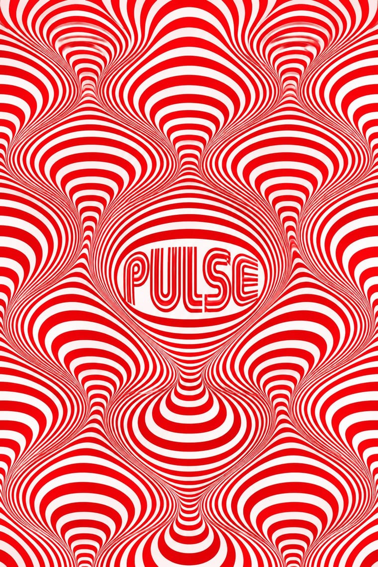
A 1960s style that turned perceptual research into graphic effect: precisely drawn lines, checks, concentric rings and modular grids, usually black and white or complementaries of equal value, that seem to vibrate, swell or move. Rooted in Bauhaus form teaching through Vasarely and Albers and popularised by MoMA's 1965 'The Responsive Eye', it spread quickly into posters, record sleeves, fashion textiles and identities such as Mexico 68.
Make something in this styleGet advice in this styleMix it with another style
01
How it works
- Build the whole image from one repeated module (line, square or circle) and vary its thickness, spacing or curvature progressively.
- Use maximum value contrast, or complementary hues of equal value, to make edges vibrate.
- Distort a regular grid locally to suggest bulging, twisting or receding surfaces.
- Draw lettering with parallel or concentric outlines so type and field share one rhythm.
- Execute with mechanical precision; any wobble breaks the illusion.
Paris, London, Milan and New York, with Latin American kinetic art in Caracas and Paris
02
Its design choices
From Stylogeny’s vocabulary of design choices: defining choices make the style, characteristic ones are usual, occasional ones turn up now and then.
- Layout & composition
- Space & hierarchy
- Typography
- Colour
- Form & shape
- Surface & texture
- Medium & production
- Tone & intent
- Avoids
- Naturalistic depiction, Straight photography, Painterly illustration, Painterly brushwork, Grain & noise, Floral & vegetal, Script, Collage & layering
Palette
#ffffff#0a0a0a#e3001b#0050b5#00a651
Typefaces
Mexico 68 multiline lettering
Lance Wyman
Futura
Helvetica
Eurostile
Known for
Victor Vasarely
Zebra, 1937; Renault lozenge with Yvaral, 1972
Bridget Riley
Movement in Squares, 1961
Franco Grignani
Woolmark logo, 1964; Alfieri & Lacroix advertisements
Lance Wyman, Eduardo Terrazas & Pedro Ramírez Vázquez
Mexico 68 Olympic identity
Josef Albers
Interaction of Color, 1963
William C. Seitz, The Responsive Eye
MoMA, 1965
03
Make something in this style
Say what you need, and Stylogeny’s image studio draws it from Op Art Graphics’s design choices and checks it against them. It takes about a minute, and you get a link to share.
04
Where it comes from, and what it’s close to
Before it
The style it grew out of, and the styles it borrowed from.

After it
The styles that grew out of it.
No later style in the atlas grew out of it yet.
Alike in its design choices
Styles that make many of the same choices, related or not, besides those above.


05
Real works
Artefacts in museums, libraries and archives that show the style, linked at their source.
- Alfieri & Lacroix tipolitozincografia in Milano – L'evoluzione della grafica accompagna la dimensione quotidiana della vita umanaFranco Grignani · c. 1960 · Museum für Gestaltung Zürich, Poster Collection (71-0612)
- Untitled (Based on Movement in Squares)Bridget Riley · 1962 · The Museum of Modern Art, New York (1161.1964)
- Kazumasa Nagai One-Man Show at Imabashi GalleryKazumasa Nagai · 1968 · The Museum of Modern Art, New York (1515.2000)
- The Paris ReviewRichard Anuszkiewicz · 1965 · The Museum of Modern Art, New York (2282.1967)
- Poster for an exhibition of work by François Morellet at Galerie der Spiegel, CologneFrançois Morellet · 1966 · The Museum of Modern Art, New York (676.1966)
06
Sources
- William C. Seitz, The Responsive Eye (MoMA, 1965) (https://www.moma.org/documents/moma_catalogue_2860_300190234.pdf)
- Estorick Collection, Franco Grignani: Art as Design 1950–1990 (https://estorickcollection.com/exhibitions/franco-grignani-art-as-design-1950-1990)
- Philip B. Meggs & Alston W. Purvis, Meggs' History of Graphic Design
How Stylogeny researches and checks a style: where the facts come from.