Typography · Sans-serif classes
Grotesque & neo-grotesque
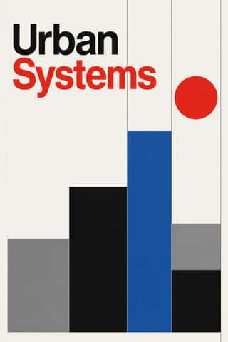
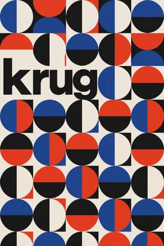
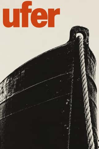
Neutral, rational sans: Akzidenz-Grotesk, Helvetica, Univers.
A design choice in Stylogeny’s vocabulary, under typography: what do the letters look like, and how are they set?
- styles make it
- 106
- as a defining choice
- 22
- as a usual one
- 48
- now and then
- 36
- avoid it
- 39
Styles defined by it 22
For these styles it is one of the choices that make the style.
- Vorticism & BLAST TypographyLondon's short-lived rival to Futurism, launched by Wyndham Lewis with BLAST (dated 20 June 1914; War Number, July 1915).
- Russian ConstructivismConstructivism rejected art for art's sake in favour of the artist-engineer building useful things for the new Soviet society.
Die Neue TypographieThe programme that turned avant-garde experiment into a functional typographic method, named by Moholy-Nagy in 1923 and codified in Jan Tschichold's 'elementare typographie' (1925) and Die neue Typographie (1928).
International Typographic StyleA post-war refinement of the New Typography in which the mathematical grid, objective photography and neo-grotesque sans-serifs were used to communicate with clarity and neutrality.
Zagreb Modernist Graphics (EXAT 51 to Teatar &TD)Zagreb graphic design grown from the EXAT 51 manifesto (1951), which tied abstract art to visual communication.
HfG Ulm Systematic DesignThe Hochschule für Gestaltung Ulm (1953–1968) was founded as the successor to the Bauhaus.
West German Conceptual Film & Culture Poster (Hillmann and Rambow)The art-film and culture poster Hans Hillmann developed from 1953 for the West German distributors Neue Filmkunst and Atlas Film, which his Kassel student Gunter Rambow took with Gerhard Lienemeyer into staged photo posters for theatre, publishers and protest.
Corporate Identity ModernismModernist reduction applied to corporate communication.
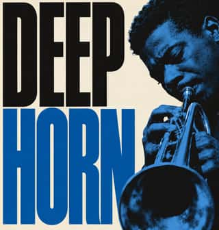
Blue Note Jazz Sleeve ModernismThe record-sleeve language of Blue Note Records, set by art director Reid Miles, who designed some 350 twelve-inch LP covers between about 1956 and 1967, often around Francis Wolff's session photographs.
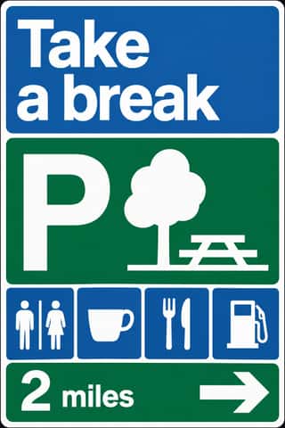
British Road Signage (Kinneir & Calvert)The national sign system Jock Kinneir and Margaret Calvert designed for Britain's motorways, first used on the Preston By-pass in 1958, and through the Worboys Committee for all roads from 1 January 1965.
Di Tella Graphic Design (Instituto Torcuato Di Tella)The in-house graphics of Buenos Aires' Instituto Torcuato Di Tella, 1960–1970, led by Juan Carlos Distéfano with Juan Andralis, Rubén Fontana, Norberto Coppola and Carlos Soler.
Total Design & Dutch FunctionalismThe Dutch strand of systematic modernism took shape when Wim Crouwel, Benno Wissing, Friso Kramer and Paul and Dick Schwarz founded Total Design in Amsterdam in 1963 as the country's first multidisciplinary studio.
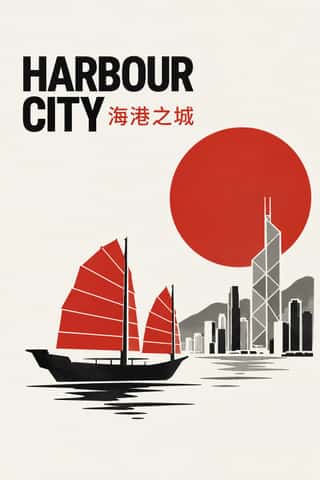
Hong Kong East–West Graphic ModernismThe studio design of Hong Kong from the 1960s, made for banks, developers, trade bodies, hotels and cultural events in a city that had to speak Chinese and English at once.
Munich 1972 Olympic Design (Otl Aicher)The visual programme Otl Aicher's department made for the 1972 Munich Olympics, the 'cheerful Games' meant to show a democratic, modest West Germany.
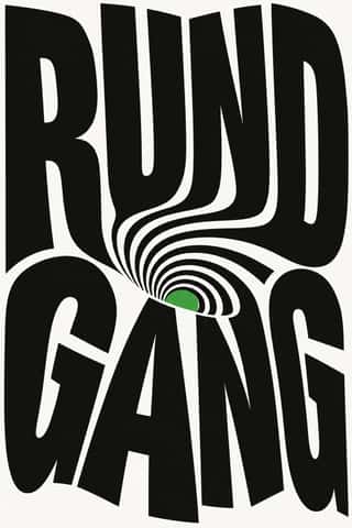
- Swiss Punk / New Wave TypographyA rebellion from inside the Swiss school: Wolfgang Weingart and his Basel students kept the grotesque and the grid but set them in motion with extreme letterspacing, stepped and angled lines, rules and bars, enlarged halftone screens and layered film montage.
Roman-like Thai Typography (modern loopless Thai)A Thai type genre that drops the head loops of most Thai letters, so the script reads as an even sans like Helvetica.
Hauntology & Ghost Box DesignSleeves and print that rebuild a misremembered British past from the public graphics of roughly 1958–1978.
Neo-Swiss RevivalA contemporary revival of the International Typographic Style, fuelled by digital re-releases of neo-grotesques and by studios such as Experimental Jetset and Norm: modular grids, flush-left grotesque type, huge tightly set headlines and flat fields of black, white and one signal colour.
GOV.UK Design (GDS Style)The text-led design of GOV.UK, the UK government's single website, built by the Government Digital Service from 2012 and codified in the GOV.UK Design System (2018).
Plain Tobacco PackagingA packaging language written into law to strip tobacco of persuasion.
- Front-of-Pack Warning Octagons (Latin American Food Warning Seals)A state warning system stacked on commercial food packs.
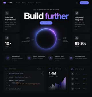
Dark Tech MinimalismThe dark, restrained aesthetic of developer tools and SaaS landing pages since about 2019: near-black grounds, grey type ramps, a neutral grotesque such as Inter, hairline borders, soft radial glows and bento grids of crisp product screenshots.
Styles that often use it 48
A characteristic choice: usual in these styles, though not essential.
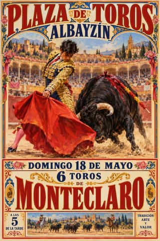
Spanish Bullfight Poster (Cartel Taurino)The Spanish bullfight poster in its illustrated form, from Marcelino de Unceta's lithographs (from 1879) to the Valencian house of Ortega, which supplied rings across Spain.
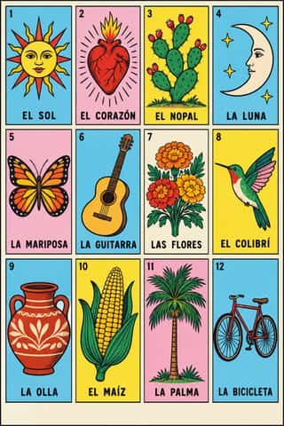
Lotería Card Imagery (Mexican Lotería)The picture deck of Mexico's lotería, a bingo-like game of chance.
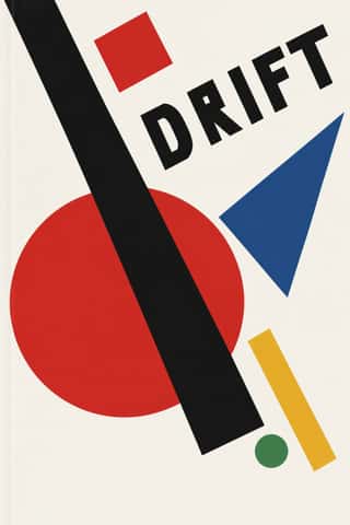
SuprematismKazimir Malevich's non-objective art, unveiled with the Black Square at the 0.10 exhibition in Petrograd in 1915, reduced painting to pure geometric planes floating in white, infinite space.
- BauhausThe German school founded by Walter Gropius in 1919 moved from Expressionist craft ideals to a programme of 'art and technology' after 1923, when Moholy-Nagy, Herbert Bayer and Joost Schmidt made its printing and advertising workshops a laboratory for functional communication.
- Estridentismo (Stridentist) GraphicsMexico's first avant-garde (1921-27), launched when Manuel Maples Arce pasted his manifesto Actual No. 1 on Mexico City walls.
- Italian Fascist Graphics (Romanità & Exhibition Photomontage)The visual language of Italian Fascism, which turned modernist means to a cult of Rome and of the Duce.
- Brazilian Modernismo Graphics (Klaxon and the Semana de 22)The print side of São Paulo's Modernismo (1922-29), set in jobbing print shops.
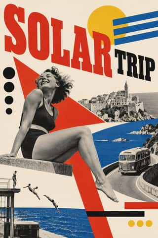
Czech Poetist Book Design (Devětsil)The book and magazine design of the Czech Devětsil circle, where Karel Teige and his colleagues turned constructivist tools (asymmetry, sans and slab capitals, heavy bars, photomontage) toward Poetism's lyrical celebration of travel, cinema, jazz and the circus.
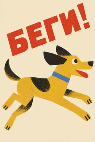
Leningrad Avant-Garde Picture BookThin, large picture books made in Petrograd/Leningrad from 1922 to the mid-1930s for Raduga and the Gosizdat children's department led by Samuil Marshak, with Vladimir Lebedev as art editor.
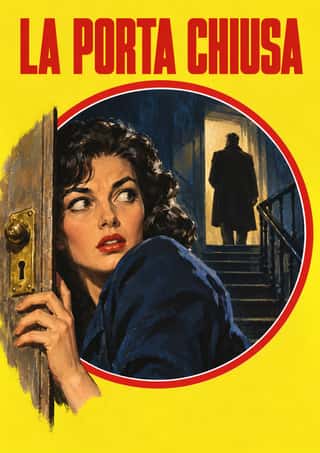
Giallo Mondadori Covers (I Libri Gialli)The cover system of Mondadori's crime series, Milan, from I Libri Gialli of 1929 to Il Giallo Mondadori today.
- AIZ Political Photomontage (Heartfield)The political photomontage John Heartfield made for the communist weekly AIZ from 1930 to 1938, in Berlin and, from 1933, in Prague exile.
Scandinavian FunctionalismNordic functionalism (funkis) arrived in graphic form with Sigurd Lewerentz's posters and winged emblem for the 1930 Stockholm Exhibition.
Milanese Industrial Modernism (Olivetti, Pirelli, Studio Boggeri)The Milan-centred school that married Bauhaus- and Swiss-trained discipline with Italian painterly wit for enlightened industrial patrons such as Olivetti, Pirelli and La Rinascente.
Hebrew Poster Lettering & Early Israeli State DesignThe commercial and state graphics of the Jewish community in Mandate Palestine and early Israel, made in Tel Aviv from 1934 by designers who had trained in Berlin and Vienna: Franz Krausz, Otte Wallish and the Shamir brothers.
Penguin Paperback Design (Three Bands to the Marber Grid)The cover system of Penguin Books, London, from 1935 until Germano Facetti left in 1972.
- Onitsha Market PamphletsCheap, stapled pamphlets of romance, advice, drama and political biography, written by students, clerks, journalists and traders and printed by jobbing letterpress shops around Onitsha Main Market in eastern Nigeria from the late 1940s.
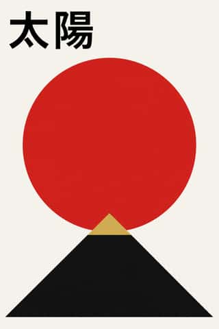
Japanese Postwar ModernismBuilding on the New Typography that Hiromu Hara and the Nippon Kobo circle had absorbed in the 1930s, Japan's postwar graphic designers fused the grid, sans-serif and objective photography of European modernism with indigenous traditions of family crests (kamon), asymmetry and charged emptiness (ma).
Brazilian Concrete DesignA São Paulo and Rio movement in which concrete art, concrete poetry and Brazil's first design offices shared one vocabulary: Max Bill's mathematically generated geometry, serial repetition and sans-serif type.
Drum Magazine & Sophiatown PhotojournalismThe picture magazine of Black urban Africa in the 1950s.
- Greek Tourism Modernism (EOT)The modernist image of Greece made for the National Tourism Organisation (EOT) by Michalis Katzourakis, its art adviser in 1960-1967, and by Frederick Carabott, who advised it until 1967; in 1962 the two also founded the K&K Athens Advertising Centre.
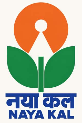
Indian Institutional Modernism (NID)The design culture of independent India's public institutions, banks and broadcasters.
Fluxus Graphics (Maciunas)The house graphics George Maciunas made from 1962 until his death in 1978 for Fluxus, a network of artists who staged events and sold cheap multiples.
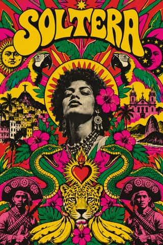
Tropicália Graphic DesignThe graphic language of Brazil's Tropicália, foreshadowed by Rogério Duarte's poster for Deus e o Diabo na Terra do Sol (1964), which already devours Ulm modernism, and set by his 1968 covers for Caetano Veloso and Gilberto Gil.
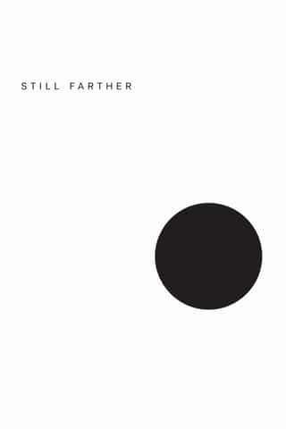
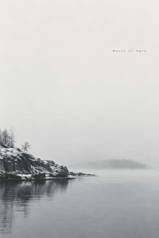
Minimalist Graphic DesignModernism reduced to its barest means, informed by 1960s Minimal art and Japanese emptiness: one image or line of type, vast white or neutral space, a monochrome or near-monochrome palette and meticulous typographic detail.
ECM Sleeve Aesthetic (Munich)The cover language of the Munich label ECM, made since 1970 by Barbara Wojirsch, Dieter Rehm and later Sascha Kleis and Mayo Bucher with co-founder Manfred Eicher.
Dutch Expressive Postmodernism (Studio Dumbar & Hard Werken)An anti-functionalist current in Dutch graphic design led by Studio Dumbar in The Hague (from 1977) and the Rotterdam collective Hard Werken (magazine from 1979, design office 1982–1994).
- Post-Punk Record Sleeve (Stiff, Factory, 4AD)The record sleeves that British art-school designers made after punk, for independent labels and some majors: Barney Bubbles at Stiff, Malcolm Garrett for Buzzcocks, Peter Saville at Factory and 23 Envelope at 4AD.
Techno-Futurist GraphicsElectronic-music and video-game graphics of the late 1980s and 1990s that turned corporate modernism into a sci-fi consumer fantasy.
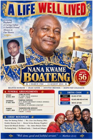
Ghanaian Funeral Poster & BannerThe printed death announcements of southern Ghana, also found elsewhere in West Africa: colour posters, mostly A2, pasted on walls, trees, poles and vehicles, and by the mid-2010s large PVC banners hung at the family house.
- Nigerian Pentecostal Crusade Poster & BillboardThe roadside adverts of Nigeria's Pentecostal and independent churches: billboards, banners and posters on poles, walls and bridges announcing crusades, revivals, conventions and night vigils.
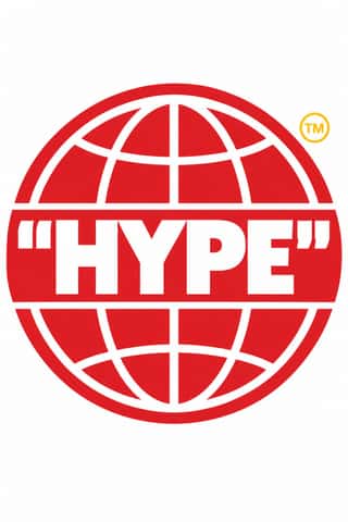
Hype Streetwear Graphics (Box Logo to Quotation Marks)The logo-led graphics of streetwear since the 1990s: one wordmark or emblem on a plain T-shirt, hoodie or object is the product.
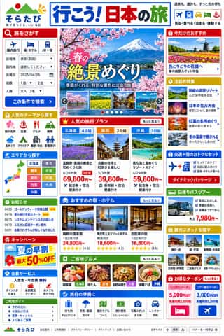
Japanese Dense Web DesignThe information-packed look of Japan's big portals, shops, airlines and ministries: three or more narrow columns of boxed modules, crowded with small Japanese text, blue links, tiny thumbnails, dated news lists and rotating ad banners, in bright colours on a white page.
Skeuomorphic UIInterface design that imitates physical materials and objects (stitched leather, linen, wooden shelves, brushed aluminium, felt, paper and glass) so that digital tools look and behave like their real-world counterparts.
Contemporary Arabic & Dual-Script Type DesignA twenty-first-century type culture that redraws Arabic as a family matched to a Latin companion in weight, proportion and contrast, so the two scripts can share a page, screen or sign as equals.
- Seoul Independent Graphic Design (Small-Studio Scene)Graphic design by Seoul's small, self-run studios, which from about 2005 chose to stay small.
- Danmaku Bullet-Comment OverlayThe bullet-comment layer of Japanese and Chinese video sites, begun on Niconico in December 2006 and taken up by AcFun and Bilibili in 2008–2009.
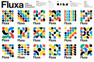
Generative & Dynamic IdentitiesIdentity systems designed as rules rather than fixed marks: logos and graphics generated by code, data or parameters so that they vary endlessly while staying recognisable.
Lucerne Poster Scene (Neubad & Südpol Posters)Lucerne's poster culture for small non-commercial venues (Südpol, Neubad, Treibhaus) and the Weltformat festival.
Risograph & Indie Print CultureA contemporary culture of zines, art books, posters and prints made on Japanese Risograph stencil duplicators, whose soy-based spot inks (fluorescent pink, yellow, blue, teal) are laid down one drum at a time.
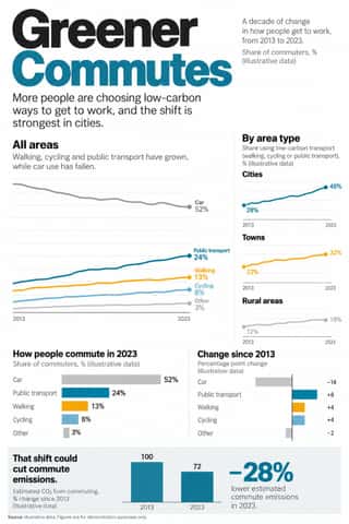
Newsroom Data Graphics & ScrollytellingThe house style of newspaper graphics desks since about 2009–2011 (the New York Times graphics desk, D3.js, the Guardian Datablog): conventional charts drawn from the data, on a white or pale paper ground with light grey gridlines and no axis titles, lines labelled directly in place of a legend where possible and short annotations saying what to look at.
Flat DesignAn interface and illustration language that stripped screens of simulated materials, replacing bevels, gloss and textures with solid fields of colour, clean sans-serif type and reduced pictograms.
DTC 'Blanding' / Millennial MinimalismThe friendly, frictionless minimalism of 2010s direct-to-consumer start-ups, built for the phone screen, the Instagram feed and the unboxing.
Brutalist Web DesignA reaction against templated, conversion-optimised web design that exposes the raw materials of the browser: default system fonts, blue underlined links, visible borders, unstyled forms and plain document flow.
Material DesignGoogle's design system, launched in 2014, which reintroduced controlled depth to flat design through the metaphor of 'material': sheets of digital paper and ink that sit at defined elevations, cast consistent shadows and move with meaningful motion.
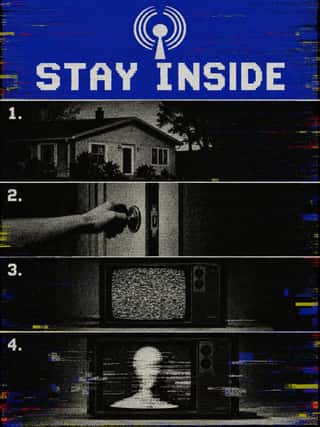
Analog Horror GraphicsA horror genre, mostly on YouTube, that tells its stories through imitation television and home-video graphics rather than actors: emergency-alert screens, station IDs, public-service, educational and instructional tapes, set between the 1960s and early 2000s.
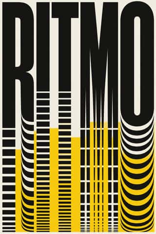
Kinetic Typography & Variable TypeTypography as the moving image: letterforms that stretch, squash, rotate and morph along variable-font axes, loop seamlessly and cut to the beat of music, used for identities, social-media posters and digital out-of-home screens.
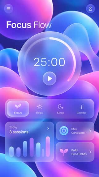
GlassmorphismAn interface style of translucent, frosted panels floating over vivid, blurred backgrounds, so that depth and hierarchy come from layered transparency.
- Neo-BrutalismA friendly, commercial descendant of web brutalism that keeps its blunt boxes but adds candy colour: thick black outlines, hard unblurred offset shadows, flat saturated fills and chunky sans-serif type on conventional, usable layouts.
Styles that use it now and then 36
An occasional choice in these styles.
- Victorian Letterpress & Wood Type1810–1900
- Kanga (Swahili Message Cloth)1886–present
- Expressionist Woodcut Graphics1905–1925
- De Stijl1917–1931
- Basel Object Poster (Swiss Sachplakat)1919–1955
- Socialist Realist Propaganda Poster1932–1989
- Taller de Gráfica Popular1937–1977
- Literatura de Cordel Woodcut1940–present
- Puerto Rican Silkscreen Poster (DIVEDCO & ICP)1946–1989
- Fotoromanzo (Italian Photo-Romance)1947–present
- Story Manga (Postwar Japanese Comics)1947–present
- French Post-War Visual-Gag Poster (Savignac, Villemot, Morvan)1948–1979
- Vicente Rojo & Mexican Editorial Modernism1953–1990
- Situationist Détournement Graphics1956–1972
- Turkish Modernist Poster & Graphic Design1959–2000
- Cuban Revolutionary Poster (OSPAAAL & ICAIC)1960–1990
- Chicano Screenprint Poster1965–present
- Amar Chitra Katha Comics1967–present
- Ultras Graphics (Curva Banners and Tifo)1968–present
- Turkish Weekly Humour Magazines (Gırgır to Uykusuz)1972–2025
- La Movida Madrileña Graphics1977–1988
- South African Resistance Poster1978–1994
- Cranbrook & Deconstructivist Typography1980–1998
- NSK Retro-Avant-Garde1980–present
- Solidarność & Polish Underground Graphics1980–1989
- ACT UP & Gran Fury AIDS Activist Graphics1987–1995
- Early Web Vernacular1994–2004
- Fantasy User Interface (FUI) & Sci-Fi HUD1999–present
- Internet Ugly & Meme Vernacular2003–present
- Natural Wine Label Art2007–present
- YouTube Thumbnail Style (the 'YouTube Face')2012–present
- Data Humanism2014–present
- Latin American Feminist Protest Graphics (Ni Una Menos and the Green Wave)2015–present
- Book Blob (Abstract Colour-Blob Literary Fiction Cover)2019–2023
- Weirdcore & Dreamcore2019–present
- Black Lives Matter Street Murals2020–present
It often goes with
Choices that the styles making it make more often than the atlas as a whole.
- Straight photographyin 55 of 106
- Ornament-freein 51 of 106
- Rational & objectivein 44 of 106
- Rectilinearin 54 of 106
- Geometric primitivesin 57 of 106
- Dynamic asymmetryin 52 of 106
Styles that avoid it
Styles that deliberately leave it out.
- Chinese Calligraphy & Seal Carving (Shufa & Zhuanke)c. 0–present
- Armenian Manuscript Illuminationc. 862–1800
- Hebrew Micrographyc. 895–present
- Maghrebi Script (Maghribi Calligraphy of al-Andalus and North Africa)c. 900–present
- Song–Ming Woodblock Book Typography (Songti / Mincho)c. 960–present
- Gothic Blackletter & Fraktur Traditionc. 1180–present
- Vyaz (Ornamental Slavonic Lettering)c. 1230–present
- Persian Miniature (Ilkhanid, Timurid and Safavid Book Painting)c. 1300–1700
- Ottoman Tughra & Dîvânî Chancery Calligraphyc. 1324–present
- Persian Nastaʿlīq Calligraphy (Qiṭʿa, Chalipa and Siyāh-mashq)c. 1400–present
- Renaissance Book Typographyc. 1460–1600
- Zoomorphic & Figural Calligraphy (Islamic Calligrams)1500–present
- Emblem Book (Motto, Picture & Epigram)1531–1724
- Lubok Popular Print1650–1920
- Neoclassical Book Typography1757–1830
- Bulaq (Amiriyya) Naskh Book Printing1822–1956
- Urdu Katib Lithography1837–present
- Celtic Revival Illumination & Lettering1861–1951
- Norwegian and Finnish National Romantic Graphics (Munthe & Karelianism)1880–1922
- Art Nouveau1890–1910
- Fileteado Porteño1890–present
- Nieuwe Kunst (Dutch Art Nouveau)1892–1914
- German Book Art Movement (Buchkunstbewegung)1895–1933
- Mir iskusstva Book Art1898–1927
- Santiniketan & Bengal School Graphics1905–1954
- Bezalel School1906–1929
- London Transport Design1908–1966
- Taishō Roman & Lyrical Illustration1910–1940
- Egyptian Painted Film Poster1932–1996
- Bengali Modernist Book Cover (Prachchhad)1943–present
- Pakistani Truck Art1947–present
- Hurufiyya Calligraphic Modernism1949–present
- Polish Poster School1950–1990
- Cairo–Beirut Arab Modernist Book & Periodical Design1952–1990
- Push Pin Style1954–1980
- Chinese National-Style Animation (Shanghai Animation Film Studio)1956–1989
- Psychedelic Poster1965–1973
- Global Village Coffeehouse1988–2003
- Arabic Calligraffiti2002–present
Other choices in typography
- Humanist & Garalde serif
- Transitional serif
- Didone
- Slab serif
- Geometric sans
- Humanist sans
- Rounded sans
- Blackletter
- Script
- Brush & pen calligraphy
- Hand-lettering
- Ornamented display
- Condensed display
- Stencil
- Monospace
- Bitmap & pixel
- Experimental & distorted
- All caps
- Lowercase only
- Type as image
- Flush left, ragged right
- Rotated & vertical setting
- Eclectic mixing
- Tight setting
- Wide letterspacing