Form & shape · Geometric
Rectilinear
Orthogonal bars, blocks and lines.
A design choice in Stylogeny’s vocabulary, under form & shape: what is the shape language?
- styles make it
- 114
- as a defining choice
- 16
- as a usual one
- 58
- now and then
- 40
- avoid it
- 1
Styles defined by it 16
For these styles it is one of the choices that make the style.
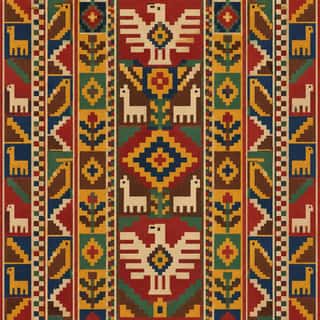
Andean Woven Graphic SystemsThe graphic systems of Andean cloth, the region's most prestigious medium, in which every motif is built on the warp-and-weft grid.
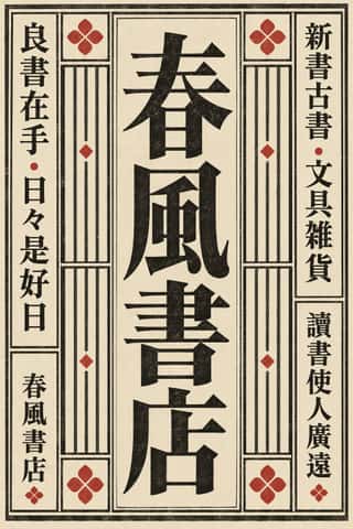
Song–Ming Woodblock Book Typography (Songti / Mincho)The page and letter of the East Asian book.
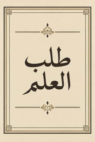
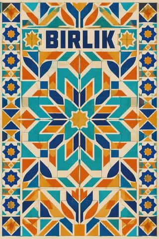
- Square Kufic (Bannāʾī)Square Kufic builds Arabic script on a square grid: straight lines and right angles only, with every stroke as wide as the gap beside it.
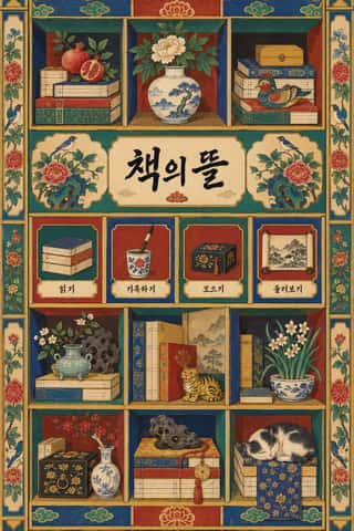
Chaekgeori & Minhwa Screen PaintingKorean painted folding screens of the late Joseon period.
- Glasgow StyleGlasgow's distinctive answer to Art Nouveau, formed around Charles Rennie Mackintosh, Margaret and Frances Macdonald and Herbert MacNair at the Glasgow School of Art.
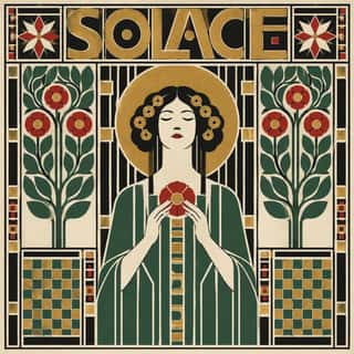
Vienna SecessionThe Viennese break with academic art led by Gustav Klimt, Koloman Moser, Josef Hoffmann and Alfred Roller, which pulled Art Nouveau toward the square, the grid and the flat plane.
- London Transport DesignThe design programme Frank Pick built for London's Underground from 1908 and the London Passenger Transport Board (1933–40), continued by Harold Hutchison (1947–66).
De StijlA Dutch movement formed around Theo van Doesburg's journal De Stijl and Piet Mondrian's Neoplasticism, which sought universal harmony through the most elementary means: horizontal and vertical lines, rectangles, the three primaries and black, white and grey.
Wendingen & Amsterdam School TypographyThe graphic language of Wendingen (1918–1932), monthly of the Amsterdam architects' society Architectura et Amicitia, and its editor H.
Penguin Paperback Design (Three Bands to the Marber Grid)The cover system of Penguin Books, London, from 1935 until Germano Facetti left in 1972.
- Machine-Age Simplified Arabic TypeArabic redrawn for the machine rather than the reed pen.
Fluxus Graphics (Maciunas)The house graphics George Maciunas made from 1962 until his death in 1978 for Fluxus, a network of artists who staged events and sold cheap multiples.
Total Design & Dutch FunctionalismThe Dutch strand of systematic modernism took shape when Wim Crouwel, Benno Wissing, Friso Kramer and Paul and Dick Schwarz founded Total Design in Amsterdam in 1963 as the country's first multidisciplinary studio.
GOV.UK Design (GDS Style)The text-led design of GOV.UK, the UK government's single website, built by the Government Digital Service from 2012 and codified in the GOV.UK Design System (2018).
Plain Tobacco PackagingA packaging language written into law to strip tobacco of persuasion.
Brutalist Web DesignA reaction against templated, conversion-optimised web design that exposes the raw materials of the browser: default system fonts, blue underlined links, visible borders, unstyled forms and plain document flow.
Styles that often use it 58
A characteristic choice: usual in these styles, though not essential.
- Ancient Egyptian Hieroglyphic & Register CompositionThe visual system of pharaonic Egypt, in which writing is made of pictures and pictures are ruled like writing.
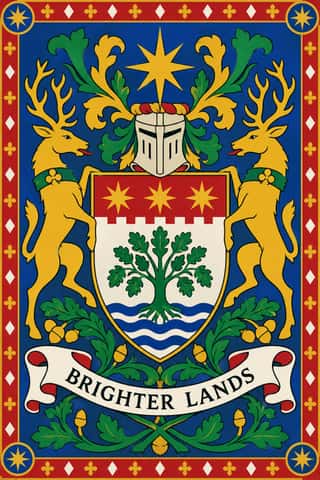
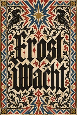
European HeraldryThe hereditary identifying devices of medieval Europe's knights and seals, codified into a rule-bound grammar still used by states, cities, churches, universities and families.
Gothic Blackletter & Fraktur TraditionThe broken scripts of the Latin West.
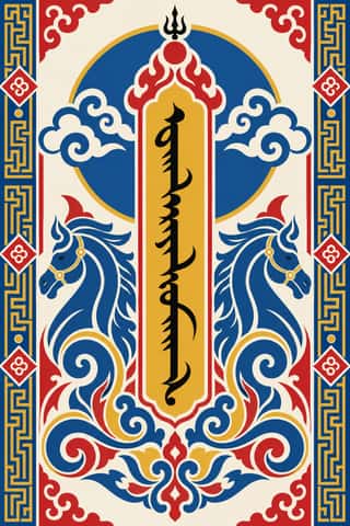
Mongol Bichig Calligraphy & Ugalz OrnamentMongolia's classical script and the auspicious ornament that frames it on state, Buddhist and household objects.
Vyaz (Ornamental Slavonic Lettering)Cyrillic letters bound into one even band of ornament.
- Tibetan Woodblock Print Culture (Pecha & Prayer Flags)Tibetan Buddhist and Bön woodblock printing, from the first printed Kangyur (1410, cut in China) and the 15th-century presses of Gungthang to the great printing houses of Narthang, Derge and Lhasa.
- Sápmi Graphic Identity (Duodji & Gákti Colour Code)Duodji is Sámi handicraft: hard work in wood, horn and bone, soft work in skin and cloth; drums painted with alder-bark figures survive from the 17th and 18th centuries.
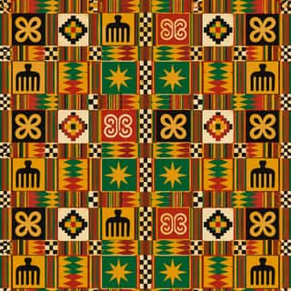
Adinkra & Kente Symbol SystemsThe Akan textile languages of Ghana.
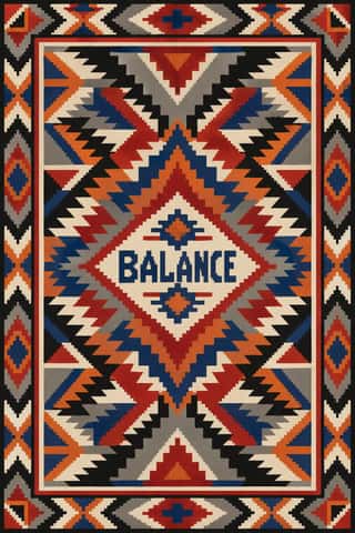
Diné (Navajo) Weaving DesignThe tapestry-woven design tradition of Diné (Navajo) weavers, recorded in Spanish sources from the early 18th century.
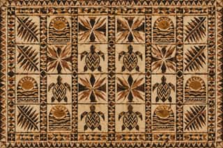
Pacific Barkcloth (Tapa) DesignBarkcloth beaten from paper-mulberry inner bark and decorated across Polynesia and Fiji for gift exchange at weddings, funerals and chiefly investitures.
- Thai Yantra (Yant) DiagramsThai protective diagrams in which Pali formulae, written in Khom, a sacred script derived from Khmer, are packed into squares, circles, triangles, spires and the outlines of Buddhas, monks and tigers, often framed by lines of script.
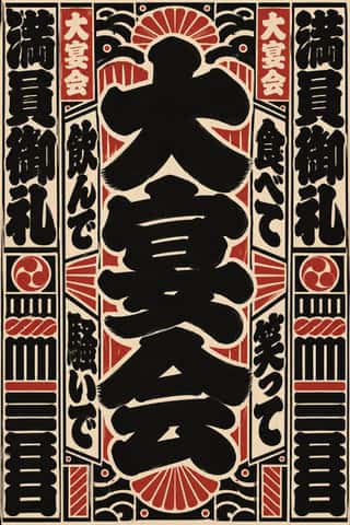
Edo-moji Commercial Lettering (Kanteiryū, Yose-moji, Sumō-ji)The fat, ink-heavy brush hands that Edo's professional sign and bill writers made for the city's entertainments: Kanteiryū for kabuki signboards and playbills from 1779, yose-moji for rakugo halls, sumō-ji for sumo ranking sheets, and squarish kago-moji for votive name slips.
Bulaq (Amiriyya) Naskh Book PrintingThe page of the Arabic printed book as Egypt's state press at Bulaq shaped it from 1822: justified blocks of black Naskh type on pale paper, often boxed in a ruled frame, with an ornamental headpiece on the opening page, headings set larger or in a second script such as Nastaʿlīq, and almost no pictures.
- Urdu Katib LithographyFor about a century and a half Urdu chose lithography over movable type, because metal type could not reproduce the sloping, stacked ligatures of Nastaʿlīq.
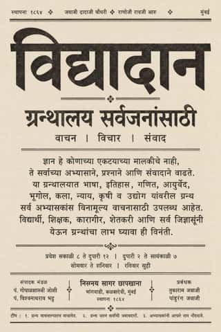
Nirnaya Sagar Devanagari Typography (Bombay Metal Type)Devanagari as Javaji Dadaji's Bombay type foundry (1864) and Nirnaya Sagar Press (1869) cut and printed it: upright metal type with a strong headline, cut with the punch-cutter Ranoji Aru, and enough conjunct and 'Akhand' sorts to set Sanskrit, Vedic accents and Marathi whole.
Cubist Pictorial SpaceThe pictorial revolution of Picasso and Braque that shattered single-point perspective into overlapping, faceted planes seen from several viewpoints at once.
- Arnhem Land Bark Painting & RarrkPainting in ochres on flattened stringybark by Yolŋu, Kunwinjku, Kuninjku and other clans of Arnhem Land, carrying ceremonial designs into portable form; collected from 1912, painted through art centres since the 1970s.
- Vorticism & BLAST TypographyLondon's short-lived rival to Futurism, launched by Wyndham Lewis with BLAST (dated 20 June 1914; War Number, July 1915).
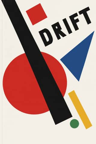
SuprematismKazimir Malevich's non-objective art, unveiled with the Black Square at the 0.10 exhibition in Petrograd in 1915, reduced painting to pure geometric planes floating in white, infinite space.
- Russian ConstructivismConstructivism rejected art for art's sake in favour of the artist-engineer building useful things for the new Soviet society.
- BauhausThe German school founded by Walter Gropius in 1919 moved from Expressionist craft ideals to a programme of 'art and technology' after 1923, when Moholy-Nagy, Herbert Bayer and Joost Schmidt made its printing and advertising workshops a laboratory for functional communication.
- Estridentismo (Stridentist) GraphicsMexico's first avant-garde (1921-27), launched when Manuel Maples Arce pasted his manifesto Actual No. 1 on Mexico City walls.
- Italian Fascist Graphics (Romanità & Exhibition Photomontage)The visual language of Italian Fascism, which turned modernist means to a cult of Rome and of the Duce.
Die Neue TypographieThe programme that turned avant-garde experiment into a functional typographic method, named by Moholy-Nagy in 1923 and codified in Jan Tschichold's 'elementare typographie' (1925) and Die neue Typographie (1928).
- MavoTokyo's anarchist avant-garde, founded in July 1923 by Murayama Tomoyoshi, back from a year in Berlin, with four former Futurists, and its magazine MAVO (seven issues, July 1924 to August 1925).
- Ndebele Geometric PaintingThe mural tradition of Southern Ndebele women, who paint homestead walls and gateways, and later canvases and objects, with bold, symmetrical geometric designs.
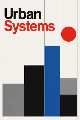
International Typographic StyleA post-war refinement of the New Typography in which the mathematical grid, objective photography and neo-grotesque sans-serifs were used to communicate with clarity and neutrality.
Brazilian Concrete DesignA São Paulo and Rio movement in which concrete art, concrete poetry and Brazil's first design offices shared one vocabulary: Max Bill's mathematically generated geometry, serial repetition and sans-serif type.
Finnish Bold Print (Marimekko Modernism)The printed-cotton modernism of Marimekko, founded in Helsinki in 1951 by Armi and Viljo Ratia out of Viljo's printing firm Printex.
HfG Ulm Systematic DesignThe Hochschule für Gestaltung Ulm (1953–1968) was founded as the successor to the Bauhaus.
Vicente Rojo & Mexican Editorial ModernismThe design of Mexico City's literary and cultural press, shaped from the 1950s by the Barcelona-born exile Vicente Rojo: México en la Cultura, the Revista de la Universidad, Plural, La Jornada and the covers of Ediciones Era.
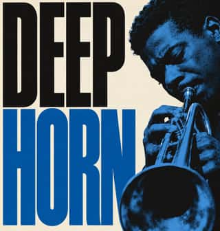
Blue Note Jazz Sleeve ModernismThe record-sleeve language of Blue Note Records, set by art director Reid Miles, who designed some 350 twelve-inch LP covers between about 1956 and 1967, often around Francis Wolff's session photographs.
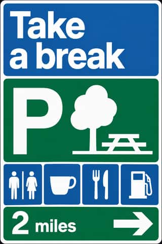
British Road Signage (Kinneir & Calvert)The national sign system Jock Kinneir and Margaret Calvert designed for Britain's motorways, first used on the Preston By-pass in 1958, and through the Worboys Committee for all roads from 1 January 1965.
- Greek Tourism Modernism (EOT)The modernist image of Greece made for the National Tourism Organisation (EOT) by Michalis Katzourakis, its art adviser in 1960-1967, and by Frederick Carabott, who advised it until 1967; in 1962 the two also founded the K&K Athens Advertising Centre.
Munich 1972 Olympic Design (Otl Aicher)The visual programme Otl Aicher's department made for the 1972 Munich Olympics, the 'cheerful Games' meant to show a democratic, modest West Germany.
Soviet Central Asian Ornamental ModernismThe monumental art of Soviet Central Asia after the 1966 Tashkent earthquake: a strand of Socialist Realism mixed with Islamic and national ornament.
- Ultras Graphics (Curva Banners and Tifo)The graphic language of Italy's organised football supporters, the ultras, from the late 1960s, and of the groups that copied them across Europe, North Africa and beyond.
Roman-like Thai Typography (modern loopless Thai)A Thai type genre that drops the head loops of most Thai letters, so the script reads as an even sans like Helvetica.
Bitmap & Pixel GraphicsGraphics and lettering built from the square pixels of low-resolution screens (arcade and console sprites, home-computer displays and the first graphical user interfaces), where every dot was placed by hand within tight limits of memory, resolution and palette.
Dutch Expressive Postmodernism (Studio Dumbar & Hard Werken)An anti-functionalist current in Dutch graphic design led by Studio Dumbar in The Hague (from 1977) and the Rotterdam collective Hard Werken (magazine from 1979, design office 1982–1994).
City Pop IllustrationThe painted look of Japanese city pop record sleeves and magazine covers, fixed by Hiroshi Nagai's sleeve for Eiichi Ohtaki's A Long Vacation (1981) and Eizin Suzuki's for Tatsuro Yamashita's For You (1982).
Pixação (São Paulo Tag Reto)The name-writing of São Paulo's pixadores, which since the 1980s has covered walls and façades and, from the 1990s, the upper floors of tower blocks.
Emigre & Early Digital TypeRudy VanderLans and Zuzana Licko's magazine and type foundry, launched in 1984 alongside the first Macintosh, turned the computer's low-resolution constraints into a new typographic idiom.
Out-of-Square Hangul TypographyA Korean typographic movement that frees Hangul from the equal square in which metal and photo type had always set each syllable.
Techno-Futurist GraphicsElectronic-music and video-game graphics of the late 1980s and 1990s that turned corporate modernism into a sci-fi consumer fantasy.
Hype Streetwear Graphics (Box Logo to Quotation Marks)The logo-led graphics of streetwear since the 1990s: one wordmark or emblem on a plain T-shirt, hoodie or object is the product.
Early Web VernacularThe amateur web of the mid-1990s to early 2000s, when millions of people hand-coded personal homepages on free hosts such as GeoCities with table layouts, browser-default fonts, tiled backgrounds, animated GIFs, MIDI soundtracks, hit counters and ‘under construction’ signs.
Fantasy User Interface (FUI) & Sci-Fi HUDFantasy user interfaces are the screen graphics of films and series: computer screens, holograms and helmet HUDs made to be watched for a few seconds, not used.
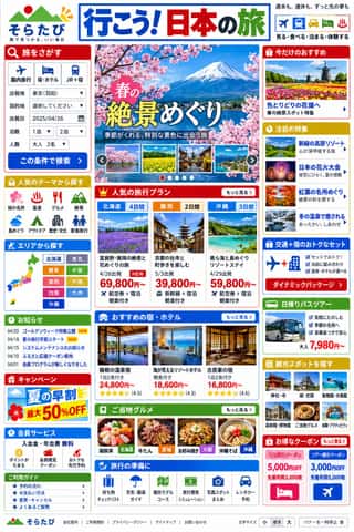
Japanese Dense Web DesignThe information-packed look of Japan's big portals, shops, airlines and ministries: three or more narrow columns of boxed modules, crowded with small Japanese text, blue links, tiny thumbnails, dated news lists and rotating ad banners, in bright colours on a white page.
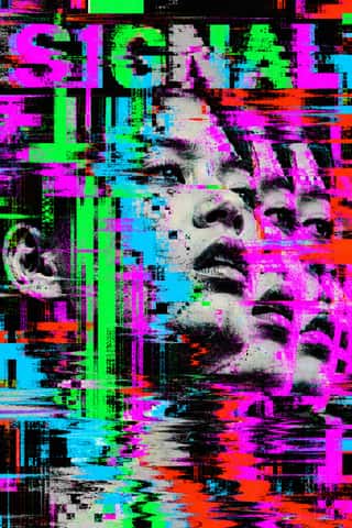
Glitch Art & Datamosh GraphicsAn art and design practice that makes digital failure the picture.
- Contemporary Chinese Book Design ('Most Beautiful Books of China')Chinese book design since 2003, when Shanghai founded the yearly 'Most Beautiful Books of China' award, whose winners go on to Leipzig.
Contemporary Arabic & Dual-Script Type DesignA twenty-first-century type culture that redraws Arabic as a family matched to a Latin companion in weight, proportion and contrast, so the two scripts can share a page, screen or sign as equals.
Neo-Andean Architecture (Cholets)The facades and party halls of El Alto, Bolivia, begun by the Aymara builder-architect Freddy Mamani in 2005 for a new Aymara merchant class.
Neo-Swiss RevivalA contemporary revival of the International Typographic Style, fuelled by digital re-releases of neo-grotesques and by studios such as Experimental Jetset and Norm: modular grids, flush-left grotesque type, huge tightly set headlines and flat fields of black, white and one signal colour.
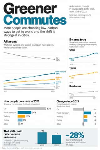
Newsroom Data Graphics & ScrollytellingThe house style of newspaper graphics desks since about 2009–2011 (the New York Times graphics desk, D3.js, the Guardian Datablog): conventional charts drawn from the data, on a white or pale paper ground with light grey gridlines and no axis titles, lines labelled directly in place of a legend where possible and short annotations saying what to look at.
Flat DesignAn interface and illustration language that stripped screens of simulated materials, replacing bevels, gloss and textures with solid fields of colour, clean sans-serif type and reduced pictograms.
Black Lives Matter Street MuralsA single protest slogan painted along the roadway in capitals 20 to 35 feet tall, filling the street from kerb to kerb, so it reads whole only from rooftops, drones and helicopters.
- Neo-BrutalismA friendly, commercial descendant of web brutalism that keeps its blunt boxes but adds candy colour: thick black outlines, hard unblurred offset shadows, flat saturated fills and chunky sans-serif type on conventional, usable layouts.
Styles that use it now and then 40
An occasional choice in these styles.
- Chinese Calligraphy & Seal Carving (Shufa & Zhuanke)c. 0–present
- Islamic Geometric & Calligraphic Traditionc. 690–present
- Mixteca-Puebla Codex Paintingc. 1200–1560
- Burmese Parabaik Painting (Konbaung Folding Books)1752–1885
- Neoclassical Book Typography1757–1830
- Hand-Painted Signage & Vernacular Lettering1800–present
- Victorian Letterpress & Wood Type1810–1900
- Fante Asafo Flags (Frankaa)1850–present
- Spanish Bullfight Poster (Cartel Taurino)1879–present
- Kanga (Swahili Message Cloth)1886–present
- Czech Poetist Book Design (Devětsil)1922–1938
- Leningrad Avant-Garde Picture Book1922–1936
- Republican Chinese Book Cover Design (Lu Xun & Tao Yuanqing)1923–1949
- Amazonian Boat Lettering (Abridores de Letras)1925–present
- Isotype Pictorial Statistics1925–1971
- Nippon Kōbō & Tōhōsha Photo-Propaganda Magazines (NIPPON & FRONT)1933–1945
- Fotoromanzo (Italian Photo-Romance)1947–present
- Hong Kong Neon & Beiwei Shop-Sign Lettering1950–present
- Drum Magazine & Sophiatown Photojournalism1951–1965
- Zagreb Modernist Graphics (EXAT 51 to Teatar &TD)1951–1975
- Zagreb School of Animated Film1954–1980
- Corporate Identity Modernism1955–1990
- Dazibao (Big-Character Posters)1957–1980
- Bossa Nova Sleeve Modernism (César Villela and Elenco)1960–1968
- Minimalist Graphic Design1965–present
- Western Desert Iconography1971–present
- Roots Reggae Sleeve Art & Rasta Iconography1973–1985
- Post-Punk Record Sleeve (Stiff, Factory, 4AD)1977–1990
- Chicha Poster1980–present
- Demoscene Graphics (Cracktros, Demos & Text-Mode Art)1985–present
- Grunge Typography1990–2000
- Danmaku Bullet-Comment Overlay2006–present
- Generative & Dynamic Identities2007–present
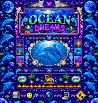
- Vaporwave2011–2017
- Material Design2014–present
- Analog Horror Graphics2015–present
- Front-of-Pack Warning Octagons (Latin American Food Warning Seals)2016–present
- NFT Profile-Picture Collections (CryptoPunks to Bored Apes)2017–present
- Dark Tech Minimalism2019–present
- Weirdcore & Dreamcore2019–present
It often goes with
Choices that the styles making it make more often than the atlas as a whole.
- Rules & barsin 59 of 114
- Rational & objectivein 45 of 114
- Typography onlyin 60 of 114
- Modular gridin 46 of 114
- Grotesque & neo-grotesquein 54 of 114
- Geometric primitivesin 60 of 114