Digital native · 2016–present · Global / networked, North America, Western Europe
Kinetic Typography & Variable Type
Also known as Kinetic identity, Motion type, Variable-font design, Elastic type, Kinetic type posters
Typography as the moving image: letterforms that stretch, squash, rotate and morph along variable-font axes, loop seamlessly and cut to the beat of music, used for identities, social-media posters and digital out-of-home screens. Enabled by OpenType variable fonts (2016) and popularised by studios such as DIA, it treats a typeface with axes and a motion toolkit, not a fixed logo, as the core of a brand.
Make something in this styleGet advice in this styleMix it with another style

01
How it works
- Make the letters the whole picture: fill the frame edge to edge with type and let movement supply the drama.
- Animate along real typographic axes (weight, width, slant or custom axes) so every frame remains a legible letterform.
- Build seamless loops and cut transitions to the rhythm of sound.
- Keep colour to black, white and one signal hue so form and motion carry the identity.
- Deliver a motion toolkit or variable typeface rather than a single static mark.
New York and European motion-branding studios; OpenType variable fonts were announced at ATypI Warsaw in September 2016
02
Its design choices
From Stylogeny’s vocabulary of design choices: defining choices make the style, characteristic ones are usual, occasional ones turn up now and then.
- Layout & composition
- Space & hierarchy
- Typography
- Colour
- Surface & texture
- Ornament
- Medium & production
- Avoids
- Abundant decoration, Floral & vegetal, Painterly illustration, Line illustration, Naturalistic depiction, Skeuomorphic material, Classical text block
Palette
#0b0b0b#f3f3ef#ff3d1f#2b3dff#c8ff3a
Typefaces
Variable grotesques with weight and width axes
e.g. Roboto Flex
Decovar
David Berlow
Bahnschrift
Microsoft's variable DIN 1451, 2017
Custom display typefaces drawn for animation
Known for
DIA (Mitch Paone & Meg Donohoe, Brooklyn, founded 2008), kinetic identities and typographic systems
OpenType 1.8 variable fonts, announced by Adobe, Apple, Google and Microsoft at ATypI Warsaw
2016
David Berlow, Decovar, a multi-axis decorative variable font
Font Bureau / Type Network
36 Days of Type (Nina Sans & Rafa Goicoechea, Barcelona, from 2014), annual letter challenge that spread animated type online
Saul Bass, North by Northwest title sequence (1959), precursor
Kyle Cooper, Se7en title sequence (1995), precursor
03
Make something in this style
Say what you need, and Stylogeny’s image studio draws it from Kinetic Typography & Variable Type’s design choices and checks it against them. It takes about a minute, and you get a link to share.
04
Where it comes from, and what it’s close to
Before it
The style it grew out of, and the styles it borrowed from.


After it
The styles that grew out of it.
No later style in the atlas grew out of it yet.
Alike in its design choices
Styles that make many of the same choices, related or not, besides those above.
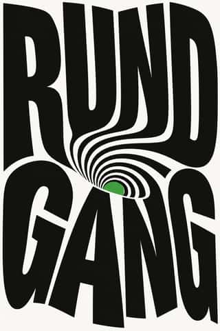
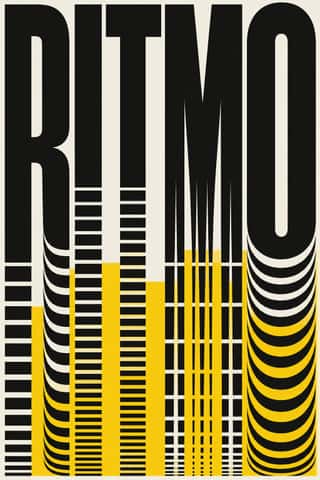
- Danmaku Bullet-Comment Overlay59% alike
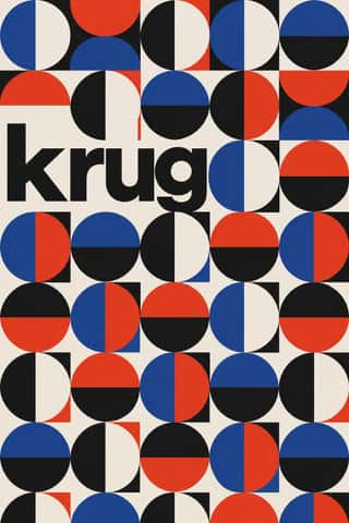
- Seoul Independent Graphic Design (Small-Studio Scene)56% alike


05
Real works
Artefacts in museums, libraries and archives that show the style, linked at their source.
- A-Trak, In the Loop: A Decade of Remixes: animated typographic covers and packagingDIA (Mitch Paone, Meg Donohoe) · c. 2016–17 (DIA project page archived 23 January 2017) · Internet Archive Wayback Machine (DIA website, dia.tv)
- Stattkino & Bourbaki – Innerschweizer Filmpreis (digital poster)Mixer, Luzern (Erich Brechbühl) · 2019 · Museum für Gestaltung Zürich, Poster Collection (eAd-0034)
- Haettenschweiler von A bis Z – Schriftgestalter, Grafiker und Künstler (animated digital poster)Studio Feixen, Luzern · 2022 · Museum für Gestaltung Zürich, Graphic Design Collection (dig-GS-2022-0010)
- Variable version of Founder Lanting Hei (方正兰亭黑), weight-axis animationTypeface by Founder Type (方正字库); animation by Buernia (Wikimedia Commons user) · 2019 (animation uploaded 31 August 2019) · Wikimedia Commons

06
Sources
- Creative Review, 'DIA: typography and motion design' (creativereview.co.uk)
- It's Nice That, 'Nicer Tuesdays March 2019: DIA' (2019)
- Type Network, 'ATypI Warsaw 2016, Day 2, Part I: the return of the Multiple Master'
- Wikipedia, 'Variable font'
How Stylogeny researches and checks a style: where the facts come from.