Typography · Typographic treatment
Tight setting
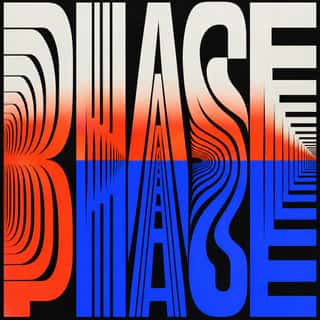
Letters and lines crowded together, touching or overlapping.
A design choice in Stylogeny’s vocabulary, under typography: what do the letters look like, and how are they set?
- styles make it
- 60
- as a defining choice
- 7
- as a usual one
- 30
- now and then
- 23
- avoid it
- 1
Styles defined by it 7
For these styles it is one of the choices that make the style.

- Ottoman Tughra & Dîvânî Chancery CalligraphyThe Ottoman sultan's calligraphic monogram and the chancery hand written beneath it.




Styles that often use it 30
A characteristic choice: usual in these styles, though not essential.
- Hebrew MicrographyA Jewish scribal art in which lines of minute Hebrew script, usually the Masoretic notes that guard the biblical text, are written so that the line itself draws: interlaced frames and star rosettes on full carpet pages, and animals, knights, fish and grotesques in the margins.
- Persian Nastaʿlīq Calligraphy (Qiṭʿa, Chalipa and Siyāh-mashq)The 'hanging' script of Persian poetry and an art of the single sheet.
- Zoomorphic & Figural Calligraphy (Islamic Calligrams)Pictorial writing in which the strokes of a devotional text form one figure: a lion of ʿAli built from the Nad-e ʿAli prayer, a galleon whose hull spells the names of the Seven Sleepers, a peacock, a Sufi cap.
- Thai Yantra (Yant) DiagramsThai protective diagrams in which Pali formulae, written in Khom, a sacred script derived from Khmer, are packed into squares, circles, triangles, spires and the outlines of Buddhas, monks and tigers, often framed by lines of script.
- Urdu Katib LithographyFor about a century and a half Urdu chose lithography over movable type, because metal type could not reproduce the sloping, stacked ligatures of Nastaʿlīq.
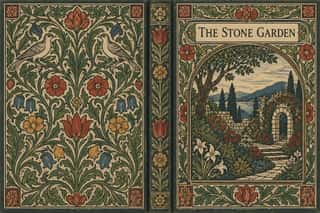
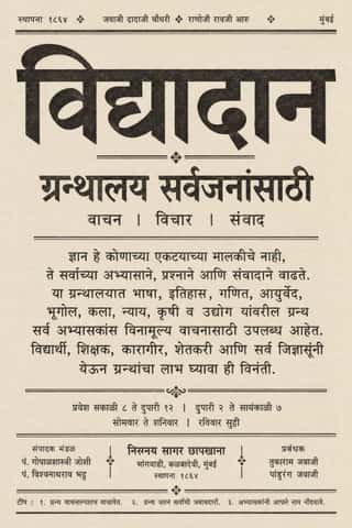
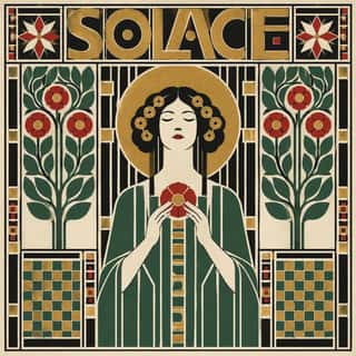
- Vorticism & BLAST TypographyLondon's short-lived rival to Futurism, launched by Wyndham Lewis with BLAST (dated 20 June 1914; War Number, July 1915).

- Machine-Age Simplified Arabic TypeArabic redrawn for the machine rather than the reed pen.
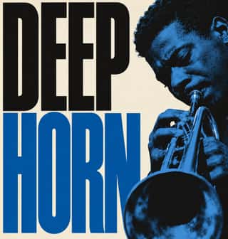
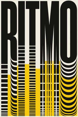
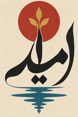


- Ultras Graphics (Curva Banners and Tifo)The graphic language of Italy's organised football supporters, the ultras, from the late 1960s, and of the groups that copied them across Europe, North Africa and beyond.
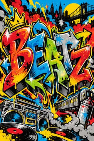

- Chicha PosterFluorescent screen-printed street posters that emerged in the 1980s to promote chicha (Andean cumbia) concerts in Lima, made by printers from Andean migrant communities.

- Black Metal GraphicsThe visual language of black metal, fixed by Norway's second wave in the early 1990s, now worldwide, since the 2010s borrowed by mainstream acts (Szpajdel's Rihanna and Metallica logos, 2016).

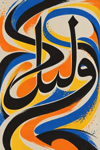
- Cartonera Books (Latin American Cardboard Publishing)Books of Latin America's cartonera presses, begun by Eloísa Cartonera in Buenos Aires in 2003 after Argentina's 2001 crash: photocopied texts stapled and glued by hand into covers cut from used boxes, usually bought from cartoneros (waste pickers) above the market price.




Styles that use it now and then 23
An occasional choice in these styles.
- Ancient Egyptian Hieroglyphic & Register Compositionc. 0–394
- Chinese Calligraphy & Seal Carving (Shufa & Zhuanke)c. 0–present
- Ethiopian Ge'ez Manuscript & Haräg Illuminationc. 500–present
- Islamic Geometric & Calligraphic Traditionc. 690–present
- Song–Ming Woodblock Book Typography (Songti / Mincho)c. 960–present
- Square Kufic (Bannāʾī)c. 1100–present
- Mongol Bichig Calligraphy & Ugalz Ornamentc. 1204–present
- Bulaq (Amiriyya) Naskh Book Printing1822–1956
- Persian Popular Narrative (Lithographs & Coffeehouse Painting)1843–2012
- Celtic Revival Illumination & Lettering1861–1951
- Nieuwe Kunst (Dutch Art Nouveau)1892–1914
- Russian Futurist Book1910–1920
- West German Conceptual Film & Culture Poster (Hillmann and Rambow)1953–1990
- Dazibao (Big-Character Posters)1957–1980
- Angura Theatre Poster1965–1985
- Chilean Unidad Popular & Nueva Canción Graphics1967–1973
- Pop Achorado (Peruvian Agrarian Reform Posters)1969–1975
- Turkish Weekly Humour Magazines (Gırgır to Uykusuz)1972–2025
- Madinah Mushaf (King Fahd Complex Qur'an Page)1985–present
- Hype Streetwear Graphics (Box Logo to Quotation Marks)1993–present
- Japanese Dense Web Design1999–present
- Danmaku Bullet-Comment Overlay2006–present
- Front-of-Pack Warning Octagons (Latin American Food Warning Seals)2016–present
It often goes with
Choices that the styles making it make more often than the atlas as a whole.
- Typography onlyin 41 of 60
- Type as imagein 38 of 60
- Horror vacuiin 41 of 60
- Rotated & vertical settingin 28 of 60
- Monochromein 41 of 60
- Pen, brush & inkin 34 of 60
Styles that avoid it
Styles that deliberately leave it out.
Other choices in typography
- Humanist & Garalde serif
- Transitional serif
- Didone
- Slab serif
- Grotesque & neo-grotesque
- Geometric sans
- Humanist sans
- Rounded sans
- Blackletter
- Script
- Brush & pen calligraphy
- Hand-lettering
- Ornamented display
- Condensed display
- Stencil
- Monospace
- Bitmap & pixel
- Experimental & distorted
- All caps
- Lowercase only
- Type as image
- Flush left, ragged right
- Rotated & vertical setting
- Eclectic mixing
- Wide letterspacing