Typography · Serif classes
Slab serif
Heavy, square serifs: Egyptians, Clarendons, typewriter slabs.
A design choice in Stylogeny’s vocabulary, under typography: what do the letters look like, and how are they set?
- styles make it
- 24
- as a defining choice
- 0
- as a usual one
- 7
- now and then
- 17
- avoid it
- 0
Styles that often use it 7
A characteristic choice: usual in these styles, though not essential.
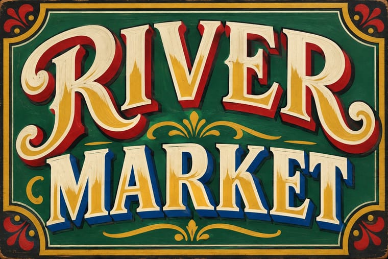
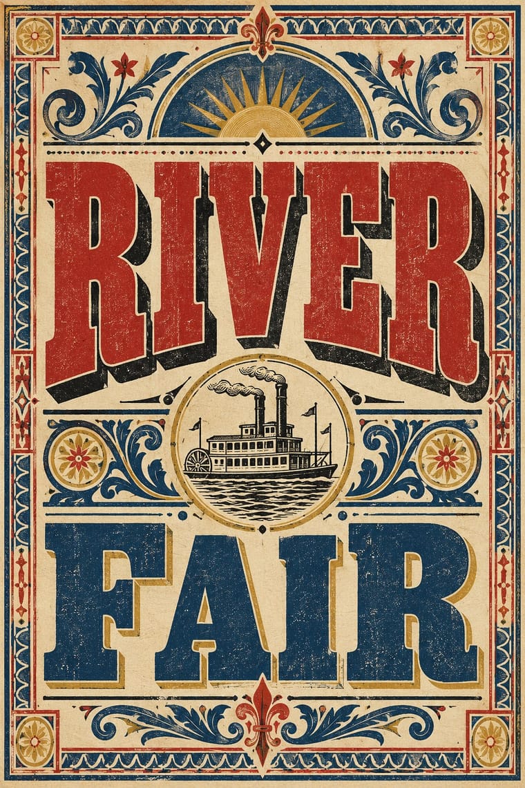
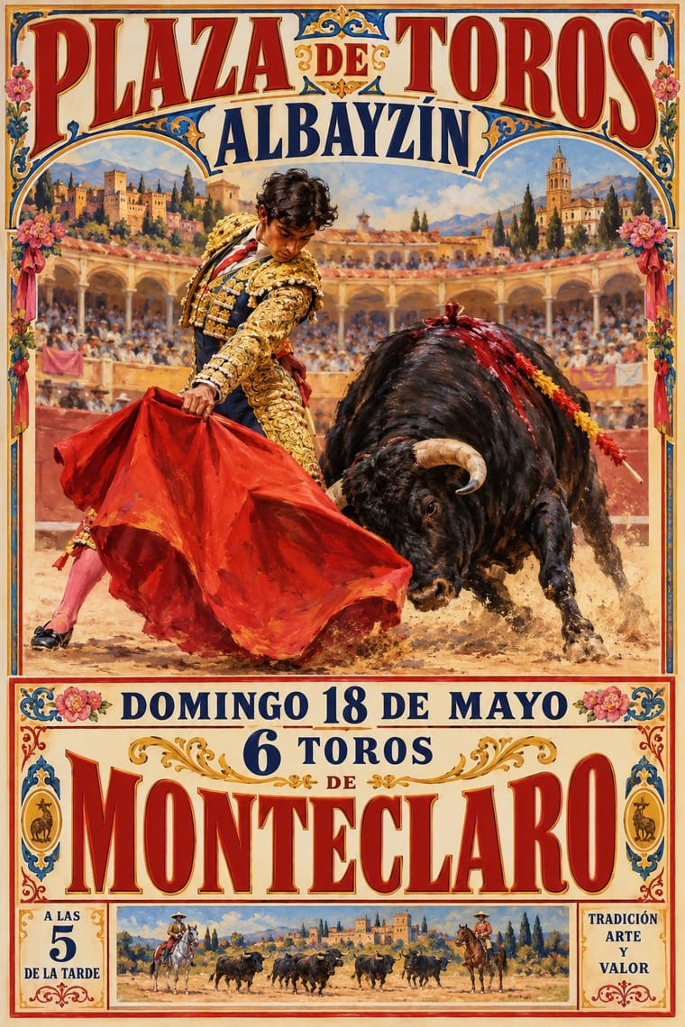
- Brazilian Modernismo Graphics (Klaxon and the Semana de 22)The print side of São Paulo's Modernismo (1922-29), set in jobbing print shops.
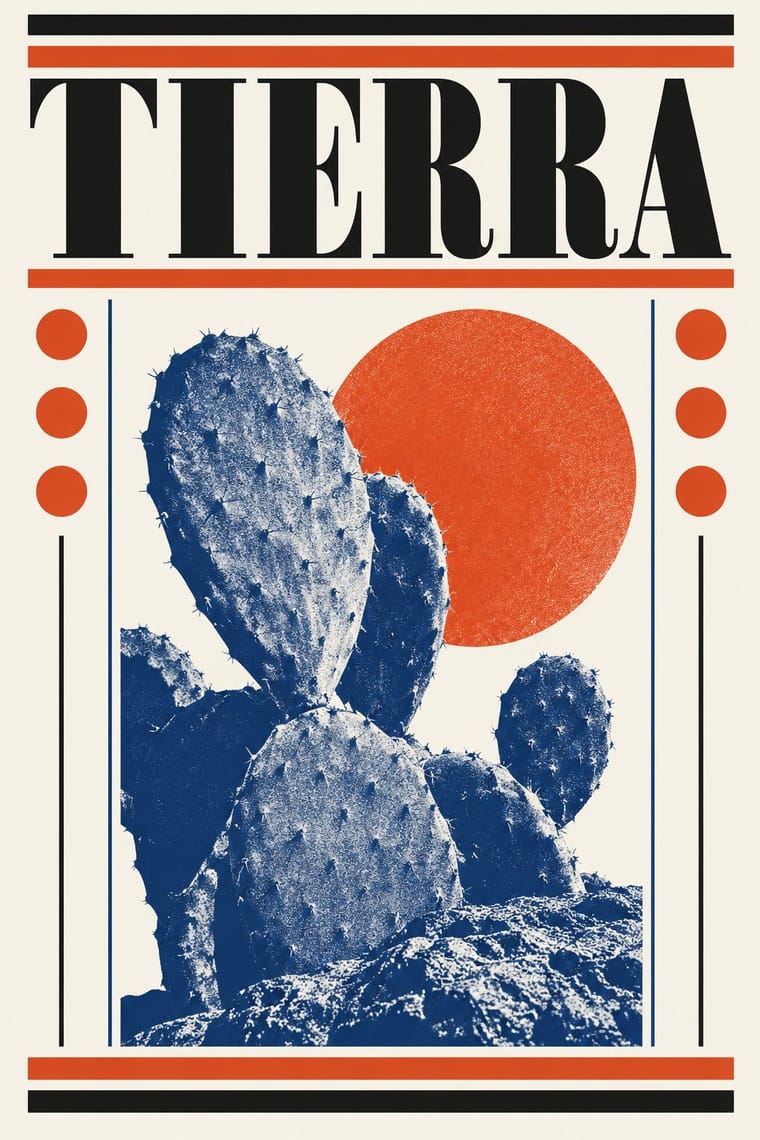
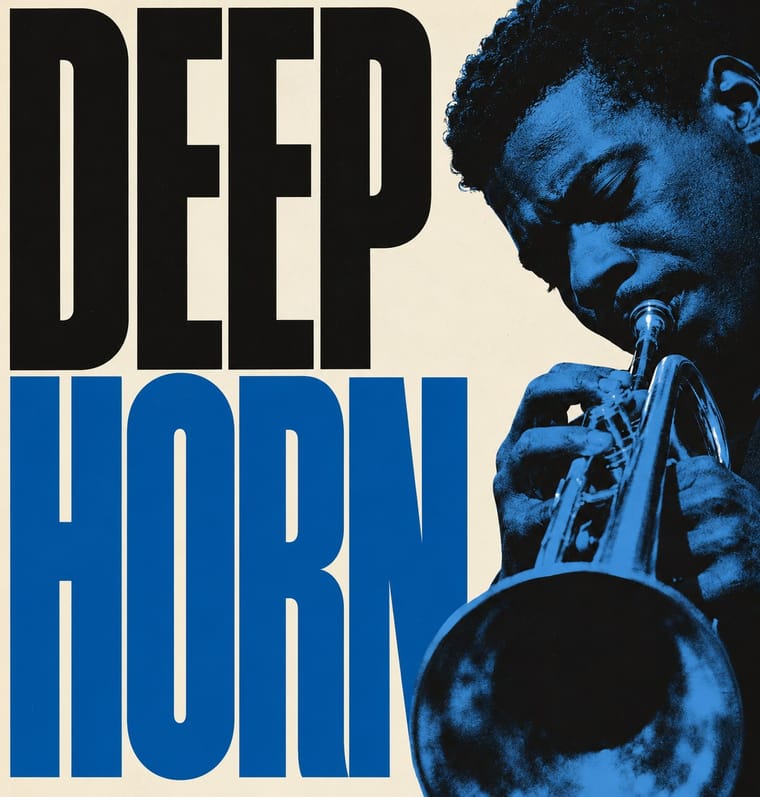
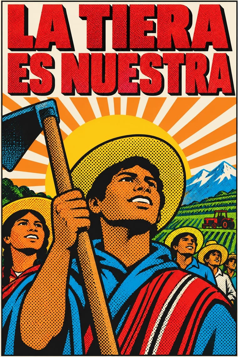
Styles that use it now and then 17
An occasional choice in these styles.
- Nirnaya Sagar Devanagari Typography (Bombay Metal Type)1864–present
- Mexican Popular Graphics (Posada)1880–1917
- Basel Object Poster (Swiss Sachplakat)1919–1955
- Czech Poetist Book Design (Devětsil)1922–1938
- Nippon Kōbō & Tōhōsha Photo-Propaganda Magazines (NIPPON & FRONT)1933–1945
- Puerto Rican Silkscreen Poster (DIVEDCO & ICP)1946–1989
- Onitsha Market Pamphlets1947–1980
- Corporate Identity Modernism1955–1990
- Pop Art Graphics1955–1975
- Turkish Modernist Poster & Graphic Design1959–2000
- Greek Tourism Modernism (EOT)1960–1974
- Phototype Expressive Typography (Lubalin & U&lc)1962–1985
- Amar Chitra Katha Comics1967–present
- Roots Reggae Sleeve Art & Rasta Iconography1973–1985
- Hauntology & Ghost Box Design2004–present
- Hipster Artisanal Revival2007–2018
- Newsroom Data Graphics & Scrollytelling2009–present
It often goes with
Choices that the styles making it make more often than the atlas as a whole.
- Grotesque & neo-grotesquein 15 of 24
- All capsin 19 of 24
- Restrained accentsin 17 of 24
- Condensed displayin 10 of 24
- Offset printingin 17 of 24
- Eclectic mixingin 12 of 24
Other choices in typography
- Humanist & Garalde serif
- Transitional serif
- Didone
- Grotesque & neo-grotesque
- Geometric sans
- Humanist sans
- Rounded sans
- Blackletter
- Script
- Brush & pen calligraphy
- Hand-lettering
- Ornamented display
- Condensed display
- Stencil
- Monospace
- Bitmap & pixel
- Experimental & distorted
- All caps
- Lowercase only
- Type as image
- Flush left, ragged right
- Rotated & vertical setting
- Eclectic mixing
- Tight setting
- Wide letterspacing