Typography · Display & special
Monospace
Fixed-width typewriter or code letterforms.
A design choice in Stylogeny’s vocabulary, under typography: what do the letters look like, and how are they set?
- styles make it
- 16
- as a defining choice
- 0
- as a usual one
- 8
- now and then
- 8
- avoid it
- 3
Styles that often use it 8
A characteristic choice: usual in these styles, though not essential.
- Punk & DIY ZineThe graphic voice of punk rock in fanzines, record sleeves and gig flyers: images and words cut from newspapers, typed or scrawled, pasted down and run off on a photocopier.

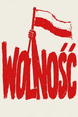
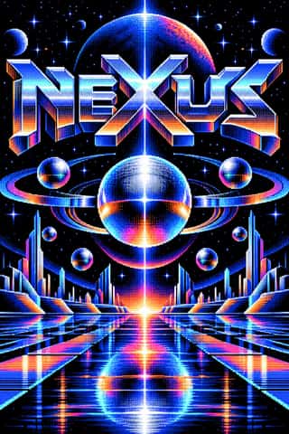


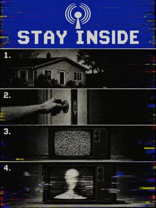
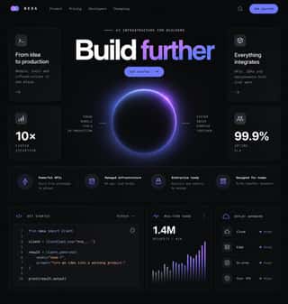


Styles that use it now and then 8
An occasional choice in these styles.
- Arnhem Land Bark Painting & Rarrk1912–present
- Machine-Age Simplified Arabic Type1947–present
- Finnish Bold Print (Marimekko Modernism)1951–present
- Techno-Futurist Graphics1986–2002
- Glitch Art & Datamosh Graphics2001–present
- Neo-Swiss Revival2005–present
- Risograph & Indie Print Culture2008–present
- Neo-Brutalism2020–present
It often goes with
Choices that the styles making it make more often than the atlas as a whole.
- Rectilinearin 13 of 16
- Fluorescent & neonin 10 of 16
- Grain & noisein 8 of 16
- Motion & broadcastin 8 of 16
- Technological & futuristin 8 of 16
- Rules & barsin 9 of 16
Styles that avoid it
Styles that deliberately leave it out.
Other choices in typography
- Humanist & Garalde serif
- Transitional serif
- Didone
- Slab serif
- Grotesque & neo-grotesque
- Geometric sans
- Humanist sans
- Rounded sans
- Blackletter
- Script
- Brush & pen calligraphy
- Hand-lettering
- Ornamented display
- Condensed display
- Stencil
- Bitmap & pixel
- Experimental & distorted
- All caps
- Lowercase only
- Type as image
- Flush left, ragged right
- Rotated & vertical setting
- Eclectic mixing
- Tight setting
- Wide letterspacing