Form & shape · Geometric
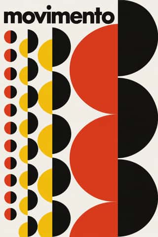
Geometric primitives
Circle, square and triangle as building blocks.
A design choice in Stylogeny’s vocabulary, under form & shape: what is the shape language?
- styles make it
- 127
- as a defining choice
- 18
- as a usual one
- 66
- now and then
- 43
- avoid it
- 1
Styles defined by it 18
For these styles it is one of the choices that make the style.
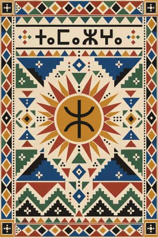
Amazigh Sign System & TifinaghThe visual language shared by Amazigh communities from the Rif, Atlas and Kabylie to the Aurès and the Tuareg Sahara.
- Thai Yantra (Yant) DiagramsThai protective diagrams in which Pali formulae, written in Khom, a sacred script derived from Khmer, are packed into squares, circles, triangles, spires and the outlines of Buddhas, monks and tigers, often framed by lines of script.
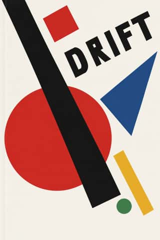
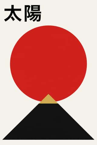
SuprematismKazimir Malevich's non-objective art, unveiled with the Black Square at the 0.10 exhibition in Petrograd in 1915, reduced painting to pure geometric planes floating in white, infinite space.
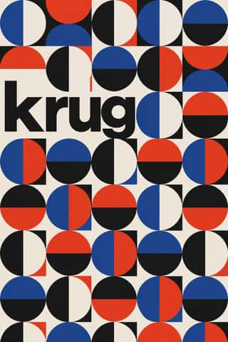
- BauhausThe German school founded by Walter Gropius in 1919 moved from Expressionist craft ideals to a programme of 'art and technology' after 1923, when Moholy-Nagy, Herbert Bayer and Joost Schmidt made its printing and advertising workshops a laboratory for functional communication.
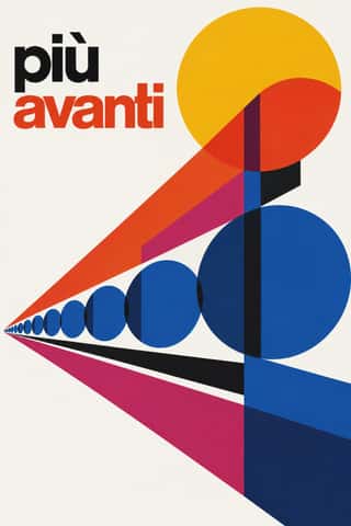
Milanese Industrial Modernism (Olivetti, Pirelli, Studio Boggeri)The Milan-centred school that married Bauhaus- and Swiss-trained discipline with Italian painterly wit for enlightened industrial patrons such as Olivetti, Pirelli and La Rinascente.
Japanese Postwar ModernismBuilding on the New Typography that Hiromu Hara and the Nippon Kobo circle had absorbed in the 1930s, Japan's postwar graphic designers fused the grid, sans-serif and objective photography of European modernism with indigenous traditions of family crests (kamon), asymmetry and charged emptiness (ma).
Zagreb Modernist Graphics (EXAT 51 to Teatar &TD)Zagreb graphic design grown from the EXAT 51 manifesto (1951), which tied abstract art to visual communication.
Corporate Identity ModernismModernist reduction applied to corporate communication.
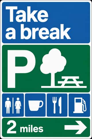
British Road Signage (Kinneir & Calvert)The national sign system Jock Kinneir and Margaret Calvert designed for Britain's motorways, first used on the Preston By-pass in 1958, and through the Worboys Committee for all roads from 1 January 1965.
- Bossa Nova Sleeve Modernism (César Villela and Elenco)The cover language of bossa nova, made in Rio by the self-taught designer César Villela, first at Odeon and then on the first sixteen LPs of Aloysio de Oliveira's label Elenco (from 1963), often around Francisco Pereira's photographs.
Indian Institutional Modernism (NID)The design culture of independent India's public institutions, banks and broadcasters.
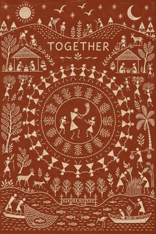
Warli PaintingThe ritual wall painting of the Warli, an Adivasi people of the northern Sahyadri in Maharashtra, carried onto paper and canvas from the 1970s by Jivya Soma Mashe and others.
Memphis DesignThe Milan collective founded by Ettore Sottsass, whose furniture, laminates and objects (first shown in September 1981) became a graphic language of their own.
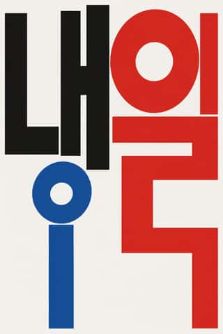
Out-of-Square Hangul TypographyA Korean typographic movement that frees Hangul from the equal square in which metal and photo type had always set each syllable.
Fantasy User Interface (FUI) & Sci-Fi HUDFantasy user interfaces are the screen graphics of films and series: computer screens, holograms and helmet HUDs made to be watched for a few seconds, not used.
- Seoul Independent Graphic Design (Small-Studio Scene)Graphic design by Seoul's small, self-run studios, which from about 2005 chose to stay small.
Low Poly IllustrationA digital illustration and game look in which subjects are built from a visible mesh of a few flat-shaded polygons, so that animals, faces, vehicles and landscapes read as hard-edged facets with no outline or texture.
- Front-of-Pack Warning Octagons (Latin American Food Warning Seals)A state warning system stacked on commercial food packs.
Styles that often use it 66
A characteristic choice: usual in these styles, though not essential.
Islamic Geometric & Calligraphic TraditionA visual system shared across the Islamic world in which proportioned calligraphy, compass-and-straightedge geometry and the vegetal arabesque carry meaning and beauty in place of figurative imagery.
- Hebrew MicrographyA Jewish scribal art in which lines of minute Hebrew script, usually the Masoretic notes that guard the biblical text, are written so that the line itself draws: interlaced frames and star rosettes on full carpet pages, and animals, knights, fish and grotesques in the margins.
Kamon (Japanese Family Crests)Japan's family crests: small one-colour emblems that reduce a plant, animal, tool or pattern to a flat silhouette, mirrored or repeated around a centre, often ringed and drawn with compass and brush.
- Square Kufic (Bannāʾī)Square Kufic builds Arabic script on a square grid: straight lines and right angles only, with every stroke as wide as the gap beside it.
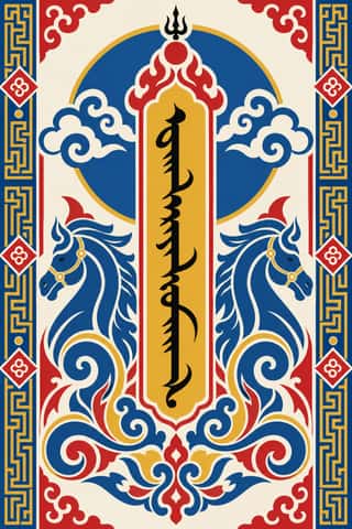
Mongol Bichig Calligraphy & Ugalz OrnamentMongolia's classical script and the auspicious ornament that frames it on state, Buddhist and household objects.
- Sápmi Graphic Identity (Duodji & Gákti Colour Code)Duodji is Sámi handicraft: hard work in wood, horn and bone, soft work in skin and cloth; drums painted with alder-bark figures survive from the 17th and 18th centuries.
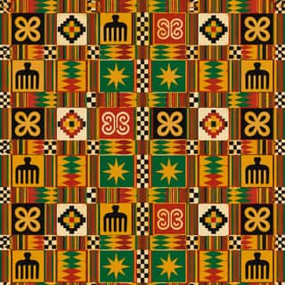
Adinkra & Kente Symbol SystemsThe Akan textile languages of Ghana.
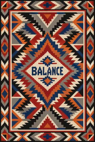
Diné (Navajo) Weaving DesignThe tapestry-woven design tradition of Diné (Navajo) weavers, recorded in Spanish sources from the early 18th century.
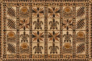
Pacific Barkcloth (Tapa) DesignBarkcloth beaten from paper-mulberry inner bark and decorated across Polynesia and Fiji for gift exchange at weddings, funerals and chiefly investitures.
Kanga (Swahili Message Cloth)Printed cotton wraps worn by women of the Swahili coast and its hinterland since the late nineteenth century, bought in pairs.
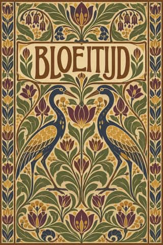
Nieuwe Kunst (Dutch Art Nouveau)The Dutch branch of Art Nouveau, seen mostly in book covers, vignettes and posters.
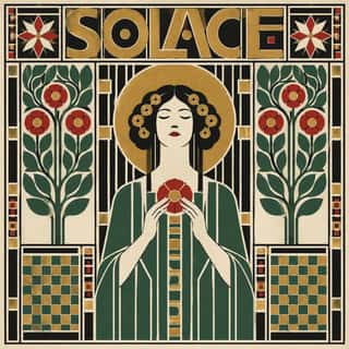
Vienna SecessionThe Viennese break with academic art led by Gustav Klimt, Koloman Moser, Josef Hoffmann and Alfred Roller, which pulled Art Nouveau toward the square, the grid and the flat plane.
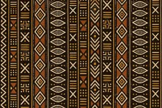
Bògòlanfini Mud ClothThe mud-dyed cotton cloth of the Bamana and other Malian peoples, in which the ground rather than the motif is painted: cloth dyed yellow with n'gallama leaves is covered around each sign with fermented iron-rich mud, and the unpainted signs are then bleached pale.
- London Transport DesignThe design programme Frank Pick built for London's Underground from 1908 and the London Passenger Transport Board (1933–40), continued by Harold Hutchison (1947–66).
Art DecoThe glamorous modern style named after the 1925 Paris Exposition des Arts Décoratifs, which disciplined ornament into geometry: sunbursts, chevrons, stepped forms and sleek stylised figures rendered in lacquer-smooth colour with metallic accents.
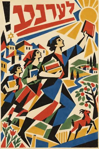
Kultur-Lige & Yiddish Avant-Garde Book DesignThe Yiddish modernist book of the Kultur-Lige, the secular Jewish culture league founded in Kyiv in 1918, and its circle: El Lissitzky, Issachar Ber Ryback, Iosif Chaikov, Boris Aronson and others, who sought a new Jewish art in the shtetl synagogues and tombstones they had recorded and in Cubo-Futurism and Suprematism.
- Russian ConstructivismConstructivism rejected art for art's sake in favour of the artist-engineer building useful things for the new Soviet society.
Wendingen & Amsterdam School TypographyThe graphic language of Wendingen (1918–1932), monthly of the Amsterdam architects' society Architectura et Amicitia, and its editor H.
Czech Poetist Book Design (Devětsil)The book and magazine design of the Czech Devětsil circle, where Karel Teige and his colleagues turned constructivist tools (asymmetry, sans and slab capitals, heavy bars, photomontage) toward Poetism's lyrical celebration of travel, cinema, jazz and the circus.
Leningrad Avant-Garde Picture BookThin, large picture books made in Petrograd/Leningrad from 1922 to the mid-1930s for Raduga and the Gosizdat children's department led by Samuil Marshak, with Vladimir Lebedev as art editor.
Die Neue TypographieThe programme that turned avant-garde experiment into a functional typographic method, named by Moholy-Nagy in 1923 and codified in Jan Tschichold's 'elementare typographie' (1925) and Die neue Typographie (1928).
Harlem Renaissance Graphic ArtThe illustration, cover and jacket art of the New Negro movement, set by Aaron Douglas after he moved to Harlem in 1925 and studied with Winold Reiss.
Giallo Mondadori Covers (I Libri Gialli)The cover system of Mondadori's crime series, Milan, from I Libri Gialli of 1929 to Il Giallo Mondadori today.
Scandinavian FunctionalismNordic functionalism (funkis) arrived in graphic form with Sigurd Lewerentz's posters and winged emblem for the 1930 Stockholm Exhibition.
American Mid-Century ModernismThe American synthesis of European avant-garde form with wit, pragmatism and commercial clients, led by Paul Rand, Alvin Lustig, Lester Beall, Bradbury Thompson and Saul Bass.
- Ndebele Geometric PaintingThe mural tradition of Southern Ndebele women, who paint homestead walls and gateways, and later canvases and objects, with bold, symmetrical geometric designs.
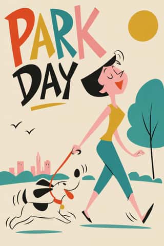
UPA & Cartoon ModernThe modern cartoon of United Productions of America (UPA) and the 1950s films, commercials and books it inspired.
International Typographic StyleA post-war refinement of the New Typography in which the mathematical grid, objective photography and neo-grotesque sans-serifs were used to communicate with clarity and neutrality.
Brazilian Concrete DesignA São Paulo and Rio movement in which concrete art, concrete poetry and Brazil's first design offices shared one vocabulary: Max Bill's mathematically generated geometry, serial repetition and sans-serif type.
HfG Ulm Systematic DesignThe Hochschule für Gestaltung Ulm (1953–1968) was founded as the successor to the Bauhaus.
Zagreb School of Animated FilmThe modernist animation of Zagreb Film's Studio for Animated Film, grown from reduced-animation advertisements of 1954-1955 and named the 'Zagreb school' by Georges Sadoul and André Martin after Cannes 1958.
Thaw Modernism (Soviet and Czechoslovak)The light, stylised modernism that replaced Socialist Realist illusionism and Stalinist pomp in Soviet and Czechoslovak graphic and applied design, from the 1956 Secret Speech, the 1957 Moscow youth festival and Expo 58 to the crushing of the Prague Spring in 1968 (a political cut-off; the manner ran on into the 1970s).
Di Tella Graphic Design (Instituto Torcuato Di Tella)The in-house graphics of Buenos Aires' Instituto Torcuato Di Tella, 1960–1970, led by Juan Carlos Distéfano with Juan Andralis, Rubén Fontana, Norberto Coppola and Carlos Soler.
- Greek Tourism Modernism (EOT)The modernist image of Greece made for the National Tourism Organisation (EOT) by Michalis Katzourakis, its art adviser in 1960-1967, and by Frederick Carabott, who advised it until 1967; in 1962 the two also founded the K&K Athens Advertising Centre.
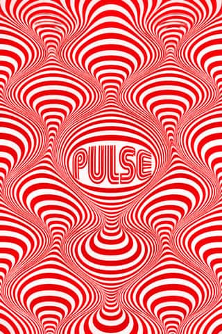
Op Art GraphicsA 1960s style that turned perceptual research into graphic effect: precisely drawn lines, checks, concentric rings and modular grids, usually black and white or complementaries of equal value, that seem to vibrate, swell or move.
- Casablanca School Graphic ModernismA postcolonial modernism formed at the Casablanca fine-art school under Farid Belkahia, where Mohamed Melehi, Mohammed Chabâa and colleagues set Amazigh rugs and jewellery, painted ceilings and calligraphy beside a Bauhaus-style merging of art, craft and design.
Total Design & Dutch FunctionalismThe Dutch strand of systematic modernism took shape when Wim Crouwel, Benno Wissing, Friso Kramer and Paul and Dick Schwarz founded Total Design in Amsterdam in 1963 as the country's first multidisciplinary studio.
Hong Kong East–West Graphic ModernismThe studio design of Hong Kong from the 1960s, made for banks, developers, trade bodies, hotels and cultural events in a city that had to speak Chinese and English at once.
Minimalist Graphic DesignModernism reduced to its barest means, informed by 1960s Minimal art and Japanese emptiness: one image or line of type, vast white or neutral space, a monochrome or near-monochrome palette and meticulous typographic detail.
- Mexico 68 Olympic & Metro IdentityThe graphic programme of the 1968 Mexico City Olympics and the city's first Metro line.
Munich 1972 Olympic Design (Otl Aicher)The visual programme Otl Aicher's department made for the 1972 Munich Olympics, the 'cheerful Games' meant to show a democratic, modest West Germany.
Soviet Central Asian Ornamental ModernismThe monumental art of Soviet Central Asia after the 1966 Tashkent earthquake: a strand of Socialist Realism mixed with Islamic and national ornament.
- Swiss Punk / New Wave TypographyA rebellion from inside the Swiss school: Wolfgang Weingart and his Basel students kept the grotesque and the grid but set them in motion with extreme letterspacing, stepped and angled lines, rules and bars, enlarged halftone screens and layered film montage.
Afrofuturist DesignA visual language of Black futures that fuses African and diasporic iconography (pyramids and ankhs, Adinkra and Nsibidi glyphs, textile patterning) with spacecraft, cosmic fields and technology.
- Western Desert IconographyThe acrylic painting movement that took form at Papunya in 1971, when men there painted the Honey Ant Dreaming on the school wall and then on board, carrying an older practice of sand, body and ceremonial designs into lasting form. 'Western Desert' is an umbrella name: the movement also includes Warlpiri, Anmatyerre and Arrernte painters of the Central Desert.
Dutch Expressive Postmodernism (Studio Dumbar & Hard Werken)An anti-functionalist current in Dutch graphic design led by Studio Dumbar in The Hague (from 1977) and the Rotterdam collective Hard Werken (magazine from 1979, design office 1982–1994).
- Post-Punk Record Sleeve (Stiff, Factory, 4AD)The record sleeves that British art-school designers made after punk, for independent labels and some majors: Barney Bubbles at Stiff, Malcolm Garrett for Buzzcocks, Peter Saville at Factory and 23 Envelope at 4AD.
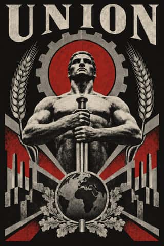
NSK Retro-Avant-GardeThe retro-avant-garde of Neue Slowenische Kunst, founded in Ljubljana in 1984 by Laibach, IRWIN and the Scipion Nasice Sisters Theatre, with Novi kolektivizem as its design department.
Demoscene Graphics (Cracktros, Demos & Text-Mode Art)The graphics of the demoscene, a mainly European community of coders, graphicians and musicians that grew from the intros software crackers added to pirated Commodore 64 and Amiga games in the mid-1980s.
Techno-Futurist GraphicsElectronic-music and video-game graphics of the late 1980s and 1990s that turned corporate modernism into a sci-fi consumer fantasy.
ACT UP & Gran Fury AIDS Activist GraphicsThe graphics of New York's AIDS activist movement: the SILENCE=DEATH poster of 1987, a pink triangle above white capitals on black, and the posters, stickers, T-shirts, billboards and bus ads of Gran Fury (1988–1995), ACT UP's 'unofficial propaganda ministry'.
Hauntology & Ghost Box DesignSleeves and print that rebuild a misremembered British past from the public graphics of roughly 1958–1978.
Neo-Andean Architecture (Cholets)The facades and party halls of El Alto, Bolivia, begun by the Aymara builder-architect Freddy Mamani in 2005 for a new Aymara merchant class.
Synthwave / OutrunThe retro-futurist look of synthwave music: a 1980s revival that grew from mid-2000s French electro and online synth scenes, took its other name from Sega's arcade racer Out Run (1986) and reached the mainstream with Drive (2011).
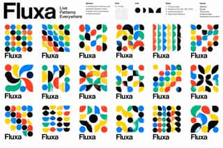
Generative & Dynamic IdentitiesIdentity systems designed as rules rather than fixed marks: logos and graphics generated by code, data or parameters so that they vary endlessly while staying recognisable.
Hipster Artisanal RevivalThe trade-mark look of the 2007–2018 craft boom, which dressed new coffee roasters, breweries and stationers as nineteenth- and early-twentieth-century firms.
Lucerne Poster Scene (Neubad & Südpol Posters)Lucerne's poster culture for small non-commercial venues (Südpol, Neubad, Treibhaus) and the Weltformat festival.
Risograph & Indie Print CultureA contemporary culture of zines, art books, posters and prints made on Japanese Risograph stencil duplicators, whose soy-based spot inks (fluorescent pink, yellow, blue, teal) are laid down one drum at a time.
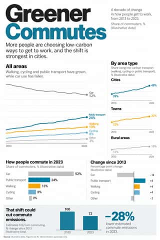
Newsroom Data Graphics & ScrollytellingThe house style of newspaper graphics desks since about 2009–2011 (the New York Times graphics desk, D3.js, the Guardian Datablog): conventional charts drawn from the data, on a white or pale paper ground with light grey gridlines and no axis titles, lines labelled directly in place of a legend where possible and short annotations saying what to look at.
Flat DesignAn interface and illustration language that stripped screens of simulated materials, replacing bevels, gloss and textures with solid fields of colour, clean sans-serif type and reduced pictograms.
VaporwaveAn internet-born microgenre and visual aesthetic that remixes the debris of late-20th-century consumer culture (Windows 95 dialogs, classical busts, palm trees, mall interiors, Japanese text, early 3D renders) in pastel pinks and cyans.
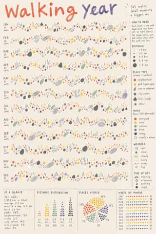
Data HumanismAn information-design approach that draws data rather than charting it, treating numbers as personal, approximate and human.
Material DesignGoogle's design system, launched in 2014, which reintroduced controlled depth to flat design through the metaphor of 'material': sheets of digital paper and ink that sit at defined elevations, cast consistent shadows and move with meaningful motion.
NeumorphismA short-lived interface trend in which controls are extruded from, or pressed into, a background of the same colour and modelled only by paired soft shadows.
Claymorphism & Soft 3DA soft, toy-like 3D look from product design around 2020, given the name 'claymorphism' in a December 2021 article by Michał Malewicz.
- Neo-BrutalismA friendly, commercial descendant of web brutalism that keeps its blunt boxes but adds candy colour: thick black outlines, hard unblurred offset shadows, flat saturated fills and chunky sans-serif type on conventional, usable layouts.
Styles that use it now and then 43
An occasional choice in these styles.
- Chinese Calligraphy & Seal Carving (Shufa & Zhuanke)c. 0–present
- Ethiopian Ge'ez Manuscript & Haräg Illuminationc. 500–present
- European Heraldryc. 1140–present
- Mithila (Madhubani) Paintingc. 1350–present
- Renaissance Book Typographyc. 1460–1600
- Ma & Wabi-sabi Aesthetics1500–present
- Batik Pattern Tradition1600–present
- African Wax & Fancy Print1880–present
- Plakatstil / Sachplakat1905–1920
- De Stijl1917–1931
- ROSTA Windows1919–1922
- Estridentismo (Stridentist) Graphics1921–1927
- Brazilian Modernismo Graphics (Klaxon and the Semana de 22)1922–1929
- Streamline Moderne1930–1945
- Nippon Kōbō & Tōhōsha Photo-Propaganda Magazines (NIPPON & FRONT)1933–1945
- WPA Silkscreen Posters1935–1943
- Bengali Modernist Book Cover (Prachchhad)1943–present
- Googie & Atomic Age1945–1965
- Finnish Bold Print (Marimekko Modernism)1951–present
- Vicente Rojo & Mexican Editorial Modernism1953–1990
- Pop Art Graphics1955–1975
- Cuban Revolutionary Poster (OSPAAAL & ICAIC)1960–1990
- Iranian Modernist Graphic Design1960–present
- Fluxus Graphics (Maciunas)1962–1978
- Phototype Expressive Typography (Lubalin & U&lc)1962–1985
- Woodland School (Legend Painting)1962–present
- Baybayin Revival Graphics1963–present
- Hipgnosis Photographic Concept Sleeve1968–1983
- Grapus (French Militant Graphic Collective)1970–1990
- Roman-like Thai Typography (modern loopless Thai)1973–present
- Emigre & Early Digital Type1984–1998
- Ghanaian Funeral Poster & Banner1990–present
- Nigerian Pentecostal Crusade Poster & Billboard1990–present
- Hype Streetwear Graphics (Box Logo to Quotation Marks)1993–present
- Emoji Pictographic Language1997–present
- Arabic Calligraffiti2002–present
- Contemporary Arabic & Dual-Script Type Design2004–present
- Neo-Swiss Revival2005–present
- DTC 'Blanding' / Millennial Minimalism2012–2022
- Latin American Feminist Protest Graphics (Ni Una Menos and the Green Wave)2015–present
- Extinction Rebellion Graphics2018–present
- Glassmorphism2020–present
- Palestinian Watermelon and Keffiyeh Graphics2021–present
It often goes with
Choices that the styles making it make more often than the atlas as a whole.
- Non-representationalin 63 of 127
- Geometric sansin 49 of 127
- Rational & objectivein 46 of 127
- Rectilinearin 60 of 127
- Grotesque & neo-grotesquein 57 of 127
- Generous white spacein 59 of 127
Styles that avoid it
Styles that deliberately leave it out.