Typography · Typographic treatment
Rotated & vertical setting
Lines set at angles, stacked or running vertically.
A design choice in Stylogeny’s vocabulary, under typography: what do the letters look like, and how are they set?
- styles make it
- 81
- as a defining choice
- 12
- as a usual one
- 27
- now and then
- 42
- avoid it
- 4
Styles defined by it 12
For these styles it is one of the choices that make the style.
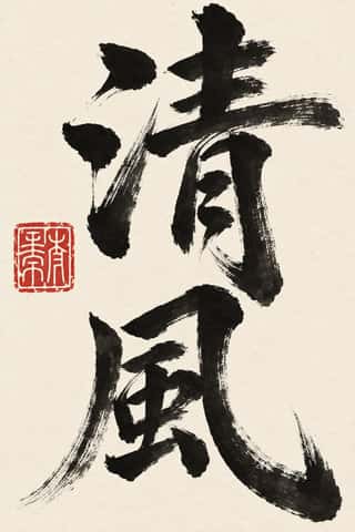
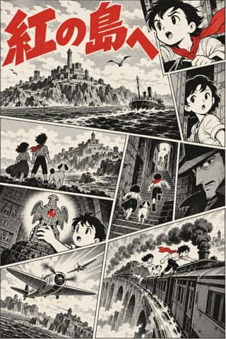
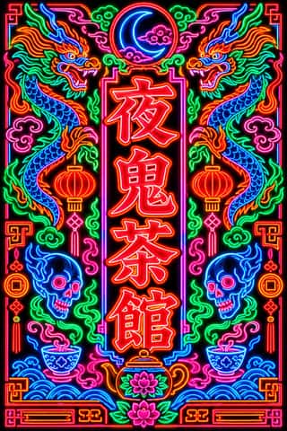
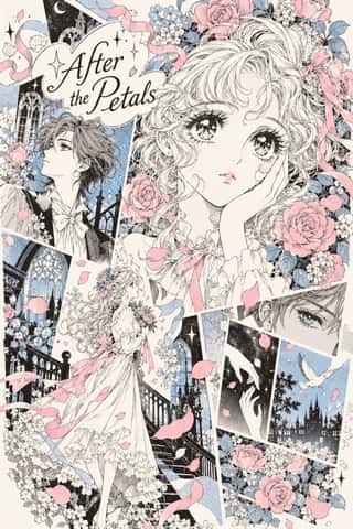
- Hebrew MicrographyA Jewish scribal art in which lines of minute Hebrew script, usually the Masoretic notes that guard the biblical text, are written so that the line itself draws: interlaced frames and star rosettes on full carpet pages, and animals, knights, fish and grotesques in the margins.
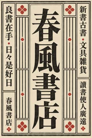
- Square Kufic (Bannāʾī)Square Kufic builds Arabic script on a square grid: straight lines and right angles only, with every stroke as wide as the gap beside it.
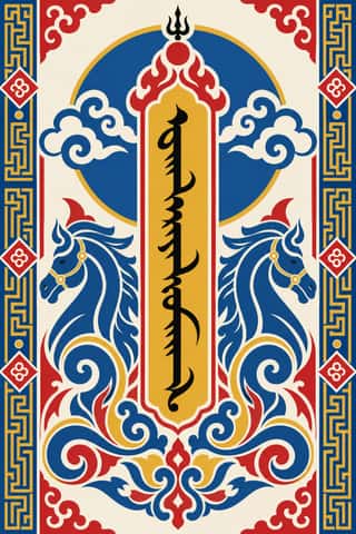
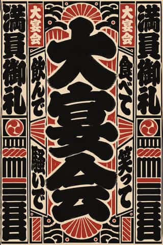
- Italian FuturismLaunched by Marinetti's 1909 manifesto, Futurism glorified speed, machines, the city and war, and turned the printed page into an explosive, noisy field.
- DadaBorn in wartime Zurich at the Cabaret Voltaire in 1916 and spreading to Berlin, Hanover, Cologne and Paris, Dada used chance, absurdity and provocation against the culture that had produced the war.
- MavoTokyo's anarchist avant-garde, founded in July 1923 by Murayama Tomoyoshi, back from a year in Berlin, with four former Futurists, and its magazine MAVO (seven issues, July 1924 to August 1925).


Styles that often use it 27
A characteristic choice: usual in these styles, though not essential.
- Ancient Egyptian Hieroglyphic & Register CompositionThe visual system of pharaonic Egypt, in which writing is made of pictures and pictures are ruled like writing.
- Ottoman Tughra & Dîvânî Chancery CalligraphyThe Ottoman sultan's calligraphic monogram and the chancery hand written beneath it.
- Persian Nastaʿlīq Calligraphy (Qiṭʿa, Chalipa and Siyāh-mashq)The 'hanging' script of Persian poetry and an art of the single sheet.
- Zoomorphic & Figural Calligraphy (Islamic Calligrams)Pictorial writing in which the strokes of a devotional text form one figure: a lion of ʿAli built from the Nad-e ʿAli prayer, a galleon whose hull spells the names of the Seven Sleepers, a peacock, a Sufi cap.

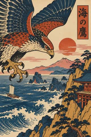
- Ten Bamboo Studio Colour Woodblock (Douban & Gonghua)A kind of colour woodblock printing begun in late-Ming Nanjing, made so that a print looks like a brush painting.
- Thai Yantra (Yant) DiagramsThai protective diagrams in which Pali formulae, written in Khom, a sacred script derived from Khmer, are packed into squares, circles, triangles, spires and the outlines of Buddhas, monks and tigers, often framed by lines of script.
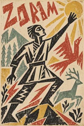
- Taishō Roman & Lyrical IllustrationThe lyrical illustration (jojōga) of late-Meiji to early-Shōwa Japan, led by Takehisa Yumeji: willowy, large-eyed women in kimono drawn with an Art Nouveau contour, set among camellias and kimono patterns and lettered by hand.
- Russian ConstructivismConstructivism rejected art for art's sake in favour of the artist-engineer building useful things for the new Soviet society.
- BauhausThe German school founded by Walter Gropius in 1919 moved from Expressionist craft ideals to a programme of 'art and technology' after 1923, when Moholy-Nagy, Herbert Bayer and Joost Schmidt made its printing and advertising workshops a laboratory for functional communication.
- Estridentismo (Stridentist) GraphicsMexico's first avant-garde (1921-27), launched when Manuel Maples Arce pasted his manifesto Actual No. 1 on Mexico City walls.
- Brazilian Modernismo Graphics (Klaxon and the Semana de 22)The print side of São Paulo's Modernismo (1922-29), set in jobbing print shops.
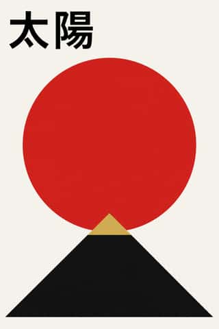
- Dazibao (Big-Character Posters)Handwritten wall posters in large brush characters that turned the walls of Mao-era China into a public forum for criticism, denunciation and, at the Democracy Wall, dissent.

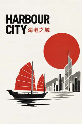

- Swiss Punk / New Wave TypographyA rebellion from inside the Swiss school: Wolfgang Weingart and his Basel students kept the grotesque and the grid but set them in motion with extreme letterspacing, stepped and angled lines, rules and bars, enlarged halftone screens and layered film montage.
- Grapus (French Militant Graphic Collective)The posters and identities of Grapus, a Paris collective founded in 1970 by Communist Party members who had met in the 1968 poster workshops.


- Contemporary Chinese Book Design ('Most Beautiful Books of China')Chinese book design since 2003, when Shanghai founded the yearly 'Most Beautiful Books of China' award, whose winners go on to Leipzig.
- Hong Kong Protest Art (Umbrella Movement to the 2019–20 Protests)The graphics of Hong Kong's democracy protests, from the 2014 Umbrella Movement to the national security law of 2020, in two linked media.


Styles that use it now and then 42
An occasional choice in these styles.
- Amazigh Sign System & Tifinaghc. 0–present
- Islamic Geometric & Calligraphic Traditionc. 690–present
- Nianhua & Chinese Folk Printc. 1100–present
- Ma & Wabi-sabi Aesthetics1500–present
- Đông Hồ & Hàng Trống Folk Prints1600–present
- Lubok Popular Print1650–1920
- Japonisme1860–1910
- Vorticism & BLAST Typography1914–1920
- Suprematism1915–1925
- Kultur-Lige & Yiddish Avant-Garde Book Design1917–1924
- Czech Poetist Book Design (Devětsil)1922–1938
- Leningrad Avant-Garde Picture Book1922–1936
- Die Neue Typographie1923–1940
- Republican Chinese Book Cover Design (Lu Xun & Tao Yuanqing)1923–1949
- Chinese Modern Woodcut Movement1931–1949
- American Four-Colour Comic Book (Golden to Bronze Age)1934–1993
- Googie & Atomic Age1945–1965
- Puerto Rican Silkscreen Poster (DIVEDCO & ICP)1946–1989
- International Typographic Style1950–1975
- Polish Poster School1950–1990
- Brazilian Concrete Design1951–1975
- Zagreb Modernist Graphics (EXAT 51 to Teatar &TD)1951–1975
- Blue Note Jazz Sleeve Modernism1956–1967
- Situationist Détournement Graphics1956–1972
- Thaw Modernism (Soviet and Czechoslovak)1956–1968
- Bossa Nova Sleeve Modernism (César Villela and Elenco)1960–1968
- Di Tella Graphic Design (Instituto Torcuato Di Tella)1960–1970
- Baybayin Revival Graphics1963–present
- AfriCOBRA1968–present
- Emigre & Early Digital Type1984–1998
- Out-of-Square Hangul Typography1985–present
- Japanese Dense Web Design1999–present
- Korean Commercial Calligraphy (Kaelligeurapi)1999–present
- Arabic Calligraffiti2002–present
- Cartonera Books (Latin American Cardboard Publishing)2003–present
- Neo-Swiss Revival2005–present
- Seoul Independent Graphic Design (Small-Studio Scene)2005–present
- Danmaku Bullet-Comment Overlay2006–present
- Lucerne Poster Scene (Neubad & Südpol Posters)2007–present
- Acid Graphics / New Ugly2016–present
- VTuber Avatar and Stream Graphics2016–present
- Neo-Brutalism2020–present
It often goes with
Choices that the styles making it make more often than the atlas as a whole.
- Dynamic asymmetryin 51 of 81
- Typography onlyin 52 of 81
- Type as imagein 51 of 81
- Non-representationalin 41 of 81
- Extreme scale contrastin 53 of 81
- Diagonal axisin 34 of 81
Styles that avoid it
Styles that deliberately leave it out.
Other choices in typography
- Humanist & Garalde serif
- Transitional serif
- Didone
- Slab serif
- Grotesque & neo-grotesque
- Geometric sans
- Humanist sans
- Rounded sans
- Blackletter
- Script
- Brush & pen calligraphy
- Hand-lettering
- Ornamented display
- Condensed display
- Stencil
- Monospace
- Bitmap & pixel
- Experimental & distorted
- All caps
- Lowercase only
- Type as image
- Flush left, ragged right
- Eclectic mixing
- Tight setting
- Wide letterspacing