Tone & intent · Reason
Rational & objective
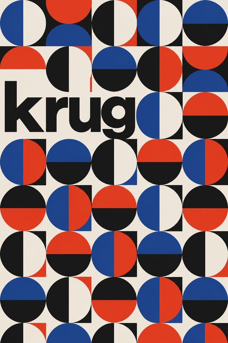
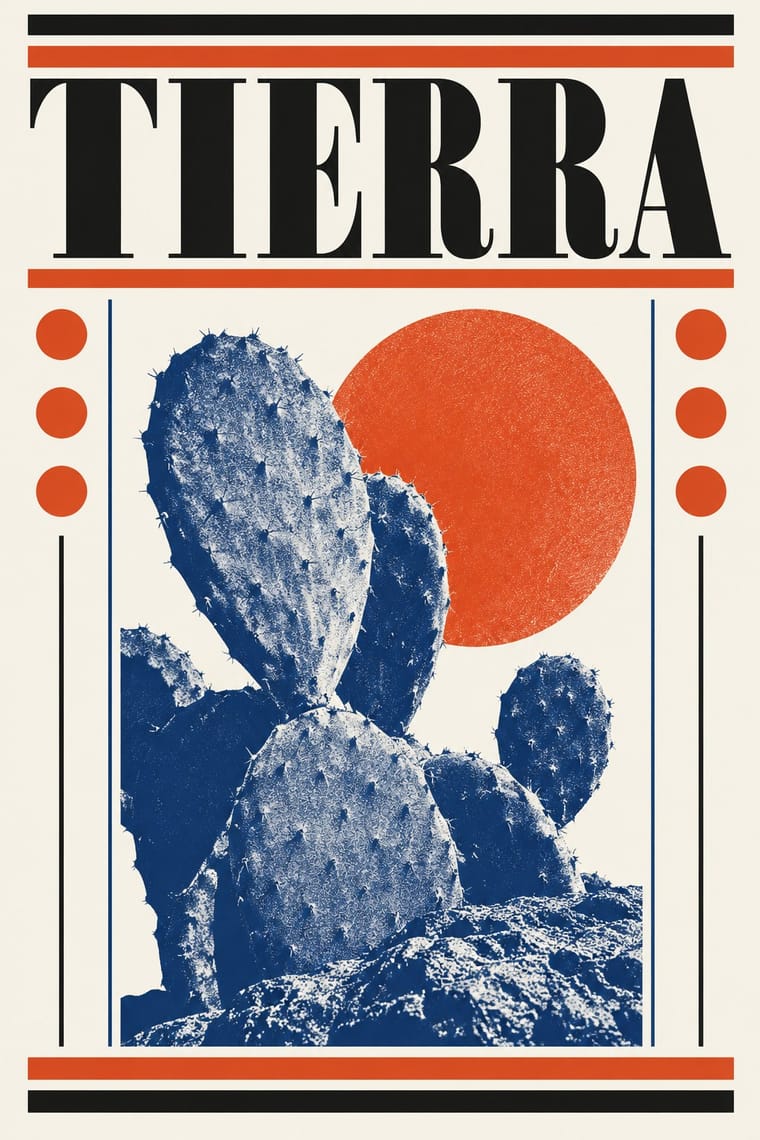
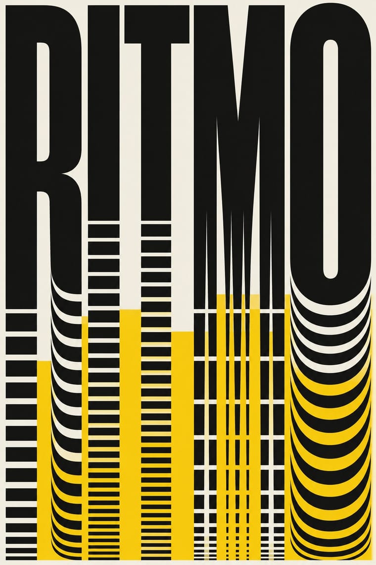
Clarity, neutrality and order above personality.
A design choice in Stylogeny’s vocabulary, under tone & intent: what should the work make people feel or do?
- styles make it
- 67
- as a defining choice
- 15
- as a usual one
- 29
- now and then
- 23
- avoid it
- 58
Styles defined by it 15
For these styles it is one of the choices that make the style.
- BauhausThe German school founded by Walter Gropius in 1919 moved from Expressionist craft ideals to a programme of 'art and technology' after 1923, when Moholy-Nagy, Herbert Bayer and Joost Schmidt made its printing and advertising workshops a laboratory for functional communication.
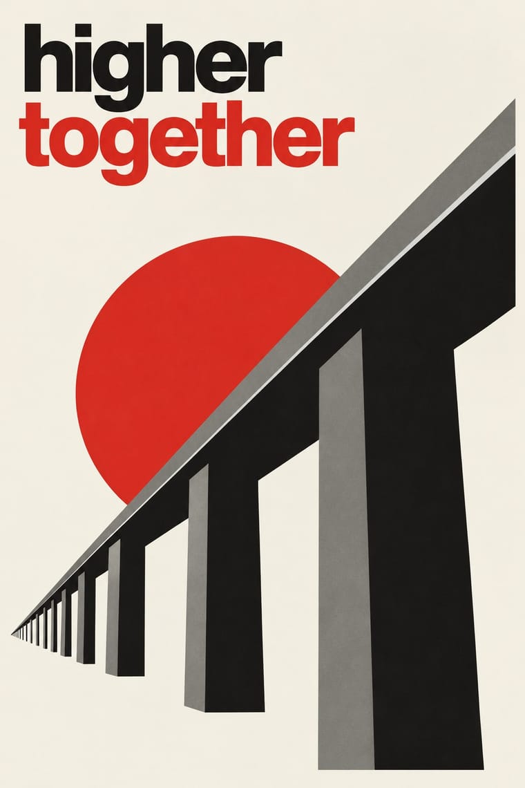
Die Neue TypographieThe programme that turned avant-garde experiment into a functional typographic method, named by Moholy-Nagy in 1923 and codified in Jan Tschichold's 'elementare typographie' (1925) and Die neue Typographie (1928).
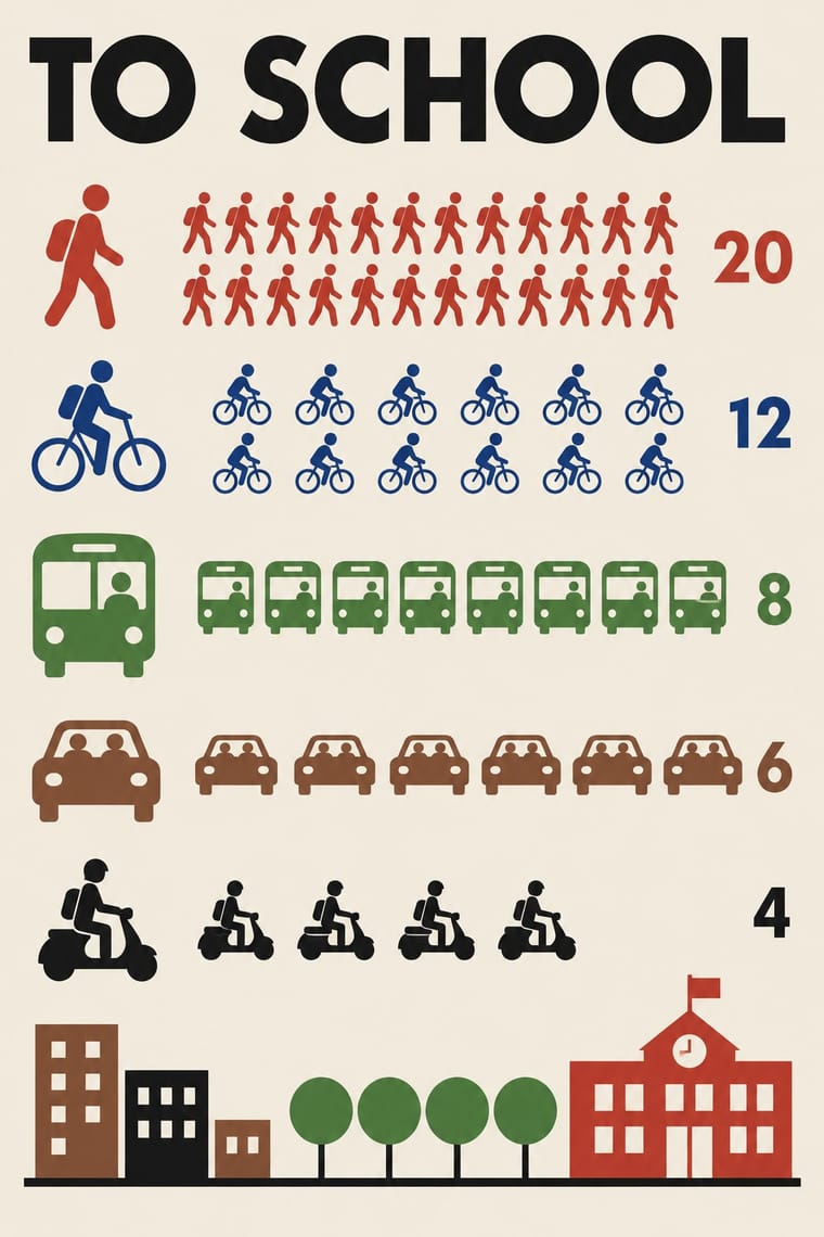
Isotype Pictorial StatisticsA method of visual education developed by Otto Neurath, Marie Neurath (Reidemeister) and Gerd Arntz in Red Vienna from 1925, which turns statistics into rows of identical pictograms where a greater quantity is shown by more signs, never by bigger ones.
Penguin Paperback Design (Three Bands to the Marber Grid)The cover system of Penguin Books, London, from 1935 until Germano Facetti left in 1972.
- Machine-Age Simplified Arabic TypeArabic redrawn for the machine rather than the reed pen.
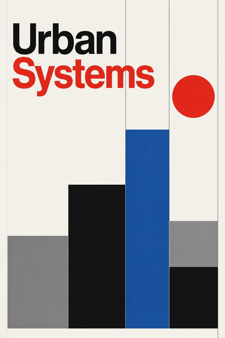
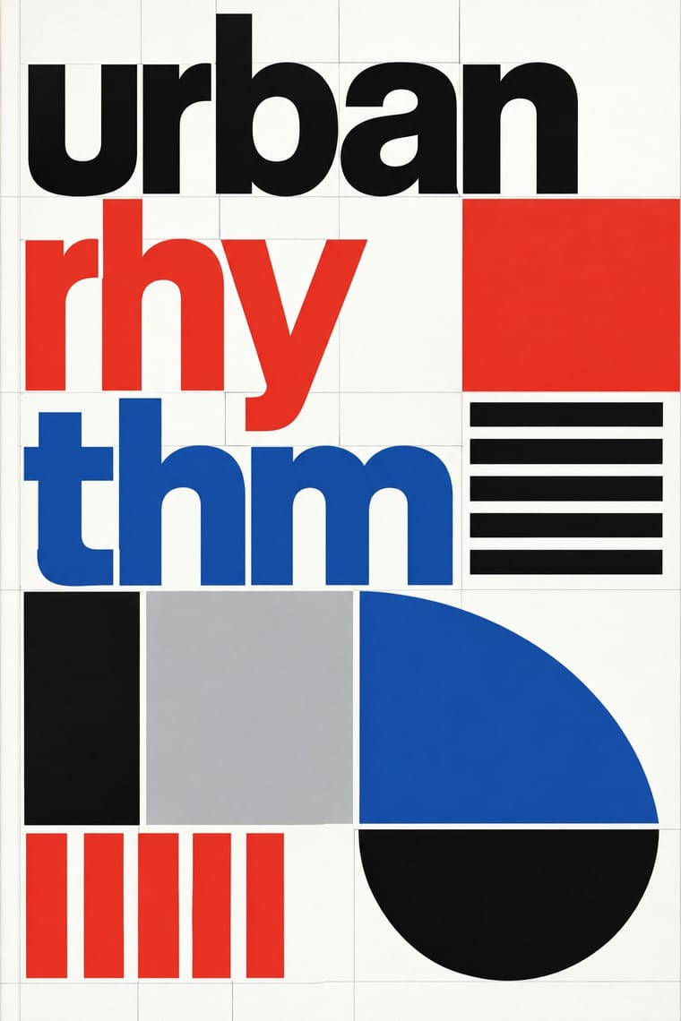
International Typographic StyleA post-war refinement of the New Typography in which the mathematical grid, objective photography and neo-grotesque sans-serifs were used to communicate with clarity and neutrality.
Brazilian Concrete DesignA São Paulo and Rio movement in which concrete art, concrete poetry and Brazil's first design offices shared one vocabulary: Max Bill's mathematically generated geometry, serial repetition and sans-serif type.
HfG Ulm Systematic DesignThe Hochschule für Gestaltung Ulm (1953–1968) was founded as the successor to the Bauhaus.
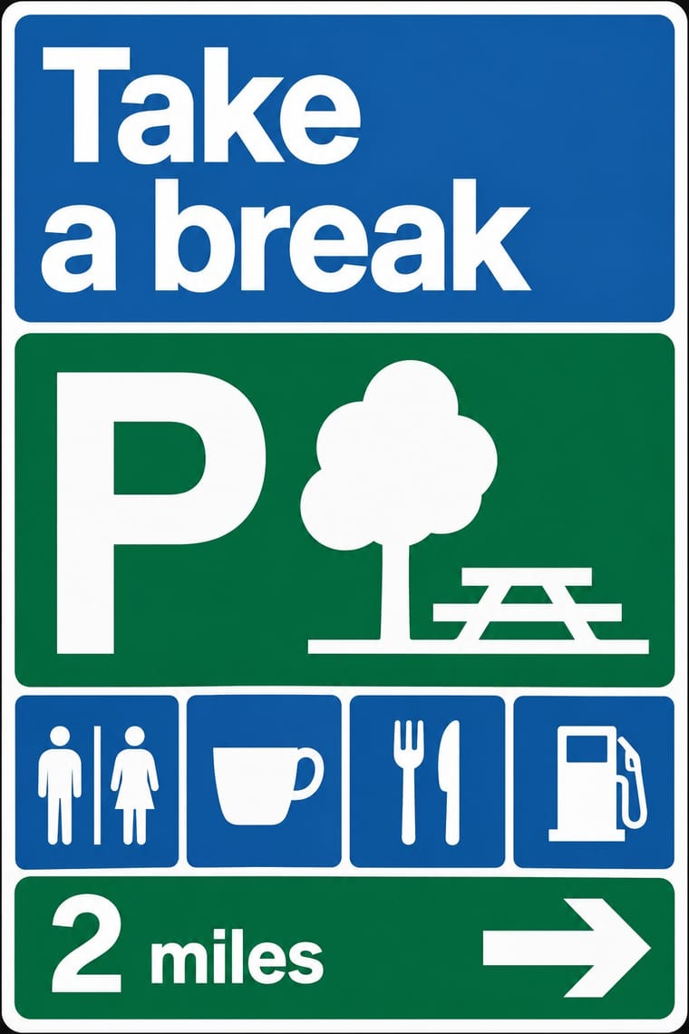
British Road Signage (Kinneir & Calvert)The national sign system Jock Kinneir and Margaret Calvert designed for Britain's motorways, first used on the Preston By-pass in 1958, and through the Worboys Committee for all roads from 1 January 1965.
Total Design & Dutch FunctionalismThe Dutch strand of systematic modernism took shape when Wim Crouwel, Benno Wissing, Friso Kramer and Paul and Dick Schwarz founded Total Design in Amsterdam in 1963 as the country's first multidisciplinary studio.
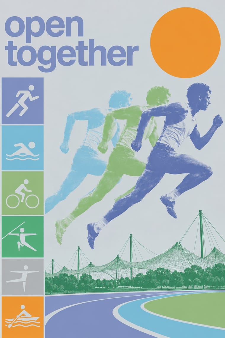
Munich 1972 Olympic Design (Otl Aicher)The visual programme Otl Aicher's department made for the 1972 Munich Olympics, the 'cheerful Games' meant to show a democratic, modest West Germany.
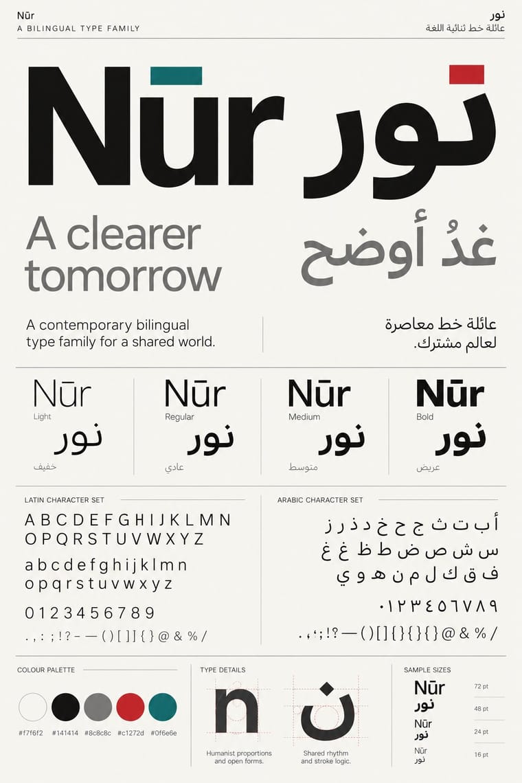
Contemporary Arabic & Dual-Script Type DesignA twenty-first-century type culture that redraws Arabic as a family matched to a Latin companion in weight, proportion and contrast, so the two scripts can share a page, screen or sign as equals.
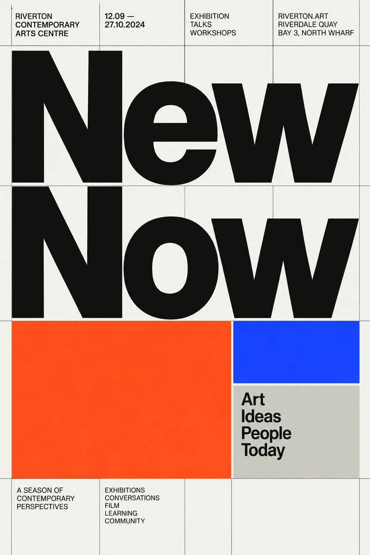
Neo-Swiss RevivalA contemporary revival of the International Typographic Style, fuelled by digital re-releases of neo-grotesques and by studios such as Experimental Jetset and Norm: modular grids, flush-left grotesque type, huge tightly set headlines and flat fields of black, white and one signal colour.
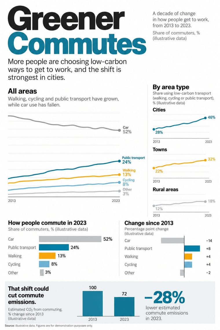
Newsroom Data Graphics & ScrollytellingThe house style of newspaper graphics desks since about 2009–2011 (the New York Times graphics desk, D3.js, the Guardian Datablog): conventional charts drawn from the data, on a white or pale paper ground with light grey gridlines and no axis titles, lines labelled directly in place of a legend where possible and short annotations saying what to look at.
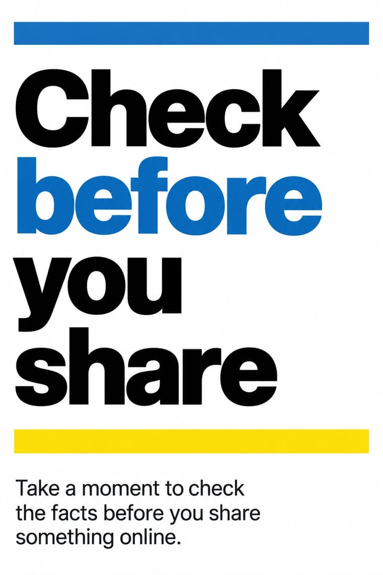
GOV.UK Design (GDS Style)The text-led design of GOV.UK, the UK government's single website, built by the Government Digital Service from 2012 and codified in the GOV.UK Design System (2018).
Styles that often use it 29
A characteristic choice: usual in these styles, though not essential.
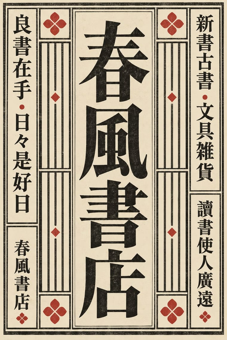
Song–Ming Woodblock Book Typography (Songti / Mincho)The page and letter of the East Asian book.
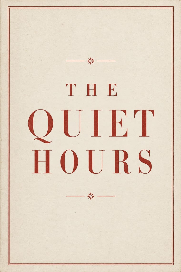
Neoclassical Book TypographyThe Enlightenment book stripped of Renaissance woodcut decoration.
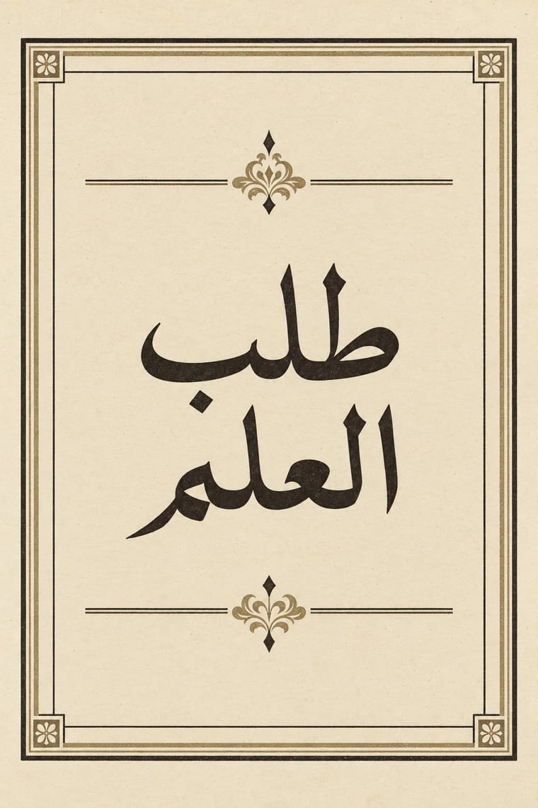
Bulaq (Amiriyya) Naskh Book PrintingThe page of the Arabic printed book as Egypt's state press at Bulaq shaped it from 1822: justified blocks of black Naskh type on pale paper, often boxed in a ruled frame, with an ornamental headpiece on the opening page, headings set larger or in a second script such as Nastaʿlīq, and almost no pictures.
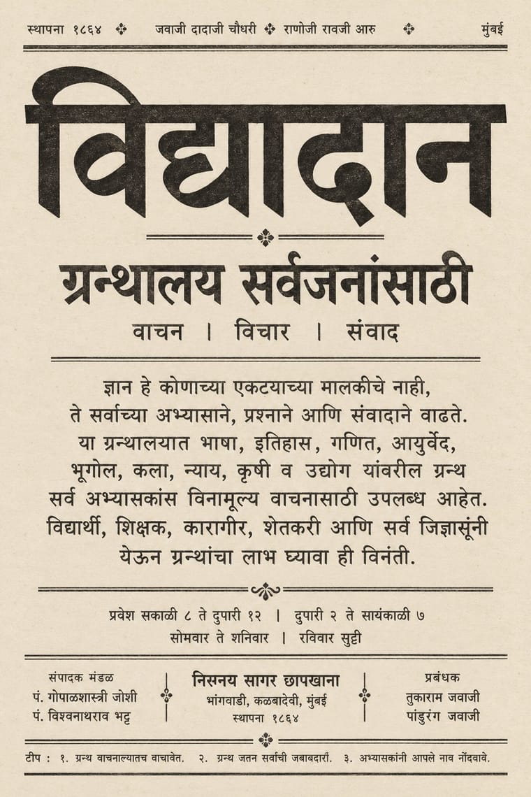
Nirnaya Sagar Devanagari Typography (Bombay Metal Type)Devanagari as Javaji Dadaji's Bombay type foundry (1864) and Nirnaya Sagar Press (1869) cut and printed it: upright metal type with a strong headline, cut with the punch-cutter Ranoji Aru, and enough conjunct and 'Akhand' sorts to set Sanskrit, Vedic accents and Marathi whole.
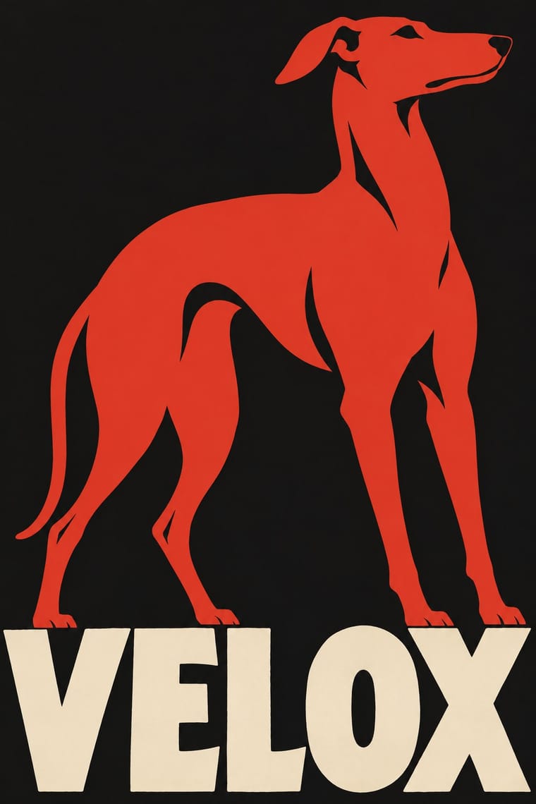
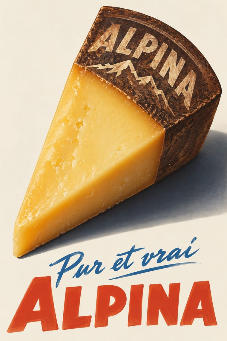
Plakatstil / SachplakatThe German 'object poster' launched by Lucian Bernhard's Priester match poster and printed by Berlin's Hollerbaum & Schmidt.
- London Transport DesignThe design programme Frank Pick built for London's Underground from 1908 and the London Passenger Transport Board (1933–40), continued by Harold Hutchison (1947–66).
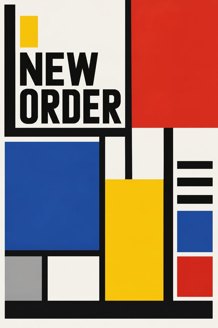
De StijlA Dutch movement formed around Theo van Doesburg's journal De Stijl and Piet Mondrian's Neoplasticism, which sought universal harmony through the most elementary means: horizontal and vertical lines, rectangles, the three primaries and black, white and grey.
Basel Object Poster (Swiss Sachplakat)The Swiss descendant of the German object poster, made in Zurich and above all Basel from 1919 to the early 1950s.
Scandinavian FunctionalismNordic functionalism (funkis) arrived in graphic form with Sigurd Lewerentz's posters and winged emblem for the 1930 Stockholm Exhibition.
Milanese Industrial Modernism (Olivetti, Pirelli, Studio Boggeri)The Milan-centred school that married Bauhaus- and Swiss-trained discipline with Italian painterly wit for enlightened industrial patrons such as Olivetti, Pirelli and La Rinascente.
American Mid-Century ModernismThe American synthesis of European avant-garde form with wit, pragmatism and commercial clients, led by Paul Rand, Alvin Lustig, Lester Beall, Bradbury Thompson and Saul Bass.
Japanese Postwar ModernismBuilding on the New Typography that Hiromu Hara and the Nippon Kobo circle had absorbed in the 1930s, Japan's postwar graphic designers fused the grid, sans-serif and objective photography of European modernism with indigenous traditions of family crests (kamon), asymmetry and charged emptiness (ma).
Zagreb Modernist Graphics (EXAT 51 to Teatar &TD)Zagreb graphic design grown from the EXAT 51 manifesto (1951), which tied abstract art to visual communication.
Vicente Rojo & Mexican Editorial ModernismThe design of Mexico City's literary and cultural press, shaped from the 1950s by the Barcelona-born exile Vicente Rojo: México en la Cultura, the Revista de la Universidad, Plural, La Jornada and the covers of Ediciones Era.
Corporate Identity ModernismModernist reduction applied to corporate communication.
Di Tella Graphic Design (Instituto Torcuato Di Tella)The in-house graphics of Buenos Aires' Instituto Torcuato Di Tella, 1960–1970, led by Juan Carlos Distéfano with Juan Andralis, Rubén Fontana, Norberto Coppola and Carlos Soler.
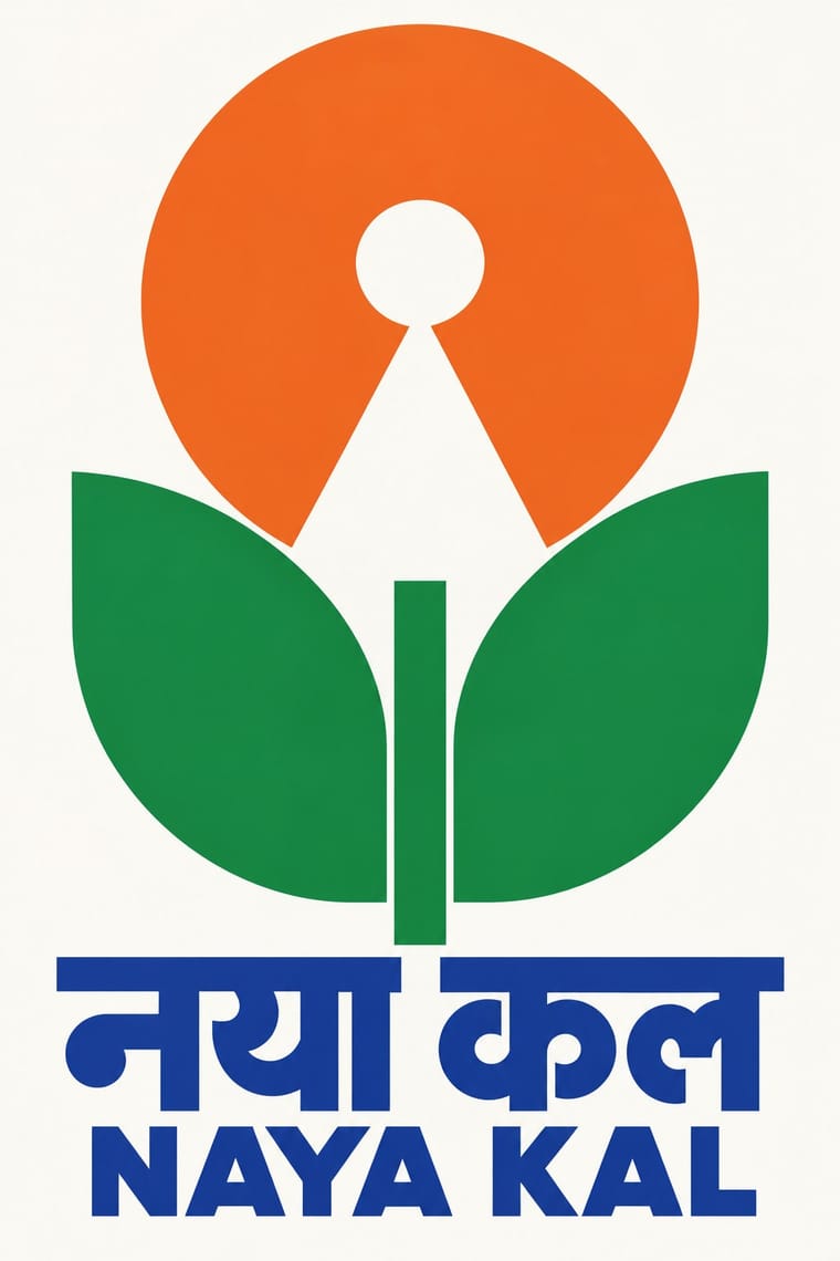
Indian Institutional Modernism (NID)The design culture of independent India's public institutions, banks and broadcasters.
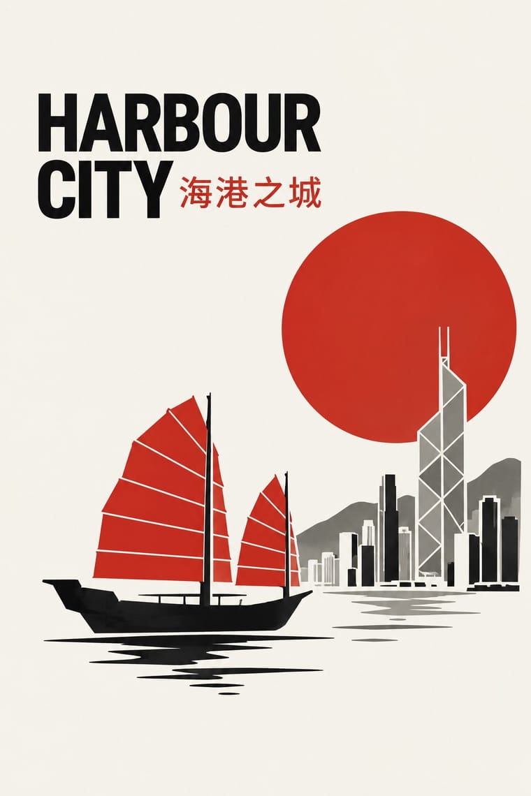
Hong Kong East–West Graphic ModernismThe studio design of Hong Kong from the 1960s, made for banks, developers, trade bodies, hotels and cultural events in a city that had to speak Chinese and English at once.
Minimalist Graphic DesignModernism reduced to its barest means, informed by 1960s Minimal art and Japanese emptiness: one image or line of type, vast white or neutral space, a monochrome or near-monochrome palette and meticulous typographic detail.
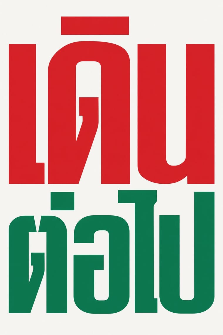
Roman-like Thai Typography (modern loopless Thai)A Thai type genre that drops the head loops of most Thai letters, so the script reads as an even sans like Helvetica.
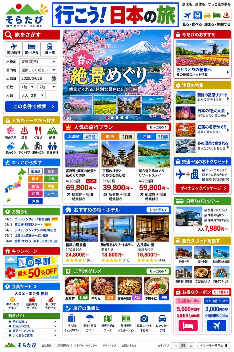
Japanese Dense Web DesignThe information-packed look of Japan's big portals, shops, airlines and ministries: three or more narrow columns of boxed modules, crowded with small Japanese text, blue links, tiny thumbnails, dated news lists and rotating ad banners, in bright colours on a white page.
- Seoul Independent Graphic Design (Small-Studio Scene)Graphic design by Seoul's small, self-run studios, which from about 2005 chose to stay small.
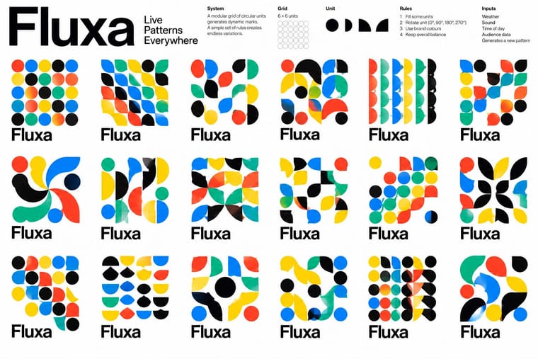
Generative & Dynamic IdentitiesIdentity systems designed as rules rather than fixed marks: logos and graphics generated by code, data or parameters so that they vary endlessly while staying recognisable.
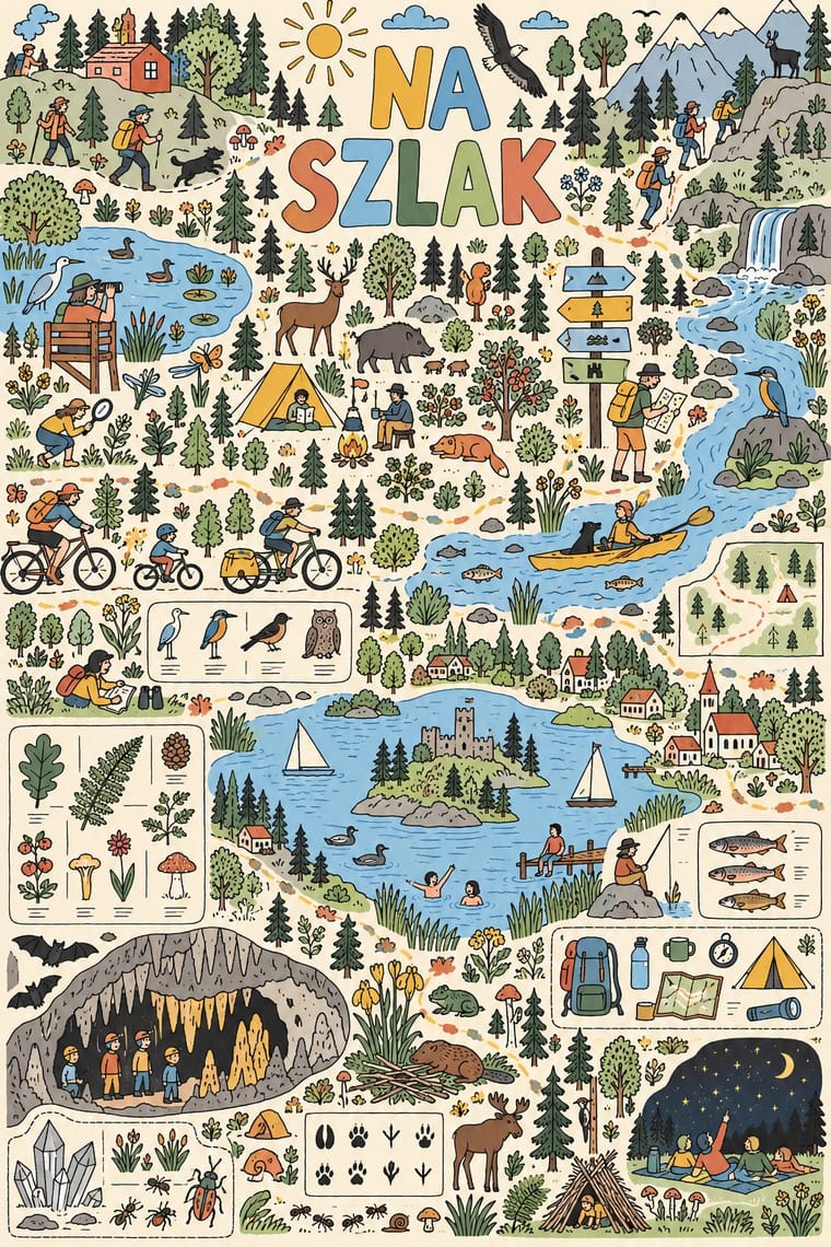
Polish Information Picture Book (Dwie Siostry)Mostly large-format information picture books made since 2008 by the Warsaw publisher Dwie Siostry with young illustrators led by Aleksandra and Daniel Mizieliński, graduates of the city's Academy of Fine Arts: atlases, cross-sections, labyrinths, activity books and wordless seek-and-find board books.
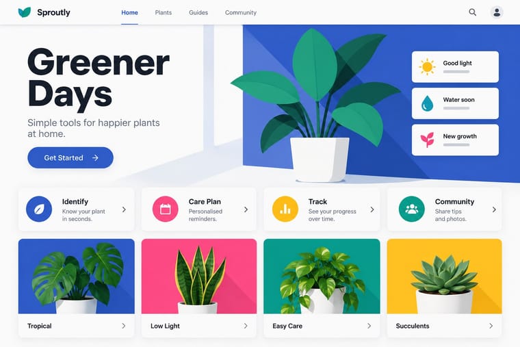
Flat DesignAn interface and illustration language that stripped screens of simulated materials, replacing bevels, gloss and textures with solid fields of colour, clean sans-serif type and reduced pictograms.
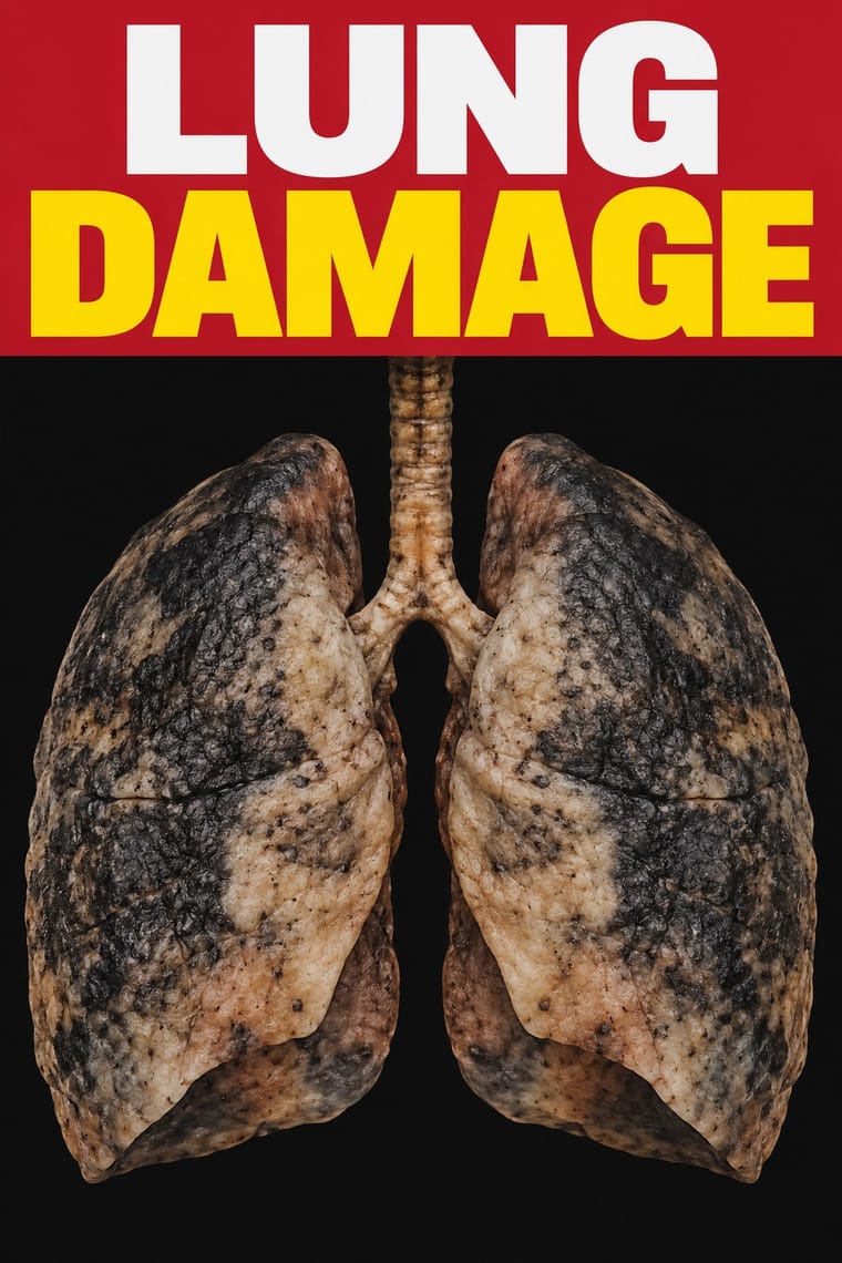
Plain Tobacco PackagingA packaging language written into law to strip tobacco of persuasion.
Material DesignGoogle's design system, launched in 2014, which reintroduced controlled depth to flat design through the metaphor of 'material': sheets of digital paper and ink that sit at defined elevations, cast consistent shadows and move with meaningful motion.
- Front-of-Pack Warning Octagons (Latin American Food Warning Seals)A state warning system stacked on commercial food packs.
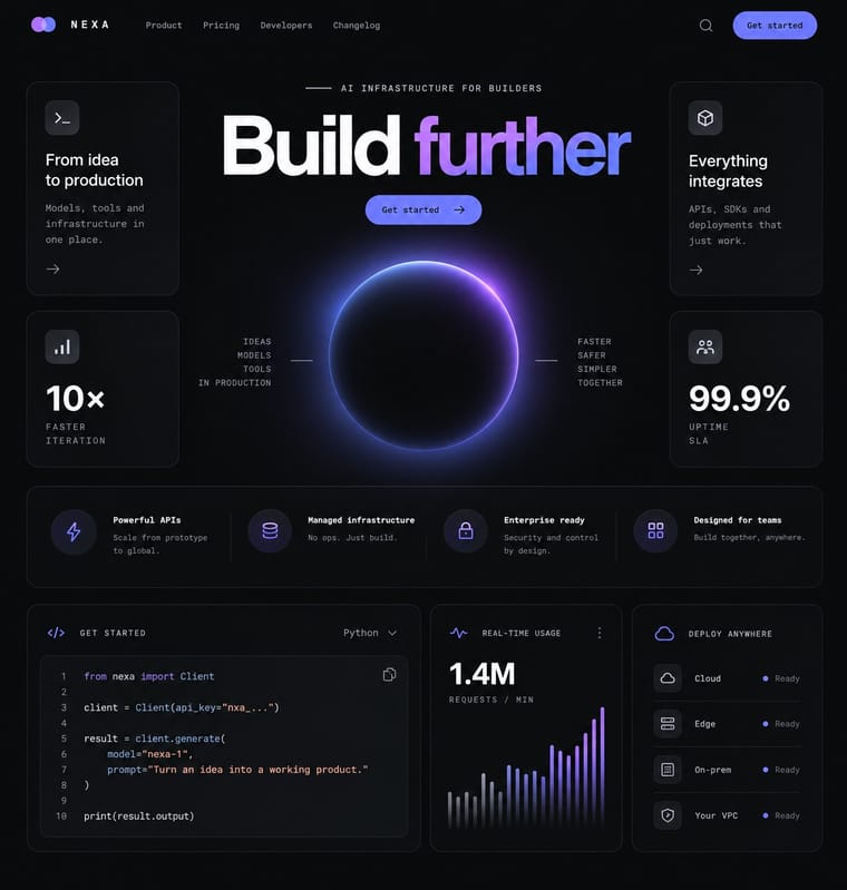
Dark Tech MinimalismThe dark, restrained aesthetic of developer tools and SaaS landing pages since about 2019: near-black grounds, grey type ramps, a neutral grotesque such as Inter, hairline borders, soft radial glows and bento grids of crisp product screenshots.
Styles that use it now and then 23
An occasional choice in these styles.
- Ancient Egyptian Hieroglyphic & Register Compositionc. 0–394
- Kamon (Japanese Family Crests)c. 1100–present
- European Heraldryc. 1140–present
- Renaissance Book Typographyc. 1460–1600
- Nieuwe Kunst (Dutch Art Nouveau)1892–1914
- Russian Constructivism1917–1934
- Leningrad Avant-Garde Picture Book1922–1936
- Ligne Claire (Franco-Belgian Clear Line)1929–present
- Blue Note Jazz Sleeve Modernism1956–1967
- Turkish Modernist Poster & Graphic Design1959–2000
- Bossa Nova Sleeve Modernism (César Villela and Elenco)1960–1968
- Op Art Graphics1960–1975
- Fluxus Graphics (Maciunas)1962–1978
- Mexico 68 Olympic & Metro Identity1966–1970
- Swiss Punk / New Wave Typography1968–1990
- Bitmap & Pixel Graphics1977–1995
- Post-Punk Record Sleeve (Stiff, Factory, 4AD)1977–1990
- Madinah Mushaf (King Fahd Complex Qur'an Page)1985–present
- Out-of-Square Hangul Typography1985–present
- Fantasy User Interface (FUI) & Sci-Fi HUD1999–present
- Brutalist Web Design2014–present
- Data Humanism2014–present
- Instagram Slideshow Activism (Social-Justice Infographics)2020–present
It often goes with
Choices that the styles making it make more often than the atlas as a whole.
- Grotesque & neo-grotesquein 44 of 67
- Modular gridin 39 of 67
- Rectilinearin 45 of 67
- Ornament-freein 39 of 67
- Geometric primitivesin 46 of 67
- Generous white spacein 41 of 67
Styles that avoid it
Styles that deliberately leave it out.
- African Wax & Fancy Print1880–present
- Fileteado Porteño1890–present
- Russian Futurist Book1910–1920
- Mavo1923–1925
- Surrealist Graphics1924–1960
- Filipino Komiks1929–1999
- Egyptian Painted Film Poster1932–1996
- Tiki Pop (Polynesian Pop)1934–present
- Hand-Painted Bollywood Poster1940–1999
- Jeepney Art1946–present
- Pakistani Truck Art1947–present
- Taiwan Floral Cloth (Huabu)1950–present
- Drum Magazine & Sophiatown Photojournalism1951–1965
- Push Pin Style1954–1980
- Situationist Détournement Graphics1956–1972
- Shōjo Manga (Japanese Girls' Comics)1958–present
- Phototype Expressive Typography (Lubalin & U&lc)1962–1985
- Tropicália Graphic Design1964–1975
- Angura Theatre Poster1965–1985
- Chicano Screenprint Poster1965–present
- Psychedelic Poster1965–1973
- Picó Sound-System Painting (Colombian Caribbean)1967–present
- Tingatinga Painting1968–present
- Ultras Graphics (Curva Banners and Tifo)1968–present
- Afrofuturist Design1970–present
- Grapus (French Militant Graphic Collective)1970–1990
- Kinshasa Popular Painting1970–present
- Graffiti & Hip-Hop Graphics1972–present
- Roots Reggae Sleeve Art & Rasta Iconography1973–1985
- Métal hurlant Science-Fiction Comics (Mœbius, Druillet & Les Humanoïdes Associés)1974–1987
- Dutch Expressive Postmodernism (Studio Dumbar & Hard Werken)1977–1994
- La Movida Madrileña Graphics1977–1988
- Chicha Poster1980–present
- Cranbrook & Deconstructivist Typography1980–1998
- Jamaican Dancehall Signs & Sleeve Art1980–present
- Memphis Design1981–1988
- Ghanaian Movie Poster1985–2005
- Global Village Coffeehouse1988–2003
- Grunge Typography1990–2000
- Matatu & Nganya Art1990–present
- Screenprinted Gig & Alt-Movie Poster1991–present
- Nollywood Video Jacket & Film Poster1992–present
- Superflat1993–present
- Early Web Vernacular1994–2004
- South African Vernacular Design (Ijusi)1995–present
- Indian Pop-Kitsch Design (Desi Kitsch)1997–present
- Tamil Nadu Flex Banners2000–present
- Glitch Art & Datamosh Graphics2001–present
- Cartonera Books (Latin American Cardboard Publishing)2003–present
- Internet Ugly & Meme Vernacular2003–present
- Itasha (Anime Character Car Graphics)2005–present
- Synthwave / Outrun2006–present
- Egyptian Revolutionary Street Art (Mohamed Mahmoud Murals)2011–2014
- Vaporwave2011–2017
- 'Good Morning' Greeting Images (WhatsApp Forward Vernacular)2013–present
- VTuber Avatar and Stream Graphics2016–present
- Weirdcore & Dreamcore2019–present
- Generative-AI Image Aesthetic2022–present