Typography · Typographic treatment
Lowercase only
Capitals rejected as unnecessary.
A design choice in Stylogeny’s vocabulary, under typography: what do the letters look like, and how are they set?
- styles make it
- 25
- as a defining choice
- 0
- as a usual one
- 10
- now and then
- 15
- avoid it
- 19
Styles that often use it 10
A characteristic choice: usual in these styles, though not essential.
- BauhausThe German school founded by Walter Gropius in 1919 moved from Expressionist craft ideals to a programme of 'art and technology' after 1923, when Moholy-Nagy, Herbert Bayer and Joost Schmidt made its printing and advertising workshops a laboratory for functional communication.
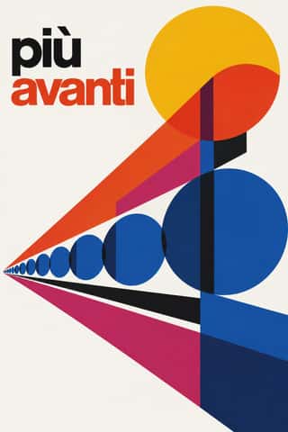
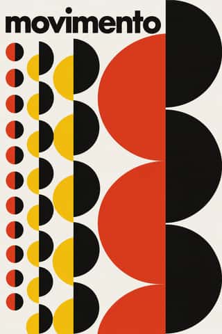
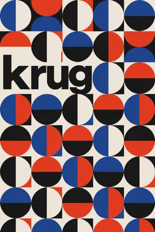
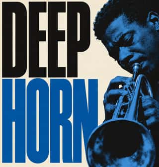
- Greek Tourism Modernism (EOT)The modernist image of Greece made for the National Tourism Organisation (EOT) by Michalis Katzourakis, its art adviser in 1960-1967, and by Frederick Carabott, who advised it until 1967; in 1962 the two also founded the K&K Athens Advertising Centre.


- Lo-fi Anime AestheticThe look of YouTube's 24/7 lo-fi hip hop streams.


Styles that use it now and then 15
An occasional choice in these styles.
- Brazilian Modernismo Graphics (Klaxon and the Semana de 22)1922–1929
- Die Neue Typographie1923–1940
- American Mid-Century Modernism1940–1970
- International Typographic Style1950–1975
- Finnish Bold Print (Marimekko Modernism)1951–present
- HfG Ulm Systematic Design1953–1968
- Situationist Détournement Graphics1956–1972
- Bossa Nova Sleeve Modernism (César Villela and Elenco)1960–1968
- Di Tella Graphic Design (Instituto Torcuato Di Tella)1960–1970
- Minimalist Graphic Design1965–present
- Frutiger Aero2004–2013
- Modern Calligraphy and Brush Lettering2005–present
- Neo-Swiss Revival2005–present
- Natural Wine Label Art2007–present
- Flat Design2010–2016
It often goes with
Choices that the styles making it make more often than the atlas as a whole.
- Generous white spacein 20 of 25
- Grotesque & neo-grotesquein 19 of 25
- Ornament-freein 17 of 25
- Rational & objectivein 15 of 25
- Flush left, ragged rightin 12 of 25
- Dynamic asymmetryin 17 of 25
Styles that avoid it
Styles that deliberately leave it out.
- Vyaz (Ornamental Slavonic Lettering)c. 1230–present
- Victorian Letterpress & Wood Type1810–1900
- Cuban Tobacco Lithography (Habilitaciones & Marquillas)1845–present
- Spanish Bullfight Poster (Cartel Taurino)1879–present
- Lotería Card Imagery (Mexican Lotería)1887–present
- Art Deco1910–1939
- Italian Fascist Graphics (Romanità & Exhibition Photomontage)1921–1943
- Amazonian Boat Lettering (Abridores de Letras)1925–present
- Early Turkish Republican Graphic Design1925–1960
- Australian Travel Poster (ANTA Era)1929–1959
- Giallo Mondadori Covers (I Libri Gialli)1929–present
- American Four-Colour Comic Book (Golden to Bronze Age)1934–1993
- Tiki Pop (Polynesian Pop)1934–present
- Spanish Civil War Poster1936–1939
- Amar Chitra Katha Comics1967–present
- Ultras Graphics (Curva Banners and Tifo)1968–present
- Hipster Artisanal Revival2007–2018
- Book Blob (Abstract Colour-Blob Literary Fiction Cover)2019–2023
- Black Lives Matter Street Murals2020–present
Other choices in typography
- Humanist & Garalde serif
- Transitional serif
- Didone
- Slab serif
- Grotesque & neo-grotesque
- Geometric sans
- Humanist sans
- Rounded sans
- Blackletter
- Script
- Brush & pen calligraphy
- Hand-lettering
- Ornamented display
- Condensed display
- Stencil
- Monospace
- Bitmap & pixel
- Experimental & distorted
- All caps
- Type as image
- Flush left, ragged right
- Rotated & vertical setting
- Eclectic mixing
- Tight setting
- Wide letterspacing