Typography · Scripts & hands
Blackletter
Gothic textura and fraktur forms.
A design choice in Stylogeny’s vocabulary, under typography: what do the letters look like, and how are they set?
- styles make it
- 17
- as a defining choice
- 2
- as a usual one
- 6
- now and then
- 9
- avoid it
- 14
Styles defined by it 2
For these styles it is one of the choices that make the style.


Styles that often use it 6
A characteristic choice: usual in these styles, though not essential.
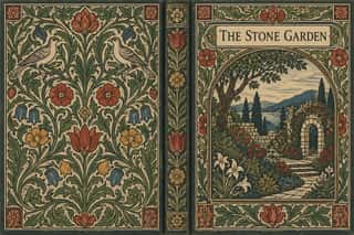
- Norwegian and Finnish National Romantic Graphics (Munthe & Karelianism)The flat, decorative branch of Norway's and Finland's national romanticism, which turned Viking carving, the sagas, the Kalevala and old peasant weaving into modern ornament.
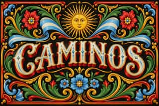
- German Book Art Movement (Buchkunstbewegung)The German reform of the book, from the magazine Pan (1895) to the private presses that ended around 1933.
- Black Metal GraphicsThe visual language of black metal, fixed by Norway's second wave in the early 1990s, now worldwide, since the 2010s borrowed by mainstream acts (Szpajdel's Rihanna and Metallica logos, 2016).


Styles that use it now and then 9
An occasional choice in these styles.
- European Heraldryc. 1140–present
- Renaissance Book Typographyc. 1460–1600
- Imagerie d'Épinal & European Bilderbogen1796–1939
- Expressionist Woodcut Graphics1905–1925
- Plakatstil / Sachplakat1905–1920
- Dada1916–1924
- Ultras Graphics (Curva Banners and Tifo)1968–present
- Pixação (São Paulo Tag Reto)1980–present
- Post-Binary Typography (Bye Bye Binary and Inclusive French Type)2018–present
It often goes with
Choices that the styles making it make more often than the atlas as a whole.
- Letterpressin 9 of 17
- Classical text blockin 7 of 17
- Woodblock & linocutin 8 of 17
- Carved linein 8 of 17
- Nostalgic & retroin 8 of 17
- Central symmetryin 14 of 17
Styles that avoid it
Styles that deliberately leave it out.
- Neoclassical Book Typography1757–1830
- London Transport Design1908–1966
- Bauhaus1919–1933
- Brazilian Modernismo Graphics (Klaxon and the Semana de 22)1922–1929
- Czech Poetist Book Design (Devětsil)1922–1938
- Die Neue Typographie1923–1940
- Milanese Industrial Modernism (Olivetti, Pirelli, Studio Boggeri)1933–1975
- Penguin Paperback Design (Three Bands to the Marber Grid)1935–1972
- WPA Silkscreen Posters1935–1943
- Googie & Atomic Age1945–1965
- Zagreb Modernist Graphics (EXAT 51 to Teatar &TD)1951–1975
- West German Conceptual Film & Culture Poster (Hillmann and Rambow)1953–1990
- Cuban Revolutionary Poster (OSPAAAL & ICAIC)1960–1990
- Modern Calligraphy and Brush Lettering2005–present
Other choices in typography
- Humanist & Garalde serif
- Transitional serif
- Didone
- Slab serif
- Grotesque & neo-grotesque
- Geometric sans
- Humanist sans
- Rounded sans
- Script
- Brush & pen calligraphy
- Hand-lettering
- Ornamented display
- Condensed display
- Stencil
- Monospace
- Bitmap & pixel
- Experimental & distorted
- All caps
- Lowercase only
- Type as image
- Flush left, ragged right
- Rotated & vertical setting
- Eclectic mixing
- Tight setting
- Wide letterspacing