Typography · Typographic treatment
Flush left, ragged right
Asymmetric, unjustified text setting.
A design choice in Stylogeny’s vocabulary, under typography: what do the letters look like, and how are they set?
- styles make it
- 28
- as a defining choice
- 6
- as a usual one
- 14
- now and then
- 8
- avoid it
- 20
Styles defined by it 6
For these styles it is one of the choices that make the style.
Die Neue TypographieThe programme that turned avant-garde experiment into a functional typographic method, named by Moholy-Nagy in 1923 and codified in Jan Tschichold's 'elementare typographie' (1925) and Die neue Typographie (1928).
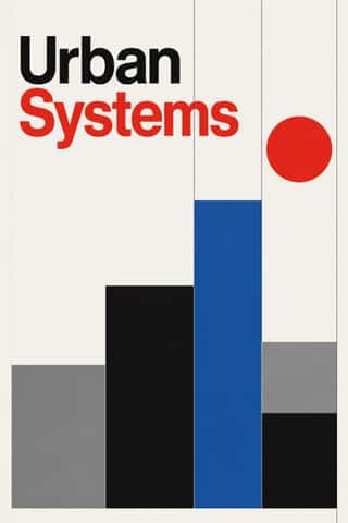
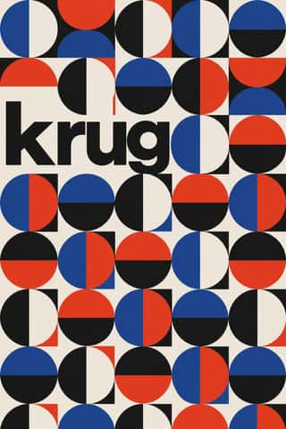
International Typographic StyleA post-war refinement of the New Typography in which the mathematical grid, objective photography and neo-grotesque sans-serifs were used to communicate with clarity and neutrality.
HfG Ulm Systematic DesignThe Hochschule für Gestaltung Ulm (1953–1968) was founded as the successor to the Bauhaus.
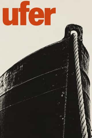
Neo-Swiss RevivalA contemporary revival of the International Typographic Style, fuelled by digital re-releases of neo-grotesques and by studios such as Experimental Jetset and Norm: modular grids, flush-left grotesque type, huge tightly set headlines and flat fields of black, white and one signal colour.
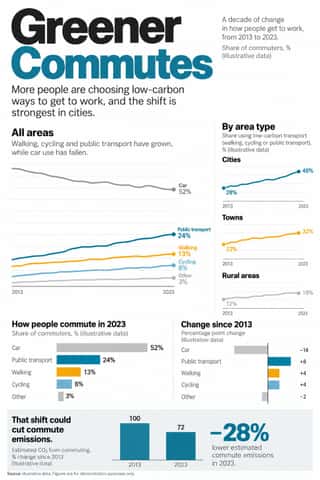
Newsroom Data Graphics & ScrollytellingThe house style of newspaper graphics desks since about 2009–2011 (the New York Times graphics desk, D3.js, the Guardian Datablog): conventional charts drawn from the data, on a white or pale paper ground with light grey gridlines and no axis titles, lines labelled directly in place of a legend where possible and short annotations saying what to look at.
GOV.UK Design (GDS Style)The text-led design of GOV.UK, the UK government's single website, built by the Government Digital Service from 2012 and codified in the GOV.UK Design System (2018).
Styles that often use it 14
A characteristic choice: usual in these styles, though not essential.
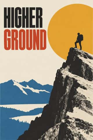
- BauhausThe German school founded by Walter Gropius in 1919 moved from Expressionist craft ideals to a programme of 'art and technology' after 1923, when Moholy-Nagy, Herbert Bayer and Joost Schmidt made its printing and advertising workshops a laboratory for functional communication.
Scandinavian FunctionalismNordic functionalism (funkis) arrived in graphic form with Sigurd Lewerentz's posters and winged emblem for the 1930 Stockholm Exhibition.
Penguin Paperback Design (Three Bands to the Marber Grid)The cover system of Penguin Books, London, from 1935 until Germano Facetti left in 1972.
American Mid-Century ModernismThe American synthesis of European avant-garde form with wit, pragmatism and commercial clients, led by Paul Rand, Alvin Lustig, Lester Beall, Bradbury Thompson and Saul Bass.
Zagreb Modernist Graphics (EXAT 51 to Teatar &TD)Zagreb graphic design grown from the EXAT 51 manifesto (1951), which tied abstract art to visual communication.
West German Conceptual Film & Culture Poster (Hillmann and Rambow)The art-film and culture poster Hans Hillmann developed from 1953 for the West German distributors Neue Filmkunst and Atlas Film, which his Kassel student Gunter Rambow took with Gerhard Lienemeyer into staged photo posters for theatre, publishers and protest.
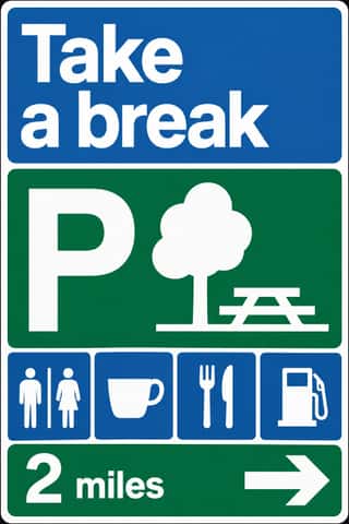
British Road Signage (Kinneir & Calvert)The national sign system Jock Kinneir and Margaret Calvert designed for Britain's motorways, first used on the Preston By-pass in 1958, and through the Worboys Committee for all roads from 1 January 1965.
Di Tella Graphic Design (Instituto Torcuato Di Tella)The in-house graphics of Buenos Aires' Instituto Torcuato Di Tella, 1960–1970, led by Juan Carlos Distéfano with Juan Andralis, Rubén Fontana, Norberto Coppola and Carlos Soler.
Total Design & Dutch FunctionalismThe Dutch strand of systematic modernism took shape when Wim Crouwel, Benno Wissing, Friso Kramer and Paul and Dick Schwarz founded Total Design in Amsterdam in 1963 as the country's first multidisciplinary studio.
Munich 1972 Olympic Design (Otl Aicher)The visual programme Otl Aicher's department made for the 1972 Munich Olympics, the 'cheerful Games' meant to show a democratic, modest West Germany.
Flat DesignAn interface and illustration language that stripped screens of simulated materials, replacing bevels, gloss and textures with solid fields of colour, clean sans-serif type and reduced pictograms.
Brutalist Web DesignA reaction against templated, conversion-optimised web design that exposes the raw materials of the browser: default system fonts, blue underlined links, visible borders, unstyled forms and plain document flow.
Material DesignGoogle's design system, launched in 2014, which reintroduced controlled depth to flat design through the metaphor of 'material': sheets of digital paper and ink that sit at defined elevations, cast consistent shadows and move with meaningful motion.
Instagram Slideshow Activism (Social-Justice Infographics)The text-led explainer slideshows that filled Instagram after George Floyd's murder in May 2020.
Styles that use it now and then 8
An occasional choice in these styles.
- Giallo Mondadori Covers (I Libri Gialli)1929–present
- Fotoromanzo (Italian Photo-Romance)1947–present
- Blue Note Jazz Sleeve Modernism1956–1967
- Minimalist Graphic Design1965–present
- ECM Sleeve Aesthetic (Munich)1969–present
- Slow-Living Editorial (the Kinfolk Look)2011–present
- Data Humanism2014–present
- Corporate Memphis2017–present
It often goes with
Choices that the styles making it make more often than the atlas as a whole.
- Rational & objectivein 22 of 28
- Grotesque & neo-grotesquein 24 of 28
- Ornament-freein 22 of 28
- Straight photographyin 20 of 28
- Dynamic asymmetryin 20 of 28
- Generous white spacein 20 of 28
Styles that avoid it
Styles that deliberately leave it out.
- Gothic Blackletter & Fraktur Traditionc. 1180–present
- Vyaz (Ornamental Slavonic Lettering)c. 1230–present
- Tibetan Woodblock Print Culture (Pecha & Prayer Flags)c. 1410–present
- Renaissance Book Typographyc. 1460–1600
- Neoclassical Book Typography1757–1830
- Victorian Letterpress & Wood Type1810–1900
- Bulaq (Amiriyya) Naskh Book Printing1822–1956
- Cuban Tobacco Lithography (Habilitaciones & Marquillas)1845–present
- Nirnaya Sagar Devanagari Typography (Bombay Metal Type)1864–present
- Spanish Bullfight Poster (Cartel Taurino)1879–present
- Art Nouveau1890–1910
- German Book Art Movement (Buchkunstbewegung)1895–1933
- Wendingen & Amsterdam School Typography1918–1932
- American Four-Colour Comic Book (Golden to Bronze Age)1934–1993
- Push Pin Style1954–1980
- Angura Theatre Poster1965–1985
- Psychedelic Poster1965–1973
- Graffiti & Hip-Hop Graphics1972–present
- Ghanaian Movie Poster1985–2005
- Madinah Mushaf (King Fahd Complex Qur'an Page)1985–present
Other choices in typography
- Humanist & Garalde serif
- Transitional serif
- Didone
- Slab serif
- Grotesque & neo-grotesque
- Geometric sans
- Humanist sans
- Rounded sans
- Blackletter
- Script
- Brush & pen calligraphy
- Hand-lettering
- Ornamented display
- Condensed display
- Stencil
- Monospace
- Bitmap & pixel
- Experimental & distorted
- All caps
- Lowercase only
- Type as image
- Rotated & vertical setting
- Eclectic mixing
- Tight setting
- Wide letterspacing