Typography · Serif classes
Humanist & Garalde serif
Calligraphic stress and bracketed serifs: Jenson, Garamond, Bembo.
A design choice in Stylogeny’s vocabulary, under typography: what do the letters look like, and how are they set?
- styles make it
- 23
- as a defining choice
- 5
- as a usual one
- 2
- now and then
- 16
- avoid it
- 2
Styles defined by it 5
For these styles it is one of the choices that make the style.
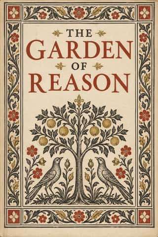
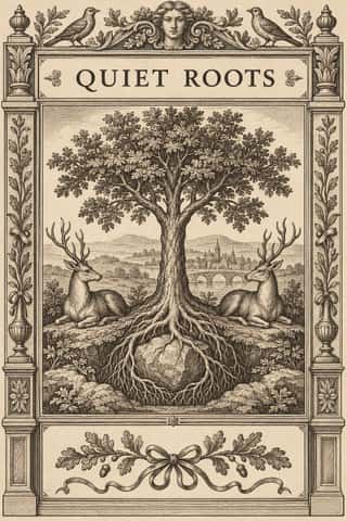
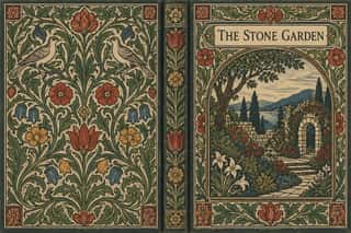
- German Book Art Movement (Buchkunstbewegung)The German reform of the book, from the magazine Pan (1895) to the private presses that ended around 1933.
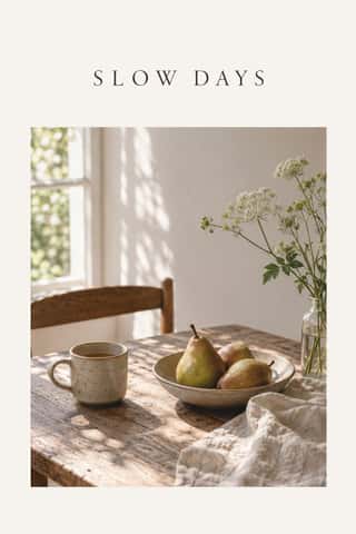


Styles that often use it 2
A characteristic choice: usual in these styles, though not essential.
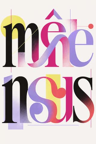


Styles that use it now and then 16
An occasional choice in these styles.
- Gothic Blackletter & Fraktur Traditionc. 1180–present
- Celtic Revival Illumination & Lettering1861–1951
- Nieuwe Kunst (Dutch Art Nouveau)1892–1914
- Italian Fascist Graphics (Romanità & Exhibition Photomontage)1921–1943
- Australian Travel Poster (ANTA Era)1929–1959
- Scandinavian Functionalism1930–present
- Estado Novo Folk Modernism (SPN)1933–1949
- Penguin Paperback Design (Three Bands to the Marber Grid)1935–1972
- Blue Note Jazz Sleeve Modernism1956–1967
- Greek Tourism Modernism (EOT)1960–1974
- ECM Sleeve Aesthetic (Munich)1969–present
- Post-Punk Record Sleeve (Stiff, Factory, 4AD)1977–1990
- L'Association and French Alternative Comics1990–present
- Contemporary Chinese Book Design ('Most Beautiful Books of China')2003–present
- Contemporary Arabic & Dual-Script Type Design2004–present
- Extinction Rebellion Graphics2018–present
It often goes with
Choices that the styles making it make more often than the atlas as a whole.
- Wide letterspacingin 13 of 23
- Classical text blockin 9 of 23
- Calm & contemplativein 11 of 23
- Restrained accentsin 16 of 23
- Typography onlyin 13 of 23
- Woodblock & linocutin 9 of 23
Styles that avoid it
Styles that deliberately leave it out.
Other choices in typography
- Transitional serif
- Didone
- Slab serif
- Grotesque & neo-grotesque
- Geometric sans
- Humanist sans
- Rounded sans
- Blackletter
- Script
- Brush & pen calligraphy
- Hand-lettering
- Ornamented display
- Condensed display
- Stencil
- Monospace
- Bitmap & pixel
- Experimental & distorted
- All caps
- Lowercase only
- Type as image
- Flush left, ragged right
- Rotated & vertical setting
- Eclectic mixing
- Tight setting
- Wide letterspacing