Typography · Sans-serif classes
Geometric sans
Built from circle and line: Futura, Avant Garde, Circular.
A design choice in Stylogeny’s vocabulary, under typography: what do the letters look like, and how are they set?
- styles make it
- 66
- as a defining choice
- 5
- as a usual one
- 34
- now and then
- 27
- avoid it
- 6
Styles defined by it 5
For these styles it is one of the choices that make the style.
Art DecoThe glamorous modern style named after the 1925 Paris Exposition des Arts Décoratifs, which disciplined ornament into geometry: sunbursts, chevrons, stepped forms and sleek stylised figures rendered in lacquer-smooth colour with metallic accents.
- BauhausThe German school founded by Walter Gropius in 1919 moved from Expressionist craft ideals to a programme of 'art and technology' after 1923, when Moholy-Nagy, Herbert Bayer and Joost Schmidt made its printing and advertising workshops a laboratory for functional communication.
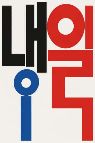
Out-of-Square Hangul TypographyA Korean typographic movement that frees Hangul from the equal square in which metal and photo type had always set each syllable.
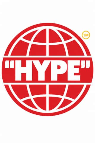
Hype Streetwear Graphics (Box Logo to Quotation Marks)The logo-led graphics of streetwear since the 1990s: one wordmark or emblem on a plain T-shirt, hoodie or object is the product.
DTC 'Blanding' / Millennial MinimalismThe friendly, frictionless minimalism of 2010s direct-to-consumer start-ups, built for the phone screen, the Instagram feed and the unboxing.
Styles that often use it 34
A characteristic choice: usual in these styles, though not essential.
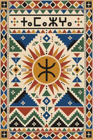
Amazigh Sign System & TifinaghThe visual language shared by Amazigh communities from the Rif, Atlas and Kabylie to the Aurès and the Tuareg Sahara.
Die Neue TypographieThe programme that turned avant-garde experiment into a functional typographic method, named by Moholy-Nagy in 1923 and codified in Jan Tschichold's 'elementare typographie' (1925) and Die neue Typographie (1928).
Isotype Pictorial StatisticsA method of visual education developed by Otto Neurath, Marie Neurath (Reidemeister) and Gerd Arntz in Red Vienna from 1925, which turns statistics into rows of identical pictograms where a greater quantity is shown by more signs, never by bigger ones.
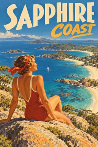
Australian Travel Poster (ANTA Era)The pictorial posters that the Australian National Travel Association (ANTA, 1929), state tourist bureaux, railways and shipping lines commissioned to sell Australia abroad and at home.
- AIZ Political Photomontage (Heartfield)The political photomontage John Heartfield made for the communist weekly AIZ from 1930 to 1938, in Berlin and, from 1933, in Prague exile.
Scandinavian FunctionalismNordic functionalism (funkis) arrived in graphic form with Sigurd Lewerentz's posters and winged emblem for the 1930 Stockholm Exhibition.
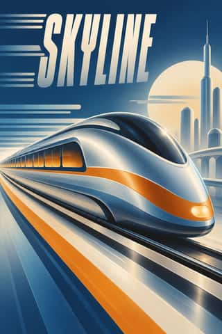
Streamline ModerneThe late, chiefly American phase of Art Deco, in which aerodynamic science became a visual language for a Depression-era culture hungry for progress.
- Nippon Kōbō & Tōhōsha Photo-Propaganda Magazines (NIPPON & FRONT)Luxury photo-propaganda magazines that imperial Japan sent abroad, 1934–45.
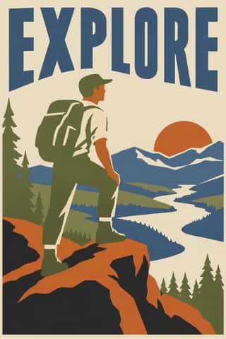
WPA Silkscreen PostersPosters made by the Federal Art Project of the Works Progress Administration to promote health campaigns, education, theatre, travel and the national parks during the Depression.
American Mid-Century ModernismThe American synthesis of European avant-garde form with wit, pragmatism and commercial clients, led by Paul Rand, Alvin Lustig, Lester Beall, Bradbury Thompson and Saul Bass.
Brazilian Concrete DesignA São Paulo and Rio movement in which concrete art, concrete poetry and Brazil's first design offices shared one vocabulary: Max Bill's mathematically generated geometry, serial repetition and sans-serif type.
Vicente Rojo & Mexican Editorial ModernismThe design of Mexico City's literary and cultural press, shaped from the 1950s by the Barcelona-born exile Vicente Rojo: México en la Cultura, the Revista de la Universidad, Plural, La Jornada and the covers of Ediciones Era.
Corporate Identity ModernismModernist reduction applied to corporate communication.
- Greek Tourism Modernism (EOT)The modernist image of Greece made for the National Tourism Organisation (EOT) by Michalis Katzourakis, its art adviser in 1960-1967, and by Frederick Carabott, who advised it until 1967; in 1962 the two also founded the K&K Athens Advertising Centre.
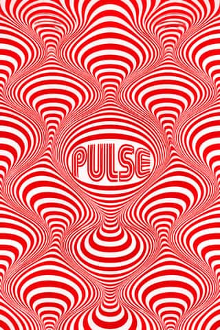
Op Art GraphicsA 1960s style that turned perceptual research into graphic effect: precisely drawn lines, checks, concentric rings and modular grids, usually black and white or complementaries of equal value, that seem to vibrate, swell or move.
Indian Institutional Modernism (NID)The design culture of independent India's public institutions, banks and broadcasters.
Phototype Expressive Typography (Lubalin & U&lc)The display typography of the phototype era, led in New York by Herb Lubalin, his lettering partners John Pistilli, Tom Carnase and Tony DiSpigna, and the International Typeface Corporation.
- Mexico 68 Olympic & Metro IdentityThe graphic programme of the 1968 Mexico City Olympics and the city's first Metro line.
- Ultras Graphics (Curva Banners and Tifo)The graphic language of Italy's organised football supporters, the ultras, from the late 1960s, and of the groups that copied them across Europe, North Africa and beyond.
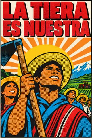
Pop Achorado (Peruvian Agrarian Reform Posters)Posters for the Peruvian military government's agrarian reform, made in Lima from 1969 by Jesús Ruiz Durand and colleagues at the state's reform publicity office.
Afrofuturist DesignA visual language of Black futures that fuses African and diasporic iconography (pyramids and ankhs, Adinkra and Nsibidi glyphs, textile patterning) with spacecraft, cosmic fields and technology.
Roman-like Thai Typography (modern loopless Thai)A Thai type genre that drops the head loops of most Thai letters, so the script reads as an even sans like Helvetica.
Memphis DesignThe Milan collective founded by Ettore Sottsass, whose furniture, laminates and objects (first shown in September 1981) became a graphic language of their own.
Techno-Futurist GraphicsElectronic-music and video-game graphics of the late 1980s and 1990s that turned corporate modernism into a sci-fi consumer fantasy.
ACT UP & Gran Fury AIDS Activist GraphicsThe graphics of New York's AIDS activist movement: the SILENCE=DEATH poster of 1987, a pink triangle above white capitals on black, and the posters, stickers, T-shirts, billboards and bus ads of Gran Fury (1988–1995), ACT UP's 'unofficial propaganda ministry'.
Y2K FuturismThe optimistic, chrome-plated vision of the future that surrounded the turn of the millennium, spread by consumer electronics, music videos, games, fashion and dot-com branding.
Fantasy User Interface (FUI) & Sci-Fi HUDFantasy user interfaces are the screen graphics of films and series: computer screens, holograms and helmet HUDs made to be watched for a few seconds, not used.
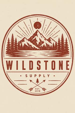
Hipster Artisanal RevivalThe trade-mark look of the 2007–2018 craft boom, which dressed new coffee roasters, breweries and stationers as nineteenth- and early-twentieth-century firms.
Corporate MemphisThe flat vector illustration style that became the default visual voice of big tech in the late 2010s: faceless, ethnically non-specific figures with elongated limbs and tiny heads, drawn in bright flat colour among blobs, leaves and confetti.
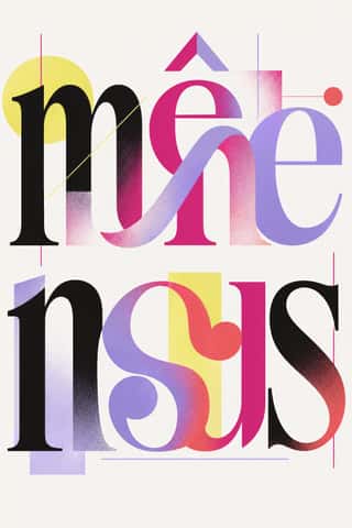
Post-Binary Typography (Bye Bye Binary and Inclusive French Type)A Franco-Belgian type practice that redesigns written French for gender inclusion inside the word.
NeumorphismA short-lived interface trend in which controls are extruded from, or pressed into, a background of the same colour and modelled only by paired soft shadows.
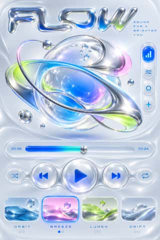
Claymorphism & Soft 3DA soft, toy-like 3D look from product design around 2020, given the name 'claymorphism' in a December 2021 article by Michał Malewicz.
- Neo-BrutalismA friendly, commercial descendant of web brutalism that keeps its blunt boxes but adds candy colour: thick black outlines, hard unblurred offset shadows, flat saturated fills and chunky sans-serif type on conventional, usable layouts.
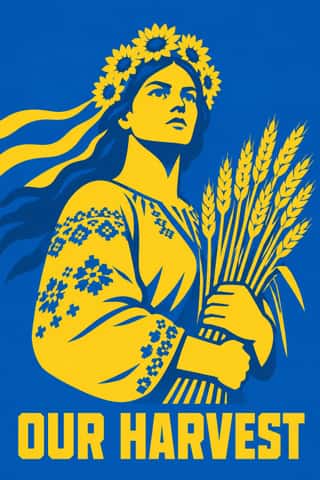
Ukrainian Wartime Graphics (Saint Javelin, War Stamps and Be Brave Like Ukraine)The graphics of Ukraine's defence since Russia's full-scale invasion in February 2022, made by the state, the national post, agencies, illustrators and volunteers at home and abroad.
Styles that use it now and then 27
An occasional choice in these styles.
- De Stijl1917–1931
- Italian Fascist Graphics (Romanità & Exhibition Photomontage)1921–1943
- Harlem Renaissance Graphic Art1925–1940
- Milanese Industrial Modernism (Olivetti, Pirelli, Studio Boggeri)1933–1975
- Spanish Civil War Poster1936–1939
- Machine-Age Simplified Arabic Type1947–present
- Japanese Postwar Modernism1950–1990
- West German Conceptual Film & Culture Poster (Hillmann and Rambow)1953–1990
- Thaw Modernism (Soviet and Czechoslovak)1956–1968
- Bossa Nova Sleeve Modernism (César Villela and Elenco)1960–1968
- Casablanca School Graphic Modernism1962–1987
- Baybayin Revival Graphics1963–present
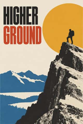
- Minimalist Graphic Design1965–present
- City Pop Illustration1979–present
- Emigre & Early Digital Type1984–1998
- Contemporary Arabic & Dual-Script Type Design2004–present
- Hauntology & Ghost Box Design2004–present
- Seoul Independent Graphic Design (Small-Studio Scene)2005–present
- Synthwave / Outrun2006–present
- Generative & Dynamic Identities2007–present
- Flat Design2010–2016
- Slow-Living Editorial (the Kinfolk Look)2011–present
- Low Poly Illustration2012–present
- Material Design2014–present
- NFT Profile-Picture Collections (CryptoPunks to Bored Apes)2017–present
- Glassmorphism2020–present
- Instagram Slideshow Activism (Social-Justice Infographics)2020–present
It often goes with
Choices that the styles making it make more often than the atlas as a whole.
- Geometric primitivesin 49 of 66
- Technological & futuristin 28 of 66
- Generous white spacein 37 of 66
- Rational & objectivein 26 of 66
- Offset printingin 44 of 66
- Web & CSSin 25 of 66
Styles that avoid it
Styles that deliberately leave it out.
- Gothic Blackletter & Fraktur Traditionc. 1180–present
- Celtic Revival Illumination & Lettering1861–1951
- Norwegian and Finnish National Romantic Graphics (Munthe & Karelianism)1880–1922
- Hurufiyya Calligraphic Modernism1949–present
- Korean Commercial Calligraphy (Kaelligeurapi)1999–present
- Oaxacan Protest Printmaking & Street Graphics (ASARO)2006–present
Other choices in typography
- Humanist & Garalde serif
- Transitional serif
- Didone
- Slab serif
- Grotesque & neo-grotesque
- Humanist sans
- Rounded sans
- Blackletter
- Script
- Brush & pen calligraphy
- Hand-lettering
- Ornamented display
- Condensed display
- Stencil
- Monospace
- Bitmap & pixel
- Experimental & distorted
- All caps
- Lowercase only
- Type as image
- Flush left, ragged right
- Rotated & vertical setting
- Eclectic mixing
- Tight setting
- Wide letterspacing