Typography · Typographic treatment
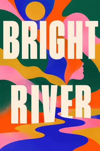
Wide letterspacing
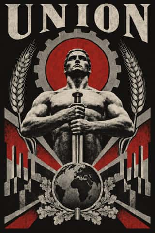
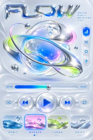
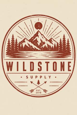
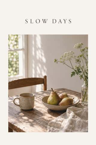
Airy, generously spaced letters, usually capitals.
A design choice in Stylogeny’s vocabulary, under typography: what do the letters look like, and how are they set?
- styles make it
- 39
- as a defining choice
- 3
- as a usual one
- 15
- now and then
- 21
- avoid it
- 4
Styles defined by it 3
For these styles it is one of the choices that make the style.
- Nippon Kōbō & Tōhōsha Photo-Propaganda Magazines (NIPPON & FRONT)Luxury photo-propaganda magazines that imperial Japan sent abroad, 1934–45.
- Swiss Punk / New Wave TypographyA rebellion from inside the Swiss school: Wolfgang Weingart and his Basel students kept the grotesque and the grid but set them in motion with extreme letterspacing, stepped and angled lines, rules and bars, enlarged halftone screens and layered film montage.


Styles that often use it 15
A characteristic choice: usual in these styles, though not essential.
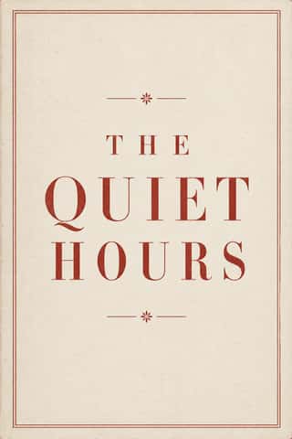

- Brazilian Modernismo Graphics (Klaxon and the Semana de 22)The print side of São Paulo's Modernismo (1922-29), set in jobbing print shops.
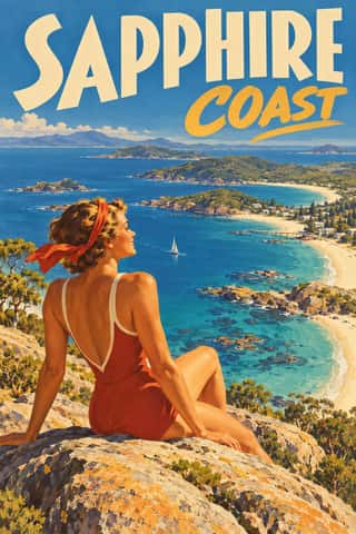
- AIZ Political Photomontage (Heartfield)The political photomontage John Heartfield made for the communist weekly AIZ from 1930 to 1938, in Berlin and, from 1933, in Prague exile.
- Greek Tourism Modernism (EOT)The modernist image of Greece made for the National Tourism Organisation (EOT) by Michalis Katzourakis, its art adviser in 1960-1967, and by Frederick Carabott, who advised it until 1967; in 1962 the two also founded the K&K Athens Advertising Centre.
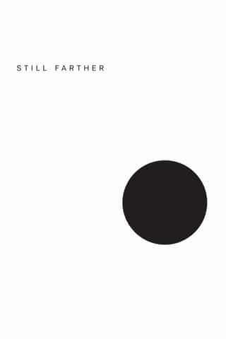
- Post-Punk Record Sleeve (Stiff, Factory, 4AD)The record sleeves that British art-school designers made after punk, for independent labels and some majors: Barney Bubbles at Stiff, Malcolm Garrett for Buzzcocks, Peter Saville at Factory and 23 Envelope at 4AD.
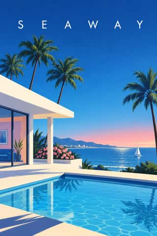



Styles that use it now and then 21
An occasional choice in these styles.
- Gothic Blackletter & Fraktur Traditionc. 1180–present
- Renaissance Book Typographyc. 1460–1600
- Ma & Wabi-sabi Aesthetics1500–present
- Emblem Book (Motto, Picture & Epigram)1531–1724
- Tarot de Marseille Woodcut Cards1639–present
- Cuban Tobacco Lithography (Habilitaciones & Marquillas)1845–present
- Lotería Card Imagery (Mexican Lotería)1887–present
- German Book Art Movement (Buchkunstbewegung)1895–1933
- Italian Fascist Graphics (Romanità & Exhibition Photomontage)1921–1943
- Tiki Pop (Polynesian Pop)1934–present
- Penguin Paperback Design (Three Bands to the Marber Grid)1935–1972
- Brazilian Concrete Design1951–1975
- British Road Signage (Kinneir & Calvert)1958–present
- ECM Sleeve Aesthetic (Munich)1969–present
- Contemporary Chinese Book Design ('Most Beautiful Books of China')2003–present
- Modern Calligraphy and Brush Lettering2005–present
- Synthwave / Outrun2006–present
- Lucerne Poster Scene (Neubad & Südpol Posters)2007–present
- DTC 'Blanding' / Millennial Minimalism2012–2022
- Lo-fi Anime Aesthetic2017–present
- Instagram Slideshow Activism (Social-Justice Infographics)2020–present
It often goes with
Choices that the styles making it make more often than the atlas as a whole.
- Nostalgic & retroin 19 of 39
- Humanist & Garalde serifin 13 of 39
- Pastelin 16 of 39
- Restrained accentsin 26 of 39
- All capsin 27 of 39
- Geometric sansin 16 of 39
Styles that avoid it
Styles that deliberately leave it out.
Other choices in typography
- Humanist & Garalde serif
- Transitional serif
- Didone
- Slab serif
- Grotesque & neo-grotesque
- Geometric sans
- Humanist sans
- Rounded sans
- Blackletter
- Script
- Brush & pen calligraphy
- Hand-lettering
- Ornamented display
- Condensed display
- Stencil
- Monospace
- Bitmap & pixel
- Experimental & distorted
- All caps
- Lowercase only
- Type as image
- Flush left, ragged right
- Rotated & vertical setting
- Eclectic mixing
- Tight setting