Form & shape · Curvilinear
Rounded & pill
Soft corners, capsules and blobs.
A design choice in Stylogeny’s vocabulary, under form & shape: what is the shape language?
- styles make it
- 39
- as a defining choice
- 7
- as a usual one
- 15
- now and then
- 17
- avoid it
- 9
Styles defined by it 7
For these styles it is one of the choices that make the style.
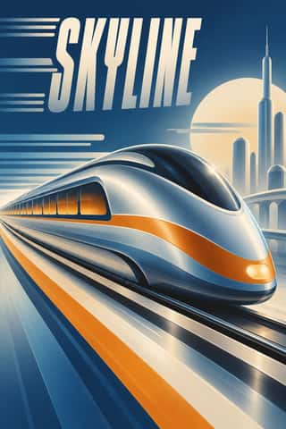
Streamline ModerneThe late, chiefly American phase of Art Deco, in which aerodynamic science became a visual language for a Depression-era culture hungry for progress.
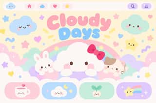
Kawaii DesignJapan's culture of cuteness, which grew from 1970s teenage rounded handwriting and shōjo fancy goods into a global design language through Sanrio, character merchandise and emoji.
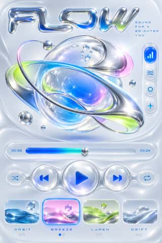
Y2K FuturismThe optimistic, chrome-plated vision of the future that surrounded the turn of the millennium, spread by consumer electronics, music videos, games, fashion and dot-com branding.
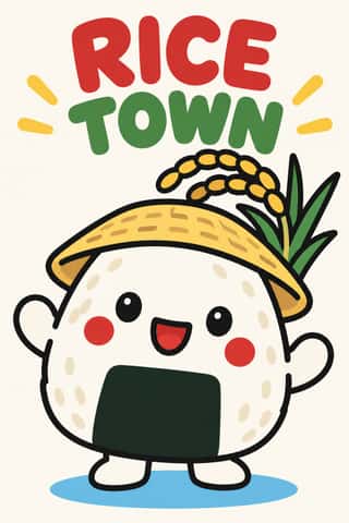
Yuru-chara (Japanese Local Mascot Design)Japan's local mascots: characters commissioned by prefectures, towns and tourism bodies to stand for a place, named yuru-kyara ('loose characters') by the illustrator Jun Miura around 2000.
NeumorphismA short-lived interface trend in which controls are extruded from, or pressed into, a background of the same colour and modelled only by paired soft shadows.
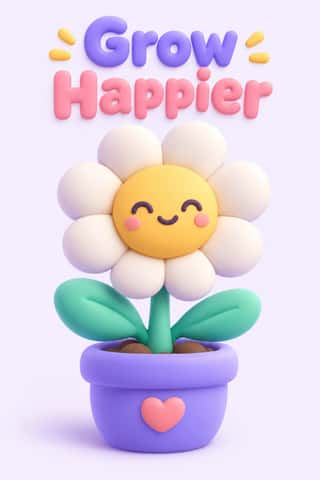
Claymorphism & Soft 3DA soft, toy-like 3D look from product design around 2020, given the name 'claymorphism' in a December 2021 article by Michał Malewicz.
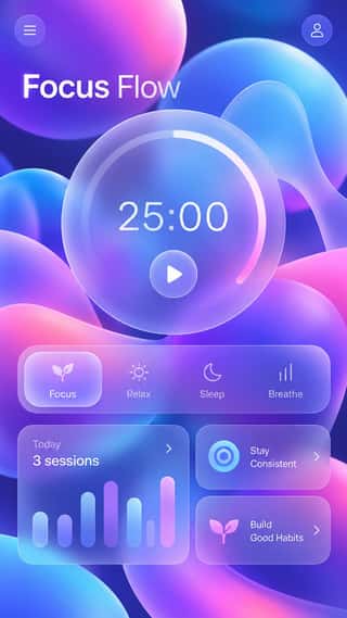
GlassmorphismAn interface style of translucent, frosted panels floating over vivid, blurred backgrounds, so that depth and hierarchy come from layered transparency.
Styles that often use it 15
A characteristic choice: usual in these styles, though not essential.
- Maghrebi Script (Maghribi Calligraphy of al-Andalus and North Africa)The family of Arabic scripts of al-Andalus and North Africa, descended from early Kufic bookhands.
- Đông Hồ & Hàng Trống Folk PrintsVietnam's two classic folk-print schools, bought for Tết. Đông Hồ families press each colour from its own carved block onto giấy điệp, dó paper brushed with ground scallop shell whose streaked, faintly sparkling surface serves as the white, and print the black line last.
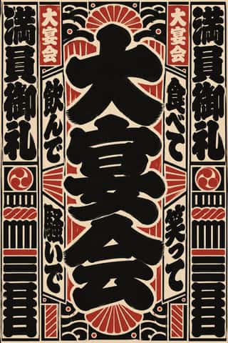
Edo-moji Commercial Lettering (Kanteiryū, Yose-moji, Sumō-ji)The fat, ink-heavy brush hands that Edo's professional sign and bill writers made for the city's entertainments: Kanteiryū for kabuki signboards and playbills from 1779, yose-moji for rakugo halls, sumō-ji for sumo ranking sheets, and squarish kago-moji for votive name slips.
Scandinavian FunctionalismNordic functionalism (funkis) arrived in graphic form with Sigurd Lewerentz's posters and winged emblem for the 1930 Stockholm Exhibition.
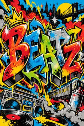
Graffiti & Hip-Hop GraphicsBorn on New York's subway cars and Bronx party flyers, graffiti writing turns the writer's name into a monumental letter-sculpture: bubble, block and wildstyle letters with arrows, 3D drop shadows, fades and highlights, painted freehand in aerosol.
- Chicha PosterFluorescent screen-printed street posters that emerged in the 1980s to promote chicha (Andean cumbia) concerts in Lima, made by printers from Andean migrant communities.
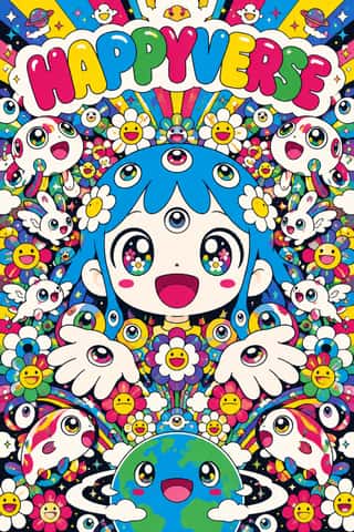
SuperflatThe flat, saturated, cartoon-crowded look that Takashi Murakami named in his exhibition and manifesto Superflat (Tokyo, 2000; US tour 2001).
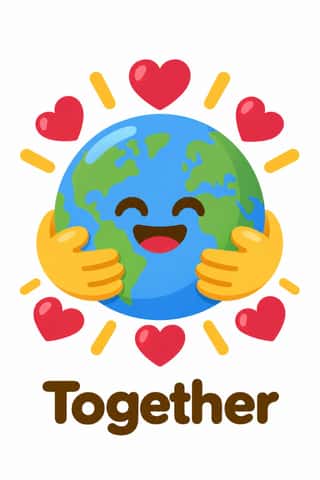
Emoji Pictographic LanguagePictographs typed as characters and set inline in running text.
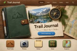
Skeuomorphic UIInterface design that imitates physical materials and objects (stitched leather, linen, wooden shelves, brushed aluminium, felt, paper and glass) so that digital tools look and behave like their real-world counterparts.
- Frutiger AeroThe glossy, optimistic look of consumer technology from the mid-2000s to the early 2010s, retrospectively named in 2017 by the Consumer Aesthetics Research Institute after Windows Vista's Aero interface and Adrian Frutiger's humanist sans.
DTC 'Blanding' / Millennial MinimalismThe friendly, frictionless minimalism of 2010s direct-to-consumer start-ups, built for the phone screen, the Instagram feed and the unboxing.
Material DesignGoogle's design system, launched in 2014, which reintroduced controlled depth to flat design through the metaphor of 'material': sheets of digital paper and ink that sit at defined elevations, cast consistent shadows and move with meaningful motion.
Newtro (Korean New-Retro)A South Korean branding trend, named 'Going New-tro' in Seoul National University's Trend Korea 2019 (October 2018), in which heritage firms reissue their own postwar to 1990s labels, trademarks and mascots, polished for young buyers.
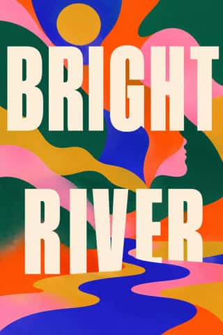
Book Blob (Abstract Colour-Blob Literary Fiction Cover)The default jacket of US literary fiction around 2019–2023: soft, overlapping blobs of saturated colour fill the cover edge to edge (cobalt, pink, orange-red, deep green, mustard).
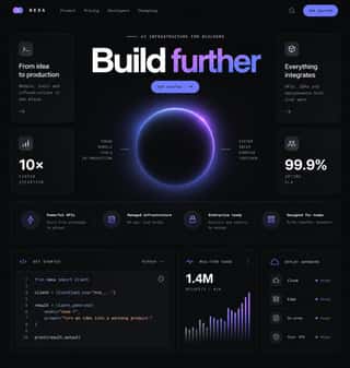
Dark Tech MinimalismThe dark, restrained aesthetic of developer tools and SaaS landing pages since about 2019: near-black grounds, grey type ramps, a neutral grotesque such as Inter, hairline borders, soft radial glows and bento grids of crisp product screenshots.
Styles that use it now and then 17
An occasional choice in these styles.
- Nianhua & Chinese Folk Printc. 1100–present
- Northwest Coast Formline Design1700–present
- Finnish Bold Print (Marimekko Modernism)1951–present
- Push Pin Style1954–1980
- Arab Children's Comic Magazines (Samir to Majid)1956–present
- British Road Signage (Kinneir & Calvert)1958–present
- Munich 1972 Olympic Design (Otl Aicher)1966–1972
- Roman-like Thai Typography (modern loopless Thai)1973–present
- Memphis Design1981–1988
- Madinah Mushaf (King Fahd Complex Qur'an Page)1985–present
- Indian Pop-Kitsch Design (Desi Kitsch)1997–present
- Seoul Independent Graphic Design (Small-Studio Scene)2005–present
- Flat Design2010–2016
- 'Good Morning' Greeting Images (WhatsApp Forward Vernacular)2013–present
- VTuber Avatar and Stream Graphics2016–present
- Corporate Memphis2017–present
- Instagram Slideshow Activism (Social-Justice Infographics)2020–present
It often goes with
Choices that the styles making it make more often than the atlas as a whole.
- App & OS interfacein 18 of 39
- Warm & approachablein 26 of 39
- Web & CSSin 19 of 39
- Icons & pictogramsin 17 of 39
- Rounded sansin 11 of 39
- Flat vector illustrationin 15 of 39
Styles that avoid it
Styles that deliberately leave it out.
- Square Kufic (Bannāʾī)c. 1100–present
- Gothic Blackletter & Fraktur Traditionc. 1180–present
- NSK Retro-Avant-Garde1980–present
- Pixação (São Paulo Tag Reto)1980–present
- Black Metal Graphics1990–present
- Fantasy User Interface (FUI) & Sci-Fi HUD1999–present
- GOV.UK Design (GDS Style)2012–present
- Low Poly Illustration2012–present
- Brutalist Web Design2014–present