World region
Graphic-design styles from North America
Styles that took shape in North America, alone or together with other regions. Stylogeny describes 76 of them. The earliest began in c. 1180, the latest in 2020. Of these, 40 are still in use.
The 76 styles
Oldest first. Each has its own page: its design choices, where it comes from, and real works.
Gothic Blackletter & Fraktur TraditionThe broken scripts of the Latin West.
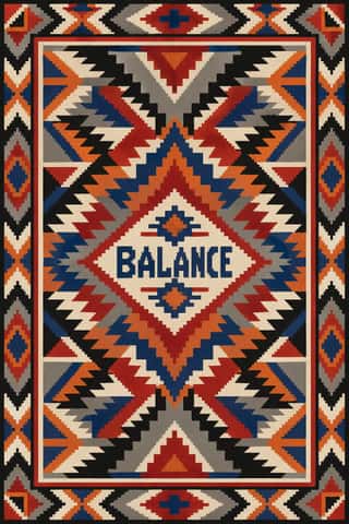
Diné (Navajo) Weaving DesignThe tapestry-woven design tradition of Diné (Navajo) weavers, recorded in Spanish sources from the early 18th century.
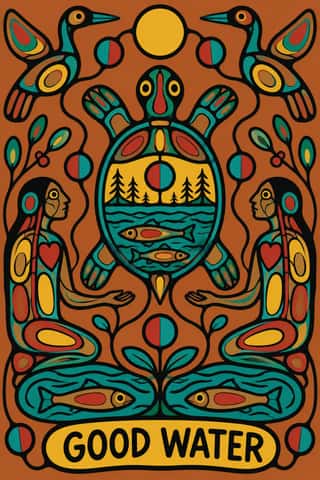
- Northwest Coast Formline DesignThe two-dimensional design system of the northern Northwest Coast nations, painted, carved and woven onto boxes, house fronts, robes and hats, and printed as serigraphs since the 1960s.
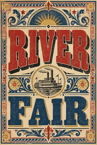
Victorian Letterpress & Wood TypeThe commercial jobbing print of the industrial century: posters, playbills, auction notices and ephemera built from a flood of new display types (fat faces, Egyptians, grotesques, Tuscans and condensed wood type).
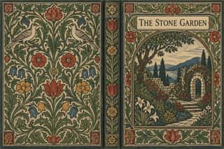
Arts & Crafts MovementA British-led reform movement that answered industrial shoddiness with honest handcraft, medieval models and the ideal of joy in labour.
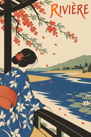
JaponismeThe Western absorption of Japanese woodblock prints, textiles and crafts after Japan reopened to trade in the 1850s.
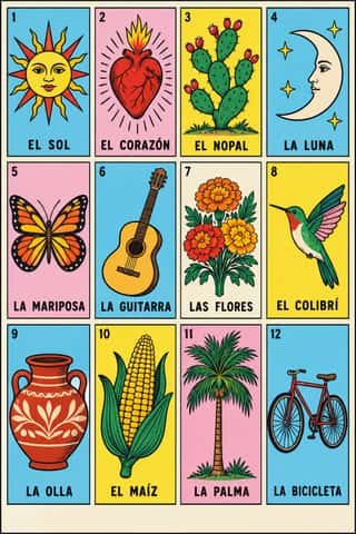
Lotería Card Imagery (Mexican Lotería)The picture deck of Mexico's lotería, a bingo-like game of chance.
Art NouveauAn international 'new art' that sought a modern style free of historical revival, drawing its forms from plant growth and the female figure.
Art DecoThe glamorous modern style named after the 1925 Paris Exposition des Arts Décoratifs, which disciplined ornament into geometry: sunbursts, chevrons, stepped forms and sleek stylised figures rendered in lacquer-smooth colour with metallic accents.
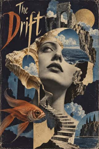
Surrealist GraphicsLaunched by André Breton's 1924 manifesto, Surrealism sought the marvellous in dreams, chance and the unconscious.
Harlem Renaissance Graphic ArtThe illustration, cover and jacket art of the New Negro movement, set by Aaron Douglas after he moved to Harlem in 1925 and studied with Winold Reiss.
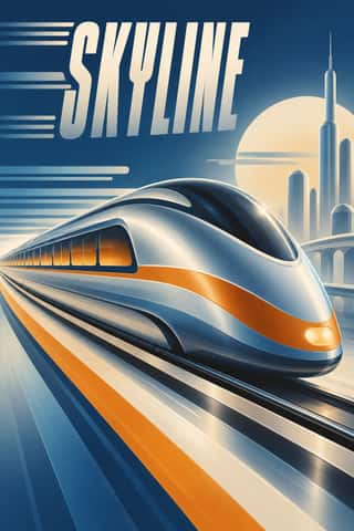
Streamline ModerneThe late, chiefly American phase of Art Deco, in which aerodynamic science became a visual language for a Depression-era culture hungry for progress.
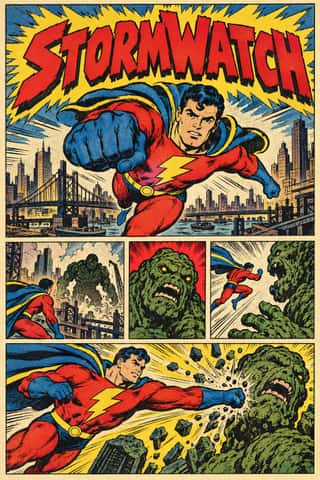
American Four-Colour Comic Book (Golden to Bronze Age)The American newsstand comic book from Famous Funnies (1934) and Action Comics #1 (1938) through the Golden, Silver and Bronze Ages, and past the Bronze Age's end in 1985 until computer colour replaced hand separations in the early 1990s.
Tiki Pop (Polynesian Pop)The mainland American fantasy of the South Seas, begun by Don the Beachcomber's Hollywood bar (about 1934) and Trader Vic's in Oakland and at its height in the Polynesian restaurants of the 1950s and 60s.
WPA Silkscreen PostersPosters made by the Federal Art Project of the Works Progress Administration to promote health campaigns, education, theatre, travel and the national parks during the Depression.
American Mid-Century ModernismThe American synthesis of European avant-garde form with wit, pragmatism and commercial clients, led by Paul Rand, Alvin Lustig, Lester Beall, Bradbury Thompson and Saul Bass.
UPA & Cartoon ModernThe modern cartoon of United Productions of America (UPA) and the 1950s films, commercials and books it inspired.
Googie & Atomic AgeThe exuberant commercial modernism of post-war American roadside culture (coffee shops, motels, car washes, bowling alleys and neon signs), named in 1952 by critic Douglas Haskell after John Lautner's Googie's coffee shop in Los Angeles (1949).
Push Pin StyleThe eclectic illustrative style of New York's Push Pin Studios, founded by Seymour Chwast, Milton Glaser and Edward Sorel.
Corporate Identity ModernismModernist reduction applied to corporate communication.
Pop Art GraphicsPop turned the commercial imagery of post-war consumer culture (comics, packaging, celebrity photographs and advertising) into both its subject and its method.
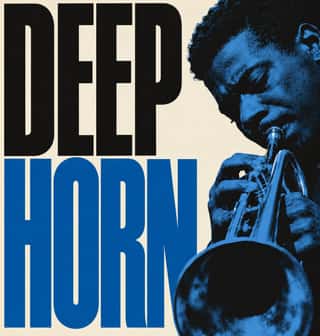
Blue Note Jazz Sleeve ModernismThe record-sleeve language of Blue Note Records, set by art director Reid Miles, who designed some 350 twelve-inch LP covers between about 1956 and 1967, often around Francis Wolff's session photographs.
Kinngait (Cape Dorset) Inuit PrintmakingPrints from the Inuit co-operative studio at Kinngait (Cape Dorset), Nunavut, with a catalogued collection every year since 1959.
Fluxus Graphics (Maciunas)The house graphics George Maciunas made from 1962 until his death in 1978 for Fluxus, a network of artists who staged events and sold cheap multiples.
Phototype Expressive Typography (Lubalin & U&lc)The display typography of the phototype era, led in New York by Herb Lubalin, his lettering partners John Pistilli, Tom Carnase and Tony DiSpigna, and the International Typeface Corporation.
Woodland School (Legend Painting)A school of painting from northwestern Ontario, made public when Norval Morrisseau showed at Toronto's Pollock Gallery in 1962 and carried on by Ojibwe, Odawa, Oji-Cree and Cree artists such as Daphne Odjig and Carl Ray.
Baybayin Revival GraphicsThe revival of baybayin, the precolonial Tagalog abugida, as a mark of Filipino identity.
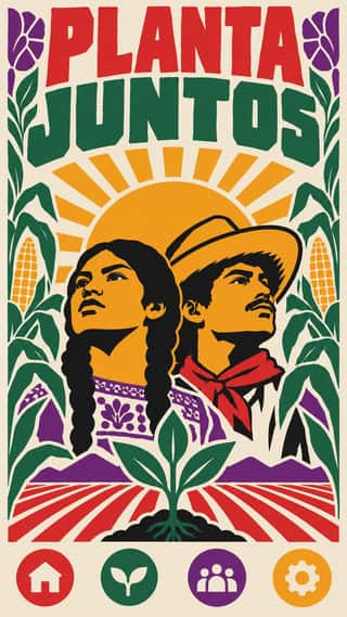
Chicano Screenprint PosterThe screenprinted poster of the Chicano Movement and its heirs, made from the mid-1960s in community workshops across California and the Southwest for farmworker strikes and boycotts, teatro, dances, anti-war marches and immigrant rights.
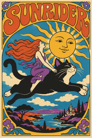
Psychedelic PosterThe concert-poster language of the 1960s counterculture, born in San Francisco's Fillmore and Avalon ballrooms and echoed in London's underground press.
- Black Panther Party GraphicsThe visual language of the Black Panther Party, created largely by its Minister of Culture, Emory Douglas, for the weekly newspaper The Black Panther.
AfriCOBRAThe Black Arts Movement collective founded in Chicago in 1968 by Jeff Donaldson, Wadsworth and Jae Jarrell, Barbara Jones-Hogu and Gerald Williams, after OBAC's Wall of Respect mural.
- Swiss Punk / New Wave TypographyA rebellion from inside the Swiss school: Wolfgang Weingart and his Basel students kept the grotesque and the grid but set them in motion with extreme letterspacing, stepped and angled lines, rules and bars, enlarged halftone screens and layered film montage.
- Ultras Graphics (Curva Banners and Tifo)The graphic language of Italy's organised football supporters, the ultras, from the late 1960s, and of the groups that copied them across Europe, North Africa and beyond.
Underground ComixSelf-published, adults-only comic books from the San Francisco counterculture, made outside the Comics Code on the newsstand comic's format.
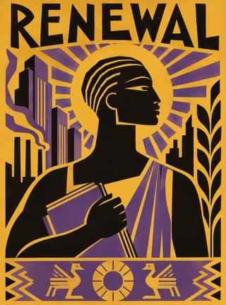
Afrofuturist DesignA visual language of Black futures that fuses African and diasporic iconography (pyramids and ankhs, Adinkra and Nsibidi glyphs, textile patterning) with spacecraft, cosmic fields and technology.
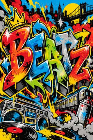
Graffiti & Hip-Hop GraphicsBorn on New York's subway cars and Bronx party flyers, graffiti writing turns the writer's name into a monumental letter-sculpture: bubble, block and wildstyle letters with arrows, 3D drop shadows, fades and highlights, painted freehand in aerosol.
Métal hurlant Science-Fiction Comics (Mœbius, Druillet & Les Humanoïdes Associés)The adult science-fiction comics of Métal hurlant, the Paris magazine founded in 1974 by Mœbius, Philippe Druillet, Jean-Pierre Dionnet and Bernard Farkas.
- Punk & DIY ZineThe graphic voice of punk rock in fanzines, record sleeves and gig flyers: images and words cut from newspapers, typed or scrawled, pasted down and run off on a photocopier.
Bitmap & Pixel GraphicsGraphics and lettering built from the square pixels of low-resolution screens (arcade and console sprites, home-computer displays and the first graphical user interfaces), where every dot was placed by hand within tight limits of memory, resolution and palette.
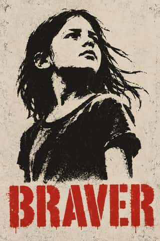
Stencil Street ArtPictures cut rather than drawn: a photograph is reduced to two or three flat tones, cut into card and sprayed onto a wall, usually uninvited, so one hard-edged figure appears in the street, in black with at most one accent colour.
Cranbrook & Deconstructivist TypographyGraduate-school experimentation, centred on Katherine and Michael McCoy's Cranbrook design programme, that applied post-structuralist literary theory to the page.
Emigre & Early Digital TypeRudy VanderLans and Zuzana Licko's magazine and type foundry, launched in 1984 alongside the first Macintosh, turned the computer's low-resolution constraints into a new typographic idiom.
Demoscene Graphics (Cracktros, Demos & Text-Mode Art)The graphics of the demoscene, a mainly European community of coders, graphicians and musicians that grew from the intros software crackers added to pirated Commodore 64 and Amiga games in the mid-1980s.
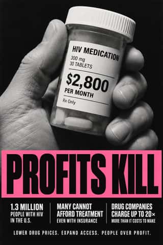
ACT UP & Gran Fury AIDS Activist GraphicsThe graphics of New York's AIDS activist movement: the SILENCE=DEATH poster of 1987, a pink triangle above white capitals on black, and the posters, stickers, T-shirts, billboards and bus ads of Gran Fury (1988–1995), ACT UP's 'unofficial propaganda ministry'.
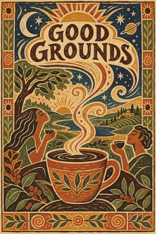
Global Village CoffeehouseThe faux-naive, earth-toned illustration style that late-1980s American designers set against Memphis, and that chain cafés, bookstores, packaging and clip art spread through the 1990s.
Grunge TypographyThe 1990s magazine and music-industry style in which type was layered, eroded, overlapped and cropped until legibility became negotiable.
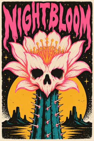
Screenprinted Gig & Alt-Movie PosterHand-pulled, numbered screenprints that revived the rock poster in Austin from 1991, led by Frank Kozik, and spread via Flatstock fairs and, from 2004, Mondo to 'alternative' film posters, for collectors as much as the show.
Hype Streetwear Graphics (Box Logo to Quotation Marks)The logo-led graphics of streetwear since the 1990s: one wordmark or emblem on a plain T-shirt, hoodie or object is the product.
Fantasy User Interface (FUI) & Sci-Fi HUDFantasy user interfaces are the screen graphics of films and series: computer screens, holograms and helmet HUDs made to be watched for a few seconds, not used.
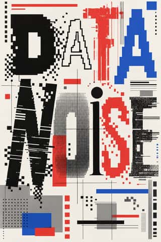
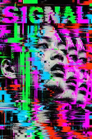
Glitch Art & Datamosh GraphicsAn art and design practice that makes digital failure the picture.
- Internet Ugly & Meme VernacularA deliberately amateur image dialect of forums, imageboards and social feeds, named 'Internet Ugly' by Nick Douglas in 2014.
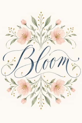
Modern Calligraphy and Brush LetteringThe loose pointed-pen and brush-pen script of wedding stationery and the 2010s craft boom.
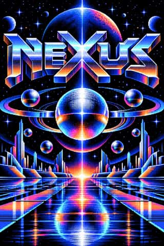
Synthwave / OutrunThe retro-futurist look of synthwave music: a 1980s revival that grew from mid-2000s French electro and online synth scenes, took its other name from Sega's arcade racer Out Run (1986) and reached the mainstream with Drive (2011).
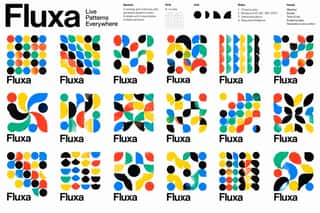
Generative & Dynamic IdentitiesIdentity systems designed as rules rather than fixed marks: logos and graphics generated by code, data or parameters so that they vary endlessly while staying recognisable.
Hipster Artisanal RevivalThe trade-mark look of the 2007–2018 craft boom, which dressed new coffee roasters, breweries and stationers as nineteenth- and early-twentieth-century firms.
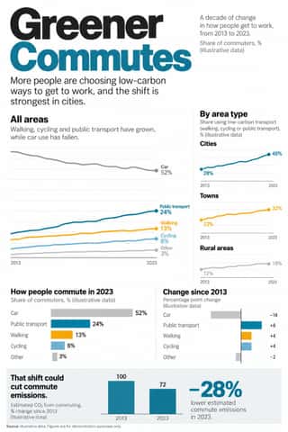
Newsroom Data Graphics & ScrollytellingThe house style of newspaper graphics desks since about 2009–2011 (the New York Times graphics desk, D3.js, the Guardian Datablog): conventional charts drawn from the data, on a white or pale paper ground with light grey gridlines and no axis titles, lines labelled directly in place of a legend where possible and short annotations saying what to look at.
Flat DesignAn interface and illustration language that stripped screens of simulated materials, replacing bevels, gloss and textures with solid fields of colour, clean sans-serif type and reduced pictograms.
Slow-Living Editorial (the Kinfolk Look)The look of Kinfolk, the slow-living quarterly founded in Portland in 2011 and run from Copenhagen since 2015, and of the indie lifestyle titles and Instagram feeds that copied it.
VaporwaveAn internet-born microgenre and visual aesthetic that remixes the debris of late-20th-century consumer culture (Windows 95 dialogs, classical busts, palm trees, mall interiors, Japanese text, early 3D renders) in pastel pinks and cyans.
DTC 'Blanding' / Millennial MinimalismThe friendly, frictionless minimalism of 2010s direct-to-consumer start-ups, built for the phone screen, the Instagram feed and the unboxing.
Plain Tobacco PackagingA packaging language written into law to strip tobacco of persuasion.
- YouTube Thumbnail Style (the 'YouTube Face')The custom thumbnail of YouTube's creator economy: a 16:9 still made to be read at fingernail size in a feed of recommendations.
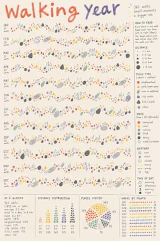
Data HumanismAn information-design approach that draws data rather than charting it, treating numbers as personal, approximate and human.
Material DesignGoogle's design system, launched in 2014, which reintroduced controlled depth to flat design through the metaphor of 'material': sheets of digital paper and ink that sit at defined elevations, cast consistent shadows and move with meaningful motion.
SolarpunkHopeful eco-futurist imagery born online.
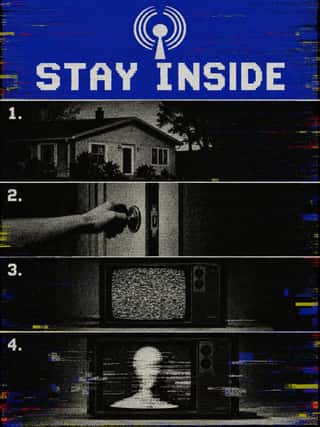
Analog Horror GraphicsA horror genre, mostly on YouTube, that tells its stories through imitation television and home-video graphics rather than actors: emergency-alert screens, station IDs, public-service, educational and instructional tapes, set between the 1960s and early 2000s.
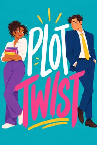
Illustrated Rom-Com Book Cover (Cartoon Couple Cover)The illustrated cover of the contemporary romantic comedy: a couple drawn as flat cartoon figures with simplified faces, from silhouettes and hidden faces to a few cartoon features, caught in one gesture that states the premise, on a single saturated ground of teal, pink, yellow or purple, under a hand-lettered title so large that the figures often lean on it.
Kinetic Typography & Variable TypeTypography as the moving image: letterforms that stretch, squash, rotate and morph along variable-font axes, loop seamlessly and cut to the beat of music, used for identities, social-media posters and digital out-of-home screens.
Corporate MemphisThe flat vector illustration style that became the default visual voice of big tech in the late 2010s: faceless, ethnically non-specific figures with elongated limbs and tiny heads, drawn in bright flat colour among blobs, leaves and confetti.
- Lo-fi Anime AestheticThe look of YouTube's 24/7 lo-fi hip hop streams.
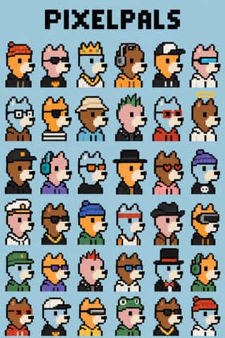
NFT Profile-Picture Collections (CryptoPunks to Bored Apes)Sets of thousands of avatar portraits that code assembles from one or two hundred hand-drawn traits, each sold as a token on a blockchain.
Book Blob (Abstract Colour-Blob Literary Fiction Cover)The default jacket of US literary fiction around 2019–2023: soft, overlapping blobs of saturated colour fill the cover edge to edge (cobalt, pink, orange-red, deep green, mustard).
Dark Tech MinimalismThe dark, restrained aesthetic of developer tools and SaaS landing pages since about 2019: near-black grounds, grey type ramps, a neutral grotesque such as Inter, hairline borders, soft radial glows and bento grids of crisp product screenshots.
Black Lives Matter Street MuralsA single protest slogan painted along the roadway in capitals 20 to 35 feet tall, filling the street from kerb to kerb, so it reads whole only from rooftops, drones and helicopters.
Instagram Slideshow Activism (Social-Justice Infographics)The text-led explainer slideshows that filled Instagram after George Floyd's murder in May 2020.
- Neo-BrutalismA friendly, commercial descendant of web brutalism that keeps its blunt boxes but adds candy colour: thick black outlines, hard unblurred offset shadows, flat saturated fills and chunky sans-serif type on conventional, usable layouts.
The design choices they share
The choices these styles make more often than the 359 styles in the atlas as a whole, most telling first.
- Web & CSSin 26 of 76
- Motion & broadcastin 23 of 76
- Geometric sansin 25 of 76
- Fluorescent & neonin 20 of 76
- Offset printingin 43 of 76
- All capsin 43 of 76
- Technological & futuristin 20 of 76
- Full bleedin 33 of 76